2.5. Commonly Observed Shapes of Skewness#
2.5.1. Positive Skewness#
Skewness is a statistical concept that quantifies the degree of asymmetry in a distribution. A positively skewed, or right-skewed, distribution is one where the tail on the right side of the distribution is longer than the left side, indicating that the distribution has a longer tail of higher values. When visualizing such a distribution through a histogram or density plot, you would notice that while most of the data points are gathered on the left, indicating more frequent lower values, there’s a stretch of less frequent higher values extending to the right. This is indicative of a few extreme values on the higher end. Statistically, this means that the average value, or mean, of the distribution is higher than the median, or the middle value when the data is sorted. Real-world examples of positively skewed distributions are often found in economic data, such as the distribution of income, wealth, and house prices, where a large number of observations are clustered at the lower end, but there are significant outliers on the higher end.
Fig. 2.27 illustrates positive skewness using two graphs: a histogram and a density plot. Both graphs show the distribution of data values, with a long tail extending to the right, indicating higher values. The mean (2.01) and median (1.58) are marked, showing that the mean is higher than the median. This pattern is typical of positively skewed distributions, where most data points are concentrated on the left, with fewer higher values stretching out to the right.
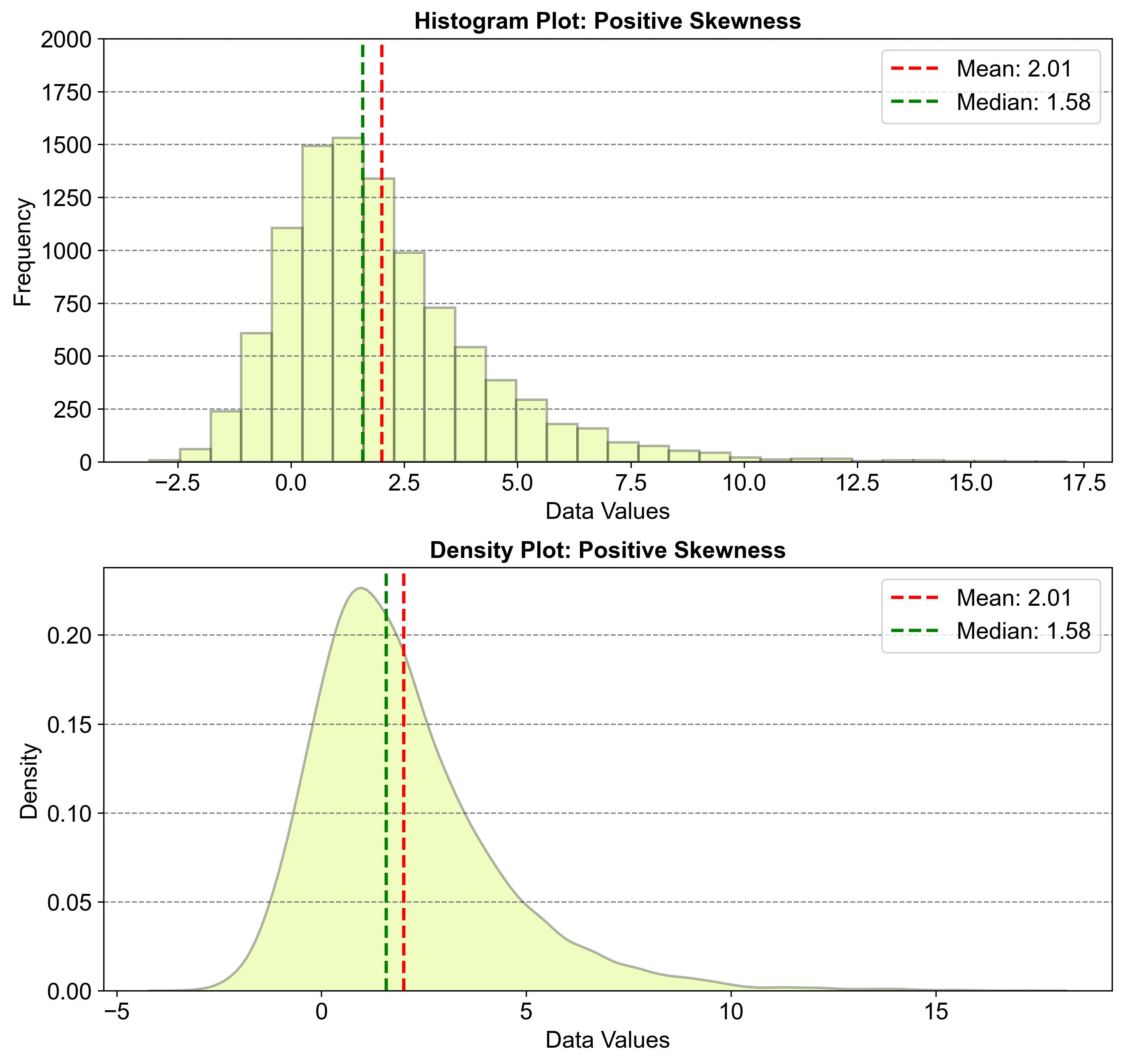
Fig. 2.27 Example of a Distribution with Positive Skewness#
2.5.2. Negative Skewness#
Skewness is a term in statistics that describes how asymmetrical a distribution is. A negatively skewed distribution, also known as left-skewed, is one where the tail on the left side of the distribution is longer than the right side, suggesting an extension towards lower values. When visualized, such as on a histogram or density plot, this skewness is evident by a concentration of data points on the right, with a tail of less frequent, extreme values stretching out to the left. Statistically, this means that the mean, or average, of the distribution is lower than the median, or middle value. This type of distribution is often seen in scenarios like exam scores, where most students achieve scores above the average but a few score much lower, or in response times, where most responses are fast, with a minority being significantly slower. These examples highlight the practical implications of negative skewness in data analysis.
Fig. 2.28 illustrates negative skewness using two graphs: a histogram and a density plot. Both graphs show the distribution of data values, with a long tail extending to the left, indicating lower values. The mean (-2.00) and median (-1.60) are marked, showing that the mean is lower than the median. This pattern is typical of negatively skewed distributions, where most data points are concentrated on the right, with fewer lower values stretching out to the left.
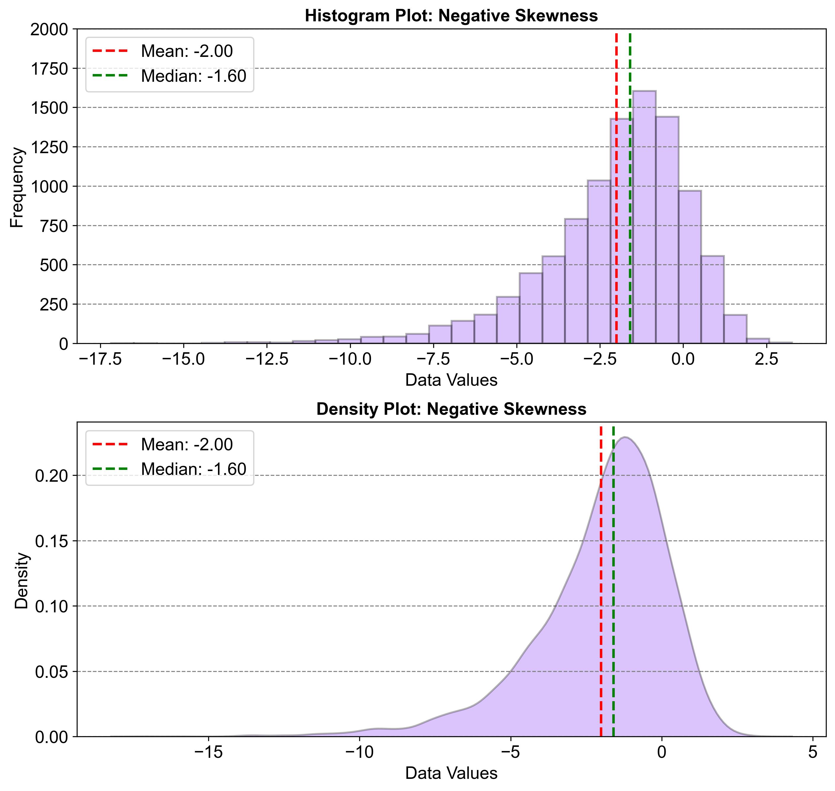
Fig. 2.28 Example of a Distribution with Negative Skewness#
2.5.3. Symmetric Distribution#
A symmetric distribution is one where the data is evenly spread out around a central value, creating a balanced and mirrored distribution on either side of this point. Visually, this can be represented by a bell-shaped curve, such as the one seen in the standard normal distribution, where the left and right sides are identical reflections of each other. In terms of statistical relationships within a symmetric distribution, the mean, which is the average of all the data points, is exactly the same as the median, the middle value when the data is ordered from smallest to largest. This equality of mean and median is a defining characteristic of symmetric distributions. Common examples of symmetric distributions include the standard normal distribution and the uniform distribution, both of which exhibit this type of balanced symmetry.
Fig. 2.29 illustrates a symmetric distribution using two graphs: a histogram and a density plot. Both graphs show the distribution of data values, forming a bell-shaped curve that is symmetrical around a central point. The mean (-0.02) and median (-0.03) are marked, showing that they are equal or very close in value. This pattern is typical of symmetric distributions, where data is evenly spread out around a central value, creating a balanced and mirrored distribution on either side.
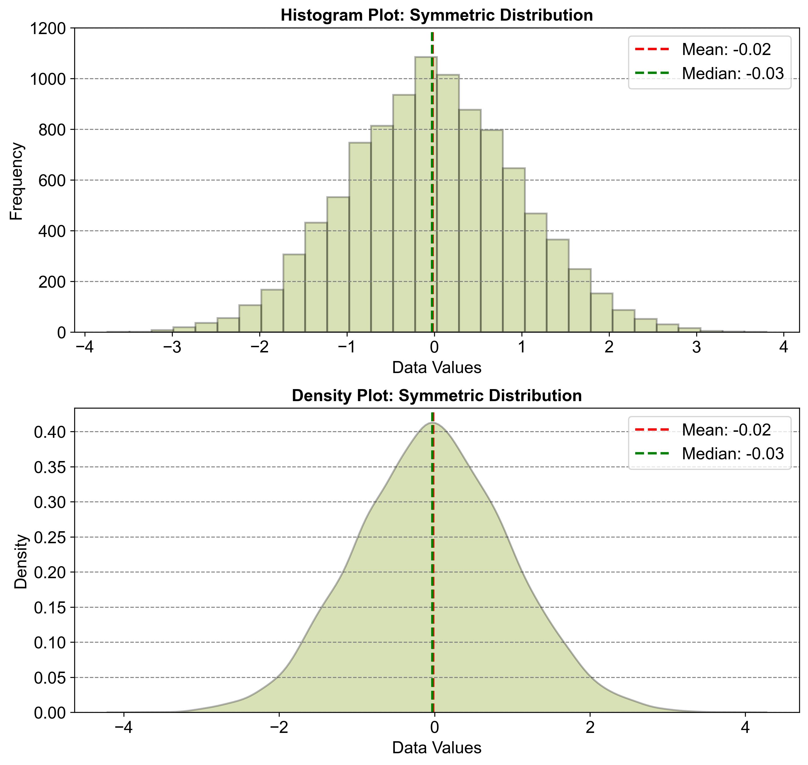
Fig. 2.29 Example of a Symmetric Distribution#
2.5.4. Asymmetric#
An asymmetric distribution, also known as a skewed distribution, is one where the data points are not evenly distributed around a central point, resulting in a distribution that leans more heavily to one side. This skewness can be either positive or negative. In a positively skewed distribution, often seen in data such as income, wealth, and house prices, the right tail of the histogram extends further than the left, indicating that the mean is greater than the median. Conversely, in a negatively skewed distribution, which might be observed in exam scores or response times, the left tail is longer, and the mean is less than the median. These distributions are depicted visually by histograms where one tail is noticeably longer than the other, highlighting the direction of the skew.
2.5.5. Uniform Distribution#
A uniform distribution, sometimes referred to as a rectangular distribution, is a type of probability distribution where every outcome within a certain range has an equal chance of occurring. This distribution is depicted as flat because the likelihood of each outcome is the same across the interval. The probability density function (PDF) for a uniform distribution is consistent within the bounds of the interval and drops to zero outside of it. This distribution is also symmetric, with its shape reflecting perfectly across the midpoint. Consequently, both the mean and median of a uniform distribution are found at the center of the interval, underscoring its balanced nature.
Fig. 2.30 illustrates a uniform distribution using two graphs: a histogram and a density plot. Both graphs show the distribution of data values, with a flat, rectangular shape indicating equal likelihood for all outcomes within the range. The mean (49.65) and median (49.35) are marked, showing that they are located at the center of the interval. This pattern is typical of uniform distributions, where every outcome within a certain range has an equal chance of occurring, creating a balanced and symmetric shape.
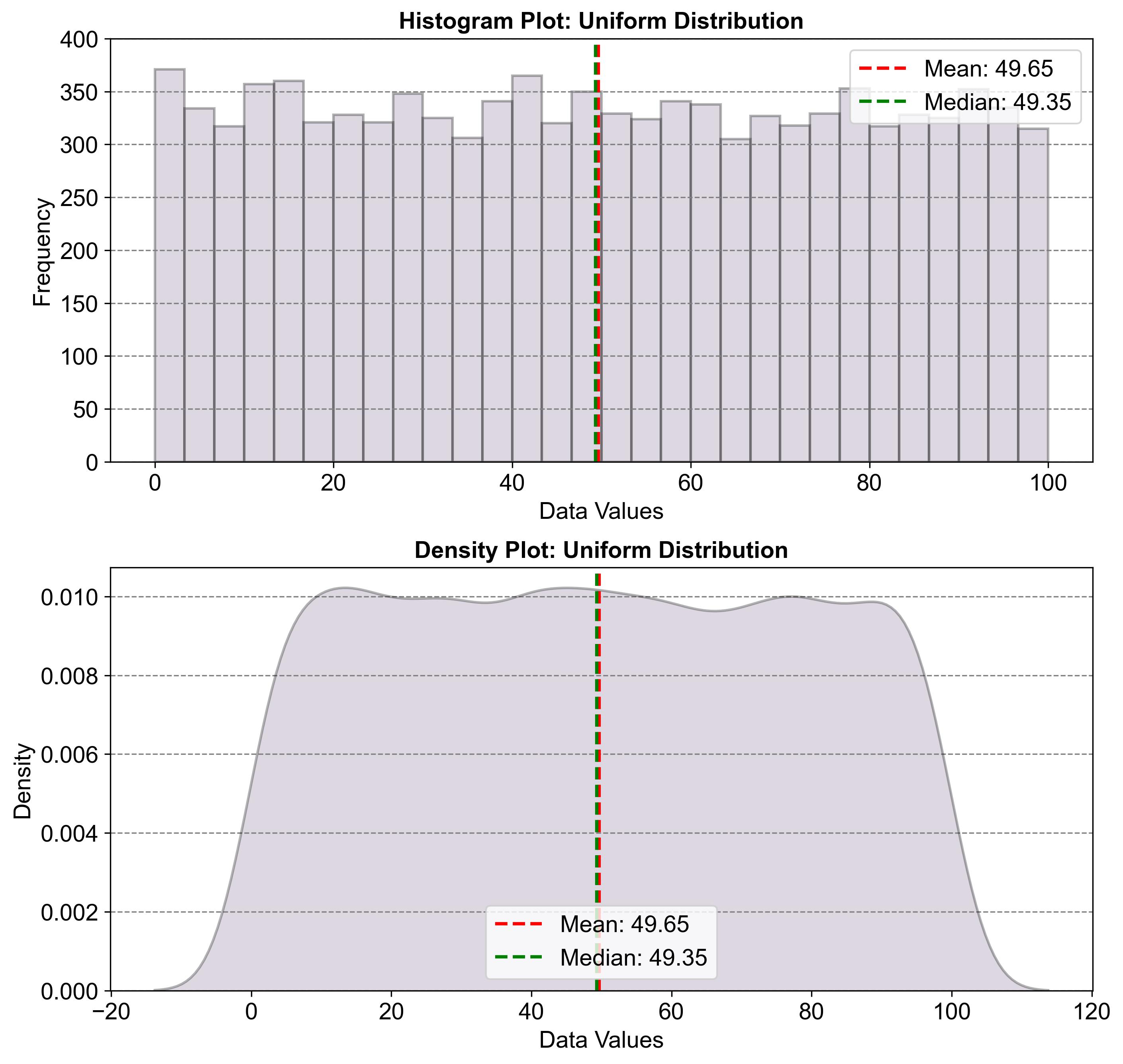
Fig. 2.30 Example of a Uniform Distribution#
