2.4. Commonly Observed Shapes of Distributions#
2.4.1. Density Curve#
A density curve is a smooth, continuous line on a graph that illustrates the distribution of data within a dataset. It differs from a histogram, which uses discrete bars to represent the frequency of data points within specific intervals. The density curve is valuable for its ability to show the shape of the distribution—whether it’s symmetric or skewed—the location of central tendencies like the mean and median, and the proportions of observations within various ranges. The bell-shaped curve is a well-known example of a density curve, signifying a normal distribution [Calin and Udrişte, 2014].
In contrast, a histogram is a graphical representation that uses bars to depict the occurrence of data values, grouping them into bins and displaying the count of values in each bin. This method is discrete and provides a clear picture of how many values fall within set ranges.
The relationship between histograms and density curves lies in their common goal of visualizing data distributions. Histograms are concerned with the actual counts of data points in each bin, while density curves focus on the proportions, offering a sense of the relative likelihood of observing values in different intervals. Essentially, density curves can be seen as the smoothed-out counterparts of histograms, highlighting the continuous aspect of data distributions.
2.4.2. Unimodal#
A unimodal distribution is characterized by a single, prominent peak in its frequency distribution. This peak represents the mode — the value that appears most frequently in the dataset. In essence, a unimodal distribution indicates that the data points tend to gather around a central, common value, which is the mode. To visualize this, picture a histogram where the bars rise to form one main peak and then gradually taper off on either side. This pattern suggests that most of the data falls close to the mode, with fewer occurrences as you move away from it [Agresti and Kateri, 2021].
Common real-world examples of unimodal distributions include the heights of adult humans, which typically center around an average height, and exam scores in a well-constructed assessment, where most students score around the median, reflecting a central tendency in performance. These examples illustrate how unimodal distributions can provide insights into the concentration and spread of values within a given dataset.
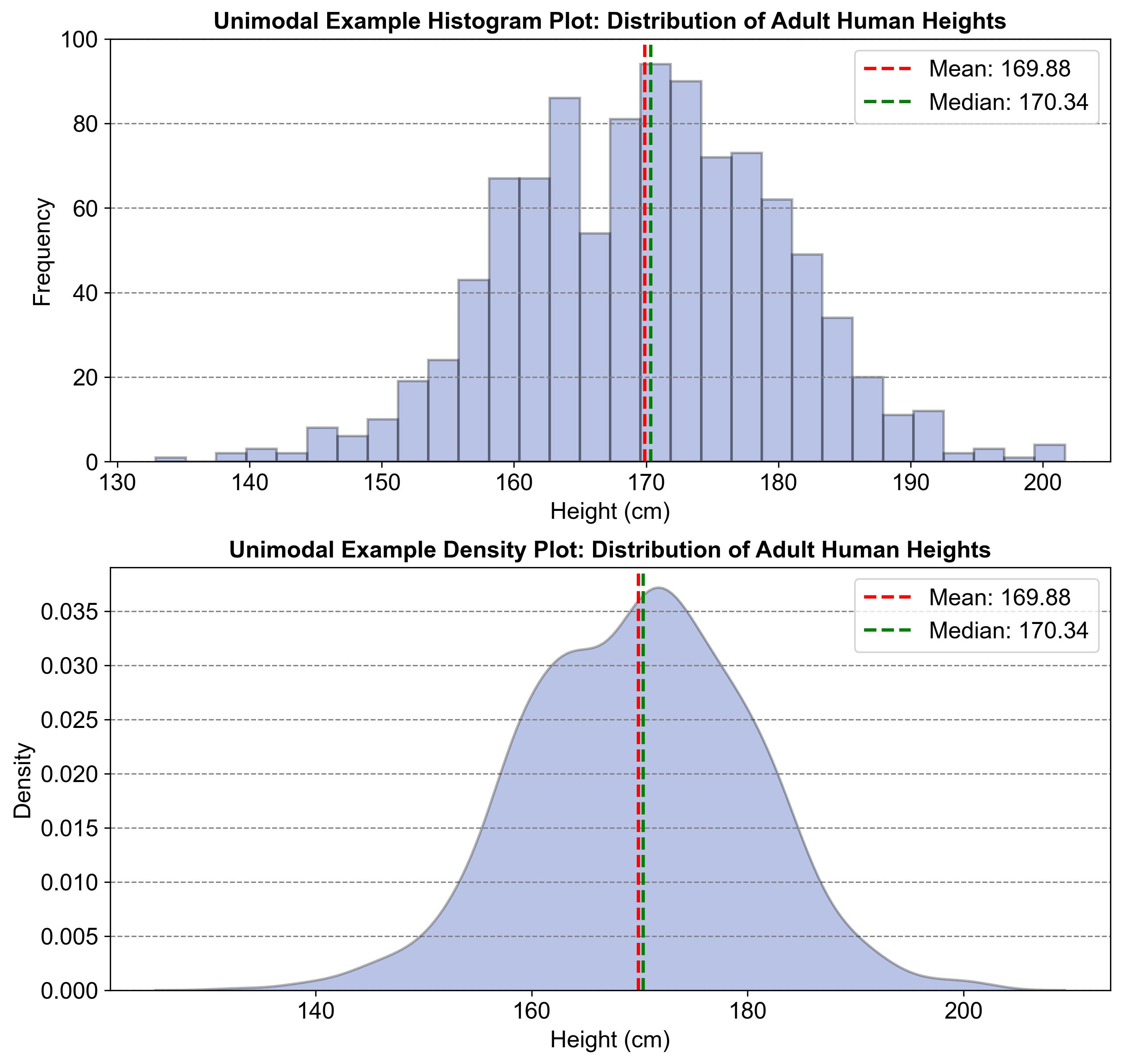
Fig. 2.24 illustrates a unimodal distribution using two graphs: a histogram and a density plot. Both graphs show the distribution of adult human heights, with a single prominent peak around 170 cm. This peak represents the mode, indicating that most heights cluster around this value. The mean (169.88 cm) and median (170.34 cm) are also marked, showing a central tendency in the data. This pattern is typical of unimodal distributions, where data points gather around a central, common value.

Fig. 2.24 Example of a Unimodal Distribution: Adult Human Heights#
2.4.3. Bimodal#
A bimodal distribution is a statistical term used to describe a distribution of data that has two distinct peaks or modes. These peaks represent the most common values in the dataset and indicate that the data is concentrated around two separate points. Visually, if you were to plot this data on a histogram, you would see two prominent peaks rather than just one [Demir et al., 2021].
This kind of distribution can occur in various scenarios, such as in exam scores where there might be a group of students who score very high and another group who score much lower, resulting in two peaks in the distribution of scores. Another example could be the distribution of income within a population where there are significant numbers of both low-income and high-income individuals, leading to two peaks—one at the lower end of the income scale and another at the higher end. These examples show how bimodal distributions can reveal interesting patterns and divisions within sets of data.
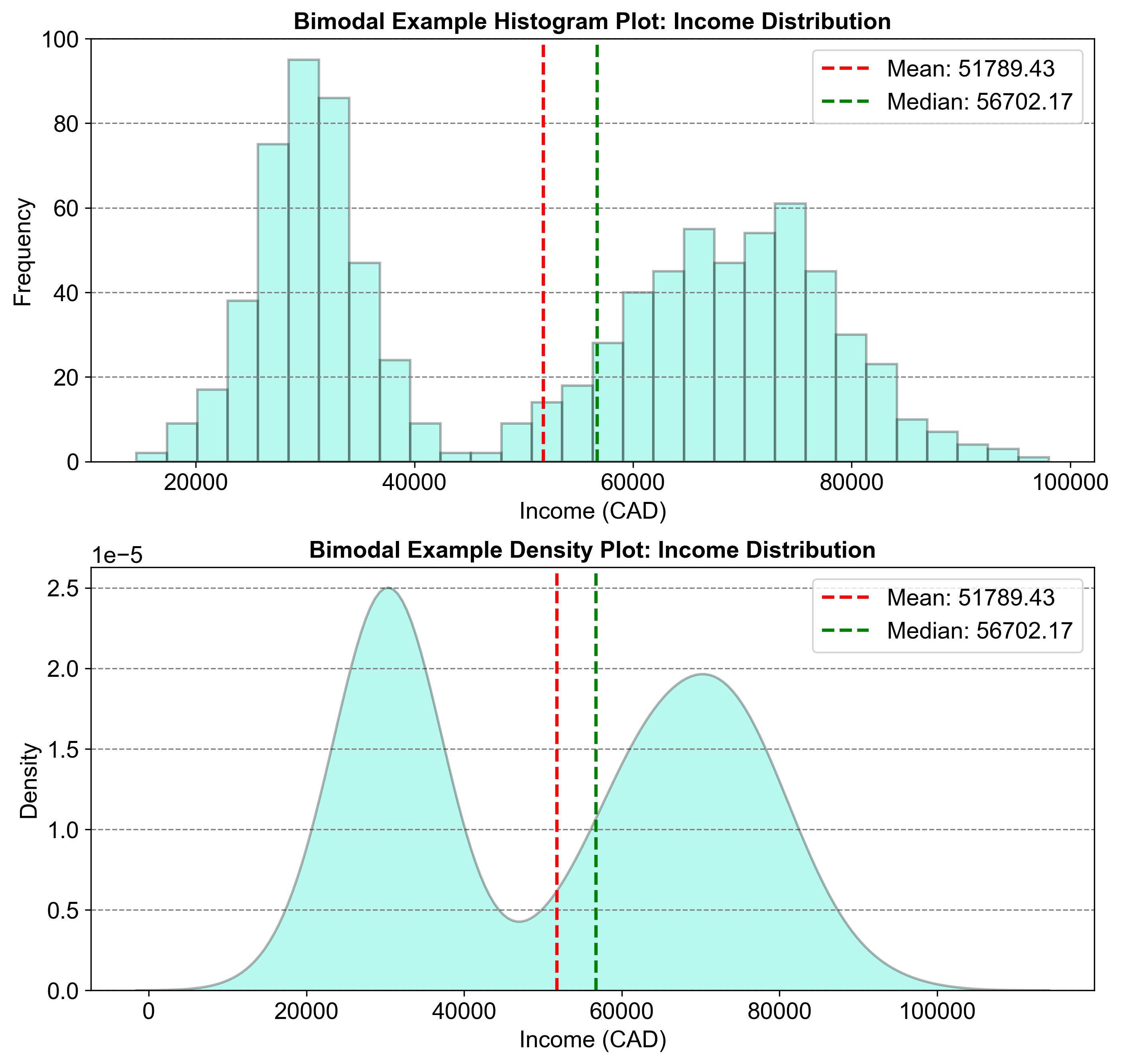
Fig. 2.25 illustrates a bimodal distribution using two graphs: a histogram and a density plot. Both graphs show the distribution of income, with two prominent peaks around \(20,000 and \)80,000. These peaks represent the two modes, indicating that incomes are concentrated around these values. The mean (\(51,789.73) and median (\)56,702.17) are also marked, showing central tendencies in the data. This pattern is typical of bimodal distributions, where data points gather around two separate values, revealing interesting patterns within the dataset.

Fig. 2.25 Example of a Bimodal Distribution: Income Distribution#
2.4.4. Multimodal#
A multimodal distribution is a type of distribution in statistics that is characterized by having more than two peaks or modes. These modes represent the most frequently occurring values in a dataset, and the presence of multiple modes indicates that the data contains several distinct clusters of values. When you visualize a multimodal distribution on a histogram, it will display several peaks, each corresponding to a mode. This kind of distribution is often observed in complex systems where there are multiple factors influencing the data [SenGupta and Arnold, 2022].
For example, in a market survey analyzing customer preferences, a multimodal distribution could reflect the different preferences or behaviors of various customer segments, each peak representing a different group with common preferences. Such distributions are useful for identifying and understanding the diversity within a dataset.
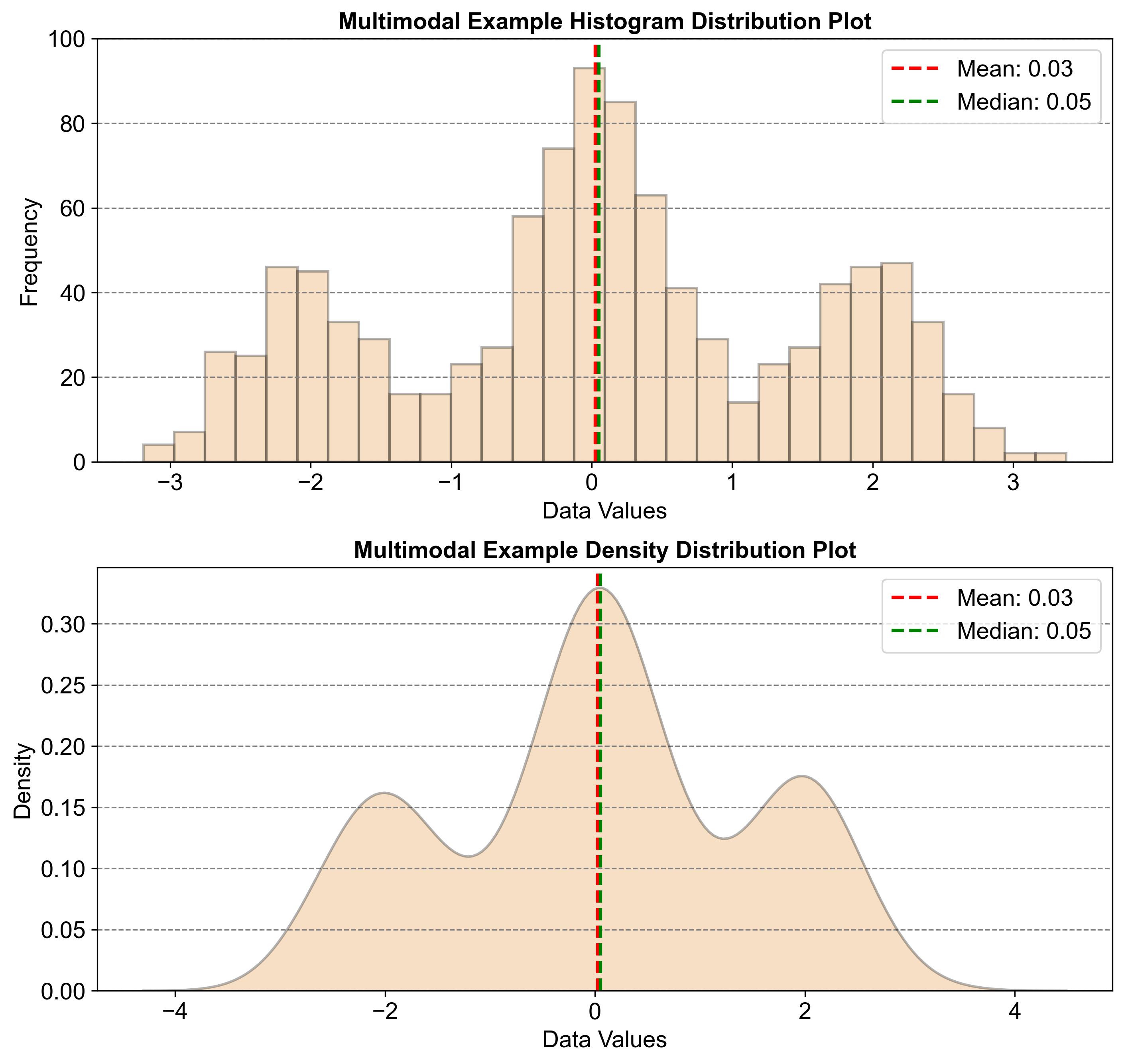
Fig. 2.26 illustrates a multimodal distribution using two graphs: a histogram and a density plot. Both graphs show the distribution of data values, with multiple peaks indicating several modes. These peaks represent the most frequently occurring values in the dataset. The mean (0.03) and median (0.05) are marked, showing central tendencies. This pattern is typical of multimodal distributions, where data points gather around several distinct values, revealing multiple clusters within the dataset.

Fig. 2.26 Example of a Multimodal Distribution#
