2.2. Visualizing Data#
Tables offer a practical means of organizing and presenting data in a structured format. However, graphs surpass tables in providing enhanced clarity and understanding of the data. Although there are no strict rules dictating the choice of graphs, various types are available to effectively communicate specific types of data. The selection of the most suitable graph depends on the nature of the data and the insights one aims to convey.
Example 2.7 (University A and University B Data Snapshot (Spring 2020))
The tables below depict the frequency and relative frequency of part-time and full-time students at University A and University B in the spring of 2020. The relative frequency is expressed as a percentage of the total enrollment for each university, facilitating a straightforward comparison of the same categories between the two institutions.
Regarding the visualization of qualitative data, two commonly used graphs are pie charts and bar graphs.
2.2.1. Pie charts#
In statistics, a pie chart is a circular graph that is divided into slices to show the percentage breakdown of a categorical variable. The area of each slice is proportional to the frequency or proportion of the category it represents. Pie charts are especially useful for displaying the composition or distribution of qualitative data with different groups [Bowerman et al., 2018].
Example 2.8 (University A and University B Data Snapshot (Spring 2020))
Create pie charts for University A and University B from Example 2.7.
Solution:
Fig. 2.1 consists of two pie charts comparing the student enrollment status at two universities:
University A:
Full-time students: 59.1% (dark blue)
Part-time students: 40.9% (light blue)
University B:
Full-time students: 28.6% (dark blue)
Part-time students: 71.4% (light green)
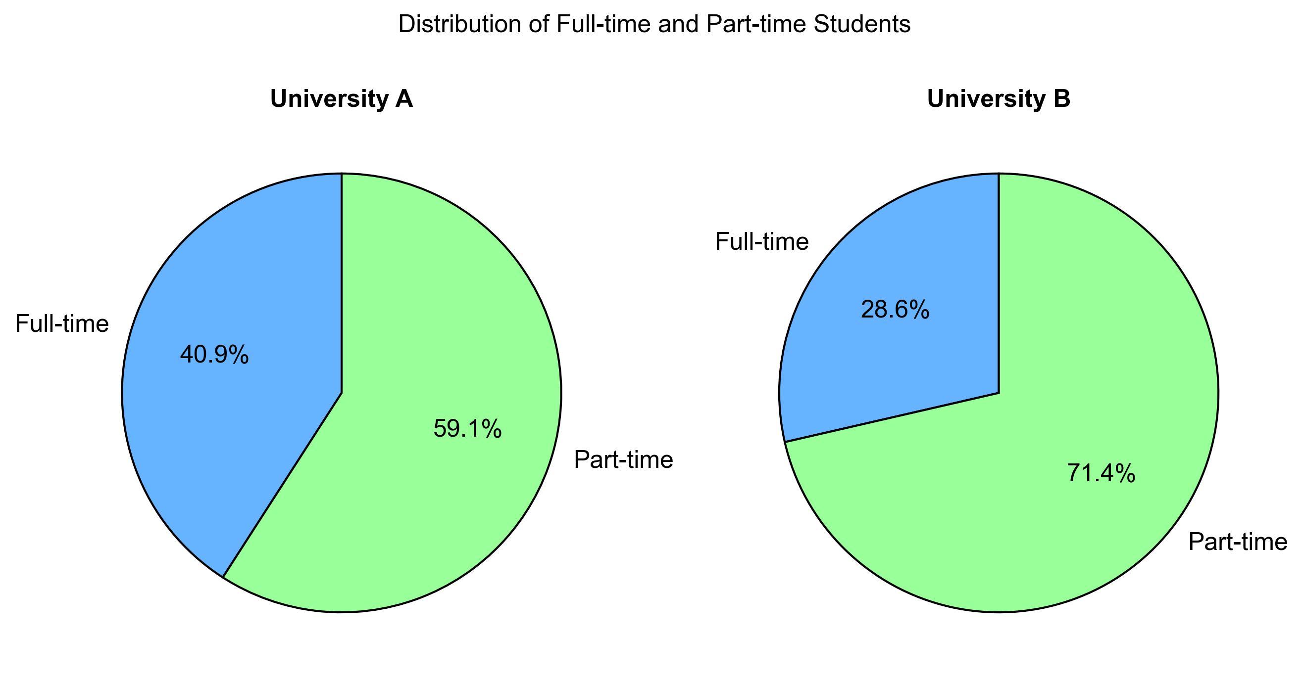
Fig. 2.1 Distribution of Full-time and Part-time Students at University A and University B.#
This comparison highlights that University A has a higher proportion of full-time students, while University B has a significantly larger proportion of part-time students. This information could be useful for understanding the different student demographics and potentially guiding resource allocation or policy decisions at these institutions.
2.2.2. Bar Graphs#
In statistics, a bar graph or a bar chart is a graph that uses horizontal or vertical bars to display the frequency, count, or value of a categorical variable. The length or height of each bar is proportional to the amount of the category it represents. Bar graphs are useful for comparing and visualizing qualitative data across different groups or categories. They help to show the variation or pattern of the data and to make comparisons and interpretations easier [Bowerman et al., 2018, Peck et al., 2024].
Key points:
Representation:
Bar graphs use bars (rectangles or rectangular prisms) to visually depict data values.
The length or height of each bar corresponds to the value it represents.
Dimensionality and Shape:
The shape of the bars depends on the dimensionality of the data:
For one-dimensional data, bars are typically simple rectangles.
For two-dimensional data, bars can be rectangular prisms (3D bars).
The choice of shape depends on the context and the information being conveyed.
Orientation:
Bars can be oriented vertically (along the y-axis) or horizontally (along the x-axis).
The orientation is chosen based on the purpose of the graph and readability.
Use Cases:
Bar graphs are useful for:
Comparing data across different categories or groups.
Showing trends or patterns over time.
Highlighting differences or similarities between data points.
Example 2.9
The following data shows the number of students in each season at some fictional university:
Seasons |
Number of Students |
|---|---|
Spring |
8 |
Summer |
9 |
Autumn |
11 |
Winter |
6 |
Construct a bar graph to visualize this data.
Solution:
Fig. 2.2 consists of a bar chart comparing the number of students in each season:
Spring: 8 students (green)
Summer: 9 students (yellow)
Autumn: 11 students (orange)
Winter: 6 students (blue)
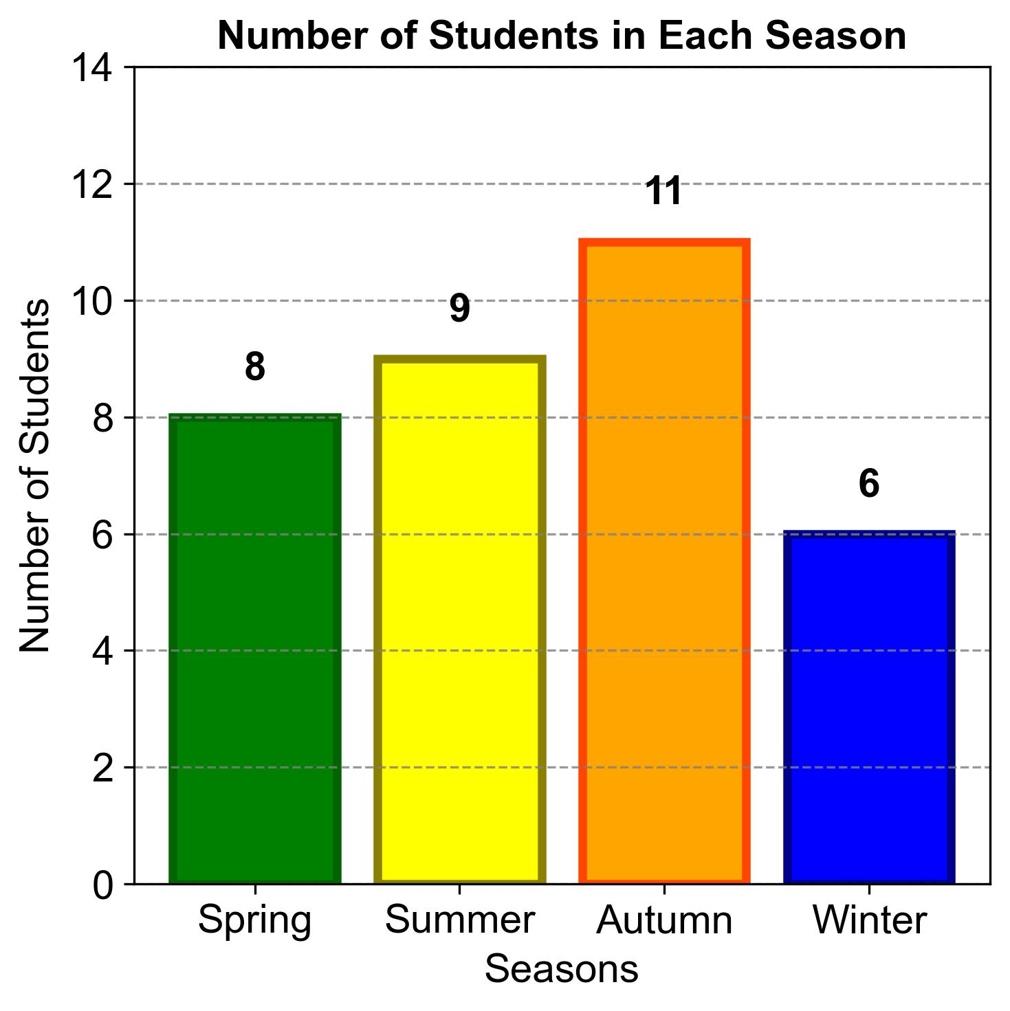
Fig. 2.2 Number of Students in Each Season.#
This comparison highlights that Autumn has the highest number of students, while Winter has the lowest. This information could be useful for understanding seasonal enrollment trends and potentially guiding academic planning and resource allocation.
Example 2.10
Construct a bar graph showing the percentages using the data from Example 2.9.
Solution:
2.2.2.1. Explanation:#
Fig. 2.3 consists of a bar chart comparing the percentage of students in each season:
Spring: 23.5% (green)
Summer: 26.5% (yellow)
Autumn: 32.4% (orange)
Winter: 17.6% (blue)
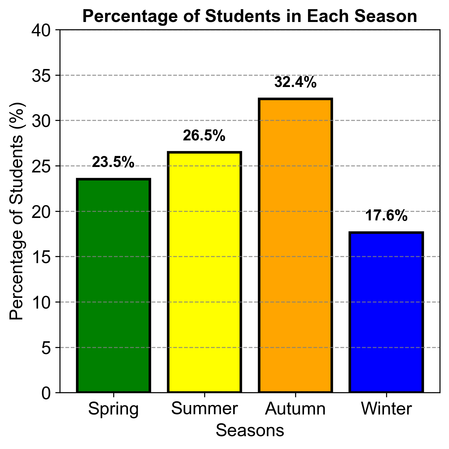
Fig. 2.3 Percentage of Students in Each Season.#
This comparison highlights that Autumn has the highest percentage of students, while Winter has the lowest. This information could be useful for understanding seasonal trends in student activities or preferences.
Example 2.11 (Grade Distribution Bar Graph)
In a statistics class of 500 students, the grades are distributed as follows:
F: 10 students
D: 20 students
D+: 15 students
C-: 25 students
C: 50 students
C+: 40 students
B-: 60 students
B: 80 students
B+: 70 students
A-: 80 students
A: 35 students
A+: 15 students
Using the data provided, create a bar graph to visualize the frequency of each grade category. Follow these steps:
Label the Axes: On the horizontal axis, list the grade categories (F, D, D+, C-, etc.). On the vertical axis, indicate the number of students.
Draw the Bars: For each grade category, draw a bar that represents the number of students who received that grade. The height of the bar should be proportional to the frequency.
Title Your Graph: Provide a descriptive title for your bar graph, such as “Grade Distribution in Statistics Class”.
Solution: We have,
Grade |
Number of Students |
|---|---|
F |
10 |
D |
20 |
D+ |
15 |
C- |
25 |
C |
50 |
C+ |
40 |
B- |
60 |
B |
80 |
B+ |
70 |
A- |
80 |
A |
35 |
A+ |
15 |
Fig. 2.4 consists of a bar chart comparing the number of students achieving various grades in a statistics class.
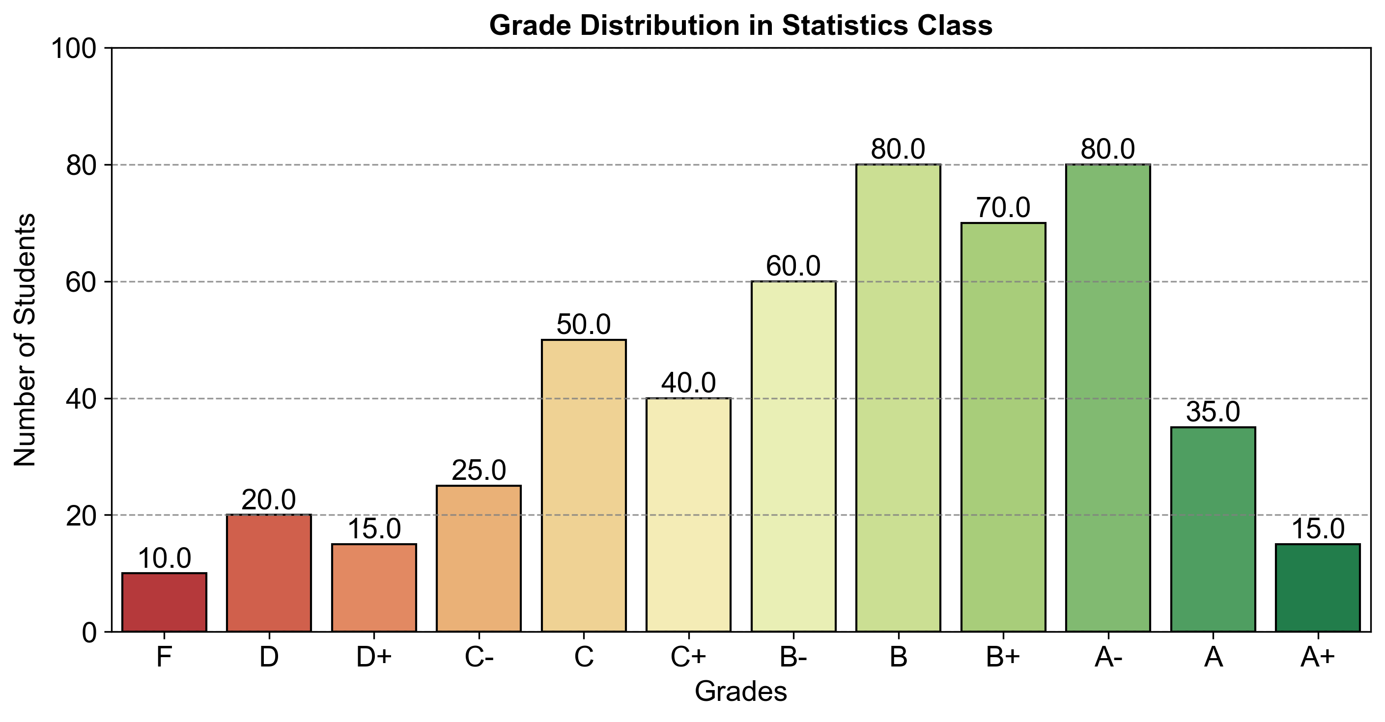
Fig. 2.4 Grade Distribution in Statistics Class.#
This comparison highlights that the majority of students received grades in the B and A range, while fewer students received grades in the F and D range. This information could be useful for understanding the overall performance distribution in the class.
2.2.3. Bar Graphs vs. Pie Charts#
When presenting categorical data, the choice between a bar graph and a pie chart is pivotal. A bar graph is adept at showcasing the frequency or proportion of each category through rectangular bars, making it an excellent tool for comparing the relative sizes of different categories. This visual format allows for an immediate and clear comparison of the distribution within the dataset.
On the other hand, a pie chart excels in its ability to convey the part-to-whole relationship. This circular graph divides the data into ‘slices,’ each representing a category’s percentage contribution to the entire dataset. Pie charts are most effective when the categories are mutually exclusive and their combined percentages total 100%.
Example 2.12 (Grade Distribution Relative Bar Graph)
Use data from Example 2.11
Construct a relative-frequency bar graph.
Construct a pie chart.
Solution: To convert a table that only lists grades and the number of students into one that also includes percentages, we followed these steps:
Calculate the Total Number of Students: We summed up the number of students across all grades to determine the total class size. For example, if we have 10 students with an F, 20 with a D, and so on, we add all these numbers together to get the total.
Determine the Percentage for Each Grade: We calculated the percentage of students in each grade by dividing the number of students in a grade by the total number of students, and then multiplying the result by 100 to convert it to a percentage. The formula we used is:
Round the Percentages: We rounded the percentages to two decimal places for a cleaner presentation in the table.
Create the Updated Table: We then constructed a new table that includes the grade, the number of students, and the calculated percentage for each grade.
An example of how we calculated the percentage for grade F:
Total Number of Students: 500 (sum of all students in each grade)
Number of Students with Grade F: 10
Percentage for Grade F:
By following these steps, we ensured that our table accurately reflects the distribution of grades in percentage terms, providing a clear and standardized view of the data.
Grade |
Number of Students |
Percentage |
|---|---|---|
F |
10 |
2.00 |
D |
20 |
4.00 |
D+ |
15 |
3.00 |
C- |
25 |
5.00 |
C |
50 |
10.00 |
C+ |
40 |
8.00 |
B- |
60 |
12.00 |
B |
80 |
16.00 |
B+ |
70 |
14.00 |
A- |
80 |
16.00 |
A |
35 |
7.00 |
A+ |
15 |
3.00 |
Fig. 2.5 consists of a bar chart comparing the percentage of students achieving various grades in a statistics class.
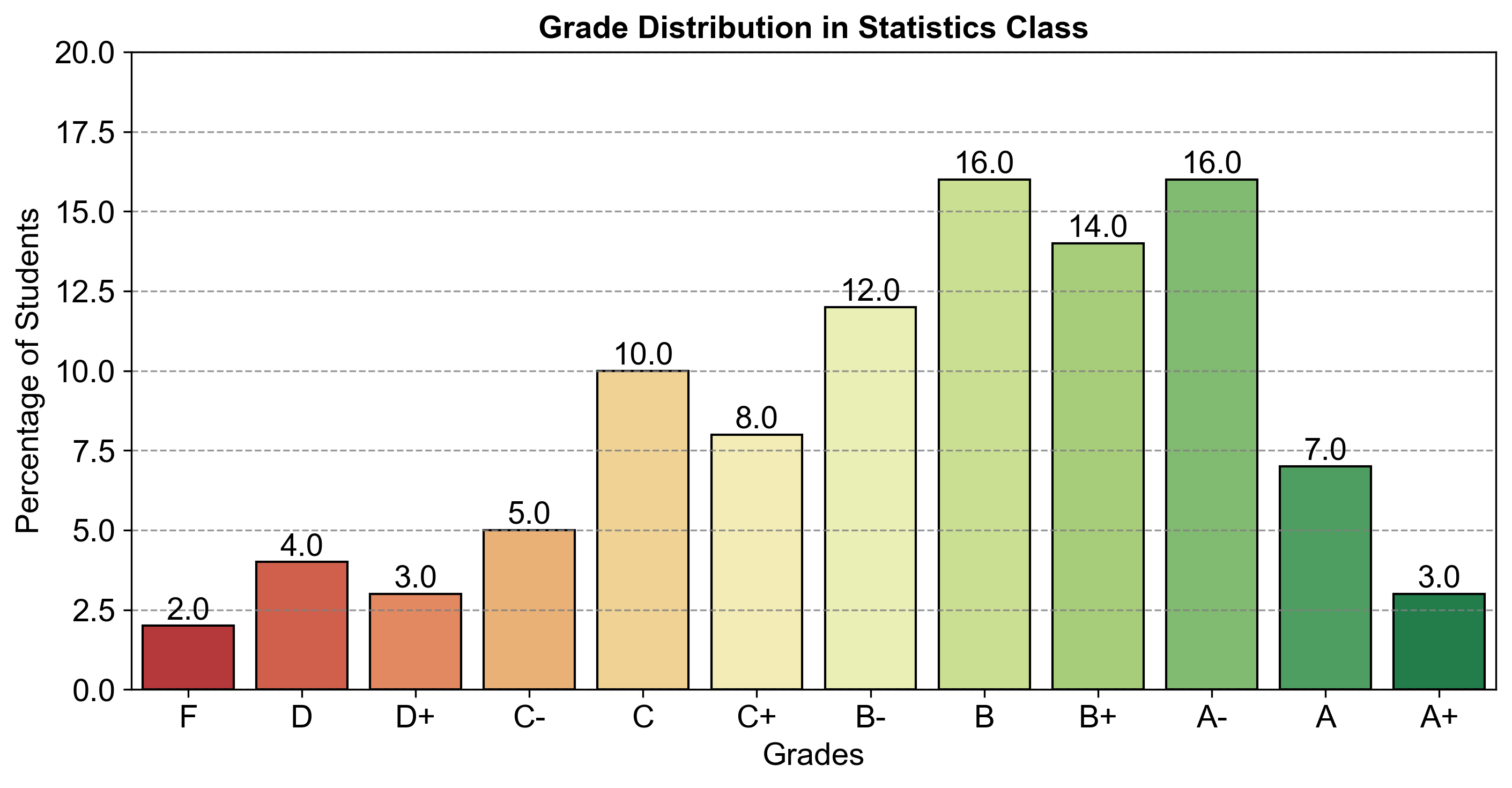
Fig. 2.5 Grade Distribution in Statistics Class.#
Fig. 2.6 consists of a pie chart comparing the percentage of students achieving various grades in a statistics class.
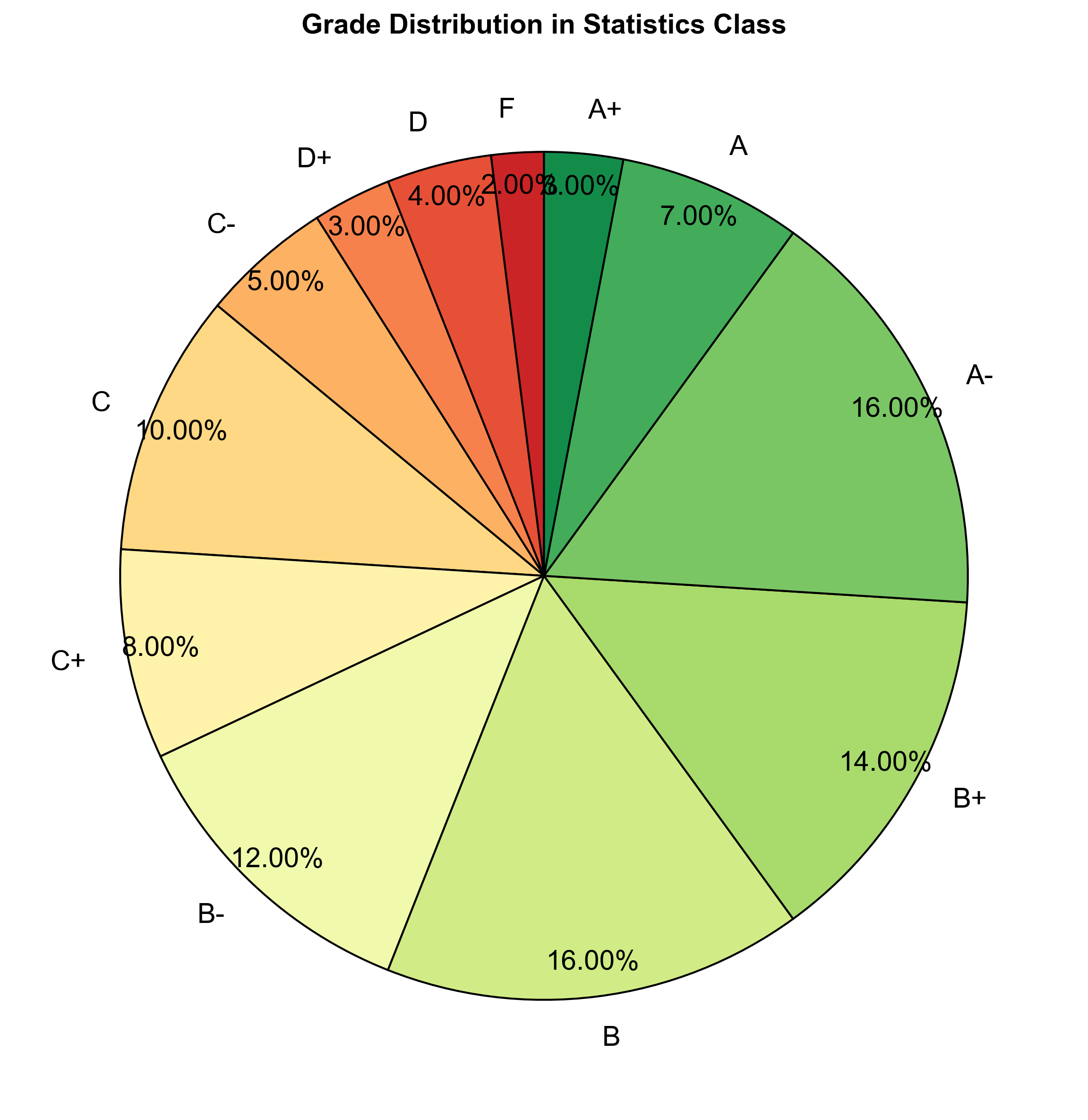
Fig. 2.6 Grade Distribution in Statistics Class.#
In examining the grade distribution in the statistics class of 500 students, we employed various visualizations to gain insights into the performance of the students. One such visualization is the pie chart, displayed above, illustrating the proportional distribution of grades. Each slice represents a grade category, and the size of the slice corresponds to the percentage of students receiving that grade.
While the pie chart provides a visually appealing snapshot of the grade distribution, it has limitations. The circular nature of the pie chart makes it challenging to precisely compare the sizes of the slices, especially when dealing with multiple categories. Additionally, pie charts are best suited for illustrating part-to-whole relationships when the parts constitute a whole, which isn’t the case with grade distributions.
For a more detailed analysis, we also created bar plots, one based on the raw number of students and another based on the percentage of students in each grade category. The bar plots offer a clearer comparison between the grades, allowing for an easy interpretation of the relative frequencies.
The first bar plot displayed the number of students in each grade, providing a straightforward representation of the class composition. In contrast, the second bar plot depicted the same data as a percentage, offering a more standardized view of the grade distribution, making it easier to identify the proportion of students in each grade relative to the total class size.
Summary - Bar Graphs vs. Pie Charts
Bar Graphs: Ideal for comparing sizes of different categories and providing a clear comparison of distribution.
Pie Charts: Best for showing percentage contributions of each category to the whole, especially when categories are mutually exclusive and sum to 100%.
Key Differences: Bar graphs highlight relative sizes but cannot show part-to-whole relationships, unlike pie charts.
Visualization Suitability: The choice between bar graphs and pie charts depends on the data’s nature and the intended insight to convey.
2.2.4. Line Graphs#
Definition - Line Graphs
A line graph, also called a line chart, visually represents the relationship between two variables by connecting data points with straight lines. It is commonly employed to illustrate trends, patterns, and changes in data over time [Wickham and Grolemund, 2016].
Example 2.13
Using the survey data provided, plot a line graph to visualize the shopping behavior of customers before making a major purchase. The data is as follows:
Number of times in store: 1, 2, 3, 4, 5
Frequency: 4, 10, 16, 6, 4
Instructions:
a. Label the x-axis as “Number of Visits” and the y-axis as “Frequency of Visits”.
b. Plot the points for each pair of “Number of Visits” and “Frequency of Visits”.
c. Connect the points with a line to show the trend.
d. Analyze the graph to determine the most common and least common number of visits.
Solution:
Fig. 2.7 consists of a line graph visualizing the shopping behavior of customers before making a major purchase:
1 visit: 4 customers
2 visits: 8 customers
3 visits: 14 customers
4 visits: 8 customers
5 visits: 4 customers
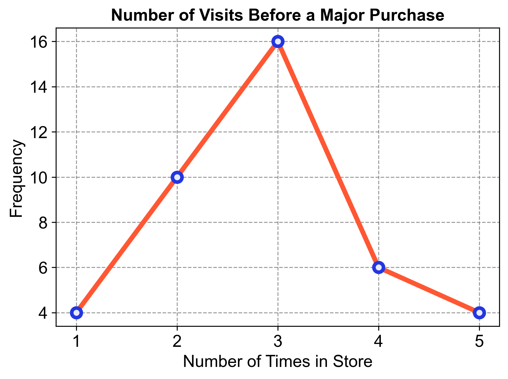
Fig. 2.7 Number of Visits Before a Major Purchase.#
Analysis:
The line graph shows an upward trend from 1 to 3 visits, indicating that most people visited the store three times before making a major purchase.
After 3 visits, the trend declines, showing that fewer people visited the store 4 or 5 times.
The least common number of visits was only once, with a frequency of 4.
2.2.5. Time Series Graphs#
A time series graph is a type of data visualization that represents how a set of values changes over time. It is constructed by plotting data points on a graph where the horizontal axis (x-axis) represents time, and the vertical axis (y-axis) represents the variable’s values that we are interested in observing [Last et al., 2004]. By connecting these data points with lines, we can easily see the upward or downward trends, recurring patterns, or any seasonal variations. This kind of graph is particularly useful for analyzing data that is collected at regular intervals over a period of time, such as daily temperature readings, monthly sales data, or yearly population growth. It helps in identifying any correlations between time and the variable, making it an essential tool for forecasting and understanding past behavior. The visual representation provided by a time series graph makes it easier to spot trends and patterns that might not be as obvious when looking at raw data in a table format.
Example 2.14
The following dataset, which includes water temperature measurements in degrees Celsius, was obtained from the City of Calgary’s open data portal.
This dataset specifically relates to the Fish Creek 37th St Calgary Station (SUR_FC-37). This data is part of a broader effort to monitor and report on the water quality of Fish Creek, providing valuable insights into the environmental conditions of the area. For this data, we can produce the following time series graph.
Solution:
Fig. 2.8 consists of a time series graph visualizing the monthly aggregated water temperature over the years.
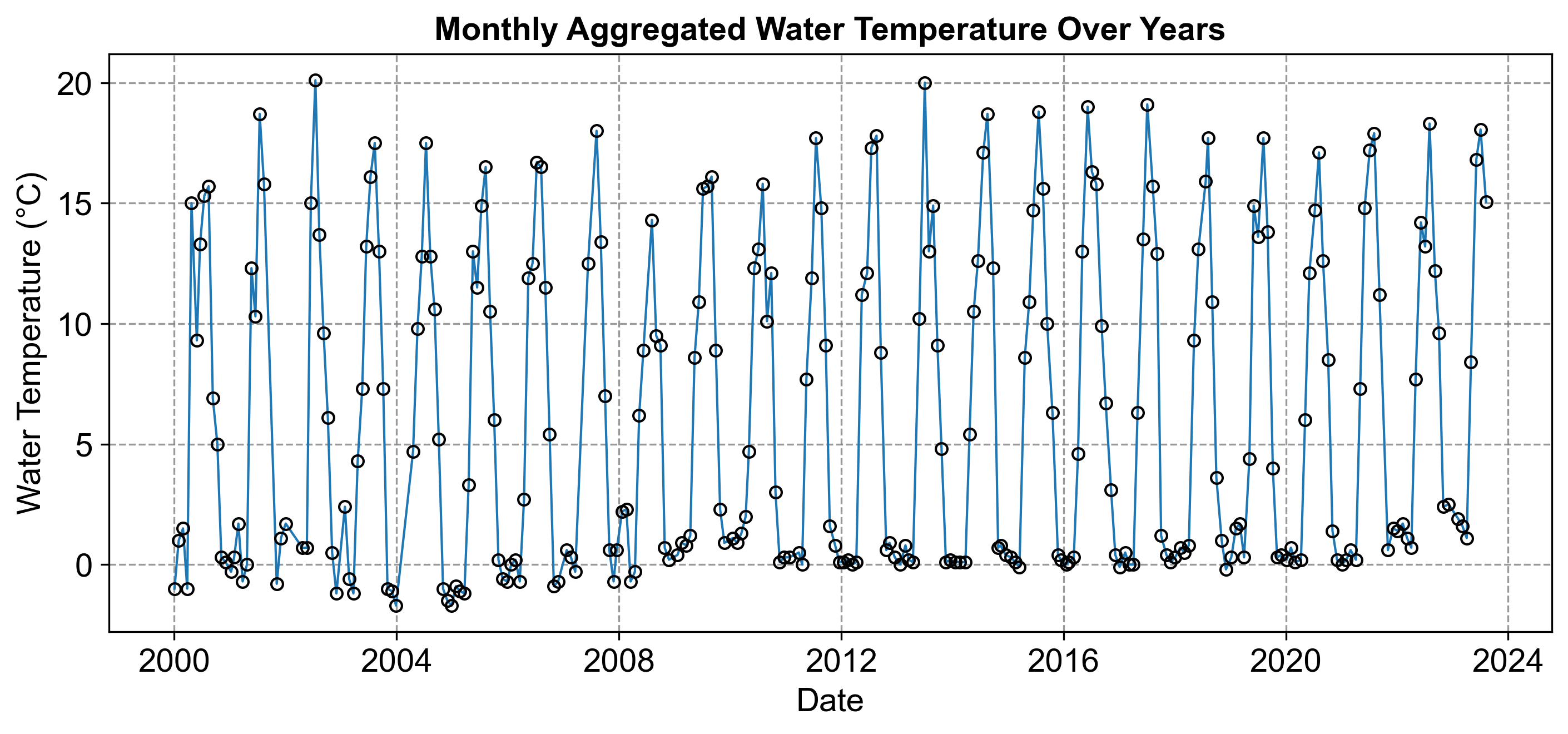
Fig. 2.8 Monthly Aggregated Water Temperature Over Years.#
Example 2.15
Plot the Graph: Using the provided data, plot each date on the horizontal axis and its corresponding value on the vertical axis.
Connect Points: Draw straight lines between the points in chronological order.
Analyze: Look for any patterns, trends, or seasonal effects.
Solution:
Step 1: Label the axes with dates (horizontal) and values (vertical).
Step 2: Plot points for each date and value pair (e.g., 2024-05-01 with a value of 16).
Step 3: Connect the points with lines to visualize the data’s movement over time.
Analysis: Observe the graph for any upward or downward trends, repeating patterns, or outliers.
Fig. 2.9 consists of a time series graph visualizing the provided data.
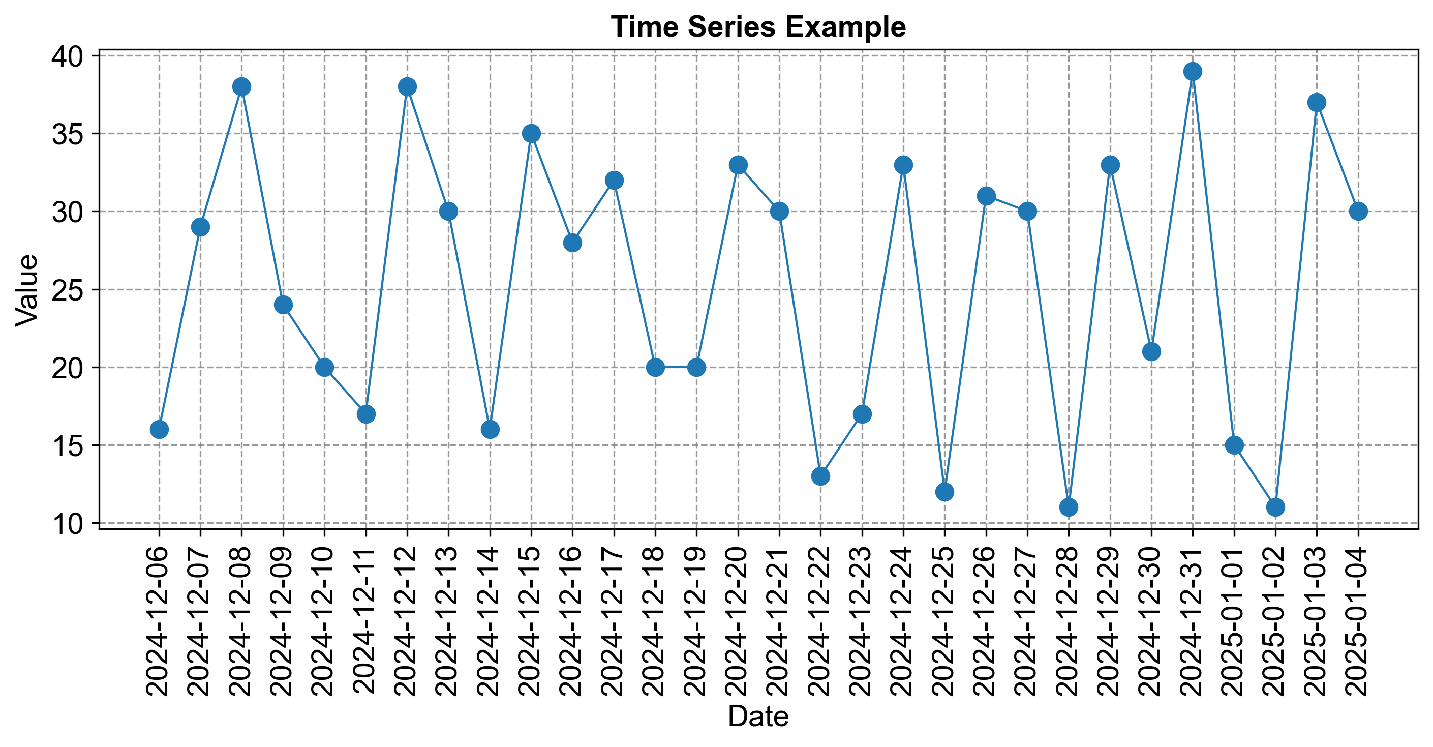
Fig. 2.9 Time Series Example.#
2.2.6. Stem-and-Leaf Graphs (Stemplots)#
Stem-and-leaf plots are a form of data visualization that efficiently organizes numerical data. Each data value is divided into two parts:
Stem: This is typically the leading digit(s) of the data value. For instance, in the numbers 23, 45, and 67, the stems would be 2, 4, and 6.
Leaf: This is usually the trailing digit of the data value. In our previous examples, the leaves would be 3, 5, and 7.
The stems are listed in a column, and the corresponding leaves are placed in rows next to their stem, creating a visual representation that allows for quick analysis of the data’s distribution.
Example 2.16
Given the data set
create a stem-and-leaf plot.
Solution:
Identify Stems: The stems are the tens place of each number. For single-digit numbers, the stem is 0.
Identify Leaves: The leaves are the ones place of each number.
Organize Data: Arrange the stems in ascending order and place the corresponding leaves next to each stem.
Construct Plot: Write down the stems in a vertical column and list the leaves in a horizontal row next to each stem.
The completed stem-and-leaf plot:
Stem | Leaf
0    | 3 4 5 6 7 8 9
1    | 0 1 2 3 4 5 6 8
Key: Each leaf in the “0” stem represents the units digit of a number in the 0-9 range, and each leaf in the “1” stem represents the units digit of a number in the 10-19 range.
This plot reveals that the data ranges from 3 to 18, with a concentration of values between 10 and 16, indicating that this is where most of the data points lie. Stem-and-leaf plots like this provide a quick way to assess the distribution and are particularly useful for small to medium-sized data sets. They also retain the actual data values, unlike many other forms of data representation.
Example 2.17
Given
create a stem-and-leaf plot to visualize the distribution of the values.
Solution:
Identify Stems: The stem is the tens digit of each number.
Identify Leaves: The leaf is the units digit of each number.
Sort Data: Arrange the data in ascending order, if not already.
Construct Plot: List the stems in a vertical column and place the leaves next to their corresponding stem in ascending order.
The stem-and-leaf plot for the given data:
Stem | Leaf
2    | 3 7
3    | 1 3 5 6
4    | 0 2 4 5 7 9
5    | 1 3 4 6 7 9
Key: The stem represents the tens place, and the leaf represents the units place of each number.
This stem-and-leaf plot allows us to quickly see that the values are distributed across the 20s to 50s, with the 40s being the most populated range. It provides a clear view of the data’s distribution and is particularly useful for small to medium-sized data sets.
Example 2.18
Create a stem-and-leaf plot using the following data set:
Solution:
Identify Stems: The stem is the tens digit of each number.
Identify Leaves: The leaf is the units digit of each number.
Sort Data: Arrange the data in ascending order, if not already.
Construct Plot: List the stems in a vertical column and place the leaves next to their corresponding stem in ascending order.
The stem-and-leaf plot for the given data:
Stem | Leaf
1    | 2 9
2    | 3 4 9
3    | 0 1 3 5 6 7 9
4    | 1 2 5 7 8
5    | 0
Key: The stem represents the tens place, and the leaf represents the units place of each number.
This stem-and-leaf plot shows that the data is spread from the low teens to 50, with a cluster of values in the 30s. It provides a clear view of the data’s distribution and is particularly useful for small to medium-sized data sets. The plot also retains the actual data values, which can be beneficial for detailed analysis.
2.2.7. Dot Plot#
A dot plot is a simple yet effective graphical tool used to display the frequency distribution of a dataset. It is particularly useful for small to moderate-sized datasets. To create a dot plot, each data point is represented by a dot. These dots are placed along a single axis, which is usually horizontal. The position of each dot directly corresponds to the value of the data point it represents.
To construct a dot plot, begin by arranging the data points along the horizontal axis in either ascending or descending order. When multiple data points share the same value, stack the dots vertically to visually represent their frequency. Each dot is plotted above its corresponding value on the horizontal axis, ensuring the position accurately reflects the data point’s value.
The horizontal axis should be labeled with an appropriate scale that represents the range of the data. If the data is discrete, meaning it consists of distinct and separate values, label the axis with each unique data point. Finally, title the dot plot with a descriptive heading that clearly conveys the dataset or the variable being analyzed.
Example 2.19
Create a dot plot based on the following dataset, which represents the number of hours students study per day:
Solution:
Arrange Data Points: List the numbers in ascending order: 1, 2, 2, 2, 3, 3, 3, 4, 4, 5.
Plot Dots: Place a dot for each data point above its corresponding value on the horizontal axis.
Stack Dots: For repeated values, stack the dots vertically.
Label Axis: Label the horizontal axis with numbers from 1 to 5, representing the study hours.
Title the Plot: Title the dot plot as “Study Hours per Day for Students”.

Fig. 2.10 Dot plot for Example 2.19.#
Analysis: From the dot plot, we can observe that the most common study durations are 2 and 3 hours, with 4 and 1 hour being less frequent. This visual representation provides a clear overview of the distribution of study hours among the students, highlighting the most and least common durations of study time.
Example 2.20
Construct the dot plot for the following dataset on the age of people in a community:
Solution:
To construct a dot plot for the dataset on the age of people in a community, we will follow these steps:
Sort the Data: Arrange the ages in ascending order for easier plotting.
Determine the Scale: Decide on the scale for the horizontal axis, which will represent the ages.
Plot the Dots: For each age in the dataset, place a dot above the corresponding value on the horizontal axis.
Stack the Dots: If there are multiple people of the same age, stack the dots
Let’s solve the exercise:
Sorted Data: 36, 56, 56, 58, 60, 64, 64, 66, 66, 66, 76, 78, 78, 78, 80, 82, 84, 86, 88, 94
Dot Plot Construction:
We’ll use the tens digit as the stem and the ones digit as the leaf.
The horizontal axis will range from 30 to 90, as these are the minimum and maximum tens digits in our data.
We’ll place a dot for each corresponding age above the tens digit on the horizontal axis.

Fig. 2.11 Dot plot for Example 2.20.#
Key:
Each dot represents one person’s age in the community.
The number of dots in each row corresponds to the frequency of that age group.
Analysis: From the dot plot, we can observe that the ages are spread out, with a notable concentration in the 60s and 70s. The community has fewer young adults (in their 30s and 50s) and one individual who is 94 years old. This visualization provides a clear overview of the age distribution within the community. It’s a simple yet powerful way to display the data and understand the demographic composition at a glance.
2.2.8. Histograms#
A histogram is a graphical representation of data that consists of adjacent rectangular boxes. It comprises a horizontal axis and a vertical axis. Here are the key components [Bruce and Bruce, 2017, Panda et al., 2018]:
Horizontal Axis:
The horizontal axis is labeled with the data being represented. For example, it could represent the distance from your home to school or any other relevant variable.
The data is divided into intervals (also known as bins), and each interval is represented by a rectangular box.
Vertical Axis:
The vertical axis is labeled with one of the following:
Frequency: The count of observations falling within each interval.
Relative Frequency: The proportion of observations within each interval relative to the total number of observations.
Percent Frequency: The relative frequency expressed as a percentage.
Probability: In some cases, the vertical axis represents probabilities (especially in statistical contexts).
Regardless of the label on the vertical axis, the graph will exhibit the same shape.
How to create a Histogram?
To create a histogram, follow these steps:
Determine the Number of Bars or Intervals:
Choose an appropriate number of bars or intervals to represent the data. A good rule of thumb is to use between five and 15 bars or intervals, depending on the size and variability of the dataset.
Choose the Lower Bound for the First Interval:
Select a lower bound for the first interval that is smaller than the minimum value in the dataset. For example, if the smallest value is 12.3, you could use 12 as the lower bound.
Decide on the Width of Each Interval:
Ensure that the width of each interval is equal for all intervals.
You can calculate the interval width using a formula such as:
(2.5)#\[\begin{equation} \text{Interval width} = \frac{\text{Maximum value} - \text{Minimum value}}{\text{Number of intervals}} \end{equation}\]Alternatively, choose a convenient value that suits the scale of the data.
Construct the Histogram:
Draw a vertical bar for each interval, with the height proportional to the frequency or relative frequency of values in that interval.
Label the horizontal axis with the interval boundaries (e.g., 30–40, 40–50) and the vertical axis with the frequencies or relative frequencies.
Example 2.21
Use the data from Example 2.2 and construct a histogram.
Solution:
Draw the Axes: Start with two perpendicular lines to form the horizontal and vertical axes. The horizontal axis (x-axis) will represent the pulse rate intervals, and the vertical axis (y-axis) will represent the frequency of each interval.
Label the Axes: On the horizontal axis, label the pulse rate intervals (30–40, 40–50, etc.). On the vertical axis, label the frequencies, ensuring the scale is appropriate for the range of frequencies in your data (from 0 to 29 in this case).
Create the Bars: For each pulse rate interval, draw a bar that reaches up to the corresponding frequency on the vertical axis. The width of each bar should be consistent and cover the entire interval without any gaps or overlaps between bars.
Color or Shade the Bars: Optionally, you can color or shade the bars to make the histogram visually appealing and easier to read.
Title the Histogram: Add a title at the top that describes what the histogram represents, such as “Histogram of Pulse Rates”.
Fig. 2.12 consists of a histogram visualizing the frequency distribution of pulse rates:
30–40: 0 occurrences
40–50: 1 occurrence
50–60: 4 occurrences
60–70: 28 occurrences
70–80: 22 occurrences
80–90: 29 occurrences
90–100: 21 occurrences
100–110: 5 occurrences
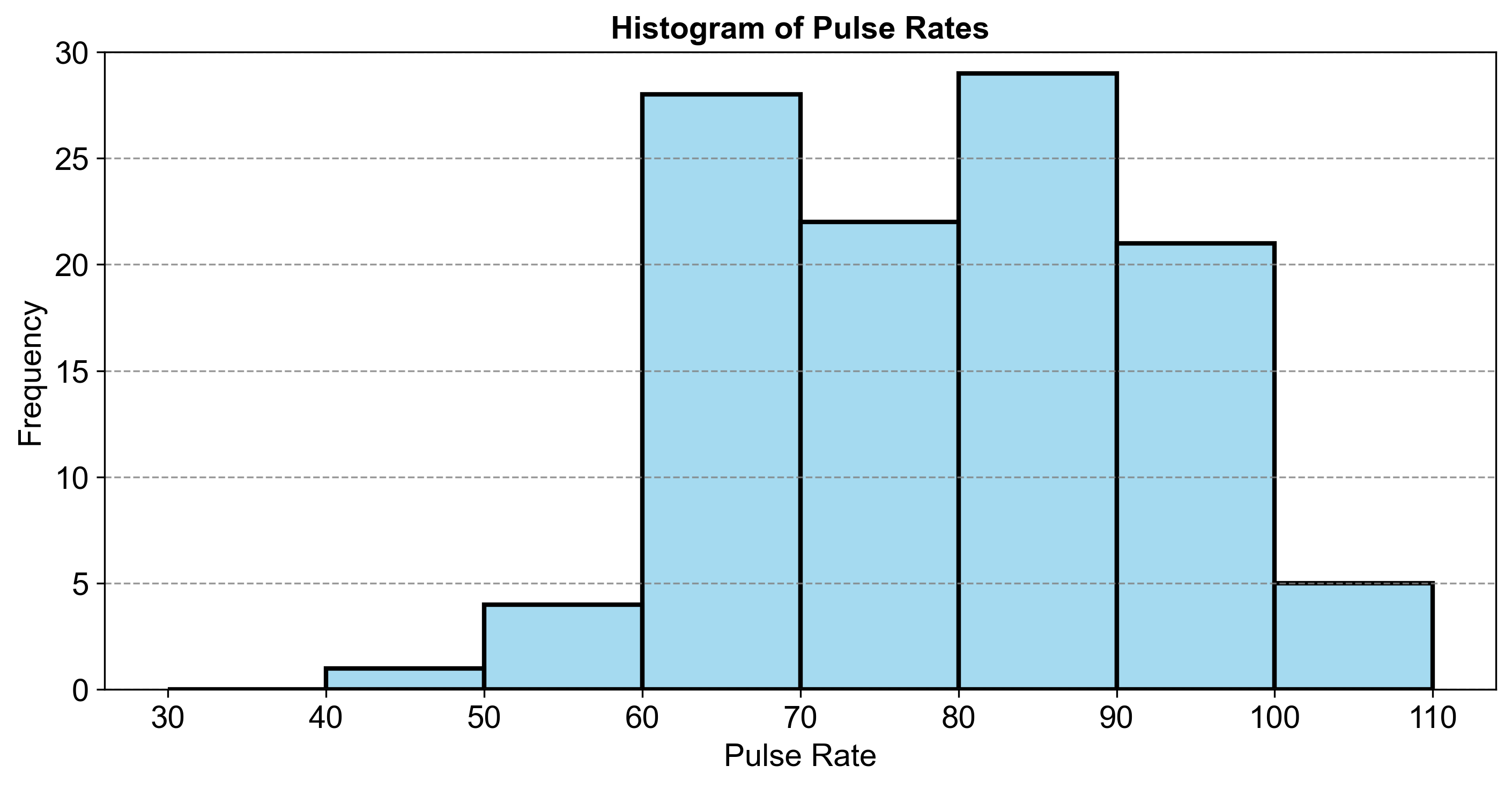
Fig. 2.12 Histogram of Pulse Rates.#
This comparison highlights that the most common pulse rates fall within the 60–70 and 80–90 ranges.
2.2.9. Relative Frequency Histograms#
A relative frequency histogram is similar to a standard histogram, but instead of showing the raw frequency of data within each bin, it shows the proportion or percentage of the data that falls within each bin relative to the total dataset. This type of histogram provides a view of the data distribution in terms of the overall dataset, making it easier to compare different datasets of varying sizes [Bruce and Bruce, 2017, Panda et al., 2018].
To create a relative frequency histogram from the given pulse rate data, follow these steps:
Calculate Relative Frequencies: Divide the frequency of each pulse rate interval by the total number of observations to get the relative frequency. For example, if there are 28 people with pulse rates between 60–70 and the total number of people is 110, the relative frequency is \( \dfrac{28}{110} \).
Draw the Axes: Create horizontal and vertical axes. The horizontal axis will represent the pulse rate intervals, and the vertical axis will represent the relative frequencies.
Label the Axes: Label the horizontal axis with the pulse rate intervals. Label the vertical axis with percentages or proportions that correspond to the relative frequencies.
Create the Bars: For each interval, draw a bar up to the height that corresponds to its relative frequency on the vertical axis.
Title the Histogram: Add an informative title that describes the content of the histogram.
Example 2.22
Use the data from Example 2.2 and construct a relative frequency histogram.
Solution: The relative frequencies for the given data:
Pulse Rates |
Frequency |
Relative Frequency |
Relative Frequency (Percentage) |
|---|---|---|---|
30–40 |
0 |
0.000 |
0.000 |
40–50 |
1 |
0.005 |
0.455 |
50–60 |
4 |
0.018 |
1.818 |
60–70 |
28 |
0.127 |
12.727 |
70–80 |
22 |
0.100 |
10.000 |
80–90 |
29 |
0.132 |
13.182 |
90–100 |
21 |
0.095 |
9.545 |
100–110 |
5 |
0.023 |
2.273 |
Total |
110 |
0.500 |
50.000 |
Total |
220 |
1.000 |
100.000 |
Fig. 2.13 consists of a histogram visualizing the frequency distribution of pulse rates along with their relative frequencies and percentages:
30–40: 0 occurrences (0.000%)
40–50: 1 occurrence (0.909%)
50–60: 4 occurrences (3.636%)
60–70: 28 occurrences (25.455%)
70–80: 22 occurrences (20.000%)
80–90: 29 occurrences (26.364%)
90–100: 21 occurrences (19.091%)
100–110: 5 occurrences (4.545%)
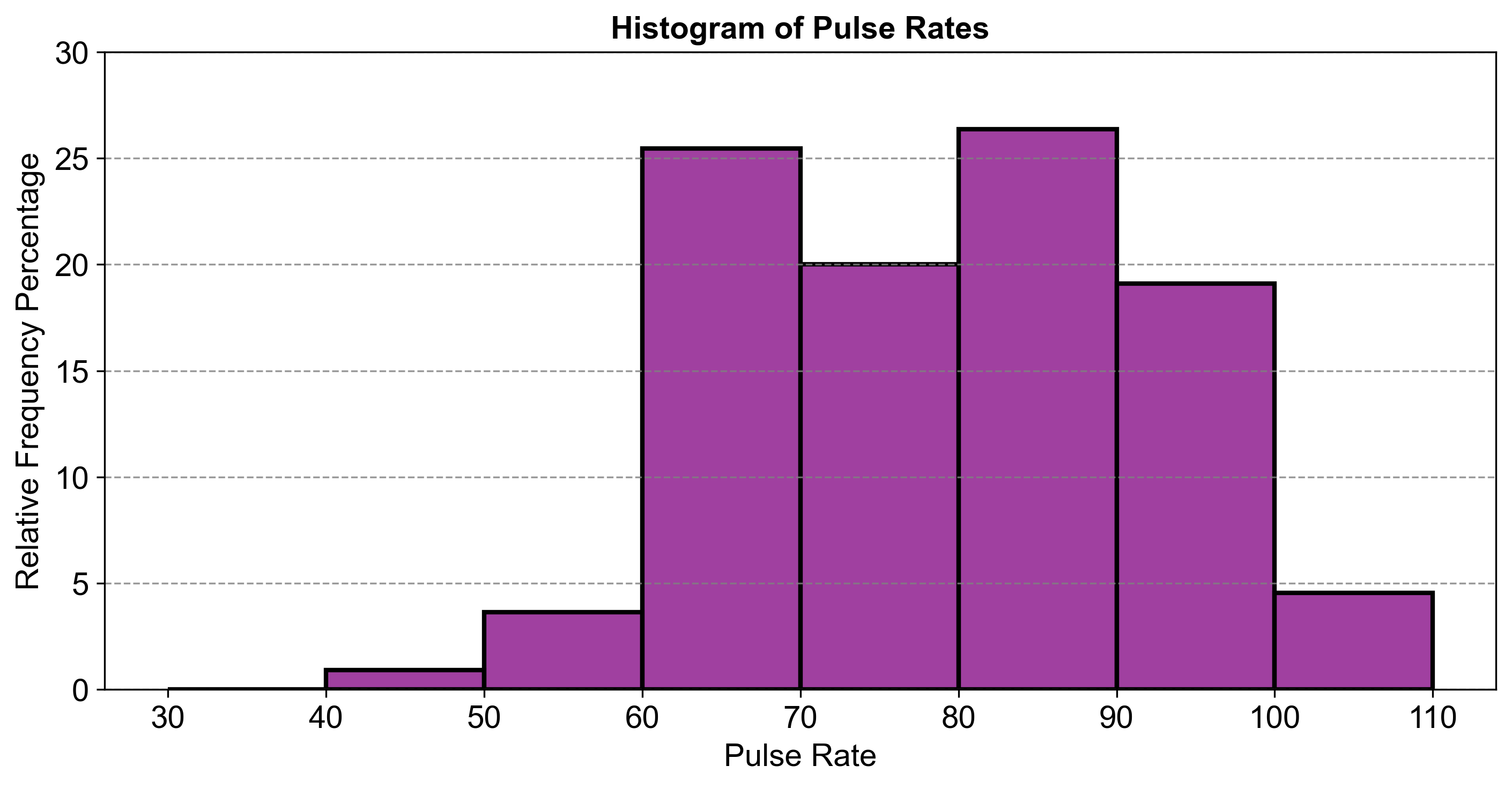
Fig. 2.13 Histogram of Pulse Rates.#
This comparison highlights that the most common pulse rates fall within the 60–70 and 80–90 ranges. This relative frequency histogram allows us to see not just how many people fall into each pulse rate category, but what proportion of the total population they represent. It’s particularly useful when comparing distributions across different groups or datasets. The most common pulse rate intervals are still 60–70, 70–80, and 80–90, but now we can see their proportions relative to the entire group. The histogram shows that these intervals contain about 25%, 20%, and 26% of the observations, respectively.
2.2.10. Frequency Polygons#
A frequency polygon is a graphical tool that offers a way to visualize the distribution of continuous data. It is akin to a line graph and is constructed by plotting points that represent the frequencies of various intervals and then connecting these points with straight lines. Here’s how you can create one:
Organize the Data: Like a histogram, start by dividing the data into intervals or bins.
Mark Midpoints: On the horizontal axis, identify and mark the midpoints of each interval. These midpoints serve as the representative values for the intervals.
Plot Coordinates: At each midpoint, plot a point that corresponds to the frequency of that interval. The frequency can be the actual number of observations or a relative frequency, which is the proportion of observations within that interval.
Connect Points: Draw straight lines to connect the plotted points in the order of the intervals.
Include Extra Points: To close the polygon, add two extra points at zero frequency—one before the first interval and one after the last interval.
Now, let’s apply this method to create a frequency polygon using the provided pulse data:
Example 2.23
Use the data from Example 2.2 and construct a frequency polygon.
Solution:
Calculate Midpoints: For each interval, calculate the midpoint (e.g., the midpoint of 30–40 is 35).
Plot Points: On a graph, plot each midpoint against its frequency.
Connect Points: Draw lines to connect these points in sequence.
Add Zero Frequency Points: Add a point at zero frequency before the first interval and after the last interval.
Draw the Polygon: Connect all points, including the zero frequency points, to form the polygon.
Fig. 2.14 consists of a frequency polygon visualizing the distribution of pulse rates.
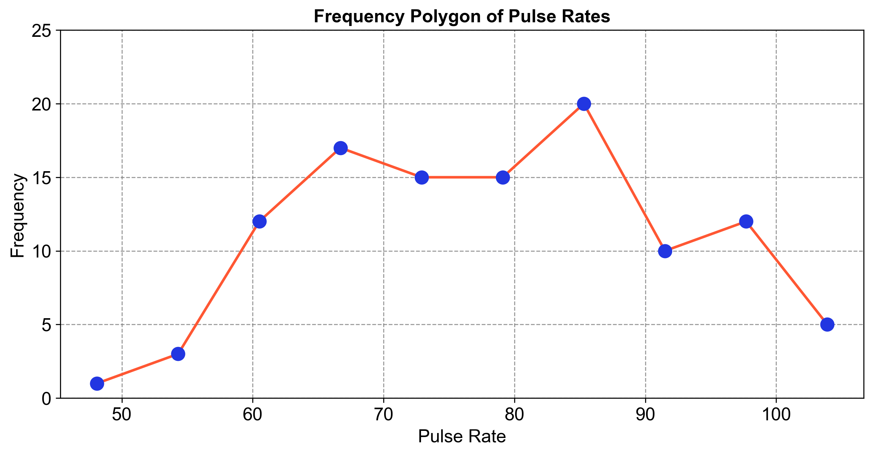
Fig. 2.14 Frequency Polygon of Pulse Rates.#
This comparison highlights the frequency of each pulse rate category, providing insights into the distribution and trends within the dataset.
