Remark
Please be aware that these lecture notes are accessible online in an ‘early access’ format. They are actively being developed, and certain sections will be further enriched to provide a comprehensive understanding of the subject matter.
5.4. Visual Methods for Outlier Detection#
Statistical tests and automated detection algorithms are powerful tools for identifying anomalies in large datasets. However, the most effective first step in outlier analysis often remains surprisingly simple: visualizing your data.
Visual methods provide immediate insight into the distribution, temporal patterns, and structural characteristics of your data that summary statistics cannot capture. A single well-designed plot can reveal whether outliers are isolated incidents, seasonal deviations, or symptoms of systematic drift. More importantly, visualization helps you understand the context surrounding anomalies—information that is essential for determining whether an outlier represents a genuine discovery, a measurement error, or an expected but rare occurrence [Chandola et al., 2009, Grolemund, 2016].
Tukey emphasized that exploratory data analysis through visualization should precede formal statistical testing [Tukey, 1977]. Visual inspection allows you to identify not just extreme values, but also clusters of moderate deviations, unexpected patterns in variance, and relationships between variables that influence what constitutes anomalous behavior. These patterns often suggest which statistical methods will be most appropriate for your specific data characteristics.
Note
While visual methods are excellent for exploration and validation, they are inherently subjective and limited by human perceptual capabilities. They should be used to identify potential issues and generate hypotheses, which are then confirmed with the statistical methods discussed in Section 5.5 and Section 5.6. For datasets with thousands or millions of observations, visual methods alone become impractical, and automated detection algorithms become necessary.
5.4.1. Time Plots (Line Plots)#
The time plot (also called a line plot or run chart) is the fundamental visualization tool for temporal data analysis. By displaying observations in chronological order, time plots reveal patterns, trends, and deviations that are impossible to detect from summary statistics alone.
Time plots excel at revealing different outlier types because each creates a distinct visual signature. Additive outliers appear as isolated spikes that break the continuity of an otherwise smooth pattern. Level shifts manifest as abrupt changes in the series mean, creating a clear “before and after” effect where the data operates at two distinct levels. Innovative outliers and transient changes produce curved patterns where the series gradually transitions between states rather than jumping instantaneously.
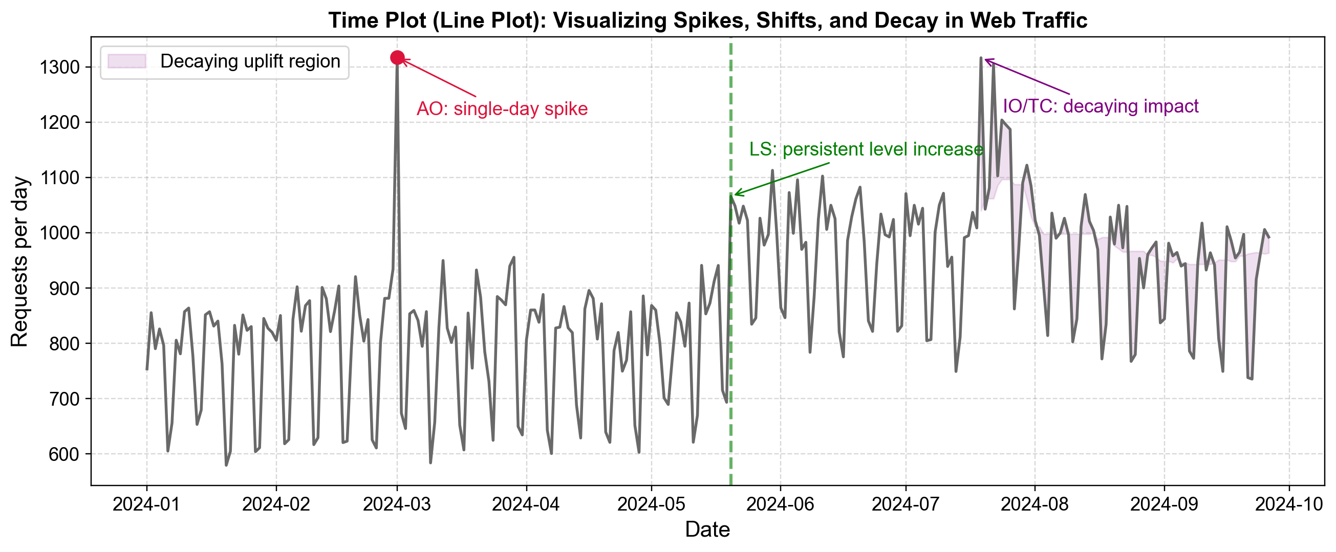
Fig. 5.14 Time plot showing web traffic with three distinct anomaly types: a single-day spike (AO), a permanent level increase (LS), and a decaying impact surge (IO/TC).#
Fig. 5.14 demonstrates web traffic data from January through October 2024, revealing three common anomaly patterns that become immediately apparent through visualization:
Additive Outlier (March 2024): The red marker indicates a sharp spike reaching approximately 1,320 requests per day—far above the baseline of 600-900 requests typical for this period. The series immediately returns to normal the following day, with no lasting impact. This pattern suggests a transient event such as a data logging error, brief viral content spike, or isolated external shock. The defining characteristic is complete isolation—the spike affects only a single observation with no influence on surrounding values.
Level Shift (Late May 2024): The green dashed vertical line marks a permanent structural change in the traffic baseline. Before this point, daily requests fluctuate between approximately 600-900 with clear weekly seasonality. After the shift, the entire series operates at a higher level, fluctuating between approximately 900-1,100 requests per day. The shift occurs abruptly, and the elevated level persists for the remainder of the observation period. This pattern suggests a structural change such as a successful SEO campaign, new content strategy, or platform feature that permanently increased user engagement.
Decaying Impact (Late July/Early August 2024): The purple shaded region highlights a surge where traffic peaks above 1,300 requests per day but does not immediately return to baseline like the additive outlier. Instead, the series remains elevated for several weeks with gradually declining peaks—each subsequent high point is slightly lower than the previous one. This decaying pattern suggests an external shock with lingering effects, such as a viral marketing campaign whose influence gradually fades, or a temporary promotional event whose momentum dissipates over time.
Fig. 5.14 also illustrates the importance of weekly seasonality in this dataset. Throughout all periods—before the level shift, after it, and during the decaying impact—a consistent weekly pattern remains visible with regular oscillations between higher and lower traffic days. This regular pattern makes the three anomalies even more apparent: the additive outlier disrupts the weekly cycle at a single point, the level shift permanently raises the entire oscillating pattern, and the decaying impact temporarily amplifies the weekly peaks before gradually subsiding.
5.4.2. Histograms#
While time plots reveal temporal patterns, histograms provide a complementary perspective by displaying the frequency distribution of values regardless of when they occurred. Histograms answer a fundamental question: how common is this particular value within the dataset?
Histograms make outliers visible through several visual cues. Isolated bars that appear far from the main distribution indicate values that occur rarely and deviate substantially from typical observations. Gaps between the primary cluster of data and extreme values suggest a natural boundary between normal variation and genuinely anomalous behavior. Asymmetry in the distribution—such as a long tail extending toward high values—reveals systematic patterns of extreme observations rather than random deviations [Chandola et al., 2009, Tukey, 1977].
However, histograms of time series data that exhibit strong seasonal or contextual patterns can be misleading when viewed in aggregate. A temperature dataset spanning an entire year will show a broad, possibly bimodal distribution mixing winter and summer observations. In such cases, values that appear normal in the overall histogram may actually be extreme for their specific context.
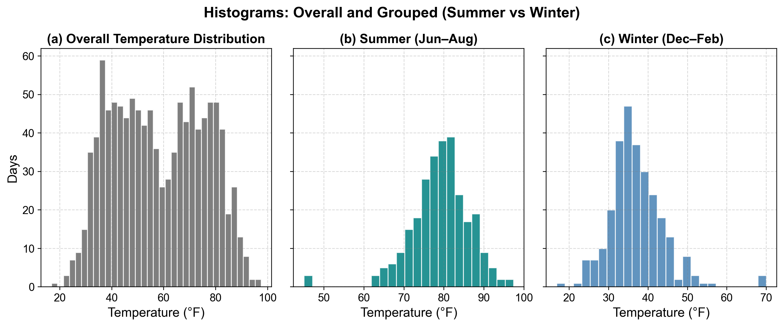
Fig. 5.15 Temperature distributions by season. The overall histogram mixes all temperatures, while seasonal breakdowns reveal context-specific outliers: anomalously cold days in summer and warm days in winter.#
Fig. 5.15 demonstrates why conditional histograms—distributions computed separately for each relevant context—provide more accurate outlier identification than aggregate distributions:
Overall Distribution (Left Panel): The blue histogram displays all temperature observations across the entire year. The distribution shows a clear bimodal pattern with two prominent peaks: one around 35-40°F (winter temperatures) and another around 80-85°F (summer temperatures). The substantial spread from approximately 20°F to 100°F reflects the natural seasonal variation in temperature. In this aggregate view, nearly all values appear to be part of the normal pattern because both winter cold and summer heat are legitimately present in the annual cycle. This makes it nearly impossible to identify true outliers—a 50°F reading could be normal for spring/fall, while 75°F could be typical for summer.
Summer Distribution (Center Panel): When isolating only summer months (June-August), the orange histogram reveals a concentrated distribution centered around 78-82°F, with most observations falling between 70-95°F. The distribution is approximately normal with a clear central tendency. Critically, a few isolated bars appear in the 50-55°F range at the far left of the distribution. These observations—which seemed unremarkable in the overall histogram where 50°F appeared as part of the continuum between winter and summer—now stand out as clear anomalies. These represent anomalously cold days for summer, potentially indicating measurement errors, unusual weather events, or sensor malfunctions worth investigating.
Winter Distribution (Right Panel): The teal histogram shows the distribution for winter months (December-February), revealing a concentration around 35-42°F with most observations ranging from 25-55°F. This distribution is also approximately normal but centered at a much lower temperature than summer. The key insight appears on the far right: a single isolated bar around 70°F stands apart from the main cluster. This observation—which blended seamlessly into the overall annual histogram—is clearly anomalous when viewed in its winter context. A 70°F day in January represents either a genuine extreme weather event or a data quality issue requiring investigation.
The overall histogram suggests that any temperature between 20°F and 100°F is “normal” because such values occur throughout the year. However, the conditional histograms reveal that 50°F is anomalous in summer and 70°F is anomalous in winter—both would be missed by methods that only examine the global distribution.
The bimodal nature of the overall distribution is itself a diagnostic signal that the data contains distinct subpopulations (seasons) that should be analyzed separately. For time series with known seasonal patterns, cyclical behavior, or distinct operational modes, constructing separate histograms for each context provides more meaningful outlier identification than a single global distribution. This technique extends beyond seasonality—web traffic should be analyzed separately for weekdays versus weekends, manufacturing data by production line or shift, and retail sales by holiday versus non-holiday periods.
5.4.3. Box Plots (Box-and-Whisker)#
Box plots provide a statistical visualization of data distribution based on a five-number summary: minimum, first quartile (Q1), median, third quartile (Q3), and maximum. The box represents the interquartile range (IQR) containing the middle 50% of observations, while whiskers extend to show the range of typical variation [Chandola et al., 2009, Mcgill et al., 1978, Tukey, 1977].
By convention, observations that fall more than 1.5 times the IQR beyond the box edges are plotted as individual points and represent potential outliers. This automated statistical rule provides an objective method for flagging anomalies without requiring manual threshold selection. Box plots become particularly powerful when comparing distributions across multiple groups or contexts, as they reveal both central tendency and variability while simultaneously highlighting unusual observations.
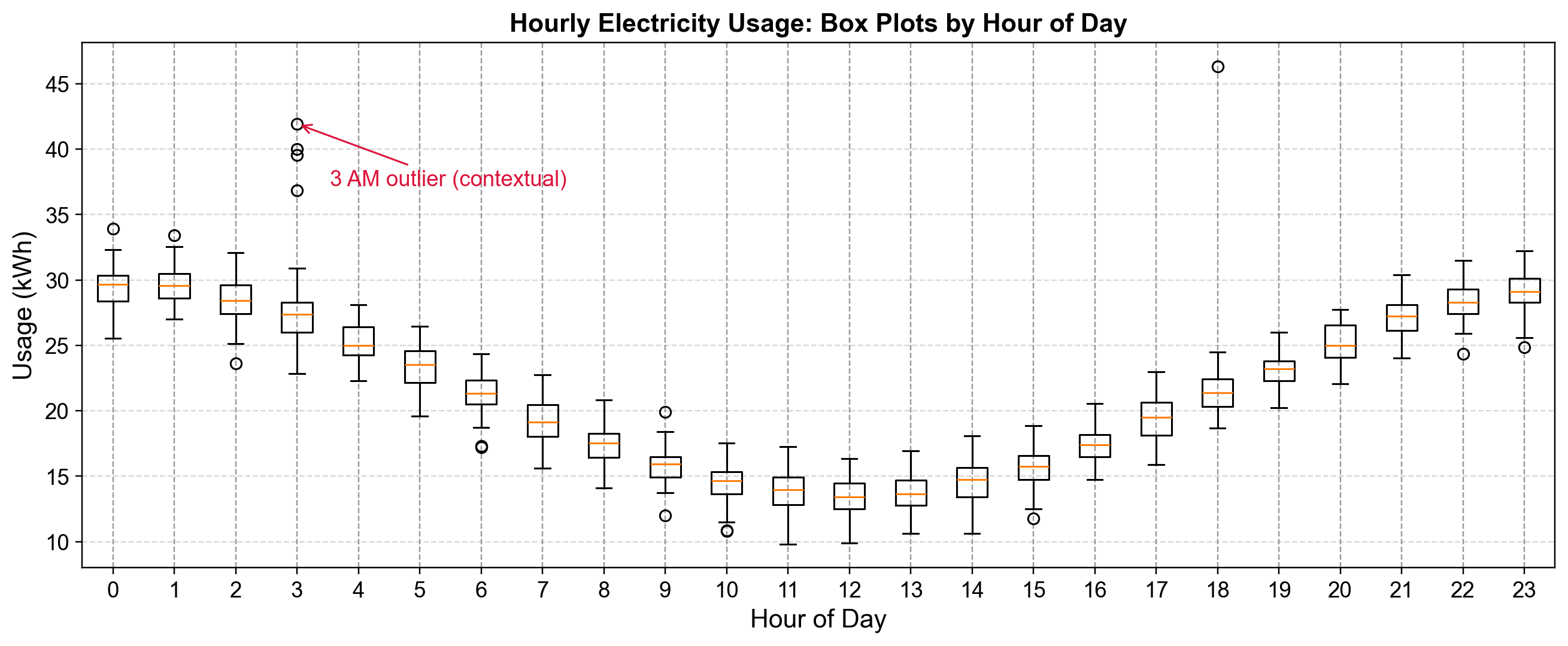
Fig. 5.16 Hourly electricity usage box plots showing the daily cycle. Individual dots beyond whiskers represent days with unusually high usage for that specific hour, with contextual outliers highlighted at 3 AM.#
Fig. 5.16 displays electricity consumption data organized by hour of the day, with separate box plots for each of the 24 hours. This arrangement reveals both the normal daily usage pattern and context-specific anomalies that would be invisible in an aggregate analysis:
Daily Usage Pattern: The box plots reveal a clear diurnal cycle in electricity consumption. During nighttime hours (approximately 10 AM through 4 PM shown as hours 10-16), the boxes are positioned lower on the y-axis with medians around 14-15 kWh, representing baseline overnight consumption when most equipment is idle. Usage gradually increases in the early evening, reaching peak levels around 6 PM (hour 18) where the box is positioned near 22 kWh. Late evening and early morning hours (hours 0-3 and 21-23) show intermediate consumption levels around 27-30 kWh, reflecting transitional periods as buildings power down or start up.
Outlier Distribution: Nearly every hour shows at least one outlier point (circles) above the upper whisker, indicating days when consumption exceeded the typical range for that specific hour. The density and magnitude of these outliers varies by time of day. Hours 0, 1, and 18 show multiple outliers, while midday hours show fewer deviations. Critically, an outlier at hour 3 reaches approximately 42 kWh—roughly double the typical consumption for that hour.
Contextual Significance: The red annotation highlights outliers at 3 AM (hour 3), where several observations fall in the 37-42 kWh range. These values might appear unremarkable when compared to the global distribution of electricity usage—42 kWh is well within the range observed during evening peak hours. However, in the context of 3 AM when typical consumption is 25-28 kWh, these observations represent anomalies exceeding 150% of expected usage. Such patterns could indicate equipment malfunctioning and running continuously, unauthorized after-hours operations, or HVAC systems failing to enter overnight setback mode.
Box plots excel at revealing contextual outliers because they provide separate distributional summaries for each relevant subgroup. An observation of 30 kWh is simultaneously:
Normal or slightly below average for hour 0 (midnight)
Extremely high for hour 10 (mid-morning)
Typical for hour 21 (9 PM)
Without the hour-by-hour breakdown, these distinctions would be lost. The figure also reveals that outliers are not uniformly distributed across hours—some time periods exhibit more variable consumption patterns than others, information useful for targeting anomaly investigation efforts.
The 1.5×IQR rule applied by box plots provides a statistically principled, automatic threshold that adapts to each context’s natural variability. Hours with highly consistent usage patterns (narrow boxes) will flag smaller deviations as outliers, while hours with naturally variable consumption (wider boxes) require larger deviations to exceed the whisker threshold.
5.4.4. Scatter Plots and Lag Plots#
Scatter plots reveal relationships between variables by displaying paired observations in two-dimensional space. While standard scatter plots compare two different variables (such as marketing spend versus sales), lag plots provide a specialized temporal perspective by plotting each observation against its own past values [Cleveland, 1993, Hyndman and Athanasopoulos, 2021, Shumway and Stoffer, 2025].
To illustrate the diagnostic power of lag plots, we generate a synthetic daily price series using an Autoregressive AR(1) process centered at $100 with a persistence parameter \(\phi=0.7\). This setup mimics typical stock price behavior where today’s price is strongly correlated with yesterday’s. We then inject two specific anomalies: a sudden “Flash Crash” on May 1st (simulating a discrete shock) and a structural increase in volatility starting in late 2023 (simulating a regime change). By comparing the time series view with lag plots, we can see how these distinct temporal features manifest differently across diagnostic tools.
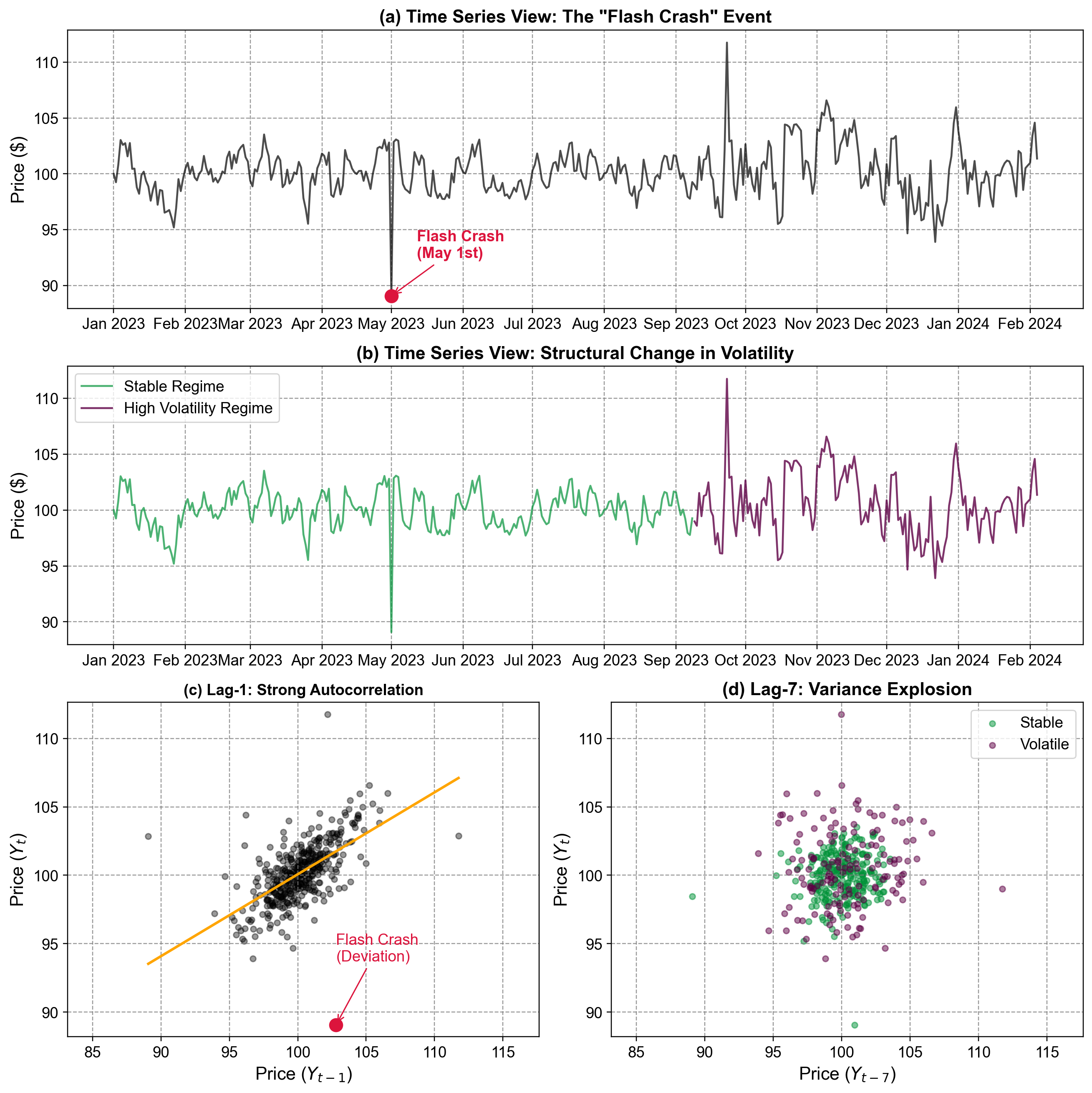
Fig. 5.17 Lag plots comparing temporal dependence at different lags against time series views. The time series plots (a, b) provide context for the “Flash Crash” and volatility shift, while the Lag-1 plot (c) highlights the outlier’s deviation from autocorrelation, and the Lag-7 plot (d) reveals the structural explosion in variance.#
Fig. 5.17 utilizes lag plots to diagnose temporal structure and identify specific anomalies that purely time-based plots might obscure.
Time Series Views (Top Panels a & b): The top panel (a) displays the raw daily price series, where the “Flash Crash” on May 1st appears as a sharp, momentary dip. The middle panel (b) highlights a structural shift in the data’s behavior: the earlier period (teal) is stable, while the later period (purple) exhibits significantly higher volatility, representing a regime change in market conditions. These time-domain views establish the “what” and “when” of the anomalies.
Lag-1 Plot (Panel c): This plot displays Price\(_t\) against its immediate predecessor Price\(_{t-1}\). The tight clustering of blue points along the orange OLS fit line indicates a strong positive autoregressive relationship—knowing yesterday’s price allows for a reliable prediction of today’s. The red marker highlights the Flash Crash as a significant outlier. Its position far below the diagonal trend line indicates that the price drop was not predicted by the previous day’s value, confirming it as a shock event inconsistent with the market’s normal inertia.
Lag-7 Plot (Panel d): This plot displays Price\(_t\) against the value seven days prior, Price\(_{t-7}\). Unlike the lag-1 plot, there is no distinct linear trend, indicating weak correlation at this weekly lag. However, the plot clearly separates the two volatility regimes. The teal points (Stable) cluster tightly around the center, while the purple points (Volatile) form a dispersed “explosion” outward. This “fanning out” effect is a visual signature of heteroscedasticity (non-stationary variance), proving that the market’s risk profile has fundamentally changed even if the mean price has not.
Comparing lag plots at multiple lags provides insight into the underlying process:
Autocorrelation Decay: Strong structure at Lag-1 vs. a “blob” at Lag-7 suggests a process with short-term memory that decays quickly (like an AR(1) process).
Regime Detection: The emergence of distinct clusters or spreads (like the purple vs. teal points in Panel d) signals that the data-generating process is not constant over time, necessitating models that can handle regime switching or volatility clustering (e.g., ARCH/GARCH models).
5.4.5. Violin Plots (Grouped by Time Unit)#
Violin plots combine box plot summaries with distributional detail, where violin width represents observation density at each value. When grouped by cyclical time units (hour, day, month, quarter), they reveal how entire distributions shift across temporal contexts, effectively identifying contextual outliers in seasonal data [Chandola et al., 2009, Hintze and Nelson, 1998].
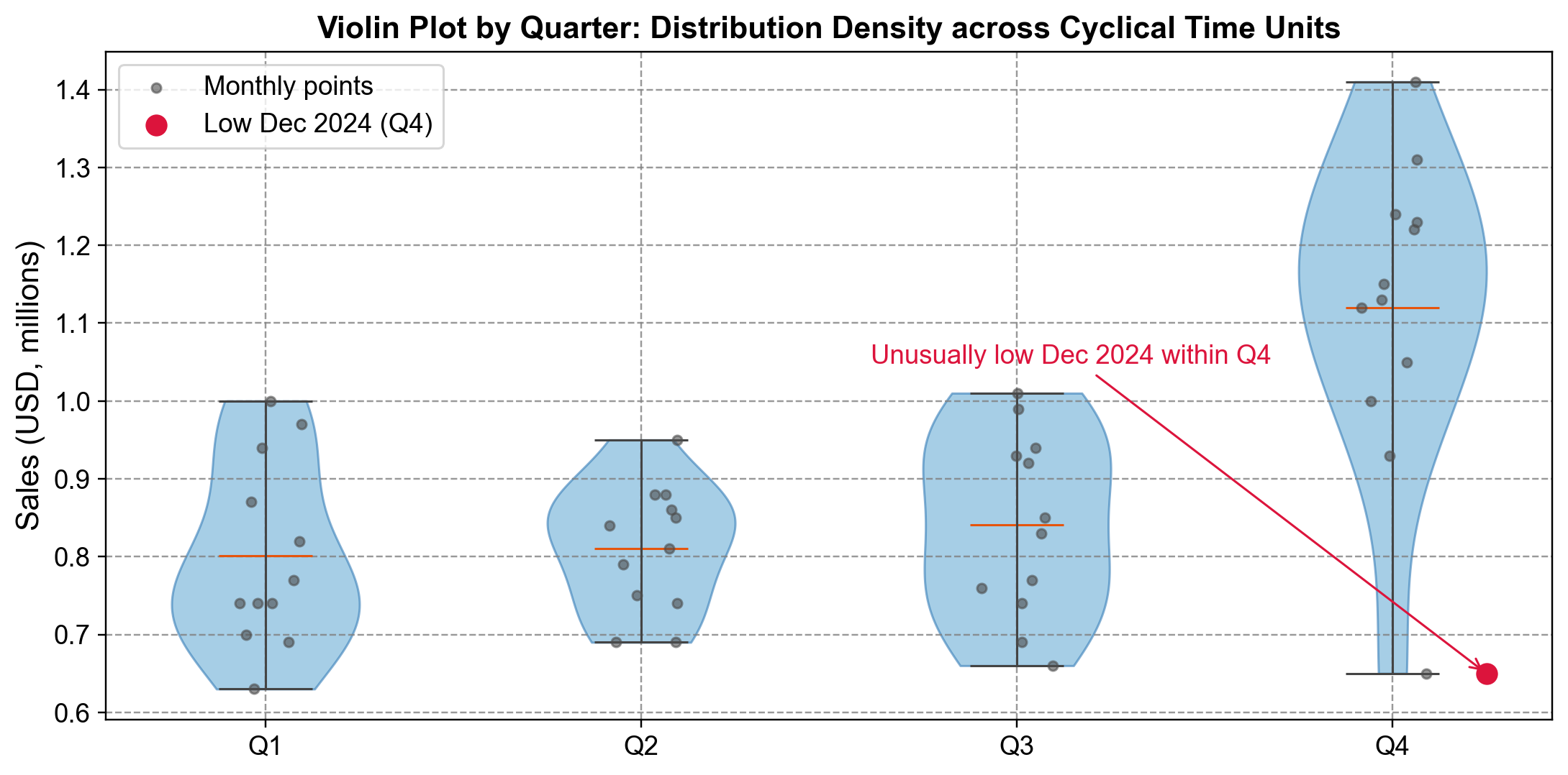
Fig. 5.18 Violin plot of quarterly sales distributions. Q4’s elevated, wider profile reflects holiday effects, making December 2024’s unusually low value clearly anomalous within its quarterly context.#
Fig. 5.18 displays monthly sales grouped by fiscal quarter, with gray dots representing individual months and orange lines marking medians:
Seasonal Pattern: Quarters 1-3 show similar distributions centered around $0.80M with narrow violins ($0.65-$1.00M). Q4’s distribution is dramatically elevated, centered at $1.12M and spanning $1.00-$1.42M, reflecting holiday shopping effects [Chandola et al., 2009].
Outlier Identification: The red marker identifies December 2024 at $0.65M—positioned far below Q4’s dense region and even lower than typical Q1-Q3 values. While every other Q4 observation clusters in $1.0-$1.4M, this point sits in isolation, warranting investigation into data errors, supply chain disruptions, or market changes [Hintze and Nelson, 1998].
Violin plots vs. box plots
Violin plots reveal full distributional shapes beyond box plots’ five-point summaries. The Q4 violin shows not just elevated values but a smooth, approximately normal distribution at that level. This context emphasizes how the outlier violates an entire consistent density pattern, not just a statistical threshold [Hintze and Nelson, 1998].
5.4.6. Seasonal Decomposition Plots#
Time series data often contain overlapping components—trends, seasonal patterns, and irregular fluctuations—that obscure genuine anomalies within expected cyclical variation. Seasonal decomposition mathematically separates these components for independent analysis [Cleveland et al., 1990, Hyndman and Athanasopoulos, 2021].
STL (Seasonal and Trend decomposition using Loess) partitions a time series into three additive components: trend (long-term movement), seasonal (repeating cycles), and residual (unexplained variation). The residual component isolates deviations that cannot be attributed to expected patterns, making it particularly valuable for outlier detection [Cleveland et al., 1990].
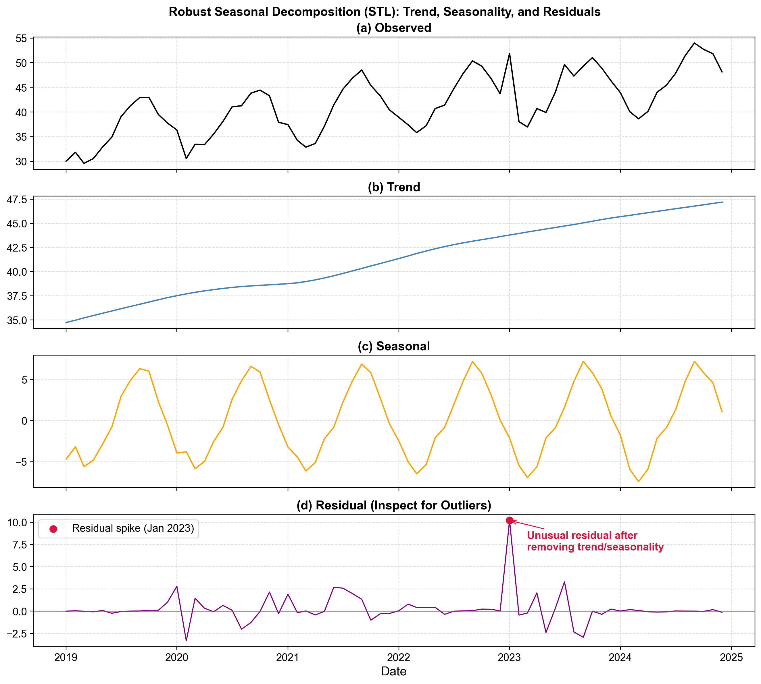
Fig. 5.19 STL decomposition of ice cream sales revealing trend, seasonal, and residual components. The residual panel exposes a massive January 2023 spike invisible in the raw data.#
Fig. 5.19 demonstrates STL decomposition on monthly ice cream sales (2019-2025):
Observed Series (Top): Raw sales show complex variability (30-55 units) with no immediately obvious outliers, as seasonal patterns mask anomalies.
Trend Component (Second): Smooth growth from 35 to 47 units reveals stable long-term dynamics without structural breaks.
Seasonal Component (Third): Consistent annual pattern (±6 units) peaks in summer and troughs in winter, indicating stable seasonality across all years.
Residual Component (Bottom): Random noise typically fluctuates within ±2 units. The red marker highlights January 2023 reaching +10 units—five times typical magnitude. This represents sales 10 units higher than expected given trend (44) and winter seasonality (-6), suggesting unusual weather, promotional success, or data quality issues [Hyndman and Athanasopoulos, 2021].
The critical insight: the January 2023 anomaly appears as routine fluctuation in raw data but stands out unmistakably in residuals. STL’s robustness to outliers ensures extreme values don’t distort fitted components, making anomalies prominent in residuals [Cleveland et al., 1990]. For multiple seasonal periods (e.g., daily data with weekly and annual cycles), advanced methods like MSTL handle complex structures.
5.4.7. Q-Q Plots (Quantile-Quantile Plots)#
Quantile-quantile plots assess whether data follow a specified theoretical distribution by plotting sample quantiles against theoretical quantiles. Points lying on the diagonal reference line indicate the data match the reference distribution, while deviations reveal the nature and location of departures [Chambers et al., 2018, Chandola et al., 2009, Wilk and Gnanadesikan, 1968].
Q-Q plots excel at identifying outliers and assessing tail behavior, where deviations from the reference line become visually prominent at the extremes.
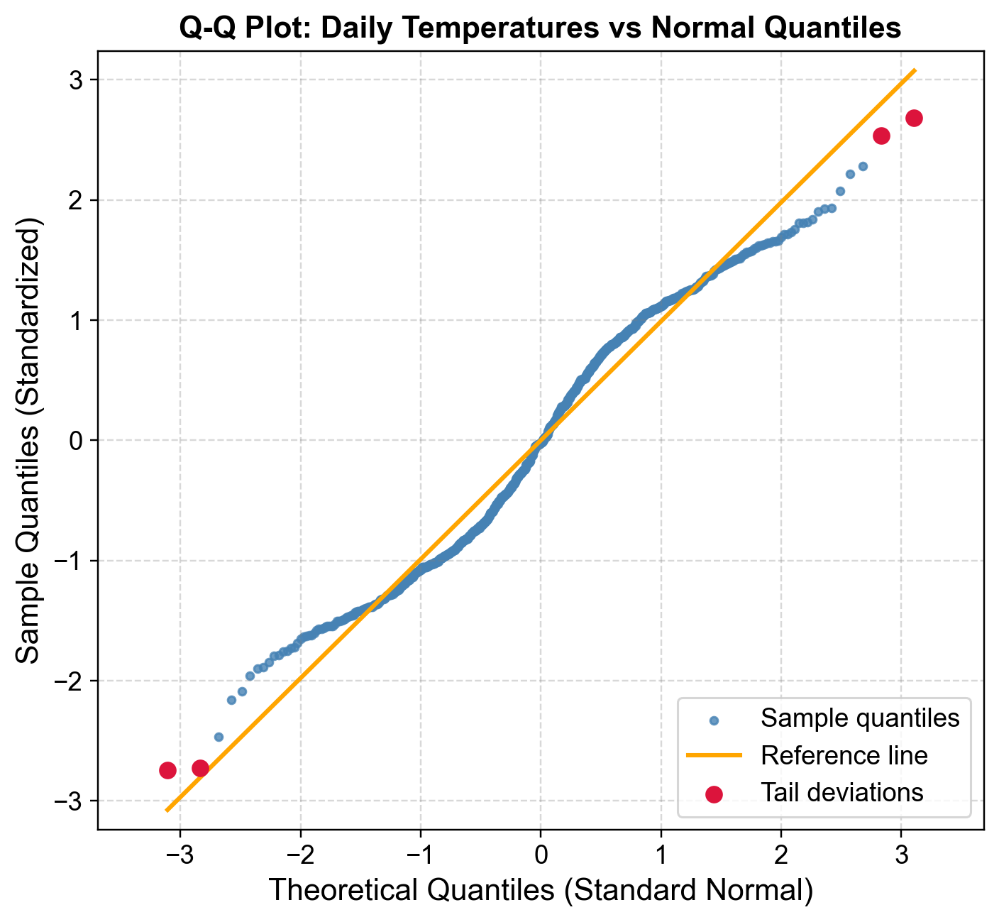
Fig. 5.20 Q-Q plot of standardized daily temperatures versus normal quantiles. Central alignment confirms approximate normality, while tail deviations (red) reveal extreme hot and cold days.#
Fig. 5.20 displays standardized daily temperatures (mean zero, unit variance) against theoretical normal quantiles:
Central Region Alignment: Blue points from approximately -1.5 to +1.5 SD align closely with the orange reference line, indicating the central 85-90% of temperatures follow approximate normality.
Lower Tail Deviations: Red points below the reference line (theoretical quantiles <-2) represent unusually cold days more extreme than normal predictions. The coldest observations reach -3.0 SD or lower where normality predicts -2.5 SD, indicating a heavier lower tail from extreme cold snaps or arctic outbreaks.
Upper Tail Deviations: Red points above the reference line (theoretical quantiles >+2) represent unusually hot days exceeding normal predictions, reflecting heat waves or climate variability. The symmetric tail deviations suggest leptokurtic (heavy-tailed) behavior with excess kurtosis rather than skewness [Chambers et al., 2018, Chandola et al., 2009].
Q-Q plots distinguish between systematic deviations (many tail observations, suggesting model misspecification requiring alternative distributions like t-distributions or mixture models) and isolated deviations (few extreme points, suggesting individual outliers warranting investigation or removal). A point at theoretical quantile -3 occurs roughly once in 740 observations under normality; multiple such points indicate either genuine rare events or data quality issues [Wilk and Gnanadesikan, 1968].
5.4.8. Normal Probability Plots#
Normal probability plots assess whether data follow a normal distribution by plotting ordered observations against expected normal quantiles. Points aligning along a straight reference line indicate normality, while deviations reveal the nature of departures—heavier tails, skewness, or discrete outliers [Chambers et al., 2018, Chandola et al., 2009, Guthrie, 2020, Montgomery, 2012].
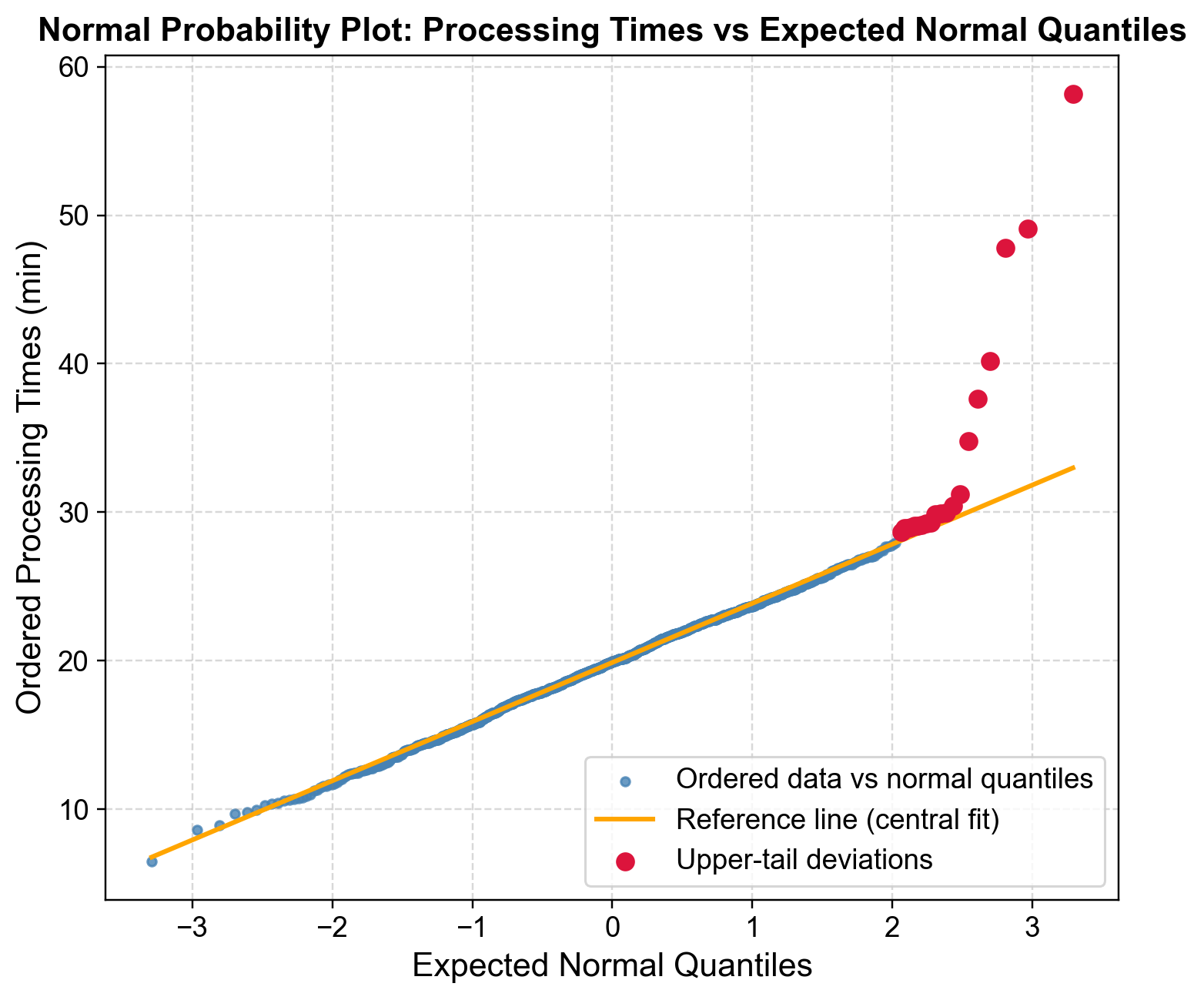
Fig. 5.21 Normal probability plot of manufacturing processing times. Central linearity confirms approximate normality for typical operations, but upper-tail curvature reveals heavy-tailed delays.#
Fig. 5.21 displays manufacturing processing times plotted against expected normal quantiles. Each observation’s plotting position \((i-0.5)/n\) converts to a normal quantile via the inverse CDF.
Central Linear Pattern: Blue points from quantile -2 to +2 align closely with the orange reference line (fitted to 10th-90th percentiles), indicating typical processing times (12-28 minutes) follow approximate normality under standard operating conditions.
Upper Tail Deviation: Beginning at quantile +2, red points deviate progressively upward. Where normality predicts 28-30 minutes at the upper tail, actual observations extend beyond 50 minutes—a heavy upper tail indicating delays occur more frequently than expected.
Outlier Identification: Processing times exceeding 45 minutes (quantile >+2.5) represent rare events (<1% under normality). The progressive separation suggests both heavy-tail behavior and discrete extreme outliers from assignable causes like equipment breakdowns, material defects, or operator errors.
The asymmetric pattern—deviation only in the upper tail—reflects manufacturing reality: processes experience delays but cannot exceed optimized minimum times [Montgomery, 2012].
Fig. 5.21 reveals that normal-based control charts will underestimate delay frequency, as 3-sigma limits flag extreme outliers but miss systematic heavy-tail patterns. Alternative approaches include log-normal or Weibull distributions, robust control charts, or separate assignable cause treatment. For capacity planning, managers using the normal 95th percentile (~28 minutes) will face more delays than anticipated; empirical percentiles or heavy-tailed distributions provide more realistic estimates [Chambers et al., 2018, Chandola et al., 2009, Guthrie, 2020].
5.4.9. Residual Plots#
After fitting a model to time series data, residuals represent unexplained variation remaining after accounting for systematic patterns. Residual analysis provides a critical diagnostic tool for model validation and outlier detection, where unusually large residuals indicate either genuine anomalies or model inadequacies [Box et al., 2016, Montgomery, 2012, Peña and Rodríguez, 2006].
Residual plots reveal different aspects of model performance: time plots detect temporal patterns or shocks, fitted value plots assess heteroscedasticity, and standardized plots flag statistical extremes using ±2 or ±3 SD thresholds.
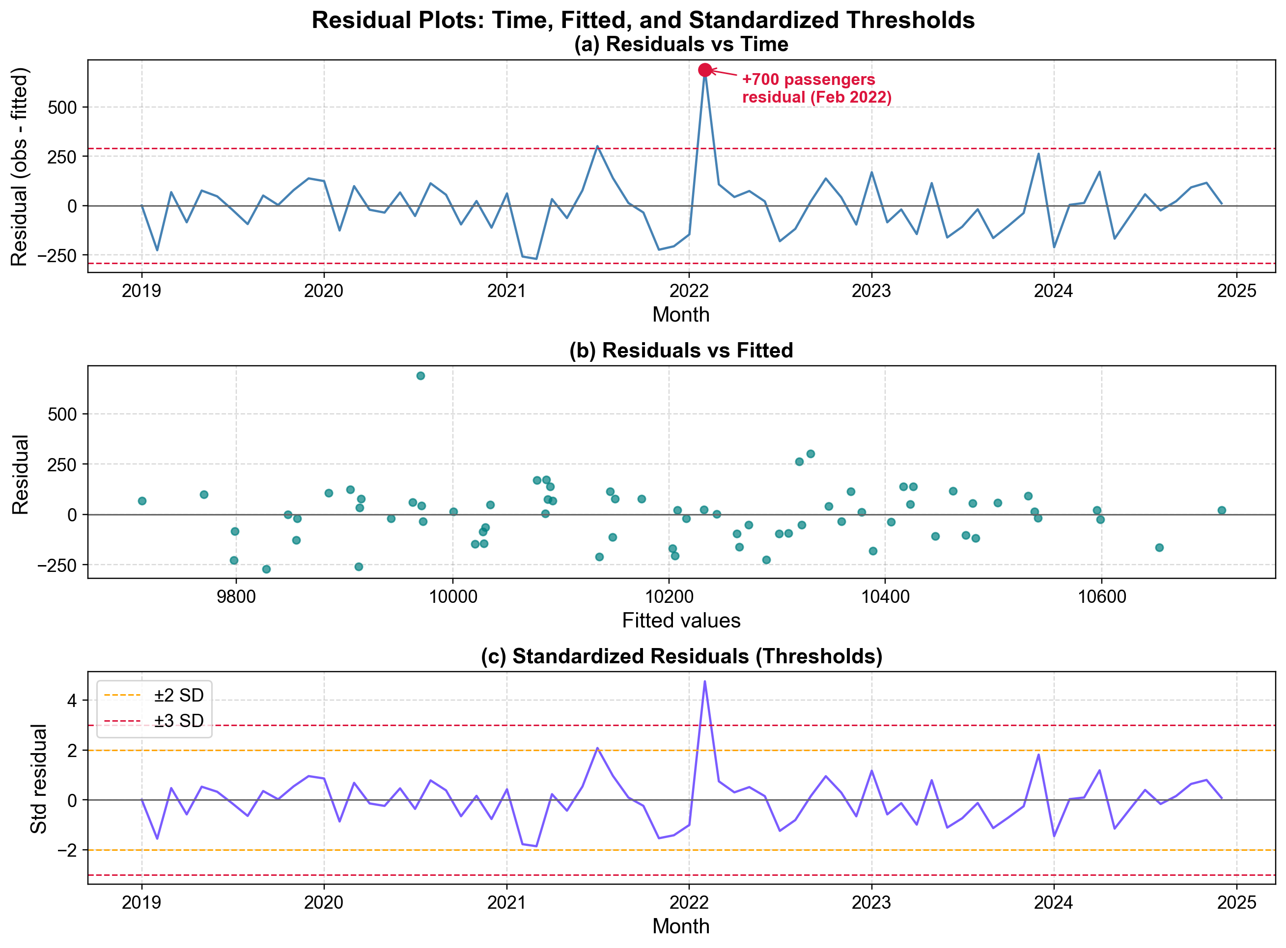
Fig. 5.22 Residual diagnostics after fitting a seasonal trend model to airline passenger data. The top panel reveals a +700 passenger residual in February 2022 exceeding ±2 SD thresholds.#
Fig. 5.22 presents three complementary diagnostics from a seasonal trend model fitted to monthly airline passenger data (2019-2025):
Residuals vs Time (Top): Raw residuals oscillate around zero within ±200 passengers, with red dashed lines marking ±2 SD thresholds at ±240. The February 2022 outlier (+700 passengers) exceeds this threshold by 3×, warranting investigation into promotional events, competitor disruptions, or data errors.
Residuals vs Fitted (Middle): Teal points scatter randomly in a horizontal band (±200 passengers) across fitted values (9,750-10,750), showing no heteroscedasticity. The +700 outlier appears in the upper region, confirming its anomalous status independent of timing. The constant variance validates the modeling approach.
Standardized Residuals (Bottom): Orange (±2 SD) and red (±3 SD) thresholds frame typical variation. The February 2022 spike reaches +4.8 SD—an event with probability <1 in 1.5 million under normality. Even with multiple testing across 72 months, this is statistically indefensible as random variation.
The plots collectively validate the model for typical observations while flagging the February 2022 outlier. This extreme observation represents either a genuine external shock requiring documentation/intervention analysis, or a data quality issue (double-counting, date errors) requiring correction [Box et al., 2016, Peña and Rodríguez, 2006].
Residual patterns guide improvement strategies: systematic time oscillations suggest additional seasonal terms, funneling in fitted plots indicates need for log transformation, and autocorrelation patterns warrant ARIMA terms.
5.4.10. Control Charts (Statistical Process Control)#
Control charts provide a statistical framework for monitoring process stability and detecting anomalies in sequential data. Developed by Walter Shewhart in the 1920s, they establish control limits based on natural process variation during stable operation, then flag observations exceeding these limits as potential special causes [Montgomery, 2012].
An Individuals control chart (X-chart or I-chart) monitors individual observations rather than sample means. The chart displays a center line (process mean) and control limits at ±3 standard deviations, encompassing 99.73% of observations under normal stable operation.
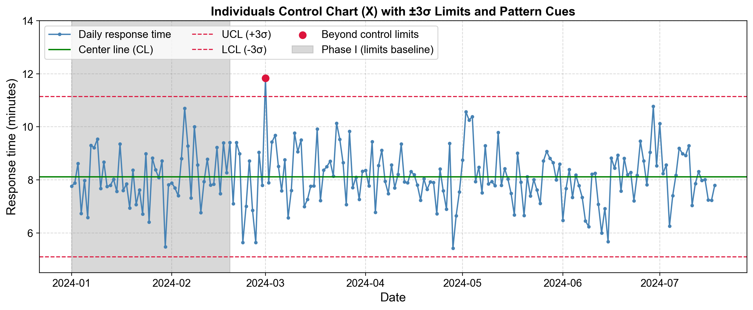
Fig. 5.23 Individuals control chart monitoring daily call center response times. A March 2024 point exceeds the upper control limit, while pattern-based rules flag trend and run violations.#
Fig. 5.23 displays daily call center response times from January through July 2024. The center line (CL) sits at approximately 8.1 minutes, with Upper Control Limit (UCL) at 11.1 minutes and Lower Control Limit (LCL) at 5.1 minutes, all calculated from the Phase 1 baseline (gray shaded region).
Phase 1 Baseline: The gray region represents the initial 50 days used to establish control limits from stable process operation.
Phase 2 Monitoring: Post-baseline observations are compared against established limits. Most response times fluctuate within 5.5-10.5 minutes, indicating statistical control.
Out-of-Control Signal: The red marker in early March 2024 reaches 11.8 minutes, exceeding the UCL. This signal (probability ~0.27% under normal operation) triggers investigation into special causes such as staffing issues, system problems, or volume spikes.
Pattern-Based Rules: The orange shaded region (late April) shows a trend pattern with 6 consecutive increases, suggesting gradual deterioration. The purple region (early June) shows a run pattern with 8 consecutive points below CL, suggesting a process shift. These Western Electric rules detect subtle changes not captured by simple limit violations.
The key distinction is between common-cause variation (inherent randomness within control limits) and special-cause variation (identifiable events causing outliers or patterns). Common causes require process redesign; special causes require root problem identification and elimination.
5.4.11. Choosing Visual Methods for Your Data#
The effectiveness of visual outlier detection depends on matching methods to data characteristics and analysis goals. Focus on complementary approaches that address your specific situation rather than applying every available visualization [Unwin, 2018].
5.4.11.1. Method Selection by Data Type#
Univariate time series with trend/seasonality: Start with time plots, then apply seasonal decomposition (STL) to examine residuals. Box plots grouped by season provide contextual screening. For high-frequency data (hourly, daily), control charts monitor ongoing operations with statistical limits, while box plots grouped by hour/day reveal when outliers concentrate in specific periods [Unwin, 2018].
Process monitoring: Control charts (X-charts) establish baseline limits and flag special-cause variation. Supplement with residual plots after fitting trend/seasonal models to identify model-independent anomalies.
Distributional assessment: Begin with histograms for overall shape, then use Q-Q plots for specific distributional assumptions. Box plots offer quick summaries while violin plots reveal detailed density for multimodal or asymmetric distributions. For non-normal distributions, Q-Q plots distinguish true outliers from systematic heavy-tail behavior requiring alternative assumptions or transformation [Unwin, 2018].
Relationship analysis: Scatter plots identify deviations from expected correlations. Lag plots at relevant lags (lag-1 for immediate dependence, lag-7 for weekly patterns, lag-24 for daily cycles) expose temporal structure changes. Residual plots after modeling expose outliers unexplained by systematic relationships.
5.4.11.2. Practical Workflow#
Progress through: Initial exploration (time plots, histograms) to understand patterns and flag obvious anomalies → Distributional analysis (box/violin plots, Q-Q plots) to assess tail behavior → Model-based detection (residuals) to identify anomalies persisting after accounting for systematic patterns. Three to five well-chosen plots typically provide more insight than fifteen redundant ones. Each should answer a specific question about temporal patterns, distributional consistency, relationships, or model adequacy [Unwin, 2018].