Remark
Please be aware that these lecture notes are accessible online in an ‘early access’ format. They are actively being developed, and certain sections will be further enriched to provide a comprehensive understanding of the subject matter.
1.4. Time Series Visualizations#
This section demonstrates how to structure and visualize time series data using official sources from the United States and Canada. We will use data from the U.S. Bureau of Labor Statistics (BLS), Environment and Climate Change Canada, and Statistics Canada.
1.4.1. US Employment Data (Bureau of Labor Statistics)#
The Bureau of Labor Statistics (BLS) provides monthly data on employment across various industries. A common way to access this “official” data in Python is using the pandas_datareader library to fetch from FRED (Federal Reserve Economic Data).
1.4.1.1. Fetching and Structuring the Data#
We will look at the “All Employees, Total Nonfarm” series for three major sectors: Construction, Manufacturing, and Education & Health Services.
1.4.1.2. Visualizing Trends and Shocks#
Visualizing the raw levels shows the scale of employment, while the Year-over-Year (YoY) growth rates highlight economic shocks—most notably the COVID-19 impact in early 2020.
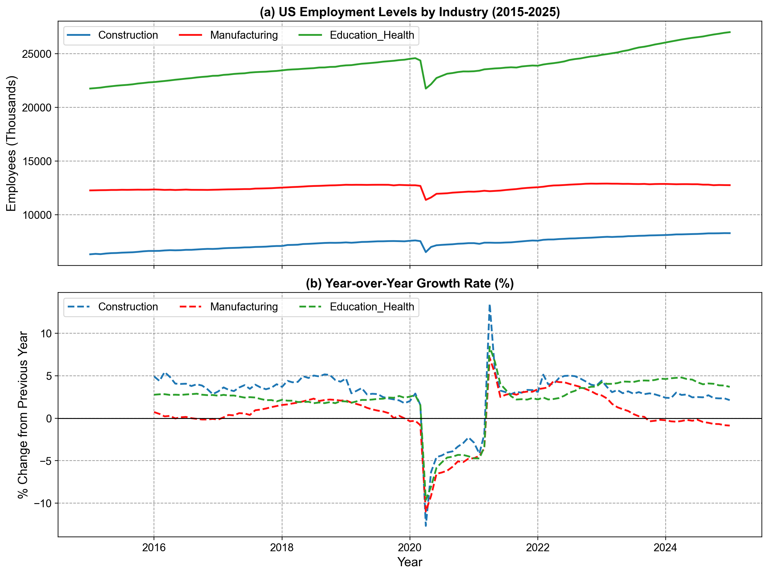
Fig. 1.6 US Employment Trends by Industry (2015-2025). Panel (a) displays total employment levels (in thousands) for Construction, Manufacturing, and Education/Health sectors, revealing a steady increase interrupted by a sharp decline in 2020. Panel (b) illustrates the Year-over-Year (YoY) growth rates, highlighting the significant contraction during the 2020 recession followed by a rapid rebound in 2021-2022.#
1.4.2. Canadian Climate Data (Environment Canada)#
For Canadian weather data, we can pull directly from the Environment and Climate Change Canada Historical Climate Data website using pd.read_csv(). This avoids hardcoding values and allows us to work with official daily records.
The code below fetches daily mean temperatures for January 2025 for four major airports:
Vancouver (YVR)
Calgary (YYC)
Toronto (YYZ)
Montreal (YUL)
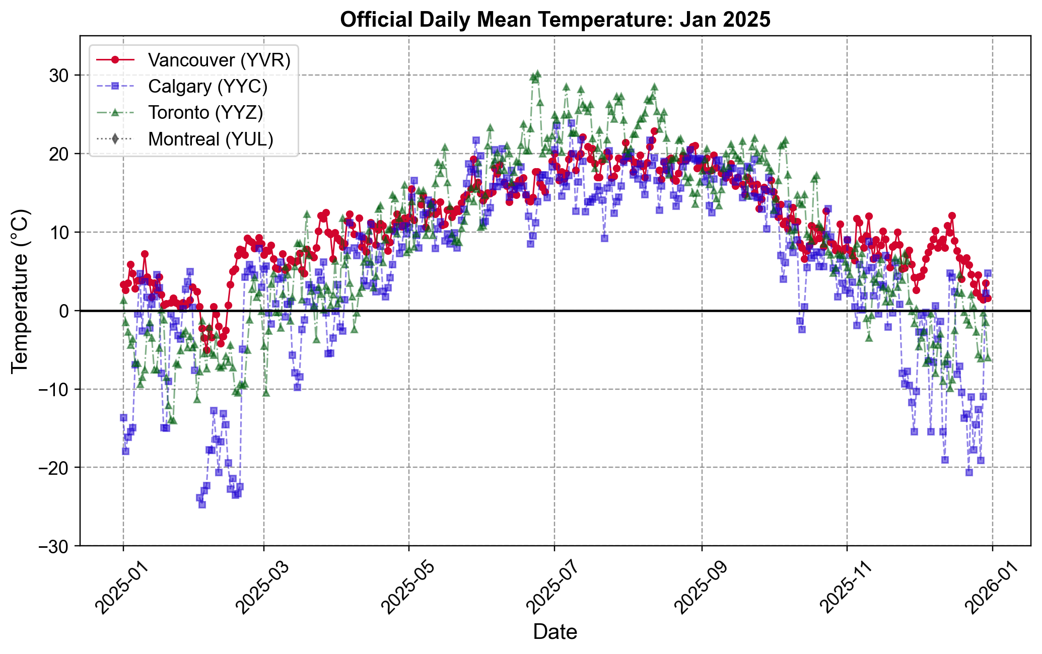
Fig. 1.7 Official Daily Mean Temperature for Major Canadian Cities (2025). The plot compares temperature trends for Vancouver (YVR), Calgary (YYC), Toronto (YYZ), and Montreal (YUL) throughout the year. Vancouver (red) exhibits the most stable climate with milder winters, while Calgary (purple) and the eastern cities (green, grey) display sharper seasonal variation and significantly colder winter temperatures dropping below -20°C.#
1.4.3. US Housing Prices (S&P/Case-Shiller)#
Instead of using manual approximations, we can access the official S&P/Case-Shiller Home Price Indices directly from the Federal Reserve Bank of St. Louis (FRED) using the pandas_datareader library.
The Case-Shiller Index is the leading measure of U.S. residential real estate prices. We will examine the “Seasonally Adjusted” indices for four major metropolitan areas: New York, Los Angeles, Phoenix, and Miami over an extended period from 2020 to 2024, capturing the post-pandemic housing boom and market shifts.
This example uses monthly frequency data spanning five years. We fetch the official series IDs from FRED and structure them into a single DataFrame with proper datetime indexing, allowing us to identify quarterly patterns and seasonal trends.
1.4.3.1. Plotting Index Growth#
We can visualize the market divergence using subplots: a line chart for the index levels and a heatmap for the monthly growth rates.
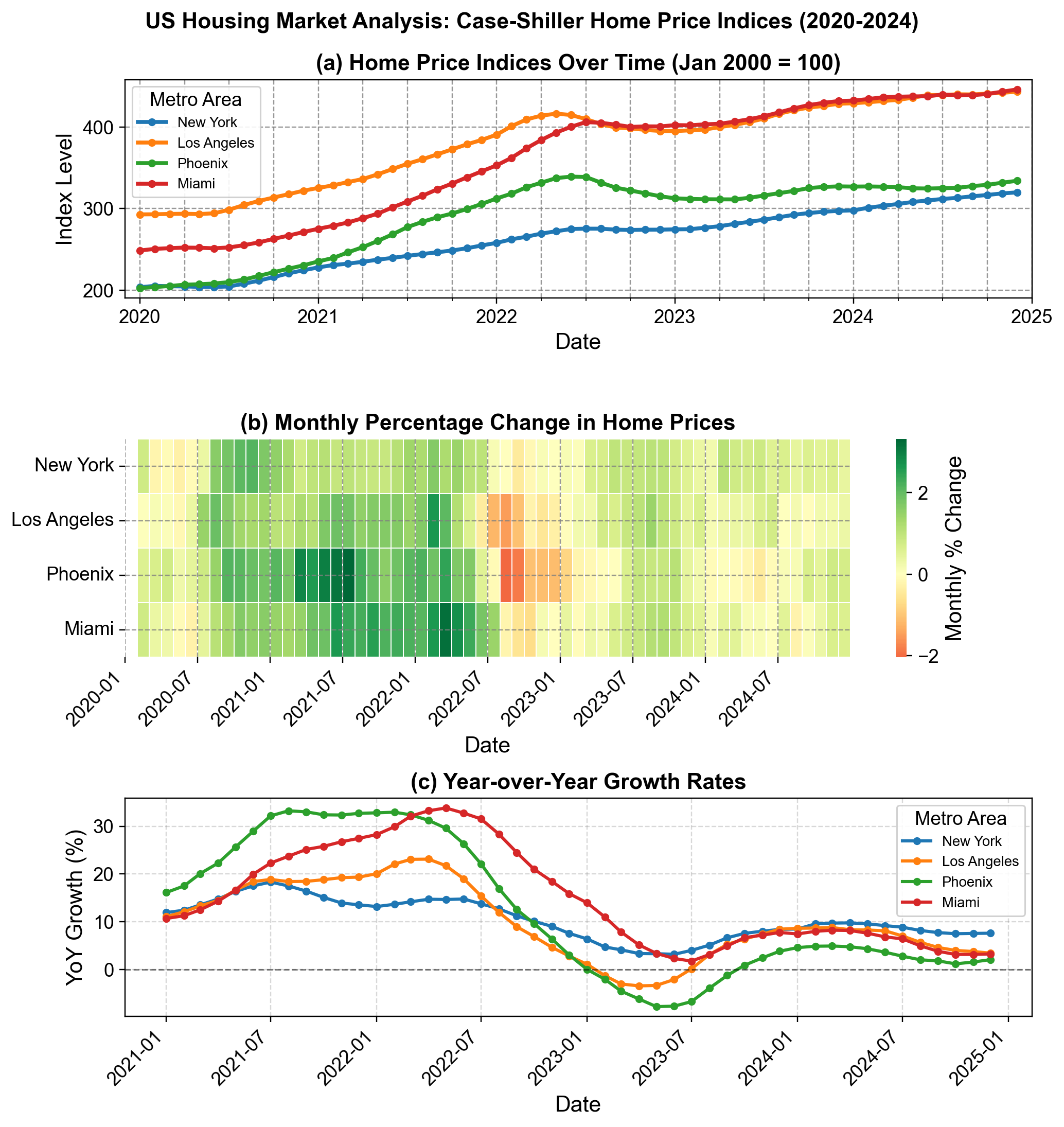
Fig. 1.8 US Housing Market Analysis: Case-Shiller Home Price Indices (2020-2024). (a) Price indices for New York, Los Angeles, Phoenix, and Miami, showing the divergence in appreciation rates. (b) Heatmap of monthly percentage changes, illustrating the widespread “red” correction phase in late 2022 across all metros. (c) Year-over-Year (YoY) growth rates, capturing the boom-bust cycle where Phoenix and Miami saw growth exceed 30% before cooling significantly in 2023.#