Remark
Please be aware that these lecture notes are accessible online in an ‘early access’ format. They are actively being developed, and certain sections will be further enriched to provide a comprehensive understanding of the subject matter.
5.2. Outlier Classification by Scope#
Outliers vary in how they appear in datasets. Some anomalies are easy to spot through visual inspection or basic statistical analysis, while others only become visible under specific conditions or when multiple data points form unusual patterns together.
Understanding how outliers differ is essential for selecting the right detection method. Different types of outliers require different analytical approaches. Using the wrong method can lead to missing important anomalies or flagging too many normal observations as outliers.
This section examines three fundamental types of outliers based on their scope: how they appear in your data and what makes them anomalous. Understanding these differences will help you choose the most appropriate detection strategy for your specific situation [Chandola et al., 2009].
Note
This section introduces the types of outliers and their visual characteristics. For detailed statistical detection methods (such as Modified Z-Score, IQR, DBSCAN, and change-point detection) [Goldstein and Uchida, 2016], please refer to Section 5.5 and Section 5.6. The following sections will explain the technical methods used to detect each type of outlier.
5.2.1. Point Outliers (Global Outliers)#
Point outliers are individual data points that differ significantly from the entire dataset. These values are extreme enough that they are clearly visible in basic visualizations and do not require additional context to identify as anomalous [Chandola et al., 2009, Kammerer et al., 2019, Safaei et al., 2022].
Characteristics of Point Outliers
Standalone: A single observation at a single point in time
Global: Anomalous compared to all other data points in the dataset
Context-Free: The outlier status does not depend on surrounding observations or temporal patterns
Easy to Spot: Appears clearly in standard plots and summary statistics
Financial Fraud: A credit card usually charges $20–$100. A single transaction of $25,000 is a point outlier.
Sensor Failure: A thermometer reads 20°C–25°C all day. Suddenly, it logs 105°C. This is physically impossible for the environment and indicates a malfunction.
Viral Traffic: A blog gets 1,000 daily hits. On one day, it receives 500,000 hits. This isolated spike is a point outlier relative to the site’s history.
5.2.1.1. Example: Industrial Sensor Monitoring#
Consider a temperature sensor in a manufacturing plant monitored daily for 4 months (120 days). Under normal conditions, the sensor shows a gradual calibration drift from 50°C to 56°C, with minor daily noise (\(\pm 2.5^\circ\)C).
We can visualize this data to identify malfunctions. The code below generates a synthetic sensor dataset and highlights the anomalies.
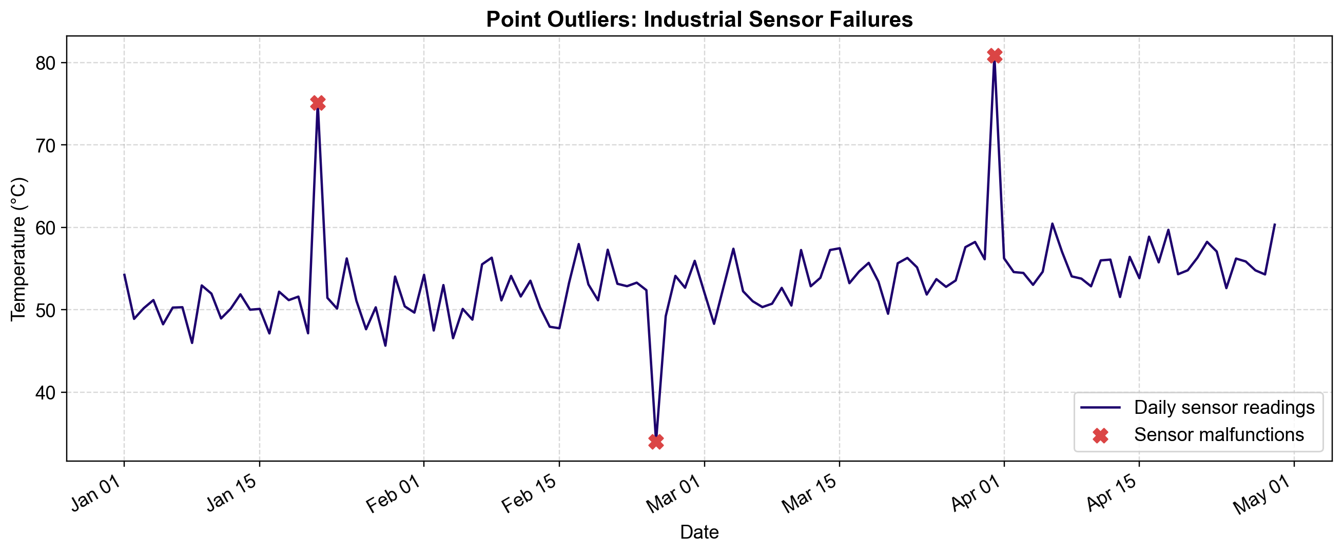
Fig. 5.5 Visualizing Point Outliers. The blue line shows the normal behavior of the sensor: a steady drift with consistent variance. The three red ‘X’ markers identify point outliers—isolated moments where the sensor reported values (e.g., +20°C spike, -18°C drop) that are statistically impossible given the global distribution of the data.#
Notice how the outliers are unmistakable. You do not need to know the day of the week or the time of day to identify them. The value 75°C (Day 21) is anomalous simply because the rest of the data never exceeds 60°C. This “global” nature allows simple statistical methods (like Z-Scores or Box Plots) to detect them effectively.
5.2.2. Contextual Outliers (Conditional Outliers)#
Contextual outliers are data points that appear normal when viewing the dataset globally but become anomalous when considered within their specific context—such as time of day, day of week, season, or location.
Characteristics of Contextual Outliers
Conditionally Anomalous: The value itself (\(x_t\)) is often within the normal global range \([min, max]\).
Context-Dependent: The anomaly arises from the relationship between the value and its context attributes (e.g., \(x_t\) vs. \(hour_t\)).
Harder to Detect: Simple global thresholds (like \(x > 3\sigma\)) will fail because the value isn’t extreme in absolute terms.
Climate: A temperature of 75°F is normal globally. But 75°F in Minnesota in January is physically impossible.
Cybersecurity: 600 requests/hour is normal for a server at noon. But 600 requests/hour at 3:00 AM suggests a botnet attack.
Retail: Selling 500 coats is normal in December. Selling 500 coats in July indicates a data error or a massive clearance event.
5.2.2.1. Example: Temperature and Web Traffic#
Fig. 5.6 demonstrates two scenarios where context is key.
Panel (a): Hourly temperature data. Global thresholds would miss the anomalies because they fall within the yearly min/max.
Panel (b): Hourly web traffic. A spike at 3:00 AM is suspicious, even though it is smaller than a typical midday peak.
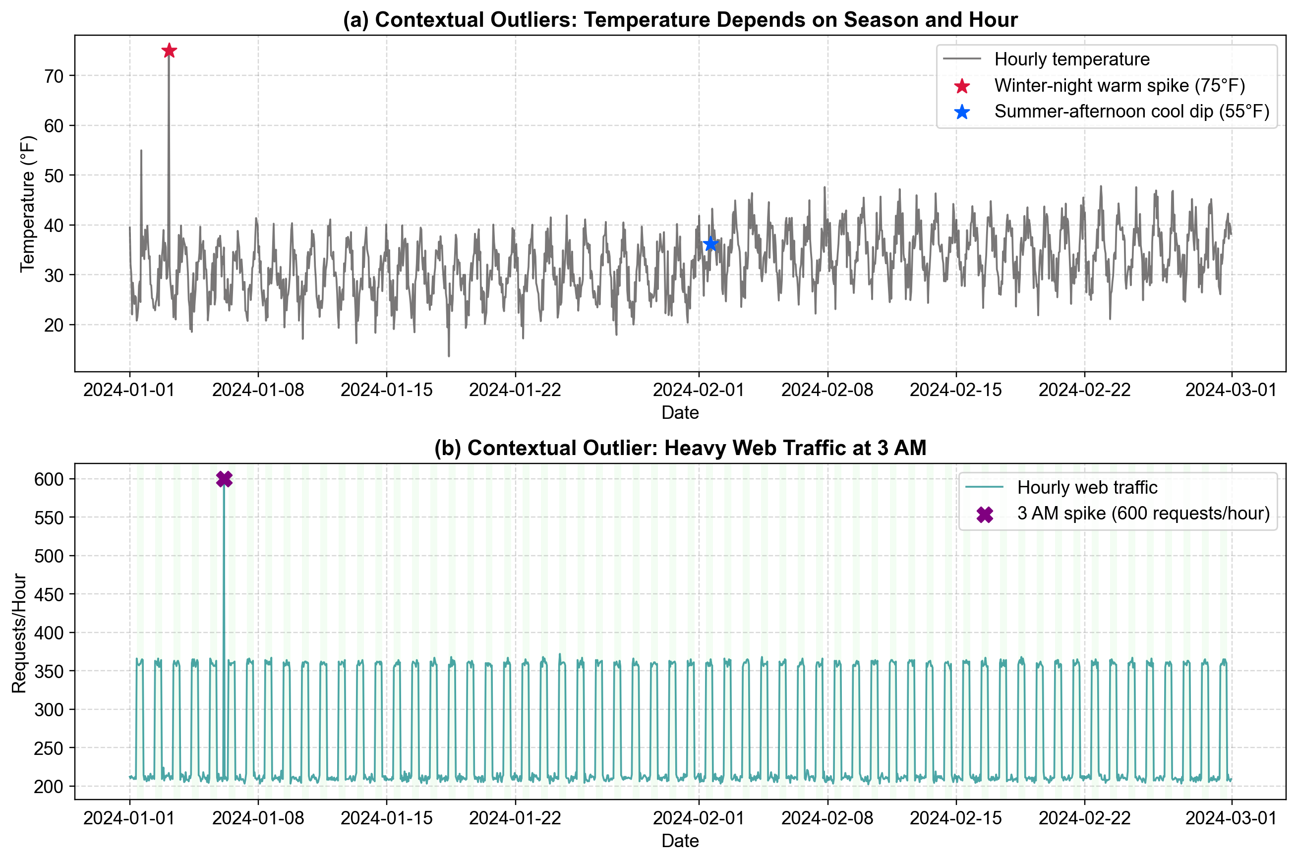
Fig. 5.6 Visualizing Contextual Outliers. Panel (a): Against the gray temperature trend line (°F), the red star marks a winter warm spike at 75°F in January, anomalous for winter cooling. The blue star indicates a summer cold dip, deviating from summer warmth. Panel Panel (b): The purple ‘X’ marks a traffic spike of 600 requests at 3:00 AM on a Sunday. While 600 requests is standard during business hours (green shaded region), it is highly anomalous during the off-hours trough.#
5.2.3. Collective Outliers (Group Anomalies)#
Collective outliers are subsets of data points that are anomalous as a group, even if the individual data points appear normal in isolation. The anomaly is not defined by any single value but by the pattern, sequence, or relationship of the collection.
Characteristics of Collective Outliers
Group Phenomenon: The “unit” of interest is a sequence or window, not a single point.
Individual Normality: Each data point (\(x_t\)) typically falls within valid global ranges.
Pattern Violation: The anomaly manifests as an unexpected structural change—such as a prolonged plateau, a frequency shift, or a break in rhythm.
Hard to Detect: Standard point-based methods (Z-Score, Box Plot) will fail completely because no single value is extreme.
ECG Monitoring: A heart voltage of 0mV is normal (between beats). But 0mV for 5 continuous seconds (flatline) is a collective outlier indicating cardiac arrest.
Stock Market: A stock price ticking up by $0.01 is normal. But ticking up by exactly $0.01 every second for 5 minutes is a collective outlier indicating an algorithmic trading loop.
Network Security: A single failed login is common. A sequence of 100 failed logins in 60 seconds from different IPs is a distributed brute-force attack.
5.2.3.1. Example: Network Traffic Monitoring#
Consider a 24-hour log of network events recorded in 5-minute intervals. Normal traffic follows a “diurnal” pattern: rising in the morning, peaking in the afternoon, and dropping overnight, with natural random variance.
Fig. 5.7 below visualizes two distinct collective outliers injected into this stream.
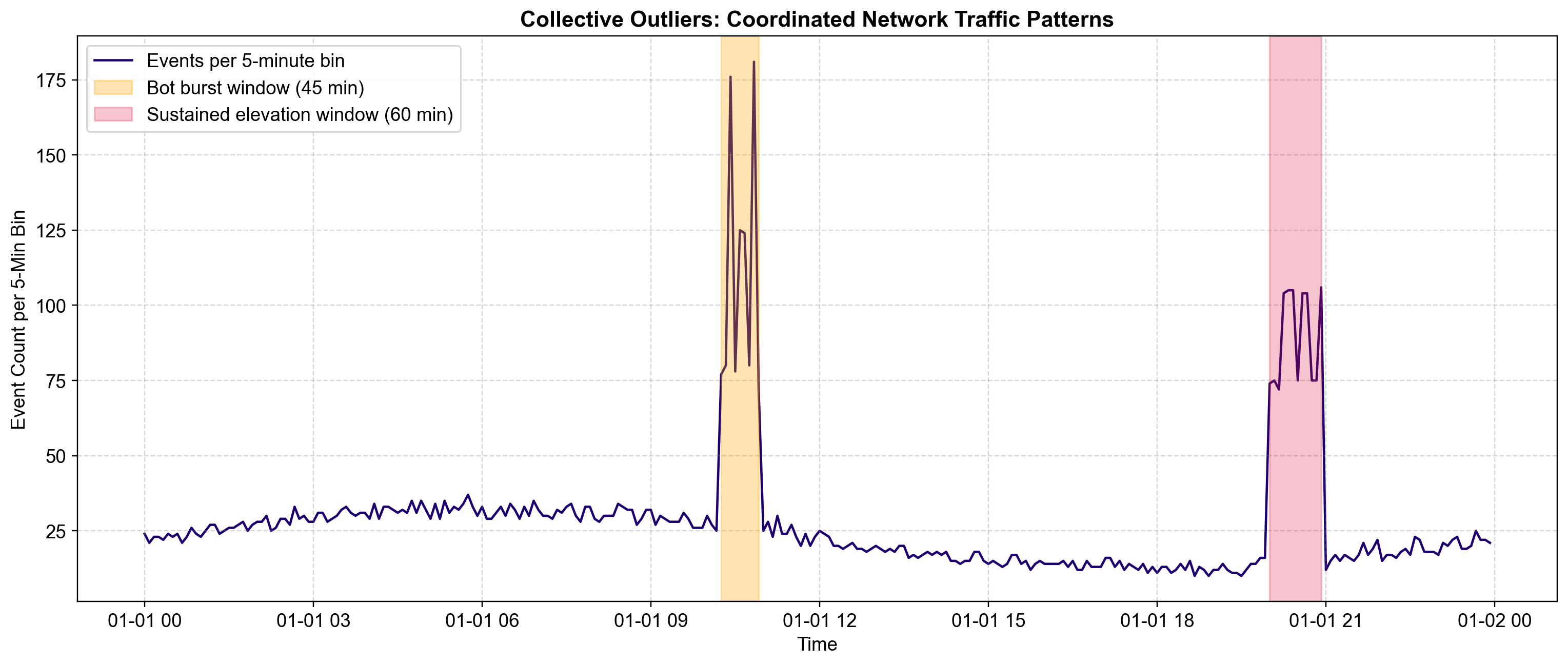
Fig. 5.7 Visualizing Collective Outliers. The blue line tracks network activity over 24 hours. The shaded regions highlight two groups of anomalies:#
Orange Region (10:15 AM): A sudden, dense burst of activity. While the peak values (~90 events) are not impossible, the density and rapid oscillation of this 45-minute sequence is unnatural compared to the smoother organic traffic around it.
Red Region (8:00 PM): A sustained plateau. The values (~50 events) are perfectly average. However, the lack of variance for 60 minutes is highly suspicious—real traffic fluctuates. This “flatline” behavior suggests a system hang or an automated script running at a fixed rate.
5.2.4. Choosing the Right Perspective#
Correctly classifying an outlier’s type is the single most important step in the detection pipeline. A mismatched method will not just fail—it will mislead you.
Table 5.1 table maps each of the three outlier scopes (Point, Contextual, Collective) to the fundamental assumption they violate and the specific family of algorithms best suited to detect them. Matching the method to the anomaly type is critical; for example, using a global IQR method (designed for Point outliers) will completely miss a Collective outlier like a system freeze, because the individual values remain within the interquartile range [Chandola et al., 2009].
Outlier Scope |
Underlying Assumption Violated |
Best Detection Strategies |
|---|---|---|
Point (Global) |
“This value is too extreme to exist in this dataset.” |
Univariate Statistics: Modified Z-Score, IQR Method, Box Plots, Isolation Forest (for high-dim data). |
Contextual |
“This value is plausible globally, but impossible right now.” |
Conditional Modeling: Seasonal Decomposition (STL), Rolling Statistics, Regression Residuals, Segmented Analysis (e.g., separate thresholds for Day/Night). |
Collective |
“These values are normal individually, but their sequence is unnatural.” |
Sequence Analysis: Change-Point Detection (PELT), Sliding Window Variance, Markov Models, LSTM Autoencoders. |
5.2.4.1. Practical Implications for Your Workflow#
Start Simple: Always check for Point Outliers first. They are the “low-hanging fruit” and often represent data quality issues (errors) that should be cleaned before more complex modeling.
Define Context: If your data has time, space, or category attributes, you likely have Contextual Outliers. Don’t just calculate a global mean; calculate a mean per hour or per region to find the true anomalies.
Watch the Pattern: If individual values look fine but the system behavior feels “off” (e.g., a frozen sensor), you are dealing with Collective Outliers. Stop looking at points and start looking at windows or sequences.
In the next sections, we will move from concepts to code, implementing specific algorithms for each of these categories—starting with the Modified Z-Score and IQR methods for robust point outlier detection.