Remark
Please be aware that these lecture notes are accessible online in an ‘early access’ format. They are actively being developed, and certain sections will be further enriched to provide a comprehensive understanding of the subject matter.
4.4. ARIMA Models#
4.4.1. The ARIMA Modeling Workflow: A Roadmap#
Before we explore the technical components of ARIMA models, let’s understand the modeling workflow at a high level. When we encounter a new time series in production—whether it’s API request rates, user engagement metrics, or system latency—we face a fundamental question: How do we systematically build a model that captures the temporal patterns in our data?
The ARIMA framework provides a structured approach built on three diagnostic questions:
Most real-world metrics aren’t stable—revenue grows, user counts increase, system load evolves. When the mean or variance changes systematically over time, we say the series is non-stationary. We’ll learn to diagnose this using statistical tests and transform non-stationary data into stable patterns through differencing (computing period-to-period changes). The number of differencing operations needed becomes our d parameter.
Once we have stable data, we need to understand its memory structure. Does today’s value depend strongly on yesterday’s value (persistence)? Or does it primarily respond to recent unexpected shocks (error correction)? These two mechanisms—autoregression and moving averages—capture different types of temporal dependence. We’ll learn to identify which mechanisms are active using diagnostic plots called ACF and PACF, which reveal correlation patterns at different time lags. This analysis guides our p and q parameters.
Theory and visual diagnostics suggest candidate models, but the ultimate test is performance. We fit multiple plausible specifications, compare them using information criteria (AIC/BIC) and out-of-sample forecast accuracy, and validate that the winning model’s residuals show no remaining patterns. This systematic comparison ensures we choose models that generalize well to new data.
4.4.1.1. The Three Building Blocks#
To answer these questions, we need to understand three fundamental mechanisms that ARIMA combines:
AR (AutoRegressive): Current values depend on past values—capturing persistence and momentum
MA (Moving Average): Current values depend on past forecast errors—capturing shock responses and corrections
I (Integration/Differencing): Transforming non-stationary data to stationary by modeling changes rather than levels
In the sections that follow, we’ll build intuition for each mechanism through concrete examples from data science practice. We’ll simulate each process to see the patterns it creates, learn to recognize these patterns in real data, and understand when each component is needed. By the end, you’ll have a systematic toolkit for diagnosing temporal structure and building appropriate ARIMA models for production forecasting systems.
4.4.2. The Building Blocks: AR, MA, and ARMA#
Before we can understand why ARIMA has become the workhorse model for time series forecasting in data science, we need to build intuition for its foundational components. Think of this section as learning the individual instruments before understanding how an orchestra works together.
We start with AR and MA processes, which assume our data is already stationary—meaning its statistical properties remain constant over time. This assumption is restrictive (most real data has trends), but understanding these building blocks first makes the full ARIMA framework much clearer. Once we see how AR and MA work on stationary data, we’ll understand why we need the “I” (Integration/differencing) component to handle non-stationary reality.
4.4.3. AR (AutoRegressive) Model: AR(p)#
In many real-world systems, today’s value naturally depends on yesterday’s value. Consider these common scenarios:
API Response Times: If our service’s average response time was 250ms yesterday, it is likely 240-260ms today, not 50ms or 2000ms—latency has persistence.
Daily Active Users (DAU): If 50,000 users logged in yesterday, we expect 48,000-52,000 today, not 10,000 or 200,000.
Server CPU Utilization: Yesterday’s 70% average usage predicts today’s 68-72% usage—workloads rarely change drastically overnight.
E-commerce Conversion Rates: If yesterday’s rate was 3.2%, today’s is likely 3.0-3.4%, not 1% or 8%.
This persistence is the essence of autoregression—the series is correlated with its own past values.
Mathematical Formulation:
where \(X_t\) is the current value, \(c\) is a baseline constant, \(\phi_1, \ldots, \phi_p\) are coefficients measuring the influence of past values, \(p\) is the order (how far back we look), and \(\varepsilon_t\) is a random shock (noise).
4.4.3.1. Example 1: AR(1) – Simple Persistence#
Suppose we fit an AR(1) model to a microservice’s daily error count:
Interpretation:
Baseline: If yesterday were “typical,” the process gravitates around a baseline error level (400 in our simulation below).
Persistence: If yesterday had abnormally high errors, today’s count will also be high, but only 75% of that excess carries over. The remaining 25% decays away.
Intuition: A high value today doesn’t vanish tomorrow; instead, it leans toward yesterday’s value.
This creates a “smooth” time series where excursions above or below the mean tend to persist for multiple days.
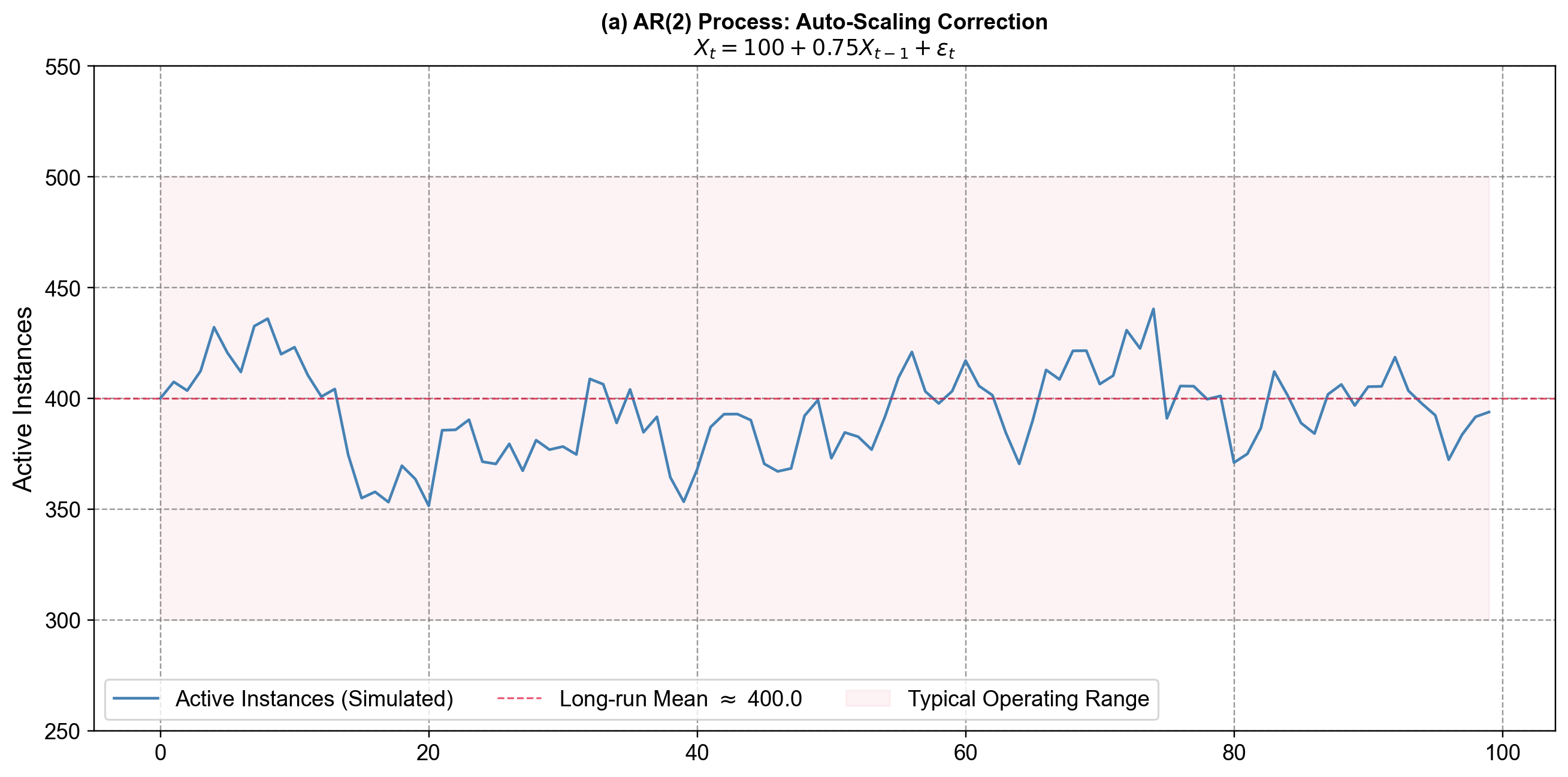
Fig. 4.11 Visualizing Persistence. An AR(1) process simulating daily error counts. The plot shows how the series fluctuates around a baseline level (mean = 400). Notice that when errors spike (e.g., around day 10 or day 60), they don’t disappear instantly but decay gradually over several days. This visual “smoothness”—where the line stays high or low for a stretch—is the hallmark of autoregressive processes with a positive coefficient (\(\phi_1=0.75\)).#
4.4.3.2. Example 2: AR(2) – Momentum plus Correction (Cloud Auto-Scaling)#
Now consider the number of active containers in an auto-scaling cluster. The system adds instances when load is high and terminates them when load falls. A simple model might be:
Think of this as “push-pull” dynamics:
Momentum term (\(\phi_1 = 0.6\)): If we scaled up last period, we are likely still somewhat scaled up now. Yesterday’s value pushes today’s in the same direction.
Correction term (\(\phi_2 = -0.3\)): If the system was very high two periods ago, the negative coefficient acts like a brake, pulling the series back down (e.g., the auto-scaler realizes it over-provisioned and terminates instances).
This combination of positive first lag and negative second lag produces gentle oscillations: the process overshoots, corrects, and then settles back toward its long-run mean.
Let’s simulate this AR(2) model to visualize this behavior compared to the smoother AR(1) process.
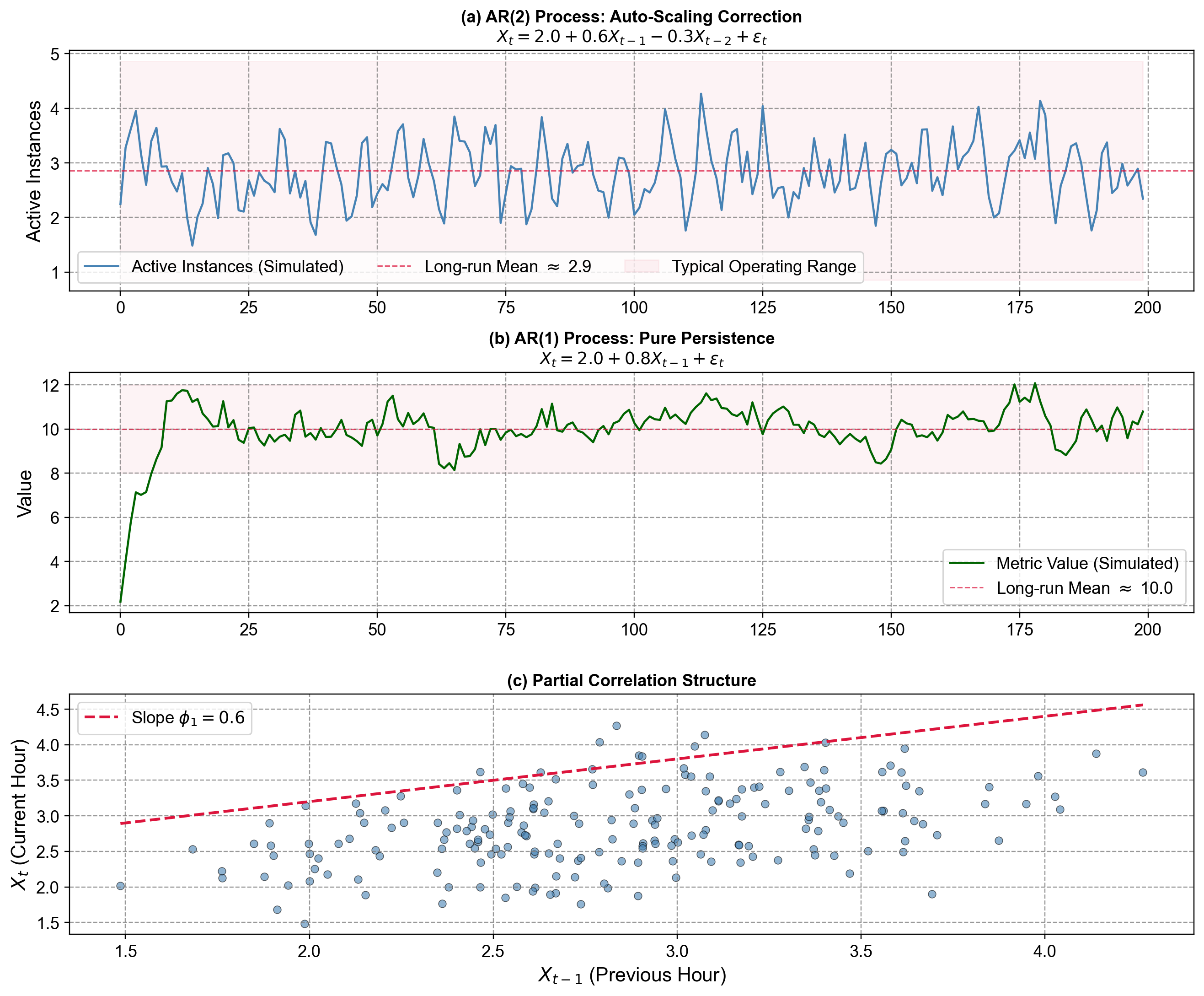
Fig. 4.12 Comparing AR Dynamics. (a) AR(2) Process: This series mimics our auto-scaling cluster. Notice the “wiggle”—when values spike, they tend to correct sharply downward shortly after. This is the effect of the negative \(\phi_2\) term (\(-0.3\)) acting as a dampener to prevent runaway growth. (b) AR(1) Process: By contrast, this series shows “pure momentum.” When it drifts above the mean, it tends to float there for longer periods. With only a positive \(\phi_1\) (\(0.8\)), there is no secondary correction force, resulting in smoother, wavier paths. (c) Lag Relationship: The scatter plot confirms the autoregressive nature: today’s value is strongly correlated with yesterday’s. The points cluster around the red line, but the spread is wider than a simple line because \(X_t\) also depends on the “hidden” variable \(X_{t-2}\).#
AR models excel when data shows state dependence—where the best predictor of the future is the immediate past. We commonly apply them to:
System Monitoring: CPU usage, memory consumption, and request latency, where workloads shift gradually.
User Analytics: Session counts or active users, which typically exhibit day-to-day inertia.
Anomaly Detection: We can flag observations that deviate significantly from the AR-predicted value. If the model predicts 50 active instances and we suddenly see 200, it indicates an incident (e.g., a DDoS attack) rather than normal organic growth.
Limitation: AR models are best for short-term horizons (1–5 steps ahead). Because they feed their own predictions back into the model to predict further out, errors compound rapidly, causing long-term forecasts to revert to the mean.
4.4.4. MA (Moving Average) Model: MA(q)#
While AR models capture persistence (high yesterday → high today), MA models capture a different phenomenon: shock propagation. Instead of depending on past values, the current observation depends on past forecast errors. This might sound abstract, so let’s see where this appears in practice:
A/B Test Metrics: When we launch a new feature, there’s an immediate user reaction (shock), but the impact fades over the next few days as novelty wears off
Alert Fatigue in Monitoring: When a false-positive alert fires, engineers ignore subsequent alerts for a short period (error propagation), then revert to normal vigilance
Inventory Adjustments: A stockout event causes temporary over-ordering to compensate (shock response), which corrects within 1-2 periods
Marketing Campaign Effects: An email blast drives a traffic spike (shock), which decays over 24-48 hours as recipients act and then stop
In each case, a disturbance has temporary but predictable influence on subsequent observations—this is the essence of the MA process.
Mathematical Formulation:
where \(\mu\) is the series mean, \(\varepsilon_t\) is the current random shock, \(\theta_1, \theta_2, \ldots, \theta_q\) are coefficients determining how much past shocks influence the current value, and \(q\) is the MA order (how many past shocks we include).
4.4.4.1. Reading the Model#
Suppose we model daily website signup rate deviations from baseline as \(X_t = 0 + \varepsilon_t - 0.3 \varepsilon_{t-1}\). This tells us:
Today’s deviation from baseline is primarily driven by today’s random events (\(\varepsilon_t\))
But if yesterday had a positive shock (e.g., viral social media post driving +500 signups), today we see a correction of \(-0.3 \times (+500) = -150\) signups as the viral effect fades
The negative coefficient creates mean reversion: unexpected surges are followed by slight dips back toward normal
4.4.4.2. Example: MA(1) for Database Query Latency Anomalies#
Imagine we’re monitoring query latency deviations from our 50ms baseline. We might model anomalies as:
This captures:
Latency spikes are primarily driven by current events (network blip, query optimization issue)
If last minute had a +20ms spike (shock), this minute shows a slight over-correction of \(-0.4 \times 20 = -8ms\) as the system recovers
Unlike AR models (where high yesterday → high today), MA models exhibit rapid mean reversion
Let’s simulate this MA(1) model to see how shocks propagate:
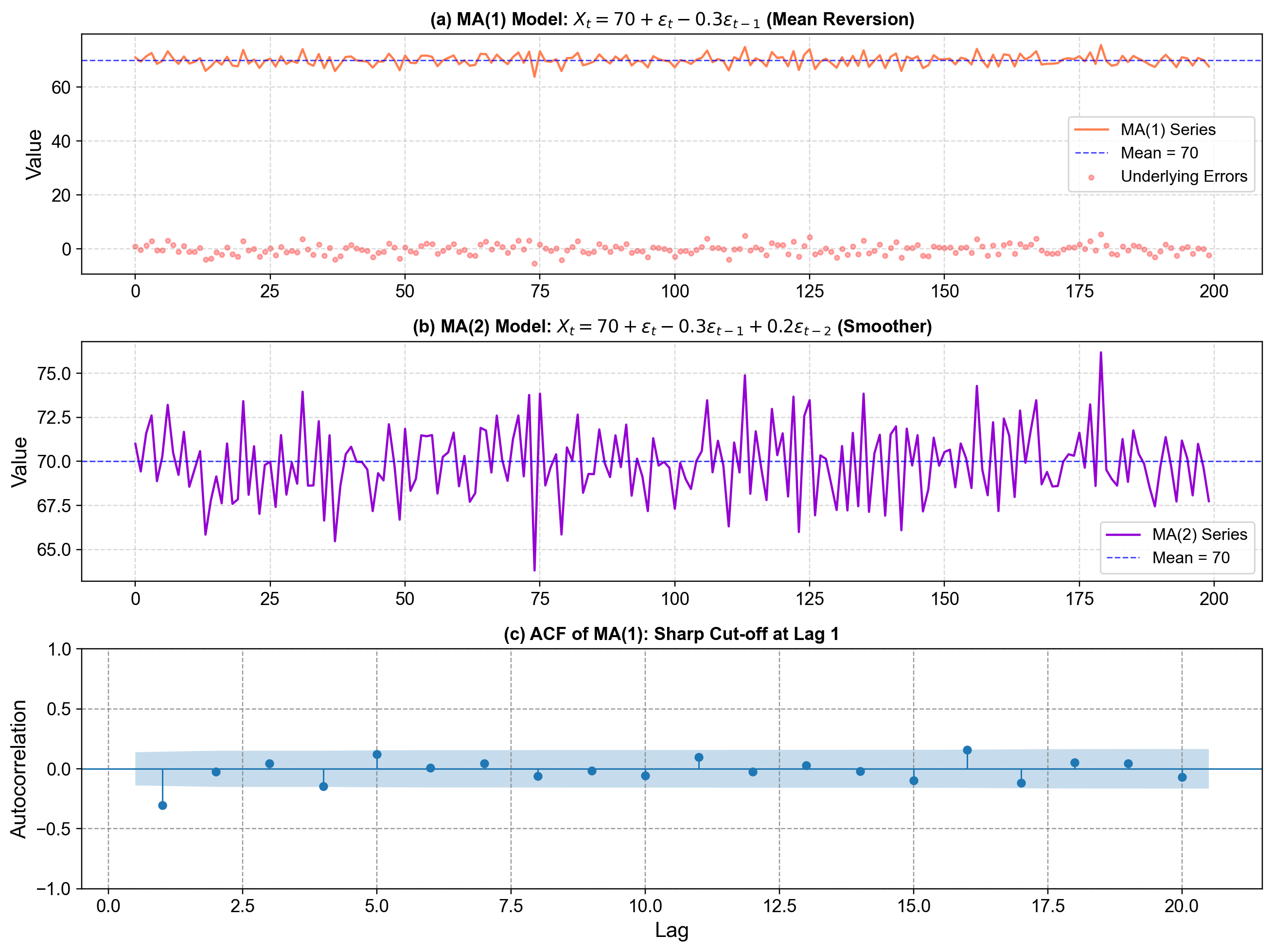
Fig. 4.13 MA(1) and MA(2) process visualization. (a): One simulated MA(1) time series from the model \(X_t = 70 + \varepsilon_t - 0.3 \varepsilon_{t-1}\), plotted together with the horizontal blue dashed line at the long‑run mean 70 and the underlying white‑noise errors as red points; this panel shows how each random shock \(\varepsilon_t\) hits the series but is partially undone by the \(-0.3 \varepsilon_{t-1}\) term on the next step, producing quick mean reversion back toward 70. (b): A simulated MA(2) series from \(X_t = 70 + \varepsilon_t - 0.3 \varepsilon_{t-1} + 0.2 \varepsilon_{t-2}\), again around mean 70, which looks smoother because each value averages over two past errors—the extra \(\varepsilon_{t-2}\) term spreads the effect of shocks out over more periods and reduces the variability seen in the summary statistics printed below the plot. (c): The sample autocorrelation function (ACF) of the MA(1) series, showing a strong spike at lag 1 and then values near zero for higher lags, illustrating the theoretical property that an MA(1) process has non‑zero autocorrelation only at lag 1, with a sharp cut‑off after that.#
Observations in Fig. 4.13:
Both MA series fluctuate around the constant mean 70 and do not drift, because the model is built as “mean + noise + weighted past noise,” so there is no autoregressive component that could push the mean level up or down over time.
Individual shocks \(\varepsilon_t\) have temporary influence: in the MA(1) case, a positive shock today raises \(X_t\), but tomorrow the \(-0.3 \varepsilon_{t-1}\) term partially cancels it out, which you can see in the top panel as upward spikes that quickly drop back toward the blue mean line.
The negative coefficient \(\theta_1 = -0.3\) induces a slight “zig‑zag” behavior: a positive error today tends to be followed by a slightly lower value tomorrow, and conversely, which is why the MA(1) path wiggles around the mean rather than moving in long runs in one direction.
Comparing the printed standard deviations, the MA(2) series has smaller variability than the MA(1) series, reflecting the more damped, smoothed behavior visible in the middle panel—aggregating two past errors spreads shock effects out and reduces their impact at any single time step.
The ACF panel shows the fingerprint of an MA(1) process: a large, significant autocorrelation at lag 1 and near‑zero autocorrelations for lags 2 and beyond, which is exactly the pattern theory predicts for MA(q) models (non‑zero up to lag q, then a sharp cut‑off).
4.4.5. ARMA (Combined): ARMA(p,q)#
Most real-world systems exhibit both persistence and shock response simultaneously. Consider these scenarios:
Cloud Resource Utilization: CPU usage shows daily patterns that persist hour-to-hour (AR), but deployments cause temporary spikes that quickly normalize (MA)
E-commerce Conversion Rates: Baseline rates show day-of-week persistence (AR), but flash sales create temporary bumps followed by rapid reversion (MA)
Model Prediction Latency: Typical response times persist based on workload (AR), but cache clears cause brief slowdowns that self-correct (MA)
User Session Duration: Average session length shows weekly patterns (AR), but new feature launches create temporary engagement spikes that fade (MA)
When our data combines these behaviors—both momentum from past values and temporary shock effects—we need the ARMA framework that unifies AR and MA components.
Mathematical Formulation:
where the AR part (\(\phi\) coefficients) captures momentum and persistence, the MA part (\(\theta\) coefficients) captures shock absorption and mean reversion, and together they create a more flexible model for complex temporal patterns.
4.4.5.1. Reading the Model#
Suppose we model hourly API request volume as \(X_t = 5000 + 0.7 X_{t-1} + \varepsilon_t - 0.4 \varepsilon_{t-1}\). This tells us:
Base traffic is 5,000 requests per hour
The AR component (\(\phi_1 = 0.7\)) means 70% of last hour’s deviation from baseline persists—if last hour was busy, this hour tends to stay busy
The MA component (\(\theta_1 = -0.4\)) means if last hour had an unexpected surge (positive shock), we see a 40% correction this hour as the surge effect fades
Together: sustained increases persist (AR), but temporary spikes self-correct (MA)
4.4.5.2. xample: ARMA(1,1) for ML Model Throughput#
Imagine we’re monitoring predictions per second (PPS) for a deployed model. We might model deviations from baseline as:
This captures:
Baseline throughput of 1,000 PPS
If last minute had high throughput, this minute likely continues high (AR persistence from sustained load)
But if last minute had a sudden spike (e.g., batch job), we see partial correction this minute (MA mean reversion)
The balance between persistence and correction creates realistic dynamics
Let’s simulate this ARMA(1,1) model and compare it to pure AR:
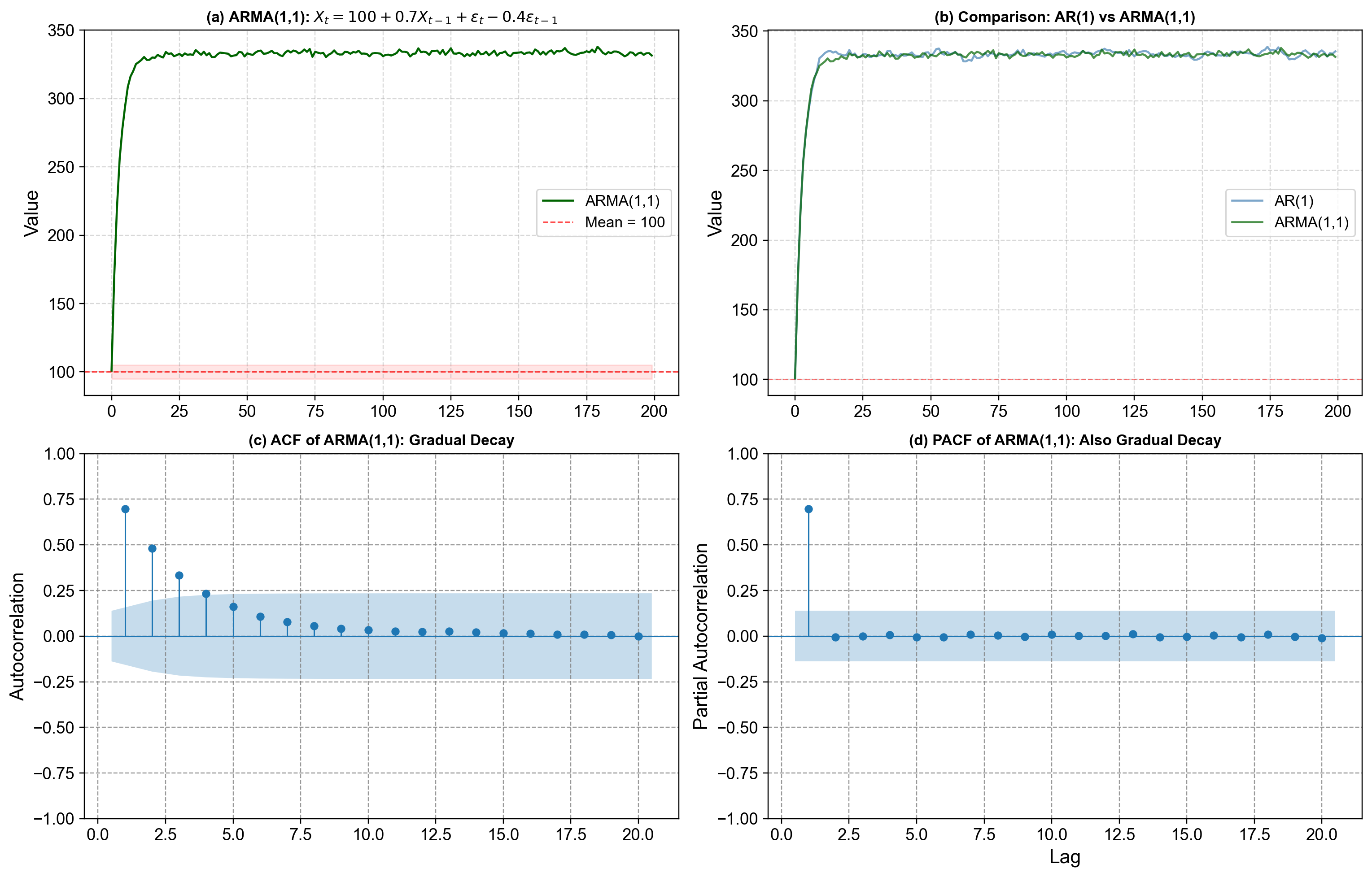
Fig. 4.14 ARMA(1,1) process visualization. Top-left: One simulated ARMA(1,1) series from the model \(X_t = 100 + 0.7 X_{t-1} + \varepsilon_t - 0.4 \varepsilon_{t-1}\), plotted with a red dashed line at the long‑run mean 100 and a light band from \(c-5\) to \(c+5\), showing that the process stays in a stable range while exhibiting both persistence (values “remember” where they came from) and mean reversion (shocks do not permanently shift the level). Top-right: A side‑by‑side comparison of a pure AR(1) series with \(X_t = 100 + 0.7 X_{t-1} + \varepsilon_t\) and the ARMA(1,1) series, where both share the same AR coefficient 0.7, but the ARMA path is visibly more stable and less volatile because the MA part \(-0.4 \varepsilon_{t-1}\) counteracts part of each shock and dampens swings. Bottom-left: The sample autocorrelation function (ACF) of the ARMA(1,1) series, which decays gradually rather than cutting off sharply at a specific lag, reflecting the combined influence of AR and MA terms. Bottom-right: The partial autocorrelation function (PACF), which also decays gradually instead of stopping abruptly, reinforcing the idea that neither a pure AR nor a pure MA pattern is present—both components are active in shaping the dependence structure.#
Observations in Fig. 4.14:
The AR component with \(\phi = 0.7\) generates persistence: when the series moves above or below 100, it tends to stay on that side for a while, which you can see in the long runs of high or low values in the ARMA path and in the AR(1) comparison.
The MA component with \(\theta = -0.4\) introduces mean reversion: a positive shock today is partially offset tomorrow by the negative multiple of yesterday’s error, so extreme moves are pulled back toward the mean more quickly than in the pure AR(1) case, leading to a smaller standard deviation in the printed summary.
Because AR and MA effects are both present, the ACF and PACF do not show the clean “cut‑off” patterns of pure AR or pure MA models; instead, they both taper off gradually over several lags, which is the typical diagnostic signature of an ARMA process.
ARMA(1,1) is therefore more flexible than either AR(1) or MA(1) alone: it can represent data where there is both noticeable momentum and clear shock‑correction behavior, making it a natural choice when the ACF/PACF patterns do not strongly favor a purely AR or purely MA specification.
4.4.6. When ARMA Breaks Down: The Non-Stationarity Problem#
The ARMA models we’ve explored—whether pure AR, pure MA, or combined ARMA—share a critical assumption: the time series must be stationary . Stationarity means the series has constant mean, constant variance, and stable autocorrelation structure over time . This requirement isn’t just a mathematical nicety—it’s fundamental to how these models work .
Consider what happens when we violate this assumption in practice:
Cloud Cost Data: Our monthly AWS spend has increased from \(5,000 to \)50,000 over three years as the product scales. An ARMA model assumes a constant baseline level \(c\), but here the “baseline” itself is rising. The model has no mechanism to track this upward drift—it will systematically underpredict future costs because it keeps reverting to an outdated mean.
User Engagement Metrics: Daily active users (DAU) show clear growth—from 10k to 100k users over two years. If we fit an ARMA model, the AR component will create persistence around the wrong level. The model learned that “high values around 30k” tend to follow “high values around 30k,” but when the current level reaches 80k, those learned patterns become irrelevant.
Stock Prices: Equity prices exhibit strong momentum without mean reversion—they can trend upward for years without returning to historical levels. An ARMA model will struggle catastrophically because its fundamental assumption (eventual reversion to a stable mean) is violated .
The mathematical issue is that ARMA parameters (\(\phi\), \(\theta\), \(c\)) estimated on data with mean 100 won’t generalize when the mean shifts to 200 . The model’s entire learned structure becomes obsolete as the series evolves.
4.4.6.1. The Solution: Differencing#
The key insight that leads to ARIMA is remarkably simple: if the level is changing but the rate of change is stable, model the changes instead of the levels . This transformation is called differencing:
When we apply first differencing to our AWS cost data ($5k → \(50k\) over 36 months), we get monthly changes that fluctuate around a stable mean increase of roughly \(+1,250\) per month. This differenced series is stationary—it has no drift, and ARMA models can now work .
The “I” in ARIMA stands for “Integrated,” which is the mathematical inverse of differencing. An ARIMA(p,d,q) model works by:
Differencing the data \(d\) times to achieve stationarity
Fitting an ARMA(p,q) model to the differenced data
Integrating (cumulative summing) the forecasts back to the original scale
This framework elegantly extends ARMA to handle non-stationary data without abandoning the AR and MA structures we’ve learned. We now turn to see how this works in practice.
4.4.7. Putting It All Together: Diagnosing and Selecting ARIMA Models#
Now that we understand what AR, MA, and differencing do individually, we can tackle the central modeling challenge: Given a time series, how do we systematically choose the appropriate values for p, d, and q?
The answer emerges from a three-stage diagnostic workflow, where each stage maps directly to the components we’ve just learned.
4.4.7.1. Stage 1: Achieving Stationarity (Determining d)#
The first diagnostic question is whether our data is stationary. Recall from the previous section that ARMA models assume constant mean and variance—but real data often has trends. We need to apply differencing until the series becomes stationary.
Consider our earlier example: global life expectancy rose approximately 14 years from 1960 to 2018, exhibiting a clear upward trend. The original series is non-stationary because its mean increases systematically. However, computing the year-to-year change (first difference) gives us a series that fluctuates around a stable mean—this differenced series is stationary.
We formalize this diagnostic using the Augmented Dickey-Fuller (ADF) test, which provides a statistical hypothesis test for stationarity:
Null hypothesis: Series has a unit root (non-stationary)
Alternative: Series is stationary
Decision rule: If p-value < 0.05, reject null → series is stationary
The workflow:
Apply ADF test to original data
If p-value > 0.05, apply first difference and retest
If still non-stationary, apply second difference
The number of differences needed is your d parameter
In practice, most economic and environmental time series require \(d=0\) (already stationary), \(d=1\) (one difference), or occasionally \(d=2\) (two differences). Values of d > 2 are rare and suggest the series may need a different modeling approach.
4.4.7.2. Stage 2: Identifying Autocorrelation Structure (Determining p and q)#
Once we have stationary data (either original or differenced), we analyze its autocorrelation structure using two complementary diagnostic tools:
ACF (Autocorrelation Function): Measures total correlation at each lag, including both direct and indirect effects. Recall that MA(q) processes have a distinctive ACF signature—they show significant correlation up to lag q, then cut off sharply to near-zero values beyond that lag.
PACF (Partial Autocorrelation Function): Measures direct correlation at each lag, controlling for intermediate lags. AR(p) processes have a distinctive PACF signature—they show significant partial correlation up to lag p, then cut off sharply.
Reading the patterns: Now that you’ve seen how AR and MA processes behave, these diagnostic rules should make intuitive sense:
ACF cuts off at lag q, PACF decays gradually → Pure MA(q) process
Example: ACF significant only at lag 1 suggests MA(1)
PACF cuts off at lag p, ACF decays gradually → Pure AR(p) process
Example: PACF significant only at lags 1 and 2 suggests AR(2)
Both ACF and PACF decay gradually → Mixed ARMA(p,q) process
Example: Both decay slowly suggests ARMA(1,1) or ARMA(2,1)
In practice, we identify 2-3 candidate models from these patterns. For instance, if ACF cuts off after lag 1 and PACF decays, we might test MA(1), MA(2), and ARMA(1,1) to see which performs best.
4.4.7.3. Stage 3: Model Comparison and Selection#
With several candidate models identified from ACF/PACF analysis, we fit each specification and compare using three criteria:
AIC/BIC (Information Criteria): Balance model fit against complexity using the formulas:
where \(L\) is the likelihood, \(k\) is the number of parameters, and \(n\) is the sample size. Lower values indicate better models. BIC penalizes complexity more heavily than AIC, so it tends to favor simpler models.
Out-of-Sample RMSE: Information criteria measure in-sample fit, but the ultimate test is out-of-sample forecast accuracy. We always hold out a test set (typically 15-20% of data) and compare forecast RMSE. The model with lowest test error wins.
Residual Diagnostics: Even if a model has good AIC and test error, we must verify that residuals behave like white noise:
No significant autocorrelation (Ljung-Box test p-value > 0.05)
Approximately normal distribution (Q-Q plot)
Constant variance over time (no heteroscedasticity)
If residuals show patterns, the model is missing structure and we need to try different orders.
The Complete Workflow
Putting it all together, here’s the systematic process we follow:
Test stationarity (ADF test) → Determine d
Difference d times (if d > 0) → Obtain stationary series
Plot ACF/PACF → Identify candidate (p, q) combinations
Fit 2-4 candidate models → Compare AIC/BIC
Validate on test data → Measure out-of-sample RMSE
Check residuals → Verify white noise assumption
Select final model → Best balance of criteria
This disciplined approach ensures we build models that both capture the true data-generating process (via ACF/PACF diagnosis) and generalize well to new data (via test set validation). We now apply this workflow to real datasets.