6.6. Seaborn plots#
Seaborn is a popular Python data visualization library based on Matplotlib. It provides a high-level interface for creating attractive and informative statistical graphics. Seaborn is built on top of Matplotlib and integrates well with Pandas data structures, making it an excellent choice for data visualization and exploration tasks [Waskom, 2021]. Key features of Seaborn:
High-level interface: Seaborn allows you to create complex visualizations with just a few lines of code, making it easy to explore and communicate insights from your data.
Attractive default styles: Seaborn comes with visually appealing default styles, which makes your plots look great right out of the box.
Support for statistical plots: Seaborn includes a variety of statistical plots, such as scatter plots, line plots, bar plots, box plots, violin plots, heatmaps, and more. These plots often include informative summaries of data distribution and relationships.
Integration with Pandas: Seaborn works seamlessly with Pandas DataFrames, allowing you to easily visualize and analyze your data.
Color palettes: Seaborn provides a range of color palettes, including categorical, sequential, and diverging, making it easy to customize the appearance of your visualizations.
Facet grids: Seaborn supports the creation of facet grids, allowing you to create multiple plots, each showing a different subset of the data, based on one or more categorical variables.
To use Seaborn, you need to have it installed in your Python environment. You can install Seaborn using pip:
>>> pip install seaborn
Once installed, you can import Seaborn in your Python script or Jupyter Notebook and start creating beautiful visualizations. Here’s an example of how to create a scatter plot using Seaborn:
Note
Seaborn is pre-installed in Google Colab as of September 2023.
Seaborn is a Python data visualization library based on Matplotlib that provides a higher-level interface for creating attractive and informative statistical graphics. It simplifies the process of creating various types of plots while offering enhanced aesthetics and better support for working with structured data. Table 6.10 lists the common types of plots in Seaborn along with a brief description of each:
Plot Type |
Description |
|---|---|
Bar Plot |
Display categorical data as rectangular bars. |
Box Plot |
Display the distribution of data based on quartiles. |
Count Plot |
Show the count of observations in each category. |
Facet Grid |
Create a grid of plots based on combinations of categorical variables. |
Heatmap |
Display a matrix where each cell is represented by color based on the data values. |
Histogram |
Represent the distribution of a continuous variable. |
Joint Plot |
Show the joint distribution of two variables with their respective univariate distributions. |
Line Plot |
Show the trend of a continuous variable over a continuous x-axis. |
Pair Plot |
Create pairwise scatter plots for multiple numerical variables. |
Regression Plot |
Display linear regression models. |
Scatter Plot |
Visualize the relationship between two continuous variables. |
Violin Plot |
Combines a box plot with a KDE (Kernel Density Estimate) plot. |
6.6.1. Line Plot#
A line plot is a common type of data visualization that displays data points connected by straight lines [Waskom, 2021]. It is particularly useful for visualizing trends, changes over time, and the relationship between two numerical variables. Seaborn’s sns.lineplot() function allows you to create line plots with ease, and it provides various options for customization. Here’s an explanation of how to use sns.lineplot():
Usage: Line plots are used to show the trend or progression of a variable over a continuous axis, such as time, while connecting the data points to visualize the overall pattern or trajectory.
Seaborn Library: Seaborn is a Python data visualization library built on Matplotlib.
sns.lineplot()is part of Seaborn’s collection of plot functions.Syntax: The basic syntax for creating a line plot with Seaborn is:
sns.lineplot(x, y, data, hue, style, markers). Here,xandyare the variables to be plotted on the x-axis and y-axis, respectively.datais the DataFrame containing the data, andhue,style, andmarkers(all optional) allow you to differentiate lines based on categorical variables and customize the appearance of the lines and data points. You can see the full function descrition here.Line Plot Features:
Line Connection: The main feature of a line plot is that it connects the data points with straight lines, emphasizing the trend or pattern in the data.
Coloring (Hue): The
hueparameter allows you to color the lines based on a categorical variable, making it easier to distinguish different groups or categories in the data.Styling (Style): The
styleparameter lets you customize the line styles (e.g., solid, dashed, dotted) based on a categorical variable, providing additional information.Markers: You can add markers (e.g., circles, triangles) at the data points using the
markersparameter, making it easier to identify individual data points on the line.
Customization: Seaborn provides various customization options, such as setting plot aesthetics (line colors, styles, marker types), adding labels and titles, adjusting axis limits, and more.
Interpretation: When interpreting a line plot, focus on the overall trend of the line, any significant changes or inflection points, the relative behavior of different lines (if using
hue), and the variability or dispersion of the data points around the line.Data Preparation: Ensure that the data is properly organized and relevant for the line plot. Handle missing values and ensure that the variables being plotted on the x-axis and y-axis are suitable for a line plot (typically numerical variables).
Example: The dataset was obtained from https://data.calgary.ca/stories/s/9phu-xb4j and pertains to Water Temperature (in degrees Celsius) at the Fish Creek 37th St Calgary Station (SUR_FC-37).
Description of the Dataset Columns:
Date: The date and time corresponding to each temperature measurement.
Water Temperature: The recorded water temperature in degrees Celsius (°C).
We are analyzing water temperature data from the Fish Creek 37th St Calgary Station. The goal is to understand the trends and patterns in water temperature over time by calculating and visualizing the monthly average temperatures.
The calculated monthly average water temperatures:
| Date | Water Temperature | |
|---|---|---|
| 0 | 2000-01-01 | 0.000 |
| 1 | 2000-02-01 | 1.500 |
| 2 | 2000-03-01 | -1.000 |
| 3 | 2000-04-01 | 15.000 |
| 4 | 2000-05-01 | 9.300 |
| ... | ... | ... |
| 279 | 2023-04-01 | 1.100 |
| 280 | 2023-05-01 | 8.400 |
| 281 | 2023-06-01 | 16.800 |
| 282 | 2023-07-01 | 18.056 |
| 283 | 2023-08-01 | 15.053 |
284 rows × 2 columns
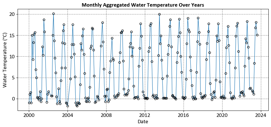
In the above figure:
Horizontal Axis (Date): This axis ranges from the year 2000 to just before 2024, showing the timeline over which the water temperature data was collected.
Vertical Axis (Water Temperature in °C): This axis ranges from 0°C to 20°C, indicating the recorded water temperatures.
Data Points: Each point represents the water temperature for a specific month and year. The points are connected with vertical lines to emphasize the monthly aggregation.
This visualization helps observe trends and variations in water temperature over approximately 24 years.
The primary limitation of the previous plot, while aesthetically pleasing, is its lack of substantive information. It fails to depict the trendline or the relationship between the variable on the x-axis (Date) and the one on the y-axis (Water Temperature). For a more informative visualization, I suggest the following plot.
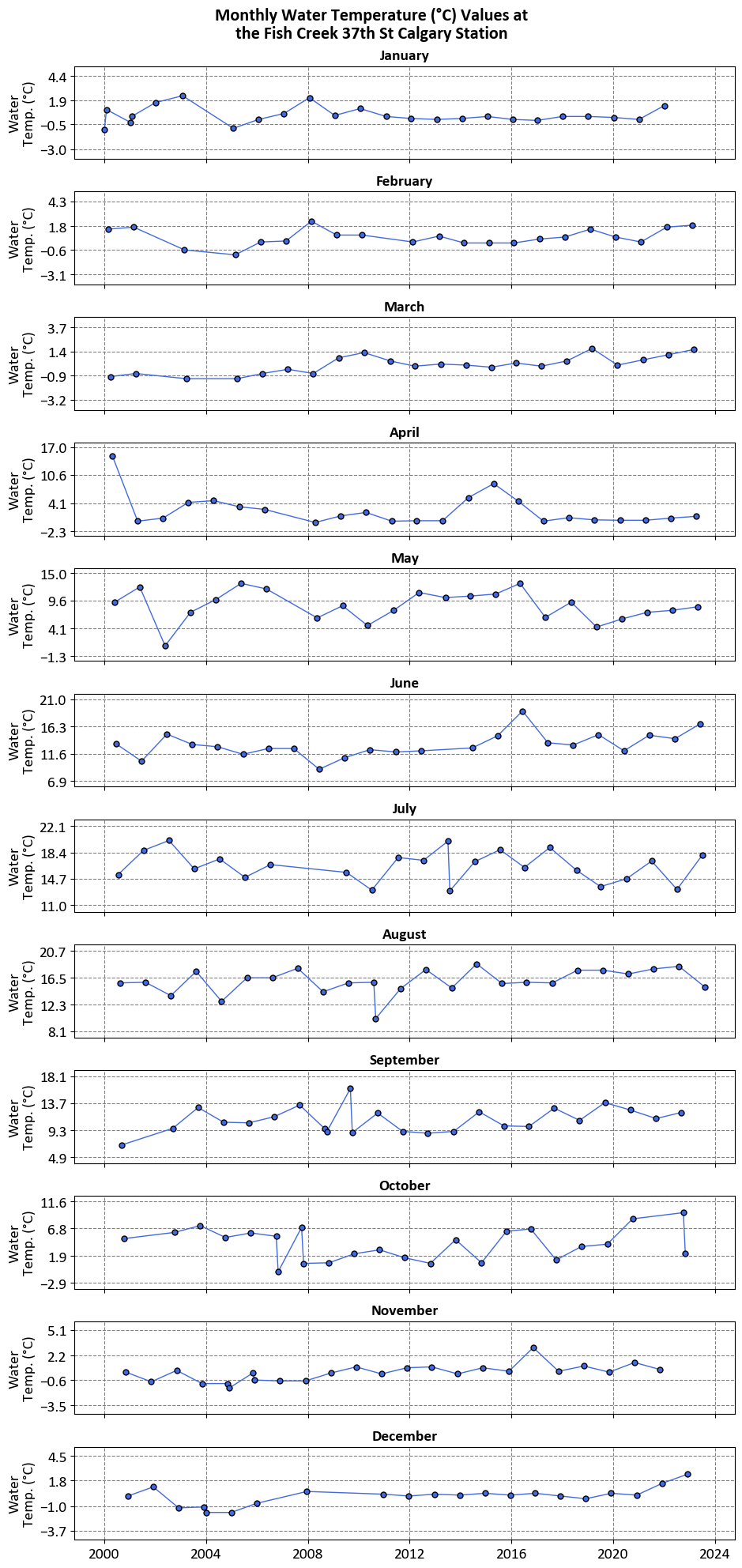
The graphs aim to visualize the water temperature values for each month from January to December over several years. This helps in understanding how water temperatures vary month-to-month and year-to-year.
Monthly Breakdown:
Each graph corresponds to a different month, starting with January at the top and ending with December at the bottom.
The x-axis represents the years, ranging from 2000 to 2014.
The y-axis represents the water temperature in degrees Celsius.
Data Points:
Data points are plotted and connected by lines, showing fluctuations in water temperature over time for each month.
This allows for easy comparison of temperature trends across different years for the same month.
However, now we cannot comment on the overall trend, and later we will use replot to demonstrate the trends.
6.6.2. Scatter Plot#
A scatter plot is a fundamental visualization in data analysis that displays individual data points as dots in a two-dimensional space, with one variable plotted on the x-axis and another on the y-axis [Waskom, 2021]. Seaborn’s sns.scatterplot() is a function used to create scatter plots, and it offers several useful features for customizing the appearance of the plot. Here’s an explanation of how to use sns.scatterplot():
Usage: Scatter plots are used to visualize the relationship between two numerical variables, allowing you to identify patterns, trends, clusters, correlations, and outliers.
Seaborn Library: Seaborn is a Python data visualization library that provides a high-level interface for creating informative and aesthetically pleasing plots.
sns.scatterplot()is part of Seaborn’s toolkit.Syntax: The basic syntax for creating a scatter plot with Seaborn is:
sns.scatterplot(x, y, data, hue, size, style). Here,xandyare the variables to be plotted on the x-axis and y-axis, respectively.datais the DataFrame containing the data, andhue,size, andstyle(all optional) allow you to add additional dimensions by coloring, sizing, and styling the data points based on categorical variables. You can see the full function descrition here.Scatter Plot Features:
Data Points: Each data point is represented as a dot on the plot, with its position determined by the values of the two variables being compared.
Transparency: When data points overlap, scatter plots can benefit from transparency, allowing you to see the density of points in congested regions.
Coloring (Hue): You can use the
hueparameter to color the data points based on a categorical variable, making it easier to distinguish different groups or categories.Sizing (Size): The
sizeparameter allows you to adjust the size of the data points based on a numerical variable, which can help emphasize the significance or quantity associated with each data point.Styling (Style): The
styleparameter lets you apply different marker styles to the data points based on a categorical variable, adding an extra dimension of information.
Customization: Seaborn provides various customization options, such as setting plot aesthetics (colors, markers, line styles), adding labels and titles, adjusting axis limits, and more.
Interpretation: When interpreting a scatter plot, observe the overall trend of the data points (linear, nonlinear, no trend), the spread or concentration of points, the relationship between the variables, any clustering or grouping, and the presence of outliers.
Data Preparation: Ensure that the data is cleaned and relevant for the scatter plot. Handle missing values and ensure that the variables being compared are suitable for a scatter plot (typically numerical variables).
Example: In this example, we use Average Weekly Earnings (including overtime). Average weekly earnings result from dividing total weekly income by the employee count, encompassing overtime pay and excluding unclassified businesses. Data is based on gross taxable payroll before deductions and available annually on the OSI website.
| Reference Date | Geography | NAICS | Value | |
|---|---|---|---|---|
| 0 | 2001-01-01 | Canada | Industrial aggregate including unclassified bu... | 12918423.00 |
| 1 | 2001-01-01 | Canada | Industrial aggregate excluding unclassified bu... | 12839228.00 |
| 2 | 2001-01-01 | Canada | Goods producing industries [11-33N] | 2914169.00 |
| 3 | 2001-01-01 | Canada | Forestry, logging and support [11N] | 70073.00 |
| 4 | 2001-01-01 | Canada | Mining, quarrying, and oil and gas extraction ... | 136744.00 |
| ... | ... | ... | ... | ... |
| 211675 | 2024-04-01 | Nunavut | Health care and social assistance [62] | 1638.19 |
| 211676 | 2024-04-01 | Nunavut | Arts, entertainment and recreation [71] | NaN |
| 211677 | 2024-04-01 | Nunavut | Accommodation and food services [72] | 861.71 |
| 211678 | 2024-04-01 | Nunavut | Other services (except public administration) ... | 1668.94 |
| 211679 | 2024-04-01 | Nunavut | Public administration [91] | 1804.33 |
211680 rows × 4 columns
| Reference Date | Geography | NAICS | Value | |
|---|---|---|---|---|
| 0 | 2022-01-01 | Alberta | Forestry, logging and support [11N] | 3724.00 |
| 1 | 2022-01-01 | Alberta | Utilities [22] | 15775.00 |
| 2 | 2022-01-01 | Alberta | Information and cultural industries [51] | 25428.00 |
| 3 | 2022-01-01 | Alberta | Real estate and rental and leasing [53] | 37119.00 |
| 4 | 2022-01-01 | Alberta | Management of companies and enterprises [55] | 18698.00 |
| ... | ... | ... | ... | ... |
| 275 | 2024-04-01 | Alberta | Forestry, logging and support [11N] | 1499.37 |
| 276 | 2024-04-01 | Alberta | Utilities [22] | 2133.23 |
| 277 | 2024-04-01 | Alberta | Information and cultural industries [51] | 1549.91 |
| 278 | 2024-04-01 | Alberta | Real estate and rental and leasing [53] | 1401.35 |
| 279 | 2024-04-01 | Alberta | Management of companies and enterprises [55] | 2158.63 |
280 rows × 4 columns
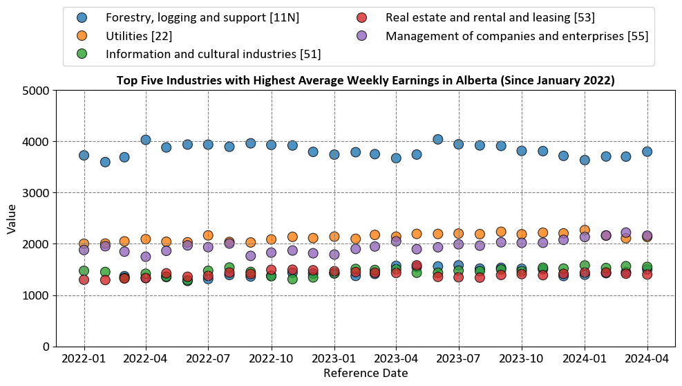
The chart aims to visualize the average weekly earnings for the top five industries in Alberta from January 2022 to April 2024. This helps in understanding which industries have the highest earnings over this period.
Industries Represented:
Forestry, logging and support [11N]
Utilities [22]
Information and cultural industries [51]
Real estate and rental and leasing [53]
Management of companies and enterprises [55]
Axes:
X-Axis (Reference Date): Shows the timeline from January 2022 to April 2024.
Y-Axis (Value): Represents the average weekly earnings in Canadian dollars.
6.6.3. Bar Plot#
A bar plot is a common type of data visualization used to display the distribution of categorical data or the relationship between categorical and numerical variables [Waskom, 2021]. Seaborn’s sns.barplot() function allows you to create bar plots with ease, and it provides options for aggregating data and customizing the appearance of the bars. Here’s an explanation of how to use sns.barplot():
Usage: Bar plots are used to compare the values of different categories, display frequencies or counts of categorical variables, and visualize the relationship between categorical and numerical variables.
Seaborn Library: Seaborn is a Python data visualization library built on top of Matplotlib.
sns.barplot()is part of Seaborn’s collection of plot functions.Syntax: The basic syntax for creating a bar plot with Seaborn is:
sns.barplot(x, y, data, hue, estimator, ci). Here,xandyare the variables to be plotted on the x-axis and y-axis, respectively.datais the DataFrame containing the data, andhue,estimator, andci(all optional) allow you to differentiate bars based on categorical variables, aggregate data, and show confidence intervals around the bars. You can see the full function descrition here.Bar Plot Features:
Bars: The main feature of a bar plot is the vertical (or horizontal) bars that represent the values of different categories or groups. The height (or width) of the bars corresponds to the aggregated values, such as the mean, count, or sum of a numerical variable within each category.
Coloring (Hue): The
hueparameter allows you to differentiate bars based on a categorical variable, creating grouped bar plots where each group represents a different category.Aggregation (Estimator): The
estimatorparameter specifies the aggregation function to be applied to the data within each category. Common options include “mean,” “count,” “sum,” etc.Confidence Intervals (ci): The
ciparameter controls whether to display confidence intervals around the bars, providing a visual representation of the uncertainty in the aggregated values.
Customization: Seaborn provides various customization options, such as setting bar colors, adding labels and titles, adjusting axis limits, and more.
Interpretation: When interpreting a bar plot, focus on the heights (or widths) of the bars, which represent the values of the data within each category or group. Observe the relative differences between the bars, any patterns or trends, and the variation in the data.
Data Preparation: Ensure that the data is properly formatted for the bar plot. Handle missing values, encode categorical variables appropriately, and ensure that the variables being plotted on the x-axis and y-axis are suitable for a bar plot.
Example: Calgary Traffic Incidents dataset, acquired from here, provides information about various traffic incidents, including their locations, timestamps, the city quadrant in which they occurred, and a count of incidents at each location.
Description of the Dataset Columns:
INCIDENT INFO: This column provides a brief description of the location of the traffic incident. It typically includes the names of streets or intersections where the incident occurred.
START_DT: This column indicates the date and time when the traffic incident was reported or occurred. For example, “9/15/2023 8:44” means the incident took place on September 15, 2023, at 8:44 AM.
QUADRANT: This column specifies the quadrant of the city where the incident occurred. In this context, “NW” stands for Northwest, “SE” for Southeast, and “SW” for Southwest. It helps geographically categorize the incident location within the city.
| INCIDENT INFO | Count | |
|---|---|---|
| 12872 | Eastbound Glenmore Trail approaching 14 Street SW | 129 |
| 18045 | Southbound Deerfoot Trail approaching Glenmore... | 127 |
| 17840 | Southbound Crowchild Trail approaching Glenmor... | 87 |
| 6042 | Southbound Deerfoot Trail approaching Glenmor... | 87 |
| 19957 | Westbound Glenmore Trail approaching Crowchild... | 68 |
| 15597 | Northbound Deerfoot Trail approaching 17 Avenu... | 67 |
| 3161 | Eastbound Glenmore Trail approaching 14 Stree... | 64 |
| 12886 | Eastbound Glenmore Trail approaching Deerfoot ... | 61 |
| 12881 | Eastbound Glenmore Trail approaching Blackfoot... | 57 |
| 12893 | Eastbound Glenmore Trail at 14 Street SW | 56 |
| 18110 | Southbound Deerfoot Trail at Peigan Trail SE | 53 |
| 15638 | Northbound Deerfoot Trail approaching Peigan T... | 53 |
| 15630 | Northbound Deerfoot Trail approaching McKnight... | 52 |
| 13222 | Eastbound Memorial Drive approaching Deerfoot ... | 52 |
| 18000 | Southbound Deerfoot Trail and Glenmore Trail SE | 51 |
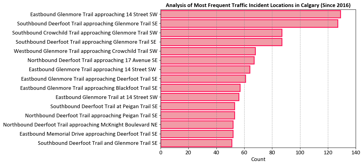
The chart aims to visualize the most frequent traffic incident locations in Calgary since 2016. This helps in identifying traffic hotspots and understanding where incidents are most likely to occur.
Locations Represented:
The y-axis lists various locations in Calgary where traffic incidents have occurred.
The longest bar indicates that Eastbound Glenmore Trail approaching 14 Street SW has the highest count of incidents.
Axes:
X-Axis (Count): Shows the number of incidents, ranging from 0 to 140.
Y-Axis (Locations): Lists the specific locations of traffic incidents.
| QUADRANT | Count | |
|---|---|---|
| 0 | NE | 9051 |
| 1 | NW | 7547 |
| 2 | SE | 10804 |
| 3 | SW | 6906 |
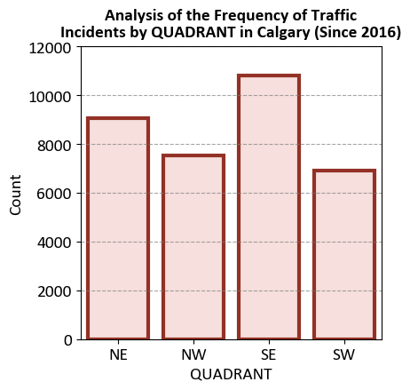
The chart aims to visualize the frequency of traffic incidents in different quadrants of Calgary since 2016. This helps in identifying which quadrants have the highest number of traffic incidents.
Quadrants Represented:
The x-axis lists the quadrants: NE (Northeast), NW (Northwest), SE (Southeast), and SW (Southwest).
Each bar represents the count of traffic incidents in a specific quadrant.
Axes:
Y-Axis (Count): Shows the number of incidents, ranging from 0 to 12000 in increments of 2000.
X-Axis (Quadrants): Lists the specific quadrants of Calgary.
6.6.4. Count Plot#
A count plot is a specific type of bar plot in Seaborn that displays the count of categorical data points in a dataset. It’s particularly useful for visualizing the distribution of categorical variables and comparing the frequency of different categories [Waskom, 2021]. Seaborn’s sns.countplot() function allows you to create count plots easily and provides options for customizing the appearance of the bars. Here’s an explanation of how to use sns.countplot():
Usage: Count plots are used to visualize the frequency or count of categorical data points, helping you understand the distribution and prevalence of different categories.
Seaborn Library: Seaborn is a Python data visualization library built on top of Matplotlib.
sns.countplot()is a specific function within Seaborn for creating count plots.Syntax: The basic syntax for creating a count plot with Seaborn is:
sns.countplot(x, data, hue). Here,xis the categorical variable to be plotted on the x-axis, anddatais the DataFrame containing the data. Thehueparameter (optional) allows you to differentiate the count bars based on another categorical variable, creating grouped count plots. You can see the full function descrition here.Count Plot Features:
Count Bars: The primary feature of a count plot is the vertical (or horizontal) bars that represent the count of data points in each category. The height (or width) of the bars corresponds to the frequency of occurrences of each category.
Coloring (Hue): The
hueparameter allows you to differentiate the count bars based on another categorical variable, creating a grouped count plot where each group represents a different category within the original categories.
Customization: Seaborn provides various customization options, such as setting bar colors, adding labels and titles, adjusting axis limits, and more.
Interpretation: When interpreting a count plot, focus on the heights (or widths) of the bars, which represent the count or frequency of data points within each category. Observe the relative differences in counts, any patterns or trends in the distribution, and the prevalence of each category.
Data Preparation: Ensure that the data is properly formatted for the count plot. Handle missing values, encode categorical variables appropriately, and ensure that the variable being plotted on the x-axis is categorical and suitable for a count plot.
Example: Consider the traffic incident example again.
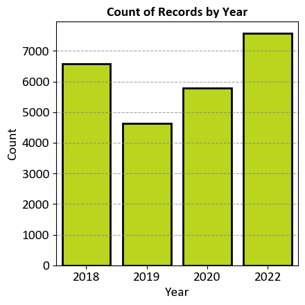
The chart aims to visualize the count of traffic incident records for the years 2018, 2019, 2020, and 2022. This helps in understanding the distribution of traffic incidents over these specific years.
Years Represented:
The x-axis lists the years: 2018, 2019, 2020, and 2022.
Each bar represents the count of traffic incident records for a specific year.
Axes:
Y-Axis (Count): Shows the number of records, ranging from 0 to 7000 in increments of 1000.
X-Axis (Years): Lists the specific years.
Data Points:
The bar for 2018 is just under the 6000 mark.
The bar for 2019 is just above the 4000 mark.
The bar for 2020 is slightly higher than that for 2019 but still below the 6000 mark.
The bar for 2022 reaches up to the top of the graph, indicating it’s at or near the maximum count of around 7000.
6.6.5. Histogram#
A histogram is a fundamental data visualization used to represent the distribution of a continuous numerical variable [Waskom, 2021]. Seaborn’s sns.histplot() function is designed to create histograms with ease and provides various options for customization. Here’s an explanation of how to use sns.histplot():
Usage: Histograms are used to understand the underlying frequency distribution of a continuous variable, allowing you to observe the pattern of values and identify central tendencies, dispersion, and potential outliers.
Seaborn Library: Seaborn is a Python data visualization library that enhances the aesthetics and ease of creating statistical graphics.
sns.histplot()is part of Seaborn’s suite of plot functions.Syntax: The basic syntax for creating a histogram with Seaborn is:
sns.histplot(data, x, bins, kde, rug). Here,datais the DataFrame containing the data,xis the numerical variable to be plotted on the x-axis,binsspecifies the number of bins (intervals) for the histogram,kde(optional) controls whether to overlay a kernel density estimate, andrug(optional) adds small vertical lines for each data point along the x-axis. You can find the full function description here.Histogram Features:
Bins: The histogram divides the range of the numerical variable into a set of contiguous intervals called “bins.” The height of each bar represents the frequency (or count) of data points falling within each bin.
Kernel Density Estimate (KDE): The
kdeparameter can be set toTrueto overlay a smooth density curve (kernel density estimate) on top of the histogram. The KDE provides a smoothed representation of the data’s distribution.Rug Plot: The
rugparameter adds small vertical lines (rugs) along the x-axis, indicating the location of individual data points. This can help in visualizing the distribution of data points more precisely.
Customization: Seaborn provides various customization options for histograms, such as setting the number of bins, adjusting the appearance of the bars, KDE customization, adding labels and titles, and more.
Interpretation: When interpreting a histogram, focus on the shape of the distribution, the location of the central tendency (mean, median), the spread (variance or standard deviation), the presence of multiple modes (bimodal, multimodal), and any potential outliers.
Data Preparation: Ensure that the data is properly cleaned and suitable for the histogram. Consider the choice of bin size, and be aware that the appearance of the histogram can change based on the chosen binning strategy.
Example: The data from the CMHC Builders Report for one and two-family homes in Calgary. Here are the key points:
Community Breakdown: The data includes various communities such as Mahogany, Cranston, Evanston, and more.
Permit Details: Information on permits, including permit numbers, applicant names, applied dates, and project costs.
Project Types: Types of projects listed include new constructions and residential improvements, such as private detached garages.
Financial Overview: Estimated project costs for different permits, ranging from a few thousand dollars to over a hundred thousand dollars.
Here we produce a histogram for University Heights community.
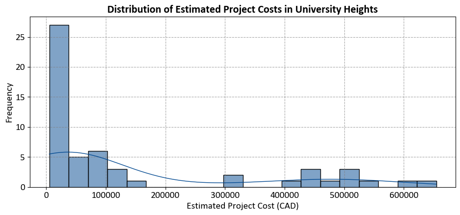
The code aims to visualize the distribution of estimated project costs for one and two-family homes in the University Heights community, based on data from the CMHC Builders Report. This helps in understanding how project costs are spread across different ranges within this community.
6.6.6. Box Plot#
A box plot [Waskom, 2021] (also known as a whisker plot) is a common data visualization used to depict the distribution and spread of numerical data. It provides insights into the central tendency, variability, and presence of outliers in a dataset. Seaborn’s sns.boxplot() function is designed to create box plots easily and allows for customization to enhance the visualization. Here’s an explanation of how to use sns.boxplot():
Usage: Box plots are particularly useful for comparing the distribution and spread of numerical data across different categories or groups, identifying potential outliers, and understanding the central tendencies (median, quartiles) of the data.
Seaborn Library: Seaborn is a Python data visualization library built on top of Matplotlib.
sns.boxplot()is part of Seaborn’s suite of plot functions.Syntax: The basic syntax for creating a box plot with Seaborn is:
sns.boxplot(x, y, data, hue). Here,x(ory) is the categorical variable to be plotted on the x-axis (or y-axis),datais the DataFrame containing the data, andhue(optional) allows you to differentiate box plots based on another categorical variable. You can find the full function description here.Box Plot Features:
Box: The main feature of a box plot is the “box” that represents the interquartile range (IQR), which encompasses the middle 50% of the data. The vertical line inside the box represents the median (50th percentile) of the data.
Whiskers: Whiskers extend from the box to the minimum and maximum non-outlier data points within a certain range (default is 1.5 times the IQR). Data points outside the whiskers are often considered potential outliers.
Outliers: Individual data points outside the whiskers are plotted as “outliers” using dots or other marker styles. These are data points that are significantly different from the bulk of the data.
Coloring (Hue): The
hueparameter allows you to differentiate box plots based on another categorical variable, creating grouped box plots for each category within the original categories.
Customization: Seaborn provides various customization options for box plots, such as setting colors, adding labels and titles, adjusting the appearance of the boxes and whiskers, and more.
Interpretation: When interpreting a box plot, focus on the median (center of the box), the spread (size of the box), the range covered by the whiskers, the presence of outliers (dots outside the whiskers), and the differences between box plots for different categories (if using
hue).Data Preparation: Ensure that the data is properly formatted for the box plot. Handle missing values, encode categorical variables appropriately, and ensure that the variables being plotted on the x-axis and y-axis are suitable for a box plot.
Example: For the CMHC Builders Report data, we plot only the top 15 communities with the highest average estimated project costs, you can first calculate the average costs for each community, sort them, and then filter the top 15.
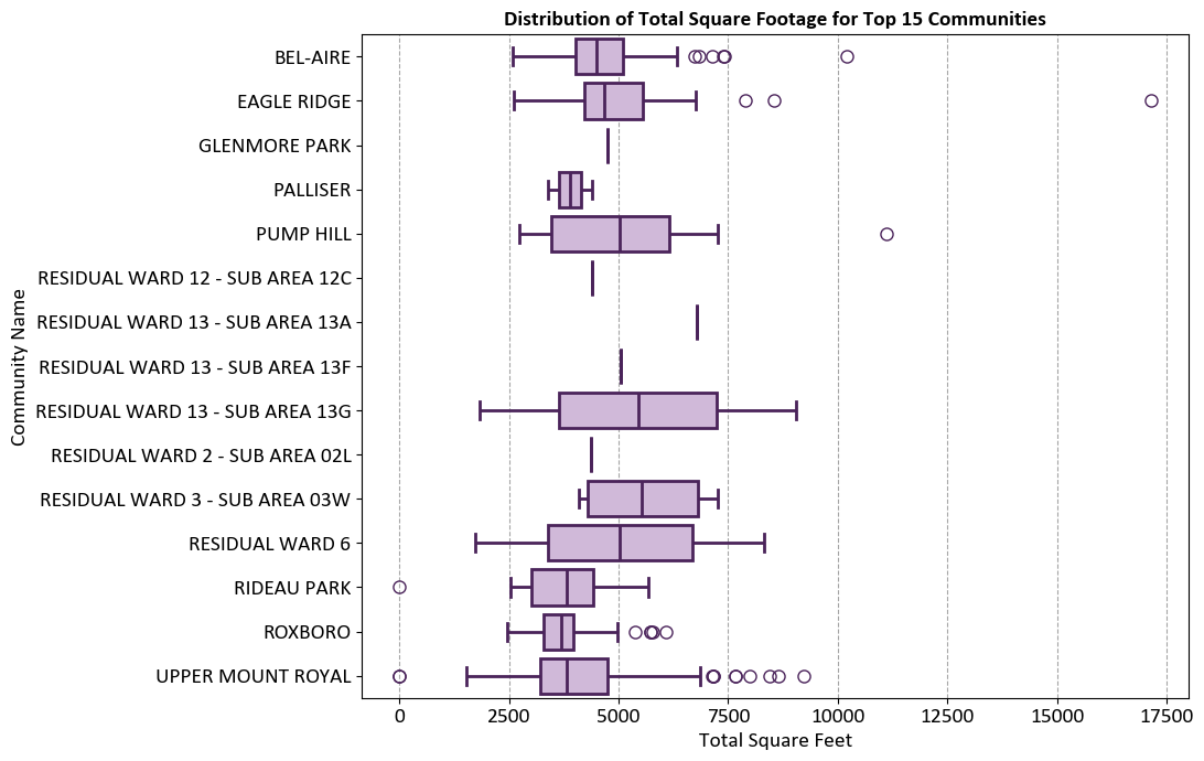
The graph aims to visualize the distribution of total square footage for properties in the top 15 communities. This helps in understanding the variation and spread of property sizes within these communities.
Communities Represented:
The y-axis lists the names of the top 15 communities.
Each community has a box plot representing the distribution of total square footage.
Axes:
X-Axis (Total Square Feet): Ranges from 0 to 17,500 square feet.
Y-Axis (Community Names): Lists the specific communities.
Box Plot Elements:
Boxes: Represent the interquartile range (IQR) of total square footage, showing the middle 50% of the data.
Lines (Whiskers): Extend from the boxes to indicate variability outside the upper and lower quartiles.
Outliers: Represented as individual circles, indicating data points that fall outside the whiskers.
Box Plots
Box plots, also known as box-and-whisker plots, are a graphical representation of the distribution of a dataset. They provide a concise summary of the data’s central tendency, dispersion, and the presence of outliers. Box plots are particularly useful for comparing multiple datasets or visualizing the spread of data across different categories. A box plot consists of several elements:
Box: The box represents the interquartile range (IQR), which contains the middle 50% of the data. The bottom (lower) edge of the box marks the first quartile (Q1), and the top (upper) edge marks the third quartile (Q3). The length of the box indicates the spread or variability of the data in this range.
Whiskers: The whiskers extend from the edges of the box to the minimum and maximum values within a certain distance from the quartiles. The length of the whiskers is typically 1.5 times the IQR. Data points beyond the whiskers are considered outliers and are shown individually as points.
Median: The line inside the box represents the median (Q2) of the data, which is the middle value when the data is sorted in ascending order. It divides the data into two equal halves.
Outliers: Individual data points that lie beyond the whiskers are shown as separate points on the plot and are considered outliers.
Box plots are particularly useful for detecting the presence of outliers, identifying skewness in the data, and comparing the distribution of data across different categories or groups. They provide a clear visual representation of the spread and central tendency of the data and are valuable tools for exploratory data analysis.
6.6.7. Violin Plot#
A violin plot [Waskom, 2021] is a data visualization that combines elements of a box plot and a kernel density estimate (KDE) to show the distribution of a continuous numerical variable within different categories. It provides insights into the central tendency, variability, and the shape of the distribution, making it useful for comparing data distributions across different groups. Seaborn’s sns.violinplot() function is specifically designed to create violin plots and allows for customization to enhance the visualization. Here’s an explanation of how to use sns.violinplot():
Usage: Violin plots are used to compare the distribution of a continuous numerical variable across different categories or groups. They provide a comprehensive view of the data’s distribution, including central tendency, spread, multimodality, and potential outliers.
Seaborn Library: Seaborn is a Python data visualization library built on top of Matplotlib.
sns.violinplot()is part of Seaborn’s suite of plot functions.Syntax: The basic syntax for creating a violin plot with Seaborn is:
sns.violinplot(x, y, data, hue). Here,x(ory) is the categorical variable to be plotted on the x-axis (or y-axis),datais the DataFrame containing the data, andhue(optional) allows you to differentiate violin plots based on another categorical variable. You can find the full function description here.Violin Plot Features:
Violin: The main feature of a violin plot is the “violin” shape that displays the kernel density estimate (KDE) of the data’s distribution within each category. The width of the violin represents the density of data points, and the wider regions indicate a higher density of data.
Central Line: Inside the violin, there is often a central line that represents the median of the data within each category, similar to a box plot.
Interquartile Range (IQR): The width of the violin around the central line indicates the interquartile range (IQR), providing information about the spread of the data.
Coloring (Hue): The
hueparameter allows you to differentiate violin plots based on another categorical variable, creating grouped violin plots for each category within the original categories.
Customization: Seaborn provides various customization options for violin plots, such as setting colors, adding labels and titles, adjusting the appearance of the violins, and more.
Interpretation: When interpreting a violin plot, focus on the width of the violin (density of data points), the central line (median), the spread (width of the violin), the presence of multiple modes (if applicable), and the differences between violin plots for different categories (if using
hue).Data Preparation: Ensure that the data is properly formatted for the violin plot. Handle missing values, encode categorical variables appropriately, and ensure that the variables being plotted on the x-axis and y-axis are suitable for a violin plot.
Example: For the CMHC Builders Report data, we plot only the top 15 communities with the highest average total square footage. First, calculate the average square footage for each community, sort them, and then filter the top 15.
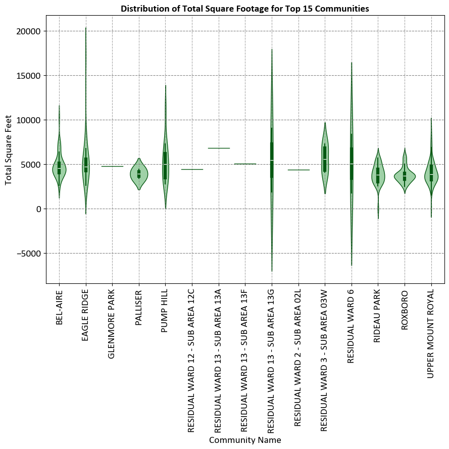
The graph aims to visualize the distribution of total square footage for properties in the top 15 communities. This helps in understanding the variation and spread of property sizes within these communities.
Axes:
Vertical Axis (Total Square Feet): Ranges from -5000 to 20000 square feet.
Horizontal Axis (Community Names): Lists the names of the top 15 communities.
Violin Plots:
Each community has a corresponding violin plot that shows the distribution of total square footage within that community.
Violin plots combine box plots with kernel density estimation to show the distribution and probability density of the data.
The width of each violin plot represents the density of data points at different values, providing a more nuanced view of the data distribution compared to traditional bar charts or line graphs.
Violin Plots
A violin plot is a type of data visualization that combines aspects of a box plot and a kernel density plot. It is used to display the distribution of data for different categories or groups. The plot consists of one or more “violins,” each representing a group of data points. Each violin represents the density of the data within a specific range.
A breakdown of the key components of a violin plot:
Violin Body: The central part of the violin plot is called the “violin body.” It resembles a mirrored kernel density plot, showing the data density along the y-axis. Wider sections of the violin indicate higher data density, while narrower sections indicate lower density.
Interquartile Range (IQR): Inside the violin, a thick horizontal line represents the interquartile range (IQR) of the data. The IQR spans from the first quartile (Q1) to the third quartile (Q3) and contains the middle 50% of the data.
Median Line: A vertical line inside the violin represents the median value of the data.
Extremes and Outliers: The “whiskers” of the violin plot extend from the ends of the IQR to the minimum and maximum values within a certain range. Data points beyond these whiskers are considered “outliers” and are plotted individually as points outside the violin.
Violin plots are particularly useful when comparing the distribution of multiple datasets or groups. They provide insights into the shape of the data distribution, skewness, multimodality, and the presence of outliers.
6.6.8. Pair Plot#
A pair plot [Waskom, 2021], often implemented using Seaborn’s sns.pairplot() function, is a versatile and effective tool for visualizing pairwise relationships in a dataset containing multiple numerical variables. It creates a grid of scatter plots or other types of plots, showing the relationships between pairs of variables, as well as distribution plots for each variable along the diagonal. Here’s a detailed explanation of how to use sns.pairplot():
Usage: Pair plots are used to explore correlations, patterns, and distributions between pairs of numerical variables in a dataset. They’re particularly valuable when you have several numerical variables and want to quickly visualize their relationships.
Seaborn Library: Seaborn is a Python data visualization library built on Matplotlib.
sns.pairplot()is a function within Seaborn that facilitates creating pair plots.Syntax: The basic syntax for creating a pair plot with Seaborn is:
sns.pairplot(data, hue, kind). Here,datais the DataFrame containing the data,hue(optional) is used to add a categorical variable for color differentiation, andkind(optional) specifies the type of plots to display on the off-diagonal subplots (e.g., “scatter,” “kde,” “reg”). You can find the full function description here.Pair Plot Features:
Scatter Plots: The off-diagonal subplots (above the diagonal) are typically scatter plots, which show the relationship between pairs of variables. Each point represents an observation, and you can quickly identify trends or clusters.
Distribution Plots: The diagonal subplots show the distribution of each variable using histograms or kernel density estimates (KDEs). This allows you to understand the data’s distribution for individual variables.
Coloring (Hue): The
hueparameter allows you to add a categorical variable, and the pair plot will color the data points based on this variable, making it easier to distinguish between categories.Customization: Seaborn’s
sns.pairplot()offers customization options such as adjusting colors, marker styles, plot aesthetics, and more.
Interpretation: When interpreting a pair plot, focus on the scatter plots for pairwise relationships. Observe the trends, patterns, and strength of the correlation. Pay attention to the diagonal plots to understand the distribution of each variable and detect potential outliers.
Data Preparation: Ensure that the data is well-prepared and relevant for the pair plot. Handle missing values and ensure that the variables being compared are suitable for scatter plots and distribution plots.
Example - Iris Flower Pair Plot: The Iris Flower dataset, introduced by the British biologist and statistician Ronald A. Fisher in 1936, serves as a benchmark dataset in the field of pattern recognition and machine learning. This dataset comprises 150 instances of iris flowers, each belonging to one of three species: setosa, versicolor, or virginica. For each instance, four features are measured: sepal length, sepal width, petal length, and petal width, all in centimeters [Breiman, 2017, Pedregosa et al., 2011, scikit-learn Developers, 2023].
The primary objective of the Iris Flower dataset is to facilitate the development and evaluation of classification algorithms. Researchers and practitioners commonly employ this dataset for tasks such as species classification, where the goal is to accurately classify an iris flower into one of the three species based on its measured features [Breiman, 2017, Pedregosa et al., 2011, scikit-learn Developers, 2023].
Due to its simplicity and well-defined structure, the Iris Flower dataset is frequently utilized to demonstrate various machine learning techniques, including clustering, classification, and dimensionality reduction. Its accessibility and widespread use contribute to its status as a fundamental resource for beginners and experts alike in the realms of data analysis and machine learning [Breiman, 2017, Pedregosa et al., 2011, scikit-learn Developers, 2023].
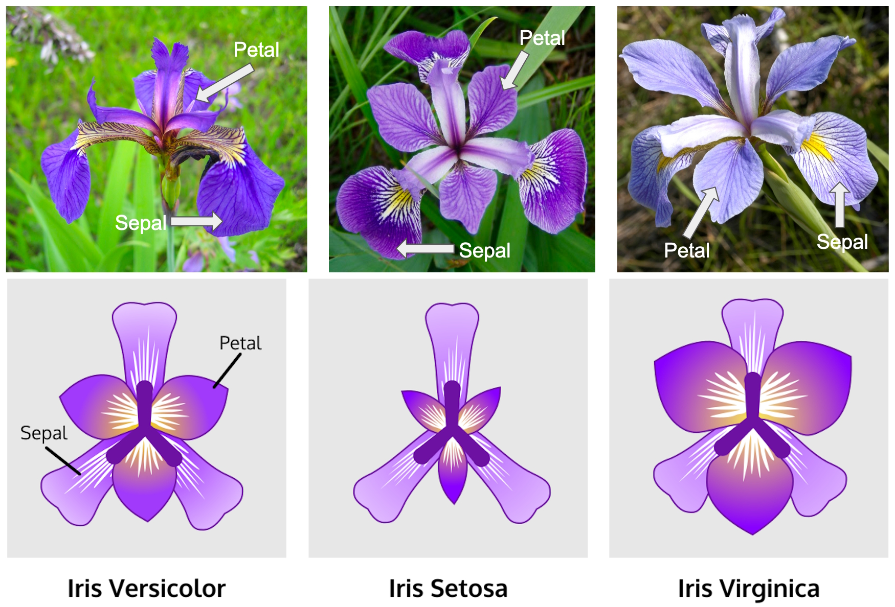
Fig. 6.13 The Iris Flower dataset. Image sourced from Kaggle.com.#
In this example, we utilize the Iris Flower dataset with Seaborn’s Pair Plot. We load the dataset, create a PairGrid for pairwise visualizations with color-coded species differentiation, and apply scatter and KDE plots to relevant sections. This enhances data understanding and pattern recognition.
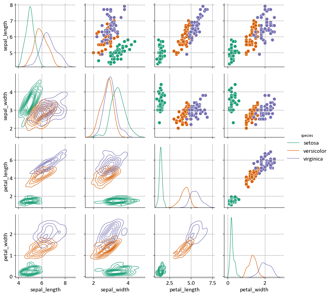
The matrix aims to visualize the relationships and distributions of various measurements of iris flowers, helping to understand the differences and similarities between the three species.
Measurements Compared:
Sepal Length
Sepal Width
Petal Length
Petal Width
Diagonal Plots:
Histograms showing the distribution of each measurement for the three species.
Off-Diagonal Plots:
Scatter plots showing the relationship between pairs of measurements for each species, distinguished by color.
Pair Plots
Seaborn’s pairplot is a versatile and informative visualization tool for exploring the relationships between multiple numeric variables in a dataset. It provides a grid of scatter plots and histograms (or kernel density estimates) to visualize pairwise relationships and individual variable distributions. This visualization can reveal correlations, trends, and patterns, making it useful for initial data exploration. A breakdown of the main elements and concepts related to Seaborn’s pairplot:
Pairwise Scatter Plots: The primary component of the
pairplotis the grid of scatter plots. Each cell in the grid represents the relationship between two numeric variables from the dataset. Points on these scatter plots indicate the values of the two variables for each data point. This helps in visualizing how the variables interact with each other.Diagonal Axes: The diagonal of the grid typically contains histograms (or kernel density estimates) for each individual variable. This allows you to understand the distribution and spread of each variable in the dataset. The diagonal elements provide insights into the univariate distribution of the data.
Hue Parameter: The
hueparameter allows you to specify a categorical variable, andpairplotuses this variable to color the data points or use different marker styles in the scatter plots. This is useful when you want to visually distinguish between different categories or groups in the data.Diagonal Plot Type: You can control the type of plot used on the diagonal axes using the
diag_kindparameter. Common options include “hist” for histograms and “kde” for kernel density estimates. This choice depends on the nature of the variable and your preference for visualization.Pairwise Relationships: By examining the scatter plots, you can identify correlations between variables. Positive correlations are indicated by points forming an upward trend, while negative correlations show a downward trend. If there’s no clear trend, the variables might be weakly correlated or not correlated at all.
Data Patterns: Pair plots can help uncover patterns or clusters within the data. If specific clusters of data points appear in the scatter plots, it may indicate the presence of subgroups or distinct patterns in the dataset.
Outliers: Outliers in the data can be identified in the scatter plots as data points that significantly deviate from the overall trend or pattern. These outliers may warrant further investigation.
Customization: Seaborn provides a range of customization options to modify the appearance of the pair plot, such as changing colors, marker styles, and more. Customization helps make the plot more visually appealing and tailored to your specific needs.
Data Preparation: Ensure that the data is cleaned and relevant for the analysis. Remove missing values or handle them appropriately before creating the pair plot.
Interpretation: Careful interpretation of the pair plot is essential. Look for interesting relationships, correlations, and patterns. The pair plot serves as a starting point for more in-depth analysis.
6.6.9. Regression Plot#
A regression plot, often referred to as a scatter plot with a regression line, is a common visualization tool used to explore and understand the relationship between two numerical variables in a dataset. It helps you visualize the trend and strength of the linear relationship between the variables and can provide insights into how changes in one variable are associated with changes in the other. Here’s a comprehensive explanation of regression plots [Waskom, 2021]:
Usage: Regression plots are primarily used to examine the relationship between two continuous numerical variables. They are often employed to identify trends, patterns, and correlations, as well as to make predictions based on the observed relationship.
Seaborn Library: Seaborn is a Python data visualization library built on top of Matplotlib. It offers a simple and aesthetically pleasing way to create regression plots.
Syntax: The basic syntax for creating a regression plot in Seaborn is:
sns.regplot(x, y, data, scatter_kws, line_kws). Here,xandyare the variables you want to compare,datais the DataFrame containing the data,scatter_kwsallows customization of scatter plot parameters, andline_kwsallows customization of the regression line. You can find the full function description here.Scatter Plot: A regression plot starts with a scatter plot, where each data point is plotted with one variable on the x-axis and the other on the y-axis. This shows the distribution of data points and the general relationship between the variables.
Regression Line: The core component of the regression plot is the fitted regression line. This line represents the best-fit linear relationship between the variables. It shows the trend, direction, and strength of the relationship.
Intercept and Slope: The regression line has an intercept (the value where the line crosses the y-axis) and a slope (indicating the rate of change). These parameters provide valuable information about the relationship between the variables.
Confidence Intervals: Many regression plots also display confidence intervals around the regression line. These intervals help assess the uncertainty of the regression estimates, showing the range within which the true regression line is likely to fall.
Residuals: Some regression plots include residuals, which are the vertical distances between each data point and the regression line. Residuals can be useful for assessing the goodness of fit and identifying outliers.
Customization: Seaborn regression plots can be customized using various parameters to adjust colors, marker styles, line styles, and other visual aspects, allowing you to tailor the plot to your needs and enhance its readability.
Interpretation: When interpreting a regression plot, focus on the direction and slope of the regression line. Consider the strength and significance of the relationship. If confidence intervals are displayed, pay attention to their width and whether they encompass zero (indicating non-significance).
Example: Recall the example for the dataset was obtained from https://data.calgary.ca/stories/s/9phu-xb4j and pertains to Water Temperature (in degrees Celsius) at the Fish Creek 37th St Calgary Station (SUR_FC-37).
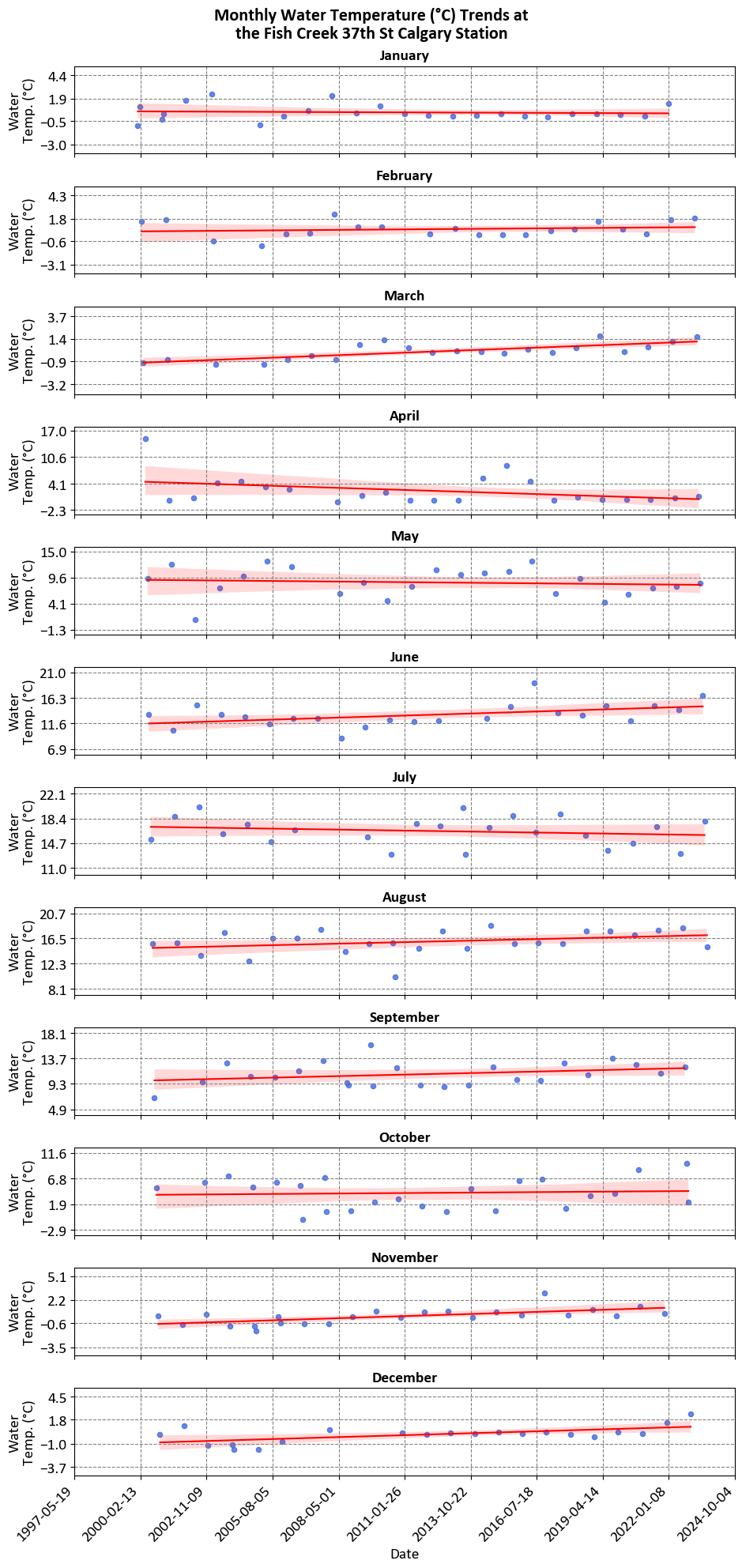
Each panel in the image represents the monthly water temperature trends at the Fish Creek 37th St Calgary Station. These panels collectively provide a detailed view of how water temperatures vary throughout the year at this specific location.
6.6.10. Heatmap#
A heatmap [Waskom, 2021] is a popular data visualization technique that uses colors to represent numerical values in a matrix-like format. It’s particularly useful for visualizing relationships, patterns, and distributions within a dataset, especially when dealing with two-dimensional data. Seaborn’s sns.heatmap() function is designed to create heatmaps easily, and it offers customization options for enhanced visualization. Here’s an explanation of how to use sns.heatmap():
Usage: Heatmaps are used to display a matrix of numerical values where each value is represented by a color. They are commonly used to show correlations, patterns, or distributions in datasets with two dimensions (e.g., a matrix of data points).
Seaborn Library: Seaborn is a Python data visualization library built on top of Matplotlib.
sns.heatmap()is part of Seaborn’s collection of plot functions.Syntax: The basic syntax for creating a heatmap with Seaborn is:
sns.heatmap(data, annot, cmap). Here,datais the two-dimensional array or DataFrame containing the numerical values,annot(optional) controls whether to annotate the heatmap cells with the actual values, andcmap(optional) specifies the color map to be used for the heatmap. You can find the full function description here.Heatmap Features:
Color Mapping: Each cell in the heatmap represents a numerical value, and the color of the cell is determined by a color map (
cmap) that maps the values to colors. You can choose a color map that best suits your data and visualization needs.Annotation: The
annotparameter allows you to display the actual numerical values within the cells of the heatmap, providing additional information and making it easier to interpret the visualization.
Customization: Seaborn’s
sns.heatmap()offers customization options, such as adjusting the color map, adding labels and titles, setting axis ticks, adjusting plot aesthetics, and more.Interpretation: When interpreting a heatmap, focus on the color variations, which indicate the relative magnitude of the numerical values. Look for patterns, correlations, or clusters within the heatmap. If annotations are enabled, the actual values within each cell can provide additional context.
Data Preparation: Ensure that the data is well-structured for the heatmap. It should be in a matrix-like format, with rows and columns representing categories or variables and the cell values being the numerical data points to be visualized.
Example:
| Year | 2016 | 2017 | 2018 | 2019 | 2020 | 2021 | 2022 | 2023 | 2024 |
|---|---|---|---|---|---|---|---|---|---|
| Month | |||||||||
| 1 | NaN | NaN | 595.0 | 545.0 | 662.0 | 413.0 | 505.0 | 619.0 | 767.0 |
| 2 | NaN | 251.0 | 721.0 | 692.0 | 584.0 | 655.0 | 545.0 | 466.0 | 507.0 |
| 3 | NaN | 411.0 | 582.0 | 379.0 | 491.0 | 414.0 | 472.0 | 613.0 | 686.0 |
| 4 | NaN | 315.0 | 452.0 | 258.0 | 269.0 | 412.0 | 559.0 | 445.0 | 448.0 |
| 5 | NaN | 427.0 | 406.0 | 372.0 | 389.0 | 397.0 | 551.0 | 570.0 | 565.0 |
| 6 | NaN | 537.0 | 537.0 | 206.0 | 445.0 | 565.0 | 638.0 | 609.0 | 564.0 |
| 7 | NaN | 427.0 | 519.0 | NaN | 446.0 | 601.0 | 632.0 | 639.0 | 475.0 |
| 8 | NaN | 482.0 | 493.0 | 1.0 | 530.0 | 603.0 | 605.0 | 564.0 | NaN |
| 9 | NaN | 530.0 | 529.0 | 360.0 | 457.0 | 636.0 | 680.0 | 695.0 | NaN |
| 10 | NaN | 572.0 | 655.0 | 593.0 | 467.0 | 638.0 | 722.0 | 773.0 | NaN |
| 11 | NaN | 633.0 | 523.0 | 614.0 | 502.0 | 695.0 | 770.0 | 613.0 | NaN |
| 12 | 316.0 | 688.0 | 555.0 | 605.0 | 541.0 | 961.0 | 893.0 | 623.0 | NaN |
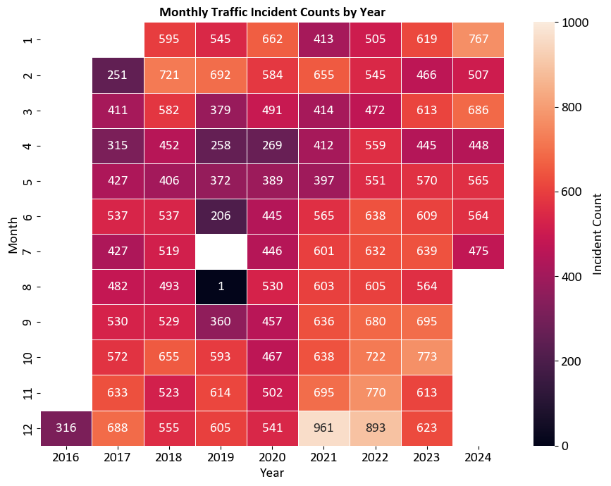
The heatmap visualizes the number of traffic incidents in Calgary, broken down by month and year. This helps in identifying trends and patterns in traffic incidents over time.
Axes:
Horizontal Axis (Years): Ranges from 2016 to 2023.
Vertical Axis (Months): Lists the months from January (1) to December (12).
Color Intensity:
Each cell represents the count of traffic incidents for a specific month and year.
The color intensity indicates the frequency of incidents, with darker colors representing higher counts.
Colorbar:
The colorbar on the right side ranges from light orange (0 incidents) to dark purple (800 incidents).
It provides a reference for interpreting the color intensity in the heatmap.
Heatmap Plots
A Seaborn heatmap is a graphical representation of a 2D dataset in which individual values are represented as colors. It’s a powerful tool for visualizing the relationships and patterns within the data, especially when dealing with numerical data and correlation matrices. Here’s a detailed explanation of Seaborn’s heatmap:
Usage: Heatmaps are commonly used to visualize matrices, including correlation matrices, confusion matrices, and any 2D data where the values have meaningful relationships.
Color Mapping: Heatmaps use a color scale to represent values in the dataset. By mapping colors to numerical values, it becomes easier to identify patterns, clusters, and variations in the data.
Seaborn Library: Seaborn is a Python data visualization library based on Matplotlib. It provides a high-level interface for creating informative and visually appealing statistical graphics, including heatmaps.
Syntax: The basic syntax for creating a heatmap in Seaborn is:
sns.heatmap(data, annot, cmap, center, linewidths). Here,datais the 2D dataset you want to visualize,annot(optional) controls whether to annotate each cell with its value,cmapspecifies the color palette,center(optional) defines the center value of the color map, andlinewidths(optional) adds space between cells.Color Palette: The choice of color palette (
cmap) is crucial. It affects the visual representation of the data. Seaborn provides various built-in color palettes, such as “coolwarm,” “viridis,” “cividis,” “plasma,” “hot,” and more. Choose a palette that suits the data and emphasizes the patterns you’re interested in.Annotating Cells: The
annotparameter allows you to display the actual values of each cell within the heatmap. This can be useful for understanding the dataset at a glance, especially when dealing with correlation matrices or other matrices where the exact values matter.Center Value: The
centerparameter lets you set a specific value around which the colors are centered. This is particularly helpful when you want to emphasize positive and negative deviations from a particular value.Interpretation: When interpreting a heatmap, look for clusters of similar colors, which indicate groups or patterns within the data. Pay attention to the color scale’s legend to understand the correspondence between colors and values. Also, consider any annotations present within the cells, especially when exploring correlation or similarity matrices.
Customization: Seaborn allows you to customize the appearance of the heatmap, such as adjusting the color scale, annotating cells with different formatting, and modifying the plot’s aesthetics.
Data Preparation: Ensure that the data is appropriately organized and cleaned before creating a heatmap. Heatmaps work best with structured 2D data.
6.6.11. Joint Plot#
A Seaborn Joint Plot [Waskom, 2021] is a versatile visualization that combines several different types of plots to visualize the relationship between two numerical variables in a dataset. It provides a compact and informative representation of the data, including scatter plots, histograms, kernel density estimates (KDEs), and optional regression fits. Here’s an explanation of Seaborn’s Joint Plot:
Usage: Joint plots are used to explore the relationship between two numerical variables. They are particularly useful for understanding the correlation, distribution, and potential trends between these variables.
Seaborn Library: Seaborn is a Python data visualization library built on top of Matplotlib. It aims to simplify the creation of informative and attractive statistical graphics, and the Joint Plot is one of its offerings.
Syntax: The basic syntax for creating a joint plot in Seaborn is:
sns.jointplot(x, y, data, kind, hue). Here,xandyare the variables from the dataset that you want to compare,datais the DataFrame containing the data,kindspecifies the type of plot (e.g., “scatter,” “reg,” “resid,” “kde,” etc.), andhue(optional) is used to add a categorical variable to color the data points. You can find the full function description here.Scatter Plot: The default plot type for a joint plot is a scatter plot, which shows the individual data points and their distribution across the two variables.
Histograms: By setting
kind="hist", joint plots can display histograms for each variable on the corresponding axes. This helps understand the distribution of each variable independently.Kernel Density Estimates (KDEs): When
kind="kde"is used, joint plots display the estimated density of the data points, providing insights into the joint distribution of the variables.Regression Fits: You can include a linear regression fit to the scatter plot using
kind="reg". This helps visualize the overall trend between the variables and provides information about the strength and direction of the relationship.Residual Plots: When
kind="resid", joint plots show the residuals of the linear regression fit. This can be useful for understanding the goodness of fit and identifying any systematic deviations.Customization: Seaborn joint plots offer various customization options, such as changing colors, marker styles, adjusting the appearance of regression lines, and more. Customization allows you to tailor the plot to your specific needs.
Interpretation: When interpreting a joint plot, pay attention to the scatter plot to observe the relationship between the variables. Look for patterns, clusters, or trends. If a regression line is included, consider its slope and the strength of the correlation. If using the
hueparameter, observe how different categories are distributed.
Example - Penguins Dataset Joint Plot: The Penguins dataset, collected by Dr. Kristen Gorman and the Palmer Station Long Term Ecological Research Program, serves as a modern alternative to the Iris dataset in the field of pattern recognition and machine learning. This dataset comprises measurements of three penguin species: Adelie, Chinstrap, and Gentoo, observed in the Palmer Archipelago, Antarctica. For each instance, several features are measured, including bill length, bill depth, flipper length, body mass, and sex [Gorman et al., 2014].
The primary objective of the Penguins dataset is to facilitate the development and evaluation of classification algorithms. Researchers and practitioners commonly employ this dataset for tasks such as species classification, where the goal is to accurately classify a penguin into one of the three species based on its measured features [Gorman et al., 2014].
Due to its simplicity and well-defined structure, the Penguins dataset is frequently utilized to demonstrate various machine learning techniques, including clustering, classification, and dimensionality reduction. Its accessibility and widespread use contribute to its status as a fundamental resource for beginners and experts alike in the realms of data analysis and machine learning [Gorman et al., 2014].
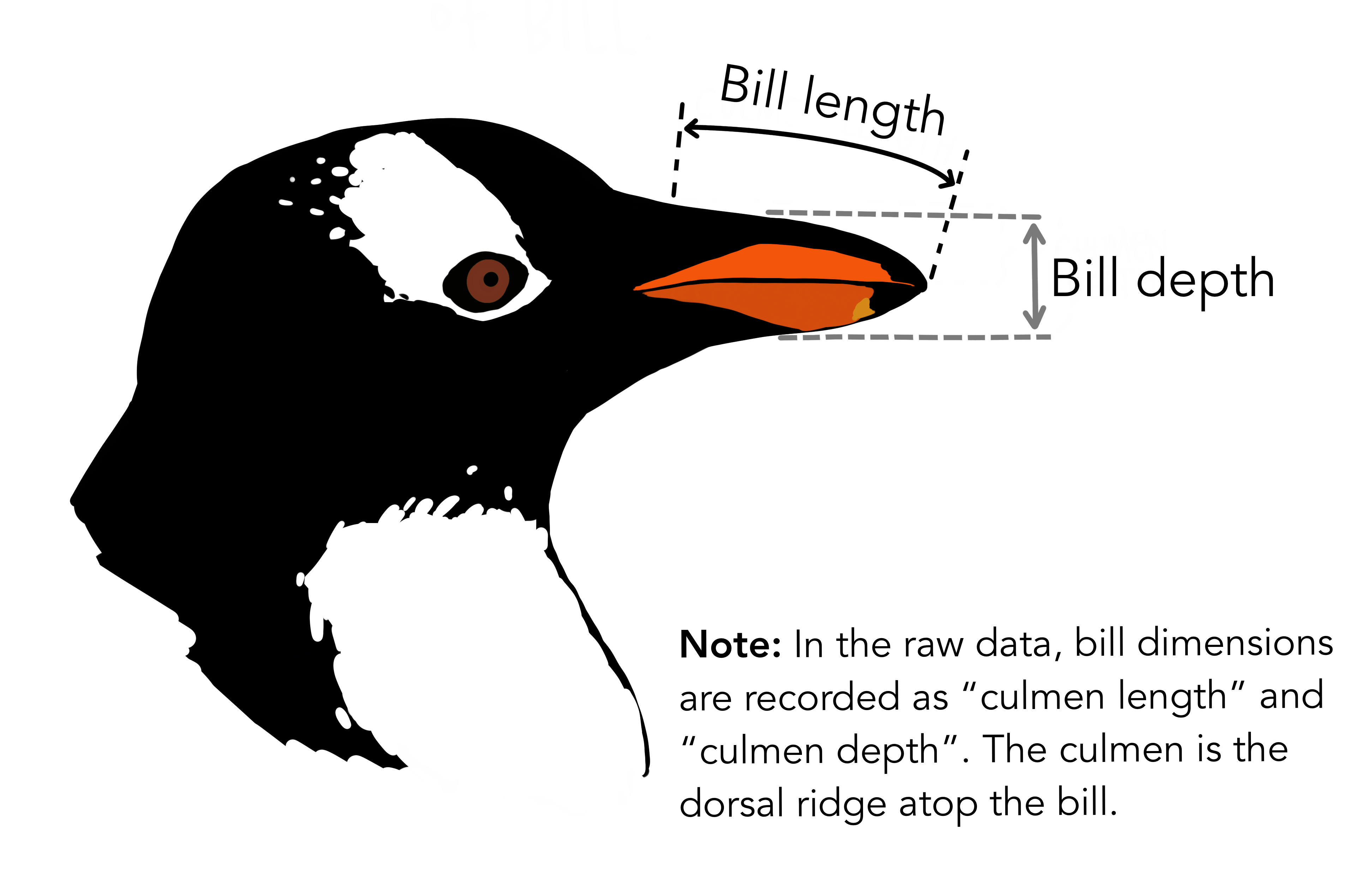
Fig. 6.14 The culmen is the upper ridge of a bird’s bill. In the simplified penguins data, culmen length and depth are renamed as variables bill_length_mm and bill_depth_mm to be more intuitive. Image sourced from allisonhorst/palmerpenguins.#
In this example, we utilize the Penguins dataset with Seaborn’s Joint Plot. We load the dataset, create a joint plot to visualize the relationship between bill length and bill depth, and differentiate species using color coding. This enhances data understanding and pattern recognition.
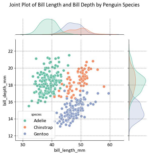
The plot aims to visualize the relationship between bill length and bill depth for three different penguin species. This helps in understanding how these two measurements vary across species.
Axes:
X-Axis (Bill Length in mm): Ranges from approximately 30 mm to 60 mm.
Y-Axis (Bill Depth in mm): Ranges from approximately 12 mm to 22 mm.
Species Represented:
Adelie: Represented by green points.
Chinstrap: Represented by orange points.
Gentoo: Represented by blue points.
Density Plots:
Top Margin: Shows the distribution of bill length for each species.
Right Margin: Shows the distribution of bill depth for each species.
This visualization is useful for statistical analysis or biological studies, providing insights into the morphological differences between penguin species.
6.6.12. Facet Grid plot#
A Seaborn Facet Grid plot is a powerful way to visualize relationships between multiple variables in a dataset by creating a grid of subplots based on unique values or combinations of categorical variables. It allows you to compare and contrast subsets of your data within the same visualization. Here’s an explanation of Seaborn’s Facet Grid [Waskom, 2021]:
Usage: Facet Grid plots are particularly useful when you want to explore how a relationship varies across different levels of one or more categorical variables. It’s a great tool for understanding interactions and patterns in the data.
Seaborn Library: Seaborn is a Python data visualization library based on Matplotlib. The Facet Grid is a higher-level feature within Seaborn that makes it easy to create grid-like arrangements of plots.
Syntax: The basic syntax for creating a Facet Grid plot in Seaborn is:
sns.FacetGrid(data, col, row, hue). Here,datais the DataFrame containing the data,colspecifies the categorical variable for creating columns of subplots,rowspecifies the categorical variable for creating rows of subplots, andhue(optional) is used to color the subplots based on a categorical variable. You can find the full function description here.Multiple Subplots: The Facet Grid creates a grid of subplots, where each subplot displays a subset of the data based on the unique values of the specified categorical variables. You can have separate plots for each combination of categorical levels.
Visualization: The type of plot you use within the Facet Grid depends on the specific relationship you want to visualize. Common plot types include scatter plots, bar plots, histograms, line plots, and more. The choice of plot type helps in understanding the relationship between variables.
colandrowParameters: Thecolandrowparameters allow you to create facets along the columns and rows, respectively. This is useful when you want to explore how the relationship between variables changes based on different categories.hueParameter: Thehueparameter can be used to add a categorical variable that colors the data points or lines in the subplots, providing additional information and making it easier to distinguish between categories.Customization: Seaborn’s Facet Grid allows for customization, including changing plot aesthetics, colors, adding titles, and applying different plot types to the subplots.
Interpretation: When interpreting a Facet Grid plot, focus on the patterns and differences in the relationships between the variables within each subplot. Observe how the relationship changes across different categories or levels.
Data Preparation: Ensure that your data is well-prepared and suitable for the Facet Grid arrangement. Categorical variables should be properly encoded, and the dataset should be structured in a way that makes sense for the visual comparison.
Example - Tips Dataset Facet Grid Plot: The Tips dataset, included with Seaborn, is a classic dataset used for demonstrating data visualization techniques. This dataset contains information about 244 tips given in a restaurant, including variables such as the total bill, tip amount, day of the week, time of day, and whether the customer was a smoker [Bryant and Smith, 1995].
The primary objective of the Tips dataset is to facilitate the exploration and visualization of relationships between different variables. Researchers and practitioners commonly employ this dataset for tasks such as regression analysis, where the goal is to understand how different factors influence the tip amount.
Due to its simplicity and well-defined structure, the Tips dataset is frequently utilized to demonstrate various data visualization techniques, including scatter plots, bar plots, and facet grids. Its accessibility and widespread use contribute to its status as a fundamental resource for beginners and experts alike in the realms of data analysis and visualization.
In this example, we utilize the Tips dataset with Seaborn’s Facet Grid. We load the dataset, create a Facet Grid to visualize the relationship between total bill and tip amount across different days of the week, and apply scatter plots to each facet. This enhances data understanding and pattern recognition.
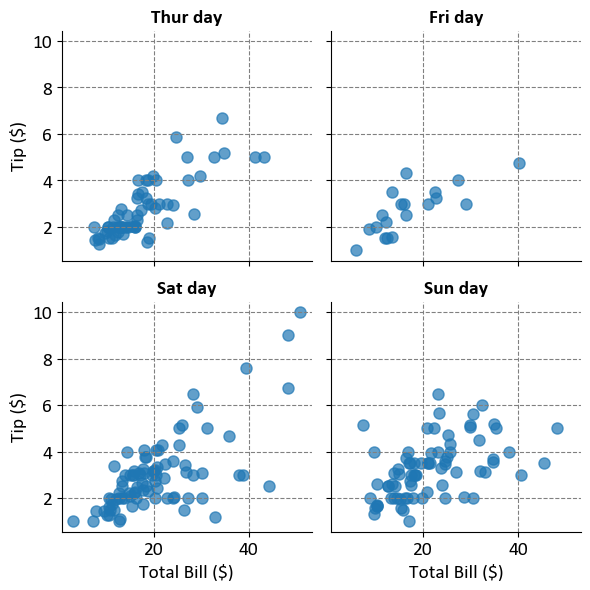
The plots aim to visualize the relationship between the total bill amount and the tip amount for different days of the week. This helps in understanding how tipping behavior varies based on the total bill amount across different days.
Axes:
X-Axis (Total Bill in $): Represents the total bill amount.
Y-Axis (Tip in $): Represents the tip amount.
Scatter Plots:
Each scatter plot shows individual points representing the relationship between the total bill and the tip for a specific day.
The points are semi-transparent (alpha=0.7), allowing for overlap visibility.
Facet Grid:
The plots are arranged in a 2x2 grid, with each plot corresponding to a different day of the week.
This arrangement allows for easy comparison between days to see if there’s any noticeable difference in tipping behavior.
This visualization is useful for analyzing tipping patterns and understanding how they might vary by day.
