6.1. Getting Started with Matplotlib#
Matplotlib is a powerful Python library used to create a wide range of visualizations and plots. It has garnered widespread popularity for its role in facilitating data visualization and exploration tasks. To commence your exploration of Matplotlib’s functionalities, adhere to these essential guidelines [Pajankar, 2021, Matplotlib Developers, 2024]:
6.1.1. Install Matplotlib#
If you don’t have Matplotlib installed already, you can install it using pip by running the following command in your terminal or command prompt:
>>> pip install matplotlib
Remark
Remember that Google Colab includes several well-known data science libraries already installed, such as NumPy, Pandas, Matplotlib, and others.
6.1.2. Import Matplotlib#
In your Python script or Jupyter Notebook, start by importing Matplotlib:
import matplotlib.pyplot as plt
6.1.3. Create Basic Plots#
Here are examples of some basic types of plots you can create using Matplotlib:
6.1.3.1. Line Plot#
A line plot is useful for visualizing data points connected by lines, typically used for showing trends over time or continuous data. You can access the full description of the function here.
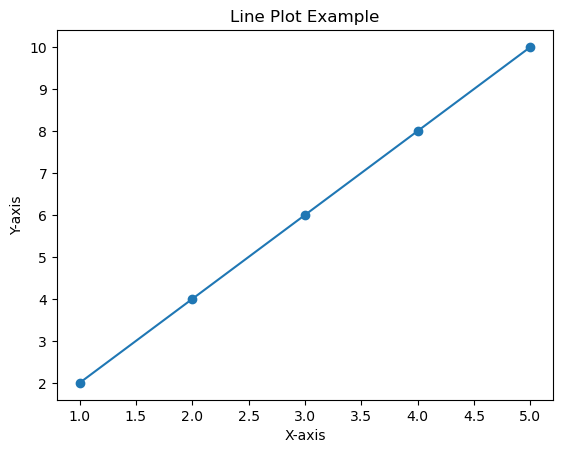
Example - Simple: In this example, we create a basic line plot with sample data points connected by lines. The plot includes labeled axes and a title.
import matplotlib.pyplot as plt

# Sample data
x = [1, 2, 3, 4, 5]
y = [2, 4, 6, 8, 10]

# Create a line plot
plt.plot(x, y, marker='o')

# Add labels and title
plt.xlabel('X-axis')
plt.ylabel('Y-axis')
plt.title('Line Plot Example')

# Display the plot
plt.show()
Example - Advanced: In this advanced example, we enhance the line plot with custom styles for markers, lines, and overall plot aesthetics. The code demonstrates additional customization options like setting figure size, grid style, and more.
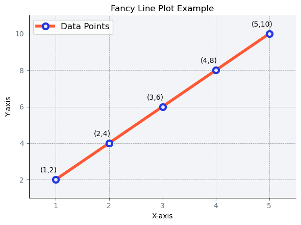
Note
This serves as a mere illustration of a line plot generated using matplotlib. Throughout this chapter, we will delve into the necessary stages to create more intricate plots.
6.1.3.2. Scatter Plot#
A scatter plot is used to display individual data points as markers without connecting lines, great for visualizing relationships between two variables. You can access the full description of the function here.
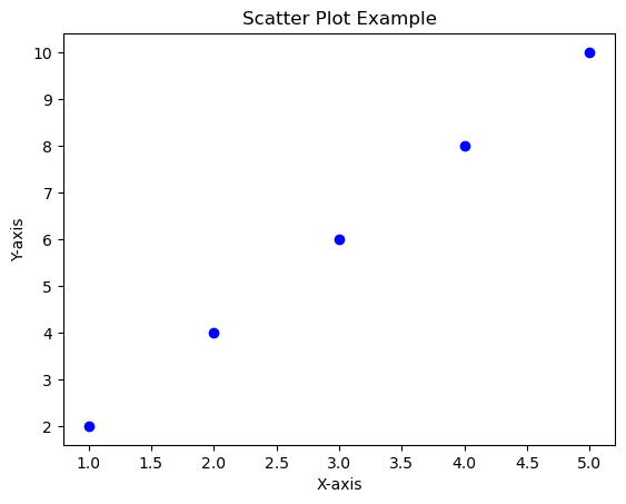
Example - Simple: In this example, we create a basic scatter plot to display individual data points. The plot includes labeled axes and a title.
import matplotlib.pyplot as plt

# Sample data
x = [1, 2, 3, 4, 5]
y = [2, 4, 6, 8, 10]

# Create a scatter plot
plt.scatter(x, y, marker='o', color='blue')

# Add labels and title
plt.xlabel('X-axis')
plt.ylabel('Y-axis')
plt.title('Scatter Plot Example')

# Display the plot
plt.show()
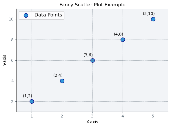
Example - Advanced: In this advanced example, we enhance the scatter plot with custom markers, colors, and overall plot aesthetics. The code demonstrates additional customization options like setting marker size, color, and adding a grid.
6.1.3.3. Bar Plot#
A bar plot is useful for comparing data among different categories or groups. You can access the full description of the function here.
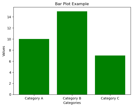
Example - Simple: In this example, we create a basic bar plot to compare values across different categories. The plot includes labeled axes and a title.
import matplotlib.pyplot as plt

# Sample data
categories = ['Category A', 'Category B', 'Category C']
values = [10, 15, 7]

# Create a bar plot
plt.bar(categories, values, color='green')

# Add labels and title
plt.xlabel('Categories')
plt.ylabel('Values')
plt.title('Bar Plot Example')

# Display the plot
plt.show()
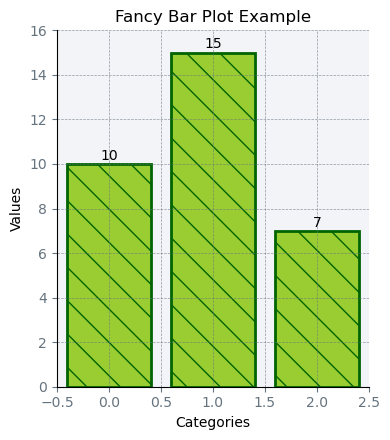
Example - Advanced: In this advanced example, we create a bar plot with additional customization such as custom colors, annotations for each bar, and various axis settings. The code demonstrates how to enhance the plot’s aesthetics and readability.
These are just a few examples of basic plots you can create using Matplotlib. The library provides extensive customization options for labels, titles, colors, and more. As you become more comfortable with Matplotlib, you can explore other types of plots, such as histograms, pie charts, and more advanced visualizations.
Note
The plots presented in this section serve as exemplars for their respective plot categories. By the end of this chapter, you will have gained the skills required to create more complex and aesthetically refined plots. These visualizations are provided as didactic tools to illustrate foundational methodologies.