6.5. Colormaps in Matplotlib#
6.5.1. \(L^*\) (Lightness) in Colormaps#
\(L^*\), also known as lightness, is a crucial component in the CIELAB color space and plays a significant role in the design of effective colormaps. The \(L^*\) parameter represents the perceived lightness of a color, ranging from 0 (black) to 100 (white). In the context of data visualization and colormaps, \(L^*\) is particularly important for several reasons:
Perceptual Uniformity: \(L^*\) is designed to match human perception of lightness. This means that changes in \(L^*\) values correspond closely to how humans perceive changes in brightness.
Data Interpretation: Colormaps with monotonically increasing \(L^*\) values allow viewers to interpret data more accurately. As the data values increase, the perceived lightness of the colors increases consistently.
Accessibility: \(L^*\) variations are more universally perceivable than changes in hue or saturation, making colormaps based on \(L^*\) more accessible to people with various forms of color vision deficiency.
Print Compatibility: \(L^*\)-based colormaps often translate well to grayscale, making them suitable for both color and black-and-white printing.
6.5.2. Sequential Colormaps#
Sequential colormaps in Matplotlib are designed to represent data with a natural ordering, such as temperature or elevation. These colormaps typically change in lightness and often saturation of color incrementally, usually using a single hue. This makes them ideal for visualizing data that progresses from low to high values. The lightness parameter is particularly important because the human brain perceives changes in lightness more effectively than changes in hue. Therefore, sequential colormaps with monotonically increasing lightness help in accurately interpreting the data. They are commonly used in heatmaps, elevation maps, and other visualizations where the data has a clear order [Matplotlib Developers, 2024].
6.5.2.1. Perceptually Uniform Sequential Colormaps#
Perceptually Uniform Sequential colormaps are specifically designed to ensure that the perceptual change in color is uniform across the colormap. This means that equal steps in data are perceived as equal steps in color change, making them particularly effective for accurately representing data.
Colormap |
Description |
|---|---|
cividis |
A colormap designed for color vision deficiency, transitioning from blue to yellow. |
inferno |
A colormap that transitions from dark purple to orange and yellow, designed for high contrast. |
magma |
A colormap that transitions from dark purple to yellow, with a focus on perceptual uniformity. |
plasma |
A colormap that transitions from dark purple to yellow, with high contrast. |
viridis |
A perceptually uniform colormap that transitions from dark blue to yellow. |
These colormaps are designed to be perceptually uniform, ensuring that equal steps in data are perceived as equal steps in color space.
Fig. 6.1 displays a set of five perceptually uniform sequential colormaps: cividis, inferno, magma, plasma, and viridis. Each colormap is represented as a horizontal gradient bar, transitioning smoothly from one color to another. These colormaps are designed to ensure that changes in color intensity correspond consistently to changes in data values, making them ideal for accurately interpreting visual data representations.

Fig. 6.1 Visualization of five perceptually uniform sequential colormaps: cividis, inferno, magma, plasma, and viridis.#
Remark
The following plot was generated using an modified version of the plot_colormaps from this source. Our implementation follows the same concept but does not rely on additional packages such as the colorspacious package.
Fig. 6.2 displays a comparison of five perceptually uniform sequential colormaps: viridis, plasma, inferno, magma, and cividis. Each colormap is represented as a vertical gradient bar, transitioning from a darker shade at the bottom to a lighter shade at the top. The y-axis shows the lightness level (\(L^*\)) ranging from 0 to 100, indicating an increase in brightness from bottom to top. The x-axis is used to label each colormap.
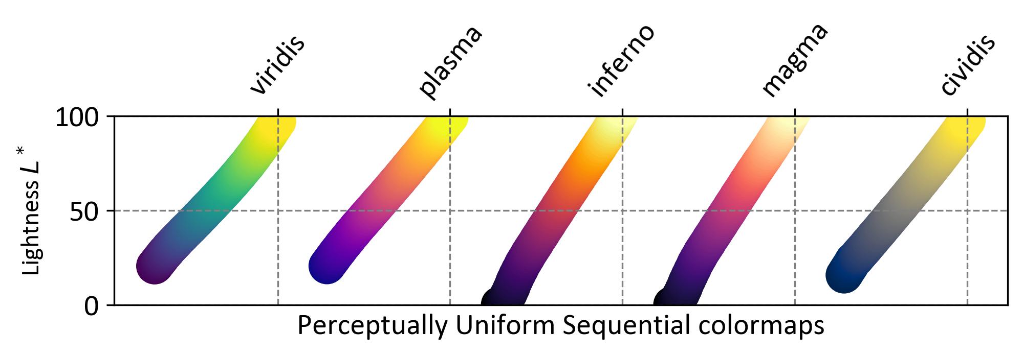
Fig. 6.2 Comparison of five perceptually uniform sequential colormaps varying from dark to light shades representing brightness levels.#
6.5.2.2. Other Sequential Colormaps#
Other Sequential colormaps are useful for a variety of applications where a natural ordering of data needs to be visualized. These colormaps may not always be perceptually uniform but are still effective for highlighting data trends and gradients [Matplotlib Developers, 2024].
Colormap |
Description |
|---|---|
Blues |
A colormap that transitions from light to dark blue. |
BuGn |
A colormap that transitions from light blue to green. |
BuPu |
A colormap that transitions from light blue to purple. |
GnBu |
A colormap that transitions from green to blue. |
Greens |
A colormap that transitions from light to dark green. |
Greys |
A colormap that transitions from light to dark grey. |
Oranges |
A colormap that transitions from light to dark orange. |
OrRd |
A colormap that transitions from light orange to red. |
PuBu |
A colormap that transitions from purple to blue. |
PuBuGn |
A colormap that transitions from purple to blue-green. |
PuRd |
A colormap that transitions from purple to red. |
Purples |
A colormap that transitions from light to dark purple. |
RdPu |
A colormap that transitions from red to purple. |
Reds |
A colormap that transitions from light to dark red. |
YlGn |
A colormap that transitions from yellow to green. |
YlGnBu |
A colormap that transitions from yellow to green to blue. |
YlOrBr |
A colormap that transitions from yellow to orange to brown. |
YlOrRd |
A colormap that transitions from yellow to orange to red. |
These colormaps provide a variety of color transitions that are suitable for different types of data, enhancing the visualization by making it easier to distinguish between different data ranges.
Fig. 6.3 displays a comparison of several perceptually uniform sequential colormaps: Greys, Purples, Blues, Greens, Oranges, Reds, YlOrBr, YlOrRd, OrRd, PuRd, RdPu, BuPu, GnBu, PuBu, YlGnBu, PuBuGn, BuGn, and YlGn. Each colormap is represented as a vertical gradient bar, transitioning from a darker shade at the bottom to a lighter shade at the top. The y-axis shows the lightness level (\(L^*\)) ranging from 0 to 100, indicating an increase in brightness from bottom to top. The x-axis is used to label each colormap.
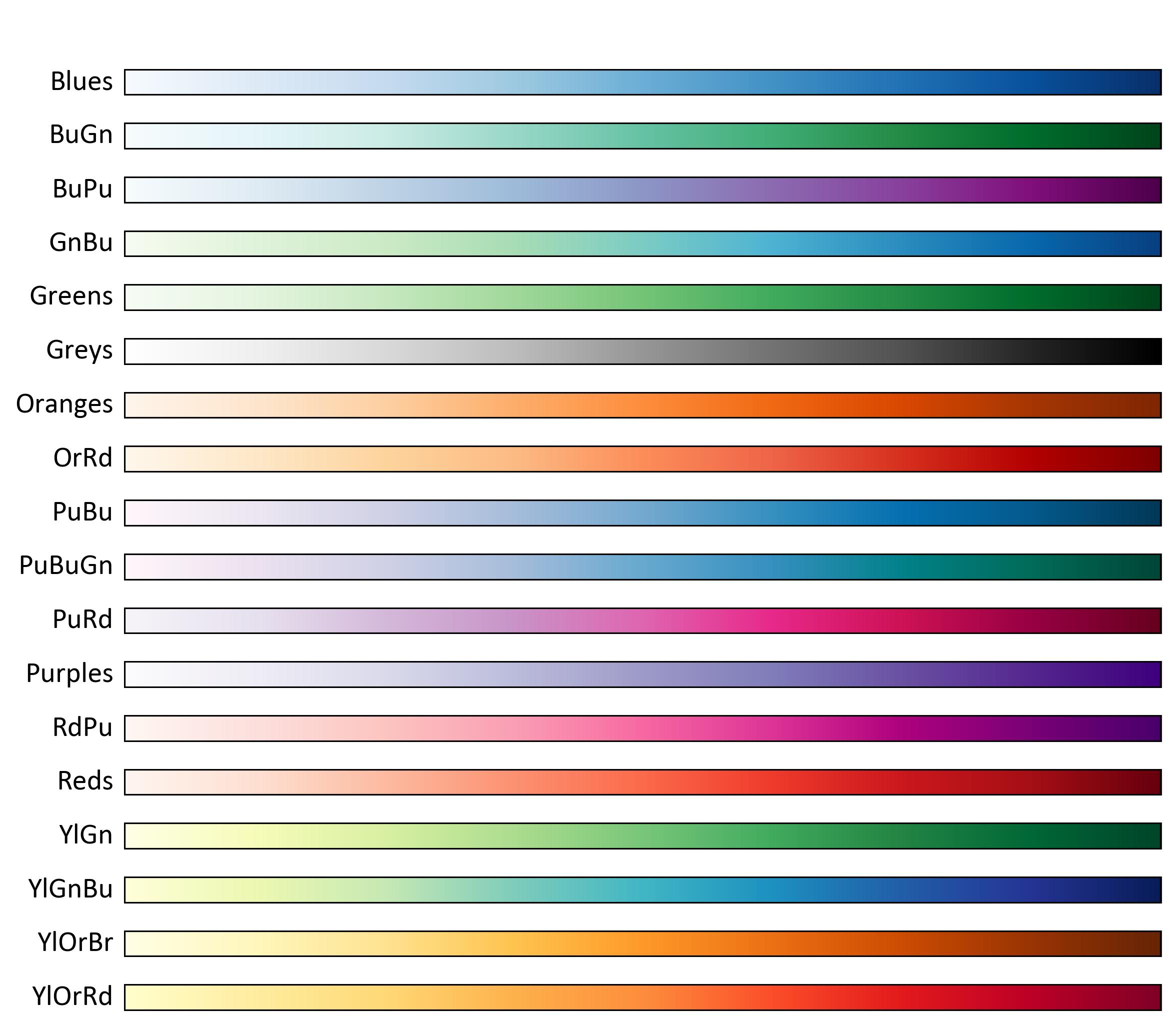
Fig. 6.3 Comparison of several perceptually uniform sequential colormaps varying from dark to light shades representing brightness levels.#
Fig. 6.4 displays a comparison of various sequential colormaps. The top panel shows seven colormaps labeled as Greys, Purples, Blues, Greens, Oranges, Reds, and YlOrRd. Each colormap is represented as a curved gradient bar resembling a teardrop shape, transitioning from a darker shade at the bottom to a lighter shade at the top. The y-axis shows the lightness level (\(L^*\)) ranging from 0 to 100, indicating an increase in brightness from bottom to top. The x-axis labels each colormap by name. Below this panel is another set of colormaps with more vibrant hues labeled PuRd, RdPu, BuPu, GnBu, PuBuGn, YlGnBu and YlGn.
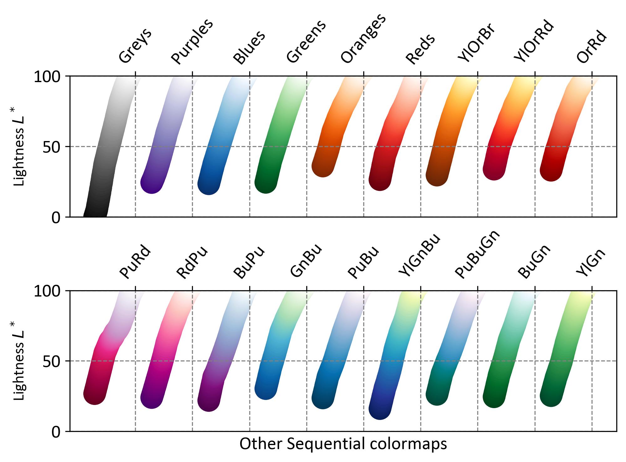
Fig. 6.4 Comparison of various sequential colormaps varying from dark to light shades representing brightness levels.#
6.5.3. Sequential2 Colormaps#
Sequential2 colormaps are designed to represent data that has a natural progression from low to high values. These colormaps often have monotonically increasing lightness values, but some may have plateaus or kinks in their lightness function. This can lead to perceptual banding in the data representation [Matplotlib Developers, 2024].
Lightness Variation: Many Sequential2 colormaps have lightness values that increase monotonically. However, some colormaps like autumn, cool, spring, and winter may plateau or fluctuate, which can cause perceptual issues.
Kinks and Plateaus: Colormaps such as afmhot, copper, gist_heat, and hot have kinks in their lightness functions. Data represented in these regions may appear banded.
Perceptual Range: Colormaps with a smaller range of lightness values will have a smaller perceptual range, affecting how data is interpreted.
Colormap |
Description |
|---|---|
afmhot |
Similar to hot but with a different lightness function. |
autumn |
A colormap that transitions from red to yellow. |
binary |
A colormap that transitions from black to white. |
bone |
A colormap that transitions from black to a light blue-white. |
cool |
A colormap that transitions from cyan to magenta. |
copper |
A colormap that transitions from black to copper. |
gist_gray |
A grayscale colormap with a smooth transition from black to white. |
gist_heat |
A colormap that transitions from black to red, orange, and yellow. |
gist_yarg |
A colormap similar to binary but with a slightly different lightness range. |
gray |
Another grayscale colormap, similar to gist_gray. |
hot |
A colormap that transitions from black to red, orange, and yellow. |
pink |
A colormap that transitions from black to pink. |
spring |
A colormap that transitions from magenta to yellow. |
summer |
A colormap that transitions from green to yellow. |
winter |
A colormap that transitions from blue to green. |
Wistia |
A colormap that transitions from light yellow to orange. |
Sequential2 colormaps are useful for highlighting data progression, but attention should be paid to their lightness functions to avoid perceptual banding.
Fig. 6.5 displays a comparison of several Sequential2 colormaps: afmhot, autumn, binary, bone, cool, copper, gist_gray, gist_heat, gist_yarg, gray, hot, pink, spring, summer, winter, and Wistia. Each colormap is represented as a vertical gradient bar, transitioning from a darker shade at the bottom to a lighter shade at the top. The y-axis shows the lightness level (\(L^*\)) ranging from 0 to 100, indicating an increase in brightness from bottom to top. The x-axis is used to label each colormap.
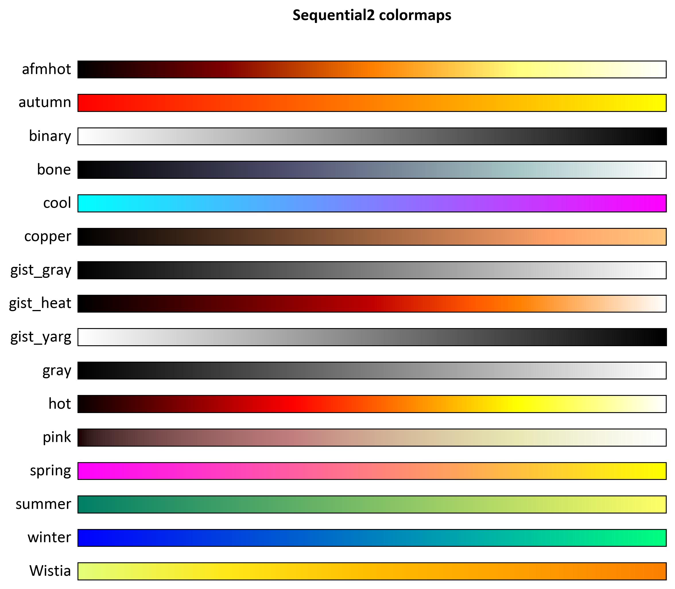
Fig. 6.5 Comparison of several Sequential2 colormaps varying from dark to light shades representing brightness levels.#
Fig. 6.6 displays a comparison of various Sequential2 colormaps. The top panel shows colormaps labeled as binary, gist_yarg, gist_gray, gray, and bone, along with seasonal names like autumn, winter, and spring. Each colormap is represented as a curved gradient bar resembling a teardrop shape, transitioning from a darker shade at the bottom to a lighter shade at the top. The y-axis shows the lightness level (\(L^*\)) ranging from 0 to 100, indicating an increase in brightness from bottom to top. The x-axis labels each colormap by name. Below this panel is another set of colormaps with more vibrant hues labeled cool, Wistia, hot, afmhot, gist_heat, and copper.
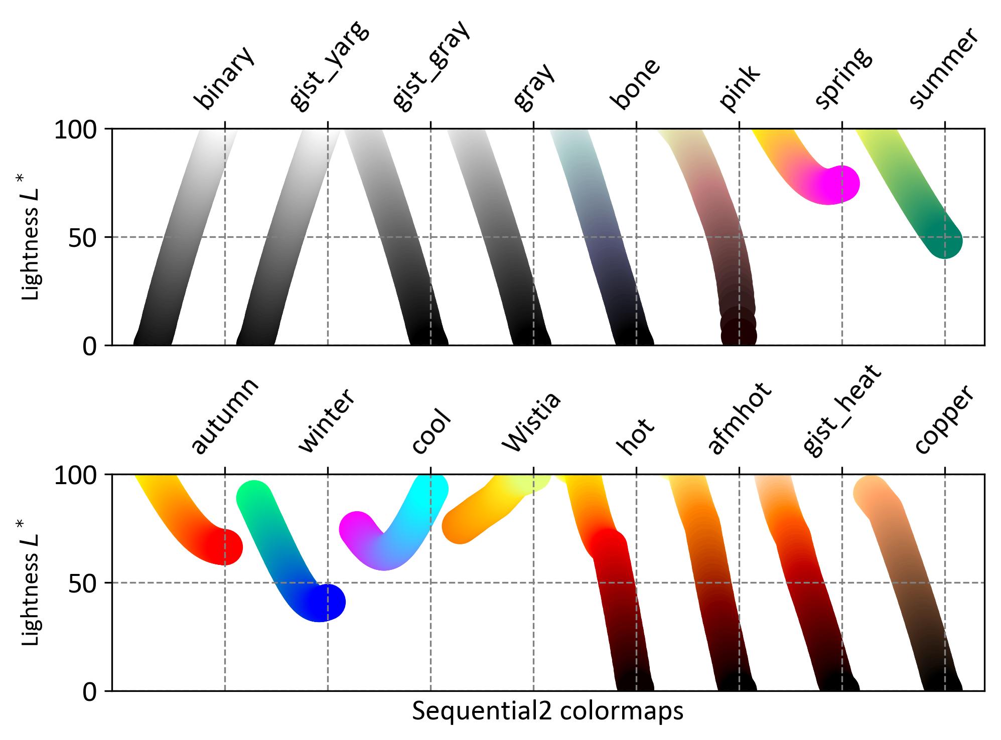
Fig. 6.6 Comparison of various Sequential2 colormaps varying from dark to light shades representing brightness levels.#
6.5.4. Diverging Colormaps#
Diverging colormaps are designed to highlight deviations from a central value, making them ideal for data that has a meaningful midpoint, such as temperature anomalies or financial gains/losses. These colormaps typically have two contrasting colors at the ends and a neutral color in the middle [Matplotlib Developers, 2024].
Key Characteristics:
Monotonic Lightness: The lightness values (\(L^*\)) should increase monotonically to a maximum near the center and then decrease monotonically towards the ends.
Symmetry: The colormap should be symmetric around the center, with approximately equal minimum \(L^*\) values at both ends.
Examples: Good options include BrBG and RdBu, which meet the criteria of having a balanced range of \(L^*\) values.
Considerations:
Perceptual Uniformity: Ensure that the colormap is perceptually uniform to avoid misinterpretation of data.
Grayscale Conversion: Diverging colormaps should convert well to grayscale, maintaining the distinction between the two diverging ends.
Colormap |
Description |
|---|---|
BrBG |
A colormap that transitions from brown to blue-green. |
bwr |
A colormap that transitions from blue to white to red. |
coolwarm |
A colormap that transitions from cool blue to warm red. |
PiYG |
A colormap that transitions from pink to green. |
PRGn |
A colormap that transitions from purple to green. |
PuOr |
A colormap that transitions from purple to orange. |
RdBu |
A colormap that transitions from red to blue. |
RdGy |
A colormap that transitions from red to grey. |
RdYlBu |
A colormap that transitions from red to yellow to blue. |
RdYlGn |
A colormap that transitions from red to yellow to green. |
seismic |
A colormap that transitions from blue to white to red, similar to bwr. |
Spectral |
A colormap that transitions through a spectrum of colors. |
Diverging colormaps are particularly useful for emphasizing differences from a central value, which makes them ideal for visualizations where understanding the magnitude and direction of deviation is crucial.
Fig. 6.7 displays a comparison of several Diverging colormaps: BrBG, PiYG, RdGy, RdBu, Spectral, coolwarm, bwr, and seismic. Each colormap is represented as a vertical gradient bar, transitioning from a darker shade at the bottom to a lighter shade at the top. The y-axis shows the lightness level (\(L^*\)) ranging from 0 to 100, indicating an increase in brightness from bottom to top. The x-axis is used to label each colormap.
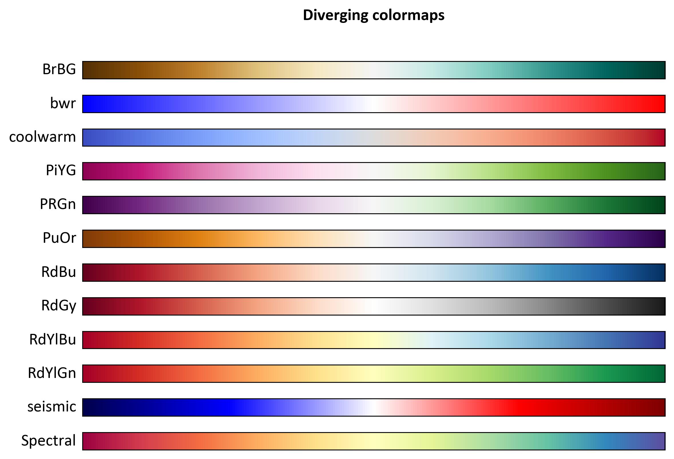
Fig. 6.7 Comparison of several Diverging colormaps varying from dark to light shades representing brightness levels.#
Fig. 6.8 displays a comparison of various Diverging colormaps. The top panel shows colormaps labeled as PiYG, PRGn, BrBG, PuOr, RdGy, and RdBu. Each colormap is represented as a curved gradient bar resembling a teardrop shape, transitioning from a darker shade at the bottom to a lighter shade at the top. The y-axis shows the lightness level (\(L^*\)) ranging from 0 to 100, indicating an increase in brightness from bottom to top. The x-axis labels each colormap by name. Below this panel is another set of colormaps with more vibrant hues labeled RdBu_r, RdGy_r, Spectral, coolwarm, bwr, and seismic.
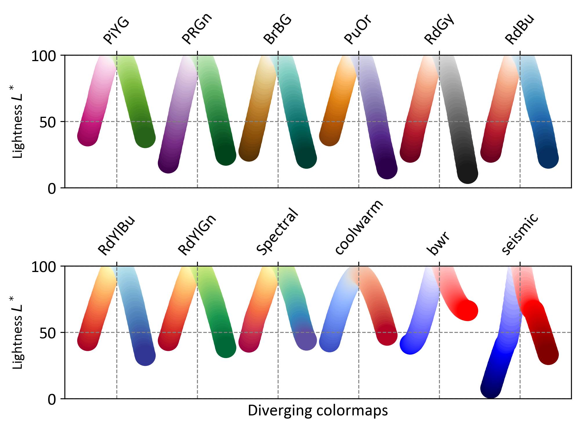
Fig. 6.8 Comparison of various Diverging colormaps varying from dark to light shades representing brightness levels.#
6.5.5. Qualitative Colormaps#
Qualitative colormaps are designed to represent categorical data. Unlike perceptual colormaps, they do not aim to show a progression of values but rather to distinguish between different categories. These colormaps often use a variety of colors that are easily distinguishable from one another [Matplotlib Developers, 2024].
Color Distribution: The lightness parameter (\(L^*\)) in qualitative colormaps varies widely, making them unsuitable for representing data that requires a perceptual gradient.
Use Cases: Ideal for visualizing data where the primary goal is to differentiate between distinct groups or categories, such as different species in a biological study or various regions in a geographical map.
Examples: Common qualitative colormaps include Accent, Set1, and Paired. These colormaps are not intended to convey magnitude but to highlight differences between categories.
When using qualitative colormaps, it’s important to ensure that the chosen colors are distinguishable by all viewers, including those with color vision deficiencies. Tools are available to simulate how colormaps appear to individuals with different types of color blindness.
Colormap |
Description |
|---|---|
Accent |
A colormap with bright, distinctive colors. |
Dark2 |
A colormap with darker, more saturated colors. |
Paired |
A colormap with pairs of colors, useful for paired data categories. |
Pastel1 |
A colormap with soft pastel colors, ideal for categories that need subtle differentiation. |
Pastel2 |
Another pastel colormap with a different set of soft colors. |
Set1 |
A colormap with bright, easily distinguishable colors. |
Set2 |
A colormap with softer, more muted colors. |
Set3 |
A colormap with a variety of colors, suitable for many categories. |
tab10 |
A colormap with ten distinct colors, useful for up to ten categories. |
tab20 |
A colormap with twenty distinct colors, useful for larger sets of categories. |
tab20b |
A variation of tab20 with a different set of twenty colors. |
tab20c |
Another variation of tab20 with a different set of twenty colors. |
Qualitative colormaps are particularly effective for visualizations where distinguishing between different categories is essential. By using a diverse palette of colors, they help to ensure that each category is clearly identifiable, enhancing the overall readability and interpretability of the data.
Fig. 6.9 displays a comparison of several Qualitative colormaps: Accent, Dark2, Paired, Pastel1, Pastel2, Set1, Set2, Set3, tab10, tab20, tab20b, and tab20c. Each colormap is represented as a vertical gradient bar, transitioning from a darker shade at the bottom to a lighter shade at the top. The y-axis shows the lightness level (\(L^*\)) ranging from 0 to 100, indicating an increase in brightness from bottom to top. The x-axis is used to label each colormap.
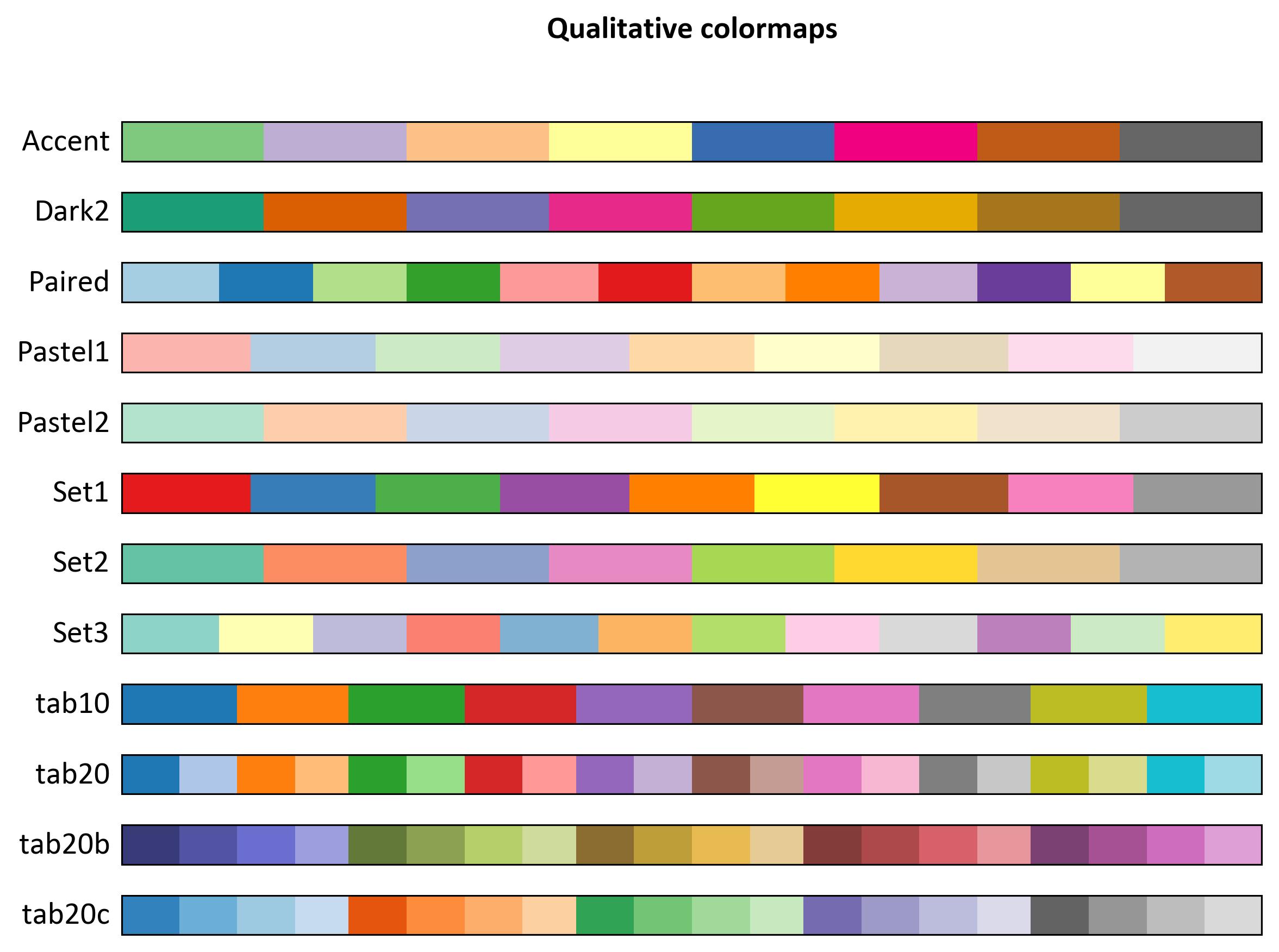
Fig. 6.9 Comparison of several Qualitative colormaps varying from dark to light shades representing brightness levels.#
Fig. 6.10 displays a comparison of various Qualitative colormaps. The top panel shows colormaps labeled as Pastel1, Pastel2, Paired, Accent, Dark2, and several sets labeled as Set1 through Set3. Each colormap is represented by a series of colored circles, each circle’s vertical position corresponding to its lightness value (\(L^*\)). The y-axis shows the lightness level (\(L^*\)) ranging from 0 to 100, indicating an increase in brightness from bottom to top. The x-axis labels each colormap by name. Below this panel is another set of colormaps with more vibrant hues labeled tab10, tab20, tab20b, and tab20c.
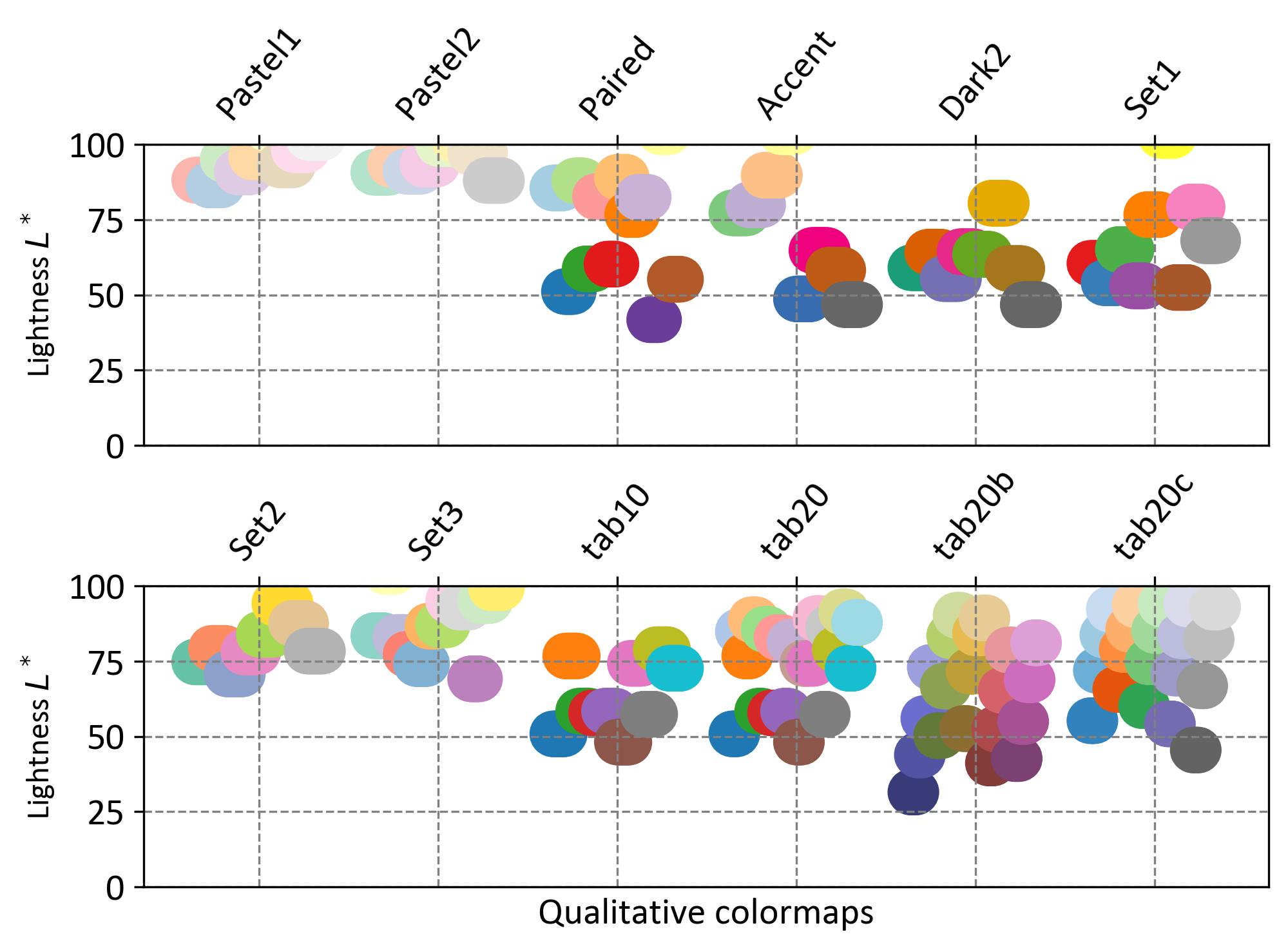
Fig. 6.10 Comparison of various Qualitative colormaps varying in lightness levels.#
6.5.6. Miscellaneous Colormaps#
Miscellaneous colormaps are designed for specific purposes and may not fit into the standard categories of colormaps. These colormaps often have unique characteristics tailored to particular types of data visualization [Matplotlib Developers, 2024]. Some examples:
gist_earth, ocean, and terrain: Useful for plotting topography and water depths. These colormaps typically show a divergence in colors to represent different terrains and water bodies.
CMRmap: Created to convert well to grayscale, though it may have some small kinks in the lightness parameter.
cubehelix: Designed to vary smoothly in both lightness and hue, but it has a small hump in the green hue area.
turbo: Developed to display depth and disparity data effectively.
Each of these colormaps has been crafted with specific visualization needs in mind, making them valuable tools for specialized data representation.
Colormap |
Description |
|---|---|
brg |
A colormap that transitions from blue to red to green. |
CMRmap |
A colormap designed to convert well to grayscale. |
cubehelix |
A colormap that varies smoothly in both lightness and hue. |
flag |
A colormap with alternating red, white, blue, and black stripes. |
gist_earth |
A colormap useful for topographical data, representing earth tones. |
gist_ncar |
A colormap with a unique color scheme, often used for atmospheric data. |
gist_rainbow |
A colormap that cycles through the colors of the rainbow. |
gist_stern |
A colormap with a unique color scheme, often used for artistic purposes. |
gnuplot |
A colormap that transitions through a spectrum of colors, used in gnuplot. |
gnuplot2 |
A variation of gnuplot with a different color scheme. |
jet |
A colormap that transitions from blue to red, often criticized for its perceptual issues. |
nipy_spectral |
A colormap that transitions through a spectrum of colors. |
ocean |
A colormap designed to represent ocean depths. |
prism |
A colormap that cycles through the colors of the rainbow. |
rainbow |
Another colormap that cycles through the colors of the rainbow. |
terrain |
A colormap that transitions through colors representing different terrains. |
turbo |
A colormap developed to display depth and disparity data effectively. |
Miscellaneous colormaps provide specialized solutions for unique visualization challenges. Their tailored characteristics make them suitable for applications such as topographical mapping, atmospheric data representation, and more.
Fig. 6.11 displays a comparison of several colormaps: flag, prism, gnuplot, ocean, terrain, gnuplot2, gist_earth, rainbow, CMRmap, cubehelix, gist_stern, turbo, brg, nipy_spectral, gist_rainbow, and gist_ncar. Each colormap is represented as a vertical gradient bar, transitioning from a darker shade at the bottom to a lighter shade at the top. The y-axis shows the lightness level (\(L^*\)) ranging from 0 to 100, indicating an increase in brightness from bottom to top. The x-axis is used to label each colormap.
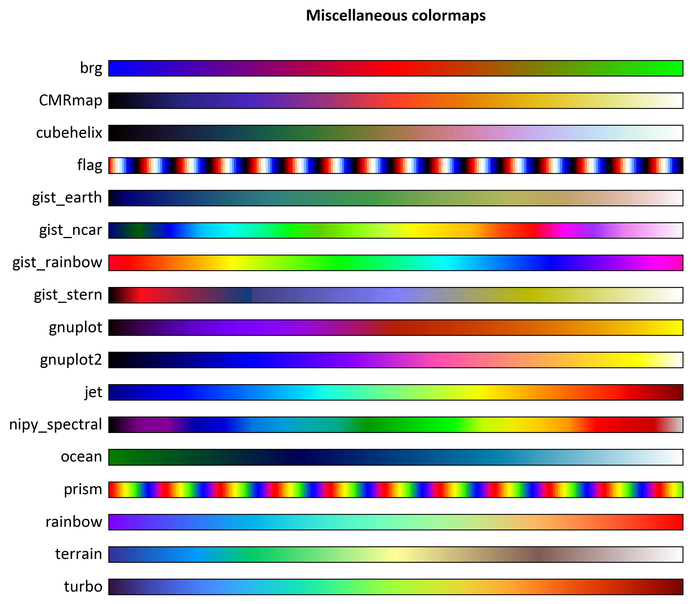
Fig. 6.11 Comparison of several colormaps varying from dark to light shades representing brightness levels.#
Fig. 6.12 displays a comparison of various colormaps. The top panel shows colormaps labeled as flag, prism, gnuplot, ocean, and terrain. Each colormap is represented as a curved gradient bar resembling a teardrop shape, transitioning from a darker shade at the bottom to a lighter shade at the top. The y-axis shows the lightness level (\(L^*\)) ranging from 0 to 100, indicating an increase in brightness from bottom to top. The x-axis labels each colormap by name. Below this panel is another set of colormaps with more vibrant hues labeled gnuplot2, gist_earth, rainbow, CMRmap, cubehelix, and gist_stern.
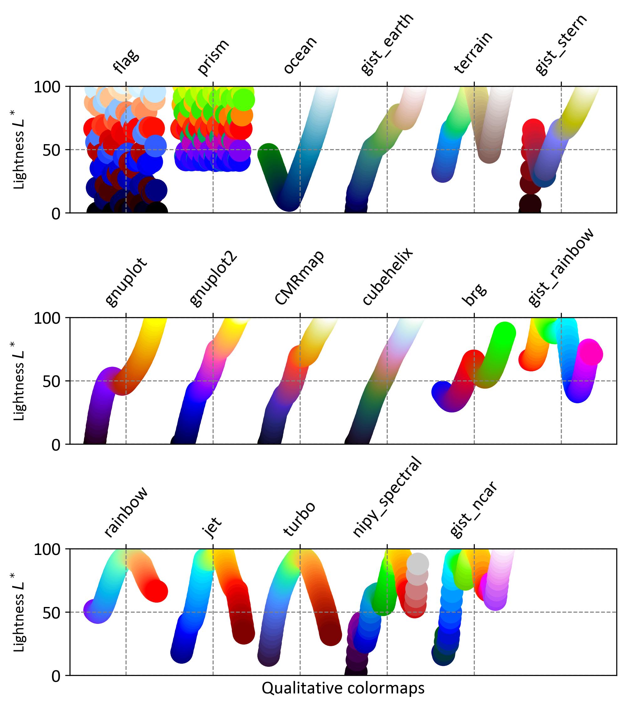
Fig. 6.12 Comparison of various colormaps varying from dark to light shades representing brightness levels.#
