6.4. Marker, Linestyles and Colors#
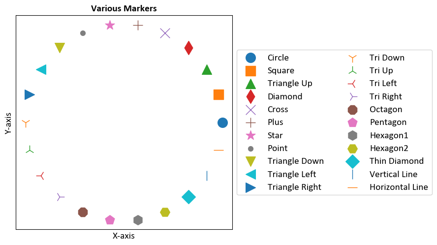
6.4.1. Marker Styles#
Markers are used to indicate individual data points on a plot. They can be added to line plots, scatter plots, and other types of plots.
Some commonly used marker styles include:
'o': Circle marker'^': Upward-pointing triangle marker's': Square marker'd': Diamond marker'x': Cross marker'+': Plus marker'*': Star marker'.': Point marker
We can get a complete list of all available markers using the following command:
from matplotlib.lines import Line2D

# Print all available markers
print(Line2D.markers)
{'.': 'point', ',': 'pixel', 'o': 'circle', 'v': 'triangle_down', '^': 'triangle_up', '<': 'triangle_left', '>': 'triangle_right', '1': 'tri_down', '2': 'tri_up', '3': 'tri_left', '4': 'tri_right', '8': 'octagon', 's': 'square', 'p': 'pentagon', '*': 'star', 'h': 'hexagon1', 'H': 'hexagon2', '+': 'plus', 'x': 'x', 'D': 'diamond', 'd': 'thin_diamond', '|': 'vline', '_': 'hline', 'P': 'plus_filled', 'X': 'x_filled', 0: 'tickleft', 1: 'tickright', 2: 'tickup', 3: 'tickdown', 4: 'caretleft', 5: 'caretright', 6: 'caretup', 7: 'caretdown', 8: 'caretleftbase', 9: 'caretrightbase', 10: 'caretupbase', 11: 'caretdownbase', 'None': 'nothing', 'none': 'nothing', ' ': 'nothing', '': 'nothing'}
Marker |
Description |
|---|---|
|
Point |
|
Pixel |
|
Circle |
|
Triangle down |
|
Triangle up |
|
Triangle left |
|
Triangle right |
|
Tri down |
|
Tri up |
|
Tri left |
|
Tri right |
|
Octagon |
|
Square |
|
Pentagon |
|
Star |
|
Hexagon1 |
|
Hexagon2 |
|
Plus |
|
X |
|
Diamond |
|
Thin diamond |
` |
` |
|
Horizontal line |
|
Plus (filled) |
|
X (filled) |
|
Tick left |
|
Tick right |
|
Tick up |
|
Tick down |
|
Caret left |
|
Caret right |
|
Caret up |
|
Caret down |
|
Caret left (base) |
|
Caret right (base) |
|
Caret up (base) |
|
Caret down (base) |
|
Nothing |
|
Nothing |
|
Nothing |
`` |
Nothing |
For more details, you can refer to the Matplotlib markers documentation.
Example: This example demostrates various markers in matplotlib.
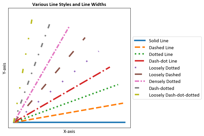
6.4.2. Line Styles and Line Widths#
Line styles determine how the lines connecting data points are displayed. They are commonly used in line plots and other plots that involve connecting data points with lines. You can also adjust the width of the lines using the linewidth parameter.
Some commonly used line styles include:
'-': Solid line (default)'--': Dashed line':': Dotted line'-.': Dash-dot line
You can get a complete list of all available line styles using the following command:
from matplotlib.lines import Line2D

# Print all available line styles
print(Line2D.lineStyles)
{'-': '_draw_solid', '--': '_draw_dashed', '-.': '_draw_dash_dot', ':': '_draw_dotted', 'None': '_draw_nothing', ' ': '_draw_nothing', '': '_draw_nothing'}
The linewidth parameter controls the thickness of the lines. The default value is 1.0, but you can set it to any positive number to increase or decrease the line width.
Example: This example demonstrates the use of different line styles and line widths.
6.4.3. Colors#
Matplotlib provides a wide range of colors that you can use to customize your plots. These colors are available as named colors or can be specified using hexadecimal color codes. Here’s an overview of the different ways you can use colors in Matplotlib [Pajankar, 2021, Matplotlib Developers, 2024]:
Named Colors: Matplotlib provides a variety of named colors that you can use directly by their names. For example:
'red','blue','green','purple','yellow','orange','cyan','magenta','black','white', and more.Hexadecimal Color Codes: You can specify colors using hexadecimal color codes. These are strings representing RGB values in hexadecimal notation. For example:
'#FF5733'for a shade of orange.RGB and RGBA Colors: Colors can also be specified using tuples of RGB values or RGBA values (including an alpha channel for transparency). For example:
(0.2, 0.4, 0.6)for a shade of blue.CSS4 Colors: Matplotlib supports CSS4 color names, which include a wide range of color names like
'aliceblue','chartreuse','darkslategray', and many more.XKCD Colors: Matplotlib includes a set of XKCD colors, which are whimsical color names inspired by the XKCD webcomic. These colors can be accessed using their unique XKCD names, like
'cloudy blue','cement','ugly pink', etc.
Example: This example illustrates the use of various color options in Matplotlib.
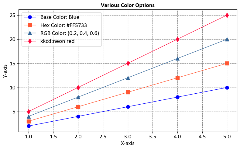
In this example, the code demonstrates how to use named colors, hexadecimal codes, RGB values, and XKCD color names to create a plot with multiple colored lines.
6.4.3.1. Base colors#
In Matplotlib, the mcolors.BASE_COLORS dictionary contains a set of predefined base colors that serve as the default colors for plots. These colors are available as named constants, making it easy to reference them when creating visualizations. The BASE_COLORS dictionary provides a consistent set of colors that are designed to be visually distinguishable from each other [Pajankar, 2021, Matplotlib Developers, 2024].
The BASE_COLORS dictionary is part of the matplotlib.colors module, and it is commonly used to set colors for various plot elements such as lines, markers, bars, and more. The base colors are typically used as the foundation for customizing plot styles, but you can also use them directly if you prefer the default color palette.

These colors are used in sequential order for different data series in your plot. If you have more than nine data series, Matplotlib will cycle back to the beginning of the list.
Example:This example demonstrates the use of the base colors in a plot.
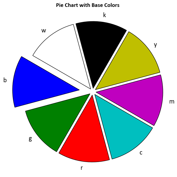
In this example, the code uses the base colors (‘C0’, ‘C1’, ‘C2’, ‘C3’) to create a plot with different colored lines. These base colors are particularly useful when you have multiple data series and want to ensure consistent and visually appealing color choices for each series.
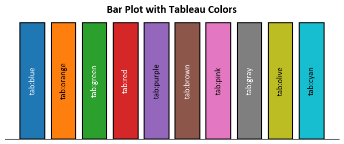
6.4.3.2. Tableau Palette#
In Matplotlib, mcolors.TABLEAU_COLORS is a dictionary that provides a set of color names representing the default Tableau color palette. The Tableau color palette is designed to be visually distinguishable and suitable for creating attractive and informative data visualizations. This palette is especially popular for creating plots with multiple data series, as the colors are chosen to be easily distinguishable in print and on screens [Pajankar, 2021, Matplotlib Developers, 2024].
The mcolors.TABLEAU_COLORS dictionary maps color names (strings) to their corresponding RGB values. These color names can be used to set the color of various plot elements, such as lines, markers, bars, and more, using the color parameter in Matplotlib.

The above plot and the following plot were generated using a adapted code from https://matplotlib.org/stable/gallery/color/named_colors.html.
Example: This example demonstrates the use of the Tableau palette colors in a plot.
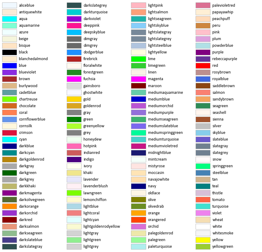
6.4.3.3. CSS Colors#
mcolors.CSS4_COLORS refers to a color dictionary provided by the Matplotlib library, a popular data visualization tool in Python. This dictionary contains a comprehensive set of named colors following the CSS4 standard, making it easy to use consistent and aesthetically pleasing colors in your data visualizations.
Each color in the mcolors.CSS4_COLORS dictionary is represented by its name (key) and its corresponding hexadecimal RGB value (value), allowing you to reference and use these colors by name in your Matplotlib plots and charts. This feature simplifies the process of choosing and using colors in your data visualizations.
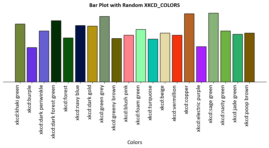
6.4.3.4. XKCD Colors#
mcolors.XKCD_COLORS is another color dictionary provided by the Matplotlib library in Python, specifically named after the XKCD Color Survey. This dictionary contains a set of named colors, each of which corresponds to a specific color that was popular in the XKCD webcomic’s color survey [Pajankar, 2021, Matplotlib Developers, 2024].
The XKCD color survey collected a wide range of color names from contributors, resulting in a unique and playful set of color labels that can add a fun and creative touch to your data visualizations.
Like mcolors.CSS4_COLORS, the mcolors.XKCD_COLORS dictionary allows you to easily use these named colors in your Matplotlib plots and charts. Each color in the dictionary is represented by its name (key) and its corresponding hexadecimal RGB value (value).
Here’s an example of how you can use colors from mcolors.XKCD_COLORS in Matplotlib: