11.3. t-Distributed Stochastic Neighbor Embedding (t-SNE)#
t-Distributed Stochastic Neighbor Embedding (t-SNE) is a formidable technique for visualizing high-dimensional data in a lower-dimensional space. This method is widely used for data exploration and analysis because it preserves the local intricacies within the data, which helps to identify clusters and patterns. Here is an in-depth exploration of how t-SNE works [Cai and Ma, 2022, Do and Canzar, 2021]:
11.3.1. Understanding t-SNE#
t-SNE is a non-linear dimensionality reduction technique that focuses on preserving the pairwise similarities between data points. Its strength lies in its ability to capture complex, non-linear relationships within the data. Unlike some other techniques, t-SNE is not aimed at feature extraction or transformation; its main purpose is visual representation [Kobak and Berens, 2019, Van der Maaten and Hinton, 2008].
Establishing Pairwise Similarities: The first step of t-SNE is to compute the pairwise similarities among data points in the original high-dimensional space. Usually, these similarities are based on Euclidean distances or other relevant distance metrics.
Mapping Similarities in Reduced Dimensions: The next step of t-SNE is to map these pairwise similarities onto a lower-dimensional space, while maintaining the intrinsic relationships. This mapping tries to bring similar data points closer and push dissimilar points further away, creating a coherent representation.
Embracing Probability Distributions: t-SNE uses probability distributions to model the similarities in both the high-dimensional and low-dimensional spaces. It creates a probability distribution that captures the similarities between data points in the original high-dimensional space, and another distribution that suits the reduced, low-dimensional space.
Minimizing Divergence: The core of t-SNE is to minimize the divergence, a measure of difference, between these two probability distributions. Through this intricate process, the algorithm ensures that data points with high similarities in the original space also have high similarities in the reduced dimensions.
Definition - Perplexity
Perplexity is a parameter that controls how t-SNE balances the attention between local and global aspects of the data. It can be loosely interpreted as the number of close neighbors each point has in the high-dimensional space. The perplexity value affects the shape and size of the clusters in the low-dimensional representation. A higher perplexity value tends to produce clearer clusters, but it may also distort the global structure of the data. A lower perplexity value preserves more of the global structure, but it may also merge distinct clusters together. There is no optimal perplexity value for all datasets, and it is recommended to try different values and see how they affect the results [scikit-learn Developers, 2023].
Example: Let’s say we have a bunch of 10,000 pictures with cats, dogs, birds, and fish. Each picture has 784 details about the pixels in a 28x28 black-and-white image. Now, we want to simplify this data to see it on a simple 2D plot.
To do this, we use a method called t-SNE, but we have to pick a number called perplexity. This number decides whether t-SNE should focus more on how close or how far animals are from each other in the pictures.
If we go for a low perplexity, like 5, t-SNE cares a lot about how close animals are in each picture. This might make it miss the big picture, so animals that are actually far apart in the pictures might end up close together on the plot. For example, pictures of cats and dogs might look like they belong to the same group, while birds and fish might be in different groups.
On the other hand, if we go for a high perplexity, like 50, t-SNE focuses more on the big picture. This might cause it to miss the details, so animals that are close together in the pictures might end up far apart on the plot. In this case, pictures of cats and dogs might be in different groups, while birds and fish might end up together.
A moderate perplexity, say 30, tries to find a balance. It considers both the closeness and the farness of animals in the pictures. This often gives a better picture where you can see clear groups of different animals, and there’s also some variety within each group.
11.3.2. Mechanisms of t-SNE (Simplified)#
t-SNE is a nonlinear dimensionality reduction technique that aims to preserve the local structure of high-dimensional data in a lower-dimensional space. It consists of four main steps [Cai and Ma, 2022, Do and Canzar, 2021, Kobak and Berens, 2019, Van der Maaten and Hinton, 2008]
Computing pairwise similarities: For each data point, t-SNE computes the conditional probabilities that represent the similarity of a data point to another point in the high-dimensional space. These probabilities depend on the distance metrics between the data points. The perplexity parameter controls the number of neighbors each point has, affecting the shape of the Gaussian distribution used to compute these conditional probabilities.
Mapping similarities: In this step, t-SNE tries to find a lower-dimensional representation of the data points that preserves their pairwise similarities as much as possible. Each data point is mapped to a point in the lower-dimensional space, which can have two or three dimensions. The algorithm starts with random initialization and iteratively refines the positions to minimize the divergence between the similarities in high and low dimensions.
Using probability distributions: In this step, the algorithm models the pairwise similarities in both high-dimensional and low-dimensional spaces using probability distributions. The high-dimensional similarities are modeled by a joint probability distribution that is obtained by symmetrizing the conditional probabilities. The low-dimensional similarities are modeled by a joint probability distribution that is constructed with a Student’s t-distribution with one degree of freedom to measure the similarity between two points in the low-dimensional space. Using the t-distribution with heavier tails than a Gaussian allows t-SNE to overcome the crowding problem that occurs when mapping high-dimensional data into lower dimensions.
Minimizing divergence: In this step, the algorithm minimizes the divergence between the probability distributions, which indicates how well the low-dimensional representation preserves the high-dimensional similarities. The divergence is measured by the Kullback-Leibler divergence, which is asymmetric and penalizes larger differences when the high-dimensional similarity is large than when the low-dimensional similarity is. This property makes t-SNE focus more on preserving the local data structure than the global structure. The algorithm uses gradient descent to minimize the Kullback-Leibler divergence, stopping either when it reaches a local minimum or after a fixed number of iterations.
11.3.3. Mechanisms of t-SNE (Alternative version - Optional Content)#
t-SNE is a nonlinear dimensionality reduction technique that aims to preserve the local structure of high-dimensional data in a lower-dimensional space. It consists of four main steps [Cai and Ma, 2022, Do and Canzar, 2021, Kobak and Berens, 2019, Van der Maaten and Hinton, 2008]:
Finding Neighbors: In this step, the algorithm calculates how likely each data point is to choose another point as its neighbor, based on how close they are in the original space. The closer they are, the more likely they are to be neighbors. The perplexity parameter controls how many neighbors each point has, affecting how the algorithm sees the data. Mathematically, the algorithm computes the conditional probabilities that represent the likelihood of a data point selecting another point as its neighbor in the high-dimensional space. These probabilities depend on the Euclidean distances or other distance metrics between the data points. For each point \(i\), the probability of choosing point \(j\) as its neighbor is denoted as \(p_{j|i}\). The perplexity parameter affects the shape of the Gaussian distribution used to compute these conditional probabilities. A Gaussian distribution is a bell-shaped curve that shows how likely a value is to occur. A higher perplexity value means a wider and flatter Gaussian curve, which means that more points are considered as neighbors. A lower perplexity value means a narrower and taller Gaussian curve, which means that fewer points are considered as neighbors.
Mapping Neighbors in Lower Dimensions: In this step, the algorithm tries to find a new representation of the data points in a lower-dimensional space, such as a 2D or 3D plot, that keeps their neighbor relationships as much as possible. The algorithm starts with random positions for the points in the lower-dimensional space and gradually adjusts them to make them more similar to their neighbors in the original space. Mathematically, the algorithm tries to find a lower-dimensional representation of the data points that preserves their pairwise similarities as much as possible. Each data point \(i\) is mapped to a point \(y_i\) in the lower-dimensional space, which can have two or three dimensions. The algorithm starts with random initialization of \(y_i\) values and iteratively refines them to minimize the divergence between the similarities in high and low dimensions.
Using Probability Distributions: In this step, the algorithm uses probability distributions to model how similar the data points are in both the original and the lower-dimensional spaces. The original similarities are modeled by a probability distribution that is based on the neighbor likelihoods calculated in the first step. The lower-dimensional similarities are modeled by a probability distribution that is based on the distances between the points in the lower-dimensional space. The algorithm uses a special type of probability distribution that can handle the differences between high and low dimensions better than a normal distribution. Mathematically, the algorithm models the pairwise similarities in both high-dimensional and low-dimensional spaces using probability distributions. The high-dimensional similarities are modeled by a joint probability distribution \(P\), which is obtained by symmetrizing the conditional probabilities \(p_{j|i}\) as
(11.17)#\[\begin{equation} P_{ij} = \frac{p_{j|i} + p_{i|j}}{2n}.\end{equation}\]The low-dimensional similarities are modeled by a joint probability distribution \(Q\), which is constructed with a Student’s t-distribution with one degree of freedom to measure the similarity between two points in the low-dimensional space as
(11.18)#\[\begin{equation} q_{ij} =\frac{\left( 1 + \|y_i - y_j \|^2 \right)^{-1}}{Z},\end{equation}\]where \(Z\) is a normalization constant. A joint probability distribution is a way to show how likely two events are to occur together. A Student’s t-distribution is a type of probability distribution that has heavier tails than a normal distribution, which means that it gives more weight to extreme values. Using the t-distribution with heavier tails than a Gaussian allows t-SNE to overcome the crowding problem that occurs when mapping high-dimensional data into lower dimensions. The crowding problem is when many points in the high-dimensional space are squeezed into a small area in the low-dimensional space, making them indistinguishable.
Reducing Divergence: In this step, the algorithm tries to make the probability distributions of the original and the lower-dimensional similarities as close as possible, which means that the lower-dimensional representation preserves the original structure of the data well. The algorithm measures how close the probability distributions are by using a divergence metric, which is a way to quantify the difference between two probability distributions. The algorithm uses a type of divergence metric that focuses more on the local structure of the data than the global structure. The algorithm changes the positions of the points in the lower-dimensional space to minimize the divergence metric, stopping either when it reaches a good enough solution or after a certain number of tries. Mathematically, the algorithm minimizes the divergence between the probability distributions \(P\) and \(Q\), which indicates how well the low-dimensional representation preserves the high-dimensional similarities. The divergence is measured by the Kullback-Leibler divergence, which is defined as
(11.19)#\[\begin{equation}KL(P||Q) = \sum_{ij} P_{ij} \log(P_{ij} / Q_{ij}).\end{equation}\]The Kullback-Leibler divergence is asymmetric and penalizes larger differences between \(P_{ij}\) and \(Q_{ij}\) more when \(P_{ij}\) is large than when \(Q_{ij}\) is. This property makes t-SNE focus more on preserving the local data structure than the global structure. The algorithm uses gradient descent to minimize the Kullback-Leibler divergence with respect to \(y_i\) values, stopping either when it reaches a local minimum or after a fixed number of iterations. Gradient descent is a method to find the optimal solution by moving in the direction of the steepest decrease of the divergence metric. A local minimum is a point where the divergence metric is lower than all nearby points. A fixed number of iterations is a limit on how many times the algorithm can try to improve the solution.
Note
The function is called the Kullback-Leibler divergence, and it is a way to measure how different two probability distributions are. A probability distribution is a way to show how likely something is to happen. For example, if you flip a fair coin, the probability distribution of the outcome is 50% heads and 50% tails. If you flip a biased coin, the probability distribution of the outcome may be different, such as 70% heads and 30% tails.
The Kullback-Leibler divergence compares two probability distributions, \(P\) and \(Q\), and tells you how much information is lost or gained when you use \(Q\) instead of \(P\). For example, if you use the biased coin instead of the fair coin, you lose some information about the true outcome. The Kullback-Leibler divergence is calculated by adding up the differences between the probabilities of each possible outcome in \(P\) and \(Q\), multiplied by the logarithm of the ratio of those probabilities. The logarithm is a mathematical function that makes the differences more noticeable when they are large, and less noticeable when they are small. The function is written as
where \(P_{ij}\) and \(Q_{ij}\) are the probabilities of the outcome \(ij\) in \(P\) and \(Q\), respectively. The sum is over all possible outcomes \(ij\). The Kullback-Leibler divergence is always greater than or equal to zero, and it is zero only when \(P\) and \(Q\) are exactly the same. The larger the Kullback-Leibler divergence, the more different \(P\) and \(Q\) are.
11.3.4. Advantages and Disadvantages of t-SNE#
t-SNE is a popular technique for nonlinear dimensionality reduction and data visualization. It has some advantages and disadvantages that you should be aware of before using it [Ellis, 2023]. Here are some of them:
Advantages:
Cluster Preservation: t-SNE keeps the data points that are close together in the original space close together in the new space, meaning that you can easily see groups and patterns in your data, better than other methods that may change the shape of the data.
Nonlinearity Discovery: t-SNE can find complex patterns in your data that are not straight lines, unlike other methods that only keep the most important features of your data. t-SNE uses a special function that keeps the similarities between data points, allowing t-SNE to show hidden structures and relationships in your data that may not be visible in a straight line projection.
Disadvantages:
Perplexity Parameter: t-SNE requires you to choose a perplexity parameter that controls how many neighbors each point has, and how much attention is given to keeping the local versus the global structure of your data. The perplexity parameter affects the shape of the curve that is used to calculate the likelihood of a data point choosing another point as its neighbor in the original space, and it can have a big impact on the quality and meaning of your visualization. Choosing a good perplexity value can be hard, as it depends on the features and density of your data, and there is no clear rule or best value for it.
Stochastic Nature: t-SNE introduces randomness into its process, resulting in slightly different outcomes for different runs of the method, depending on the initial random positions of the points in the new space and the random changes of the positions to make them more similar to their neighbors in the original space. This means that t-SNE may not produce consistent or reliable results, and it may also create false groups or artifacts that do not reflect the true structure of your data. To overcome this issue, you may need to run the method multiple times and compare or average the results, or use other methods to check the strength and validity of your visualization.
11.3.5. Applications and Use Cases of t-SNE#
t-SNE is a powerful technique for nonlinear dimensionality reduction and data visualization. It has many applications and use cases in various domains and fields, such as biology, computer vision, natural language processing, and more [Li et al., 2017, Platzer, 2013]. Here are some of them:
Visualizing Clusters and Patterns: t-SNE allows you to see high-dimensional data in a lower-dimensional space, such as a 2D or 3D plot, that can be easily shown and understood. t-SNE keeps the data points that are close together in the original space close together in the new space, meaning that you can easily see groups and patterns in your data, better than other methods that may change the shape of the data. t-SNE has been widely used for seeing groups and patterns in various types of data, such as genes , cells , DNA , pictures , words , and more.
Exploring Data Relationships: t-SNE helps you to explore relationships between data points and groups, such as how similar or different they are, how they are related, how they depend on each other, etc. t-SNE shows the similarities between data points based on how close or far they are in the original space, and puts them in a new space using a probability-based method. This helps t-SNE to show hidden structures and relationships in your data that may not be clear in a straight line projection or a simple distance table. t-SNE can also help you to discover new things or ideas about your data by allowing you to play with the visualization, such as zooming, rotating, coloring, labeling, etc.
Anomaly Detection and Complexity Analysis: t-SNE can help you to find anomalies or outliers within datasets and provide insights into the complicated structures of complex data. t-SNE uses a special function that keeps the similarities between data points, which means that it can handle curves and high-dimensions in your data better than straight line methods such as PCA. This helps t-SNE to find anomalies or outliers that may be different from the normal patterns or groups in your data, and highlight them in the visualization . t-SNE can also help you to understand the complexity of your data by showing you how different features or dimensions affect the variation or structure of your data, and how they interact with each other .
11.3.6. Caveats and Considerations of t-SNE#
t-SNE is a nonlinear dimensionality reduction technique that has some limitations and challenges that you should be aware of before using it [Kang et al., 2021, Nemade et al., 2022]. Here are some of them:
Local Emphasis: t-SNE does not always preserve the global structure of the data in the lower-dimensional space, as it focuses more on preserving the local neighborhoods in the data. This may distort or lose the global structure of the data, such as hierarchies, clusters, or trends. t-SNE also uses an asymmetric divergence measure, which means that it penalizes large differences between high-dimensional and low-dimensional similarities more when the high-dimensional similarities are large than when they are small. This may create isolated clusters that do not reflect the true structure of the data, and may also fail to capture global relationships or hierarchies in the data.
Computational Demand: t-SNE may pose computational difficulties and scalability issues for very large datasets, as it requires computing pairwise similarities between all data points in both the high-dimensional and low-dimensional spaces, which can be very expensive and time-consuming. The computational complexity of t-SNE is \(O(n^2)\), where n is the number of data points. Although there are some methods to speed up t-SNE, such as using approximate nearest neighbors or exploiting sparsity, they may introduce errors or trade-offs in the quality of the visualization.
Interpretational Nuances: t-SNE may not be easy or intuitive to interpret the lower-dimensional space produced by t-SNE, as it uses a nonlinear mapping function that preserves the pairwise similarities between data points and cannot be easily related to the original feature space. Moreover, t-SNE may produce different results depending on various factors, such as the perplexity parameter, the initial random initialization, the optimization process, and the random seed. This means that t-SNE may not produce consistent or reproducible results, and it may also create spurious clusters or artifacts that do not reflect the true structure of the data.
11.3.7. Using t-SNE with scikit-learn (sklearn)#
Scikit-learn’s TSNE class implements the t-SNE algorithm in a user-friendly manner. Here’s an overview of how the algorithm works within scikit-learn:
Importing the Necessary Module: Start by importing the
TSNEclass from thesklearn.manifoldmodule:
from sklearn.manifold import TSNE
Creating an Instance: Instantiate the
TSNEclass with the desired parameters. Key parameters include:n_components: The number of dimensions for the visualization (usually 2 or 3).perplexity: A hyperparameter that balances preserving local and global structures.learning_rate: The step size for gradient descent optimization.n_iter: The number of iterations for the optimization process.
tsne = TSNE(n_components=2, perplexity=30, learning_rate=200, n_iter=500)
Fitting and Transforming: Use the
fit_transformmethod to apply t-SNE to your high-dimensional data. This method takes your data as input and returns the transformed data in the lower-dimensional space. To test this we use the “load_digits” dataset [scikit-learn Developers, 2023].
from sklearn.datasets import load_digits
from sklearn.manifold import TSNE  # Import TSNE
import matplotlib.pyplot as plt
import seaborn as sns
plt.style.use('../mystyle.mplstyle')

# Load the digits dataset
digits = load_digits()

# Create a TSNE instance
tsne = TSNE(n_components=2, random_state=42)  # Initialize t-SNE with 2 components

# Fit and transform the data with t-SNE to project from 64 to 2 dimensions
X_tsne = tsne.fit_transform(digits.data)

# Print shapes before and after t-SNE
print("Original data shape:", digits.data.shape)
print("Projected data shape:", X_tsne.shape)

# Get a list of 10 distinct colors from a Seaborn colormap
colors = sns.color_palette("Spectral", n_colors=10)

# Create a scatter plot using Seaborn
fig, ax = plt.subplots(1, 1, figsize=(9.5, 9.5))
scatter = sns.scatterplot(x=X_tsne[:, 0], y=X_tsne[:, 1],
                          hue=digits.target, palette=colors,
                          edgecolor='k', alpha=0.7, s=40, ax=ax)

# Set labels and title
ax.set(xlabel='Component 1', ylabel='Component 2',
       title='t-SNE Projection of Handwritten Digits')

# Display the plot with tight layout
plt.tight_layout()
plt.show()  # Show the plot
Original data shape: (1797, 64)
Projected data shape: (1797, 2)
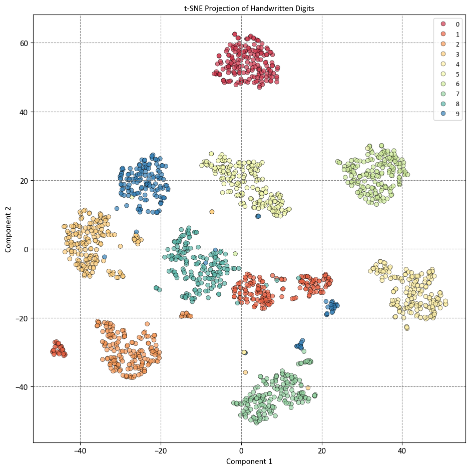
The plot shows that t-SNE has preserved the local neighborhoods in the data, meaning that data points that are close together in the original feature space are also close together in the reduced visualization space. This makes it easy to identify clusters and patterns in the data, such as the separation of different digits, the similarity of some digits, and the variation within some digits. The plot also shows that t-SNE has captured some nonlinear patterns in the data, such as the curvature of some clusters, the overlap of some clusters, and the outliers of some clusters. The plot also shows that t-SNE has not preserved the global structure of the data, such as the relative distances or orientations of the clusters, and that it may have created some spurious clusters or artifacts that do not reflect the true structure of the data, such as the isolated points or the gaps between clusters.
11.3.8. Swiss Roll Example#
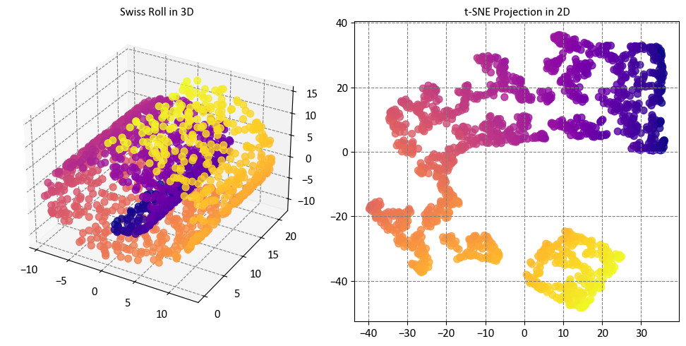
In this example, we will compare two popular nonlinear dimensionality reduction techniques: T-distributed Stochastic Neighbor Embedding (t-SNE) and Locally Linear Embedding (LLE). We will use the Swiss Roll dataset, which is a synthetic dataset that consists of a 2-dimensional manifold embedded in a 3-dimensional space, resembling a Swiss roll cake. The dataset has a nonlinear structure that cannot be captured by linear techniques such as PCA. We will apply t-SNE and LLE to the dataset and visualize the results in a 2-dimensional space. We will also explore how t-SNE and LLE perform on a modified version of the dataset that contains a void, which is a region where no data points are present [scikit-learn Developers, 2023].
# Source code:
# https://scikit-learn.org/stable/auto_examples/manifold/plot_swissroll.html

import matplotlib.pyplot as plt
from sklearn import datasets, manifold

# Generate Swiss Roll dataset
sr_points, sr_color = datasets.make_swiss_roll(n_samples=1500, random_state=0)

# Create subplots
fig = plt.figure(figsize=(10, 5))

# 3D Subplot
ax3d = fig.add_subplot(121, projection='3d')
ax3d.scatter(sr_points[:, 0], sr_points[:, 1], sr_points[:, 2],
             c=sr_color, s=50, alpha=0.8, cmap='plasma')
ax3d.set_title("Swiss Roll in 3D")

# 2D Subplot using t-SNE
tsne = manifold.TSNE(n_components=2, random_state=0)
sr_points_2d = tsne.fit_transform(sr_points)
ax2d = fig.add_subplot(122)
ax2d.scatter(sr_points_2d[:, 0], sr_points_2d[:, 1], c=sr_color, s=50,
             alpha=0.8, cmap='plasma')
ax2d.set_title("t-SNE Projection in 2D")

# Show the plots
plt.tight_layout()
Here is what the code does:
The code imports matplotlib.pyplot, which is a Python library for creating plots and graphs.
The code also imports datasets and manifold from sklearn, which are Python modules for generating and manipulating data and applying manifold learning techniques, respectively.
The code uses the datasets module to generate a synthetic dataset called the Swiss Roll, which consists of 1500 data points that form a 2-dimensional manifold embedded in a 3-dimensional space, resembling a Swiss roll cake. The dataset has a nonlinear structure that cannot be captured by linear techniques such as PCA. The code also assigns a color to each data point based on its position along the manifold.
The code creates a figure with two subplots using matplotlib.pyplot, one for showing the Swiss Roll in 3D and the other for showing its projection in 2D.
The code uses the manifold module to create a TSNE instance with two components and a random state of 0, which means that it will use the t-SNE algorithm to project the 3-dimensional data into a 2-dimensional space, and that it will use the same random seed for the initial random initialization and the stochastic gradient descent optimization process.
The code fits and transforms the data with t-SNE, which means that it computes the pairwise similarities between the data points in both the high-dimensional and low-dimensional spaces, and minimizes the divergence between them using the Kullback-Leibler divergence as the measure.
The code uses matplotlib.pyplot to create a scatter plot for the 3D subplot, which shows the Swiss Roll in 3D, colored by the position along the manifold, and with some aesthetic options such as size, alpha, and colormap.
The code also uses matplotlib.pyplot to create a scatter plot for the 2D subplot, which shows the t-SNE projection in 2D, colored by the same position along the manifold, and with the same aesthetic options as the 3D subplot.
The code sets the titles of the subplots as “Swiss Roll in 3D” and “t-SNE Projection in 2D”, which describe the purpose and content of the visualizations.
The code displays the plots with a tight layout, which adjusts the spacing and margins of the plots to fit the figure size.
The plots show that t-SNE has preserved the local neighborhoods in the data, meaning that data points that are close together in the original feature space are also close together in the reduced visualization space. This makes it easy to identify clusters and patterns in the data, such as the separation of different regions of the Swiss roll. The plots also show that t-SNE has captured some nonlinear patterns in the data, such as the curvature of the Swiss roll, and that it has not distorted or lost the global structure of the data, such as the shape of the Swiss roll. The plots also show that t-SNE has not created any spurious clusters or artifacts that do not reflect the true structure of the data, such as isolated points or gaps between clusters.
While t-SNE managed to maintain the overall structure of the data, it fell short in accurately representing the inherent continuity of our initial dataset. This was evident as t-SNE appeared to unnecessarily cluster certain groups of points together, which did not align with the continuous nature of the original data [scikit-learn Developers, 2023].
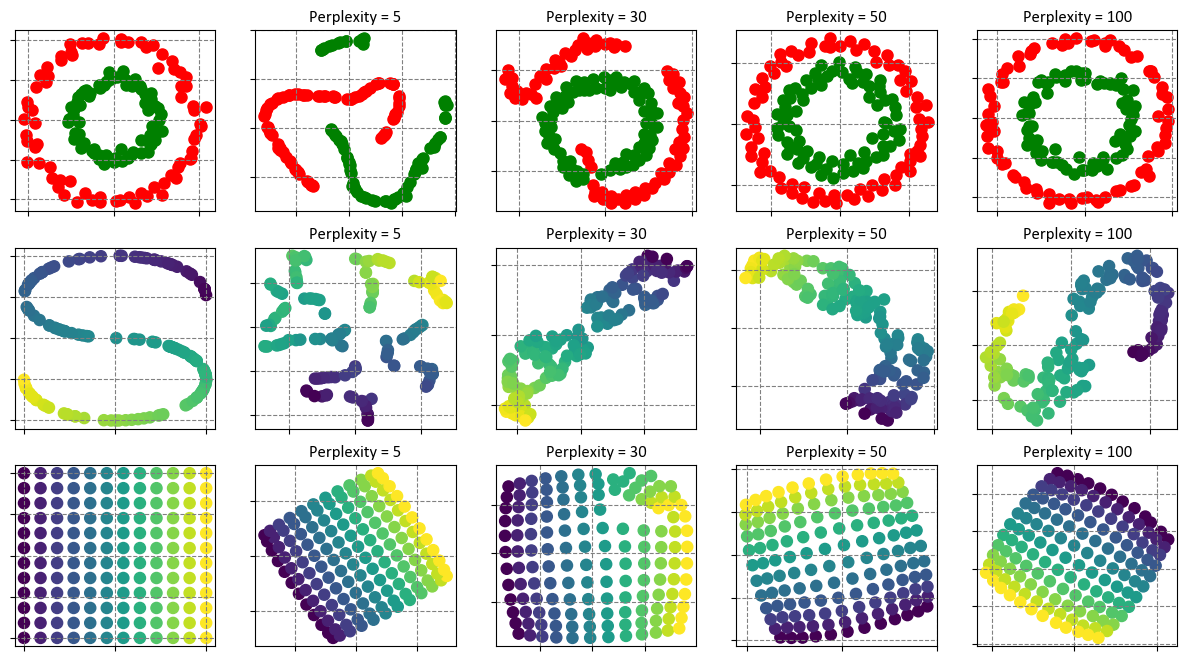
11.3.9. Exploring Perplexity’s Influence on t-SNE (Optional Content)#
Perplexity is a parameter that controls how many neighbors each data point has, and how much emphasis is placed on preserving local versus global structure in the data. Different perplexity values can have different effects on t-SNE’s behavior, depending on the characteristics and density of the data. To understand this better, let’s look at two examples: the two concentric circles and the S-curve datasets.
The two concentric circles dataset consists of two rings of data points, one inside the other, forming a 2-dimensional manifold embedded in a 3-dimensional space. The S-curve dataset consists of a twisted curve of data points, forming a 1-dimensional manifold embedded in a 3-dimensional space. Both datasets have a nonlinear structure that cannot be captured by linear techniques such as PCA.
As we increase the perplexity value, we can see a clear trend: the resulting shapes become more distinct and defined. This means that t-SNE preserves the local neighborhoods in the data better, and separates the different regions of the manifold more clearly. However, this does not mean that the size, distance, and shape of the clusters are always accurate or consistent, as they can vary due to factors such as initialization and perplexity choices. This variation does not always carry a direct interpretation [scikit-learn Developers, 2023].
For example, t-SNE applied to the two concentric circles dataset with higher perplexities successfully uncovers the meaningful topology of the concentric circles. However, there may be slight differences in the circle size and distance from the original configuration. On the other hand, t-SNE applied to the S-curve dataset with higher perplexities may still produce visible deviations in the shapes, drifting away from the S-curve topology [scikit-learn Developers, 2023].
For a more in-depth exploration of the intricate interplay between parameters, you can refer to “How to Use t-SNE Effectively” [Wattenberg et al., 2016]. This resource not only engages in a thorough discourse on the influence of diverse parameters but also offers interactive plots to facilitate a nuanced understanding.
# Author: Narine Kokhlikyan <narine@slice.com>
# License: BSD
# The code is available at: https://scikit-learn.org/stable/auto_examples/manifold/plot_t_sne_perplexity.html

plt.style.use('https://raw.githubusercontent.com/HatefDastour/ENSF444/main/Files/mystyle.mplstyle')

import matplotlib.pyplot as plt
import numpy as np
from matplotlib.ticker import NullFormatter
from sklearn import datasets, manifold
from time import time

def generate_and_plot_dataset(ax, X, y, color_map, title):
    ax.scatter(X[y == 0, 0], X[y == 0, 1], c=color_map[0])
    ax.scatter(X[y == 1, 0], X[y == 1, 1], c=color_map[1])
    ax.xaxis.set_major_formatter(NullFormatter())
    ax.yaxis.set_major_formatter(NullFormatter())
    ax.set_title(title)
    ax.axis("tight")

def apply_tsne_and_plot(ax, X, y, perplexity, iterations, color_map):
    t0 = time()
    tsne = manifold.TSNE(n_components=n_components, init="random",
                         random_state=0, perplexity=perplexity, n_iter=iterations)
    Y = tsne.fit_transform(X)
    t1 = time()
    print(f"Dataset, perplexity = {perplexity}, iterations = {iterations} in {t1 - t0:.2g} sec")

    # Create a mapping for colors based on unique class labels
    unique_labels = np.unique(y)
    label_to_color = {label: color for label, color in zip(unique_labels, color_map)}

    # Map class labels to colors
    colors = np.array([label_to_color[label] for label in y])

    ax.scatter(Y[:, 0], Y[:, 1], c=colors)
    ax.xaxis.set_major_formatter(NullFormatter())
    ax.yaxis.set_major_formatter(NullFormatter())
    ax.set_title(f"Perplexity = {perplexity}")
    ax.axis("tight")


# Set parameters
n_samples = 150
n_components = 2
perplexities = [5, 30, 50, 100]
iterations_circles = 300
iterations_s_curve = 300
iterations_uniform_grid = 400

# Create subplots
fig, axes = plt.subplots(3, 5, figsize=(12, 8))

# Generate and plot the circles dataset
X_circles, y_circles = datasets.make_circles(n_samples=n_samples, factor=0.5, noise=0.05, random_state=0)
color_map_circles = ["r", "g"]
generate_and_plot_dataset(axes[0][0], X_circles, y_circles, color_map_circles, "Original Circles")

for i, perplexity in enumerate(perplexities):
    apply_tsne_and_plot(axes[0][i + 1], X_circles, y_circles, perplexity, iterations_circles, color_map_circles)

# Generate and plot the S-curve dataset
X_s_curve, color_s_curve = datasets.make_s_curve(n_samples, random_state=0)
axes[1][0].scatter(X_s_curve[:, 0], X_s_curve[:, 2], c=color_s_curve)
axes[1][0].xaxis.set_major_formatter(NullFormatter())
axes[1][0].yaxis.set_major_formatter(NullFormatter())
axes[1][0].set_title("Original S-curve")

for i, perplexity in enumerate(perplexities):
    apply_tsne_and_plot(axes[1][i + 1], X_s_curve, color_s_curve, perplexity, iterations_s_curve, color_s_curve)


# Generate and plot a 2D uniform grid
x = np.linspace(0, 1, int(np.sqrt(n_samples)))
xx, yy = np.meshgrid(x, x)
X_uniform_grid = np.hstack([xx.ravel().reshape(-1, 1), yy.ravel().reshape(-1, 1)])
color_uniform_grid = xx.ravel()
axes[2][0].scatter(X_uniform_grid[:, 0], X_uniform_grid[:, 1], c=color_uniform_grid)
axes[2][0].xaxis.set_major_formatter(NullFormatter())
axes[2][0].yaxis.set_major_formatter(NullFormatter())
axes[2][0].set_title("Original Uniform Grid")

for i, perplexity in enumerate(perplexities):
    apply_tsne_and_plot(axes[2][i + 1], X_uniform_grid, color_uniform_grid, perplexity,
                        iterations_uniform_grid, color_uniform_grid)


plt.tight_layout()
circles, perplexity = 5 in 0.093 sec
circles, perplexity = 30 in 0.17 sec
circles, perplexity = 50 in 0.19 sec
circles, perplexity = 100 in 0.19 sec
S-curve, perplexity = 5 in 0.099 sec
S-curve, perplexity = 30 in 0.17 sec
S-curve, perplexity = 50 in 0.19 sec
S-curve, perplexity = 100 in 0.19 sec
uniform grid, perplexity = 5 in 0.12 sec
uniform grid, perplexity = 30 in 0.21 sec
uniform grid, perplexity = 50 in 0.22 sec
uniform grid, perplexity = 100 in 0.23 sec
Let’s break down the results:
Circles Dataset:
Perplexity values: 5, 30, 50, 100
For each perplexity value, t-SNE is applied to the circles dataset (where points are distributed in two concentric circles).
The execution times are relatively low, ranging from approximately 0.07 to 0.17 seconds.
As perplexity increases, t-SNE generally takes a bit more time, likely because the algorithm needs to compute probabilities over a larger neighborhood.
S-curve Dataset:
Perplexity values: 5, 30, 50, 100
The S-curve dataset is a 3D curve embedded in a 3D space.
Similar to the circles dataset, the execution times are reasonable, ranging from around 0.08 to 0.19 seconds.
As with the circles dataset, increasing perplexity tends to increase execution time.
Uniform Grid Dataset:
Perplexity values: 5, 30, 50, 100
This dataset consists of points arranged in a 2D uniform grid.
The execution times are again relatively low, ranging from approximately 0.11 to 0.2 seconds.
As perplexity increases, the execution time slightly increases as well.
The output is a set of graphs that show the original datasets and the t-SNE results with different perplexity values. You can see how the perplexity parameter affects the outcome of the t-SNE algorithm. A low perplexity value tends to emphasize local aspects of the data, while a high perplexity value tends to emphasize global aspects of the data. There is no optimal value for perplexity, as it depends on the nature and scale of the data. You can experiment with different values and see how they change the visualization.