7.4. Adjusting the Plot#
In matplotlib, you can use the set method to adjust axis limits, labels, and more when using the object-oriented interface. The set method allows you to modify various properties of the Axes object. Here’s how you can use set to customize the plot:
import matplotlib.pyplot as plt

# Data
x = [1, 2, 3, 4]
y = [10, 20, 15, 25]

# Create Figure and Axes objects
fig, ax = plt.subplots(figsize=(6, 4))

# Plot using object-oriented interface
line, = ax.plot(x, y)

# Customize axis limits
ax.set_xlim(0, 5)
ax.set_ylim(0, 30)

# Customize axis labels
ax.set_xlabel('X-axis')
ax.set_ylabel('Y-axis')

# Customize title
ax.set_title('Customized Plot')

# Customize grid
ax.grid(True)

# Customize legend
line.set_label('My Data')
_ = ax.legend()
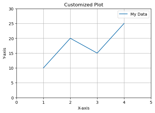
In the example above, the set_xlim and set_ylim methods are used to adjust the axis limits, set_xlabel and set_ylabel are used to set the axis labels, and set_title is used to customize the title of the plot. The grid method is used to enable the grid lines, and the legend method is used to add a legend to the plot.
Note that when using the object-oriented interface, the plot method returns a Line2D object representing the plot. By storing this returned value in a variable (in this case, line), you can use it later to customize properties of the line, such as adding a label for the legend using set_label.
You can combine all the settings in one set method call to customize various properties of the plot and axes simultaneously. This can be particularly useful when you want to apply multiple settings at once. Here’s how you can achieve this:
import matplotlib.pyplot as plt

# Data
x = [1, 2, 3, 4]
y = [10, 20, 15, 25]

# Create Figure and Axes objects
fig, ax = plt.subplots(figsize=(6, 4))

# Plot using object-oriented interface
line, = ax.plot(x, y, label = 'My Data')

# Combine settings in one set method call
ax.set(
    xlim=(0, 5),
    ylim=(0, 30),
    xlabel='X-axis',
    ylabel='Y-axis',
    title='Customized Plot',
)

# Customize grid
ax.grid(True)

# legend
_ = ax.legend()
In this example, the set method is used to combine multiple settings within a single call. The settings are provided as keyword arguments, where each argument corresponds to a specific property that you want to customize. The properties are specified using their respective names (e.g., xlim, ylim, xlabel, ylabel, and title).
You can add as many settings as you need to this set method call, making it a convenient way to customize multiple properties in one go.
Remember that this method works with the object-oriented interface of matplotlib. If you are using the MATLAB-style interface (plt module), you will need to use separate method calls for each setting as shown in the previous examples.
Adjusting the plot in Matplotlib involves customizing various aspects of the visualization to enhance its appearance, readability, and impact. Here are some common adjustments you can make to your Matplotlib plots [Pajankar, 2021, Matplotlib Developers, 2023]:
Changing Figure Size: You can control the size of the entire figure using the
plt.figure(figsize=(width, height))function. This is particularly useful when you need to ensure your plot fits well within your document or presentation.Adding Titles and Labels: Titles and labels provide context to your plot. Use
plt.title(),plt.xlabel(), andplt.ylabel()to add a title and label the axes, respectively.Setting Axis Limits: Adjust the visible range of your data on the x and y axes using
plt.xlim()andplt.ylim().Adding Gridlines: Gridlines can aid in understanding data relationships. Enable them using
plt.grid(True).Changing Line Styles and Markers: You can customize the appearance of lines and markers using options like
linestyleandmarkerwhen using functions likeplt.plot().Changing Colors: Customize colors using options like
coloror specifying color codes. You can use named colors (‘blue’, ‘red’, etc.) or hexadecimal color codes.Adding Legends: If you have multiple datasets, add a legend to differentiate them. Use
plt.legend()and provide labels for each dataset.Adjusting Tick Labels: Customize tick labels on axes using functions like
plt.xticks()andplt.yticks(). You can provide custom tick positions and labels.Adding Annotations and Text: You can annotate points on the plot or add text explanations using functions like
plt.annotate()andplt.text().Changing Background and Grid Style: Change the appearance of the plot background and gridlines using styles like ‘dark_background’ or ‘whitegrid’. Use
plt.style.use()to apply the desired style.Creating Subplots: Use
plt.subplots()to create multiple plots in a grid. This is useful when you want to visualize multiple datasets side by side.Saving Plots: Save your plot to a file using
plt.savefig('filename.png'). You can save in various formats such as PNG, PDF, SVG, etc.
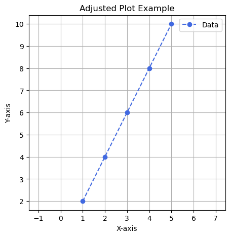
Here’s an example illustrating some of these adjustments:
import matplotlib.pyplot as plt

# Sample data
x = [1, 2, 3, 4, 5]
y = [2, 4, 6, 8, 10]

# Create a Figure and Axes object
fig, ax = plt.subplots(figsize=(5, 5))

# Plot the data using the Axes object
ax.plot(x, y, marker='o', color='RoyalBlue', linestyle='--', label='Data')

# Set multiple properties using the Axes object
ax.set(
    xlabel='X-axis',
    ylabel='Y-axis',
    title='Adjusted Plot Example',
    aspect='equal',  # Equal scaling for both axes
    adjustable='datalim',  # Adjust aspect based on data limits
)

# Add gridlines using the Axes object
ax.grid(True)

# Add legend using the Axes object
ax.legend()

# Saving the plot
fig.savefig('adjusted_plot.png')  # Save the plot
A table summarizing the changes for transitioning between MATLAB-style functions and object-oriented methods in matplotlib
MATLAB-Style |
Object-Oriented |
|---|---|
plt.xlabel() |
ax.set_xlabel() |
plt.ylabel() |
ax.set_ylabel() |
plt.xlim() |
ax.set_xlim() |
plt.ylim() |
ax.set_ylim() |
plt.title() |
ax.set_title() |
plt.plot() |
ax.plot() |
plt.scatter() |
ax.scatter() |
plt.bar() |
ax.bar() |
plt.hist() |
ax.hist() |
plt.imshow() |
ax.imshow() |
plt.legend() |
ax.legend() |
plt.grid() |
ax.grid() |
plt.xticks() |
ax.set_xticks() |
plt.yticks() |
ax.set_yticks() |
plt.figure() |
fig, ax = plt.subplots() |
plt.subplots() |
N/A (use fig, ax = plt.subplots() instead) |
plt.show() |
plt.show() (unchanged) |
Please note that this is not an exhaustive list, but it covers some commonly used functions. When transitioning from MATLAB-style to object-oriented methods, you’ll generally need to replace plt with ax. for most of the function calls related to customizing the plot elements. Additionally, for creating figures and subplots, you’ll use plt.subplots() to get the fig and ax objects to work with.
7.4.1. Marker and Linestyles#
Matplotlib offers a range of marker styles and line styles that you can use to customize the appearance of your plots. These styles allow you to differentiate between data points and control the appearance of lines connecting those points. Here’s an overview of the marker styles and line styles available in Matplotlib:
Marker Styles:
Markers are used to indicate individual data points on a plot. They can be added to line plots, scatter plots, and other types of plots.
Some commonly used marker styles include:
'o': Circle marker'^': Upward-pointing triangle marker's': Square marker'd': Diamond marker'x': Cross marker'+': Plus marker'*': Star marker'.': Point marker
Line Styles:
Line styles determine how the lines connecting data points are displayed. They are commonly used in line plots and other plots that involve connecting data points with lines.
Some commonly used line styles include:
'-': Solid line (default)'--': Dashed line':': Dotted line'-.': Dash-dot line
Here’s an example that demonstrates the use of various marker styles and line styles in Matplotlib:
import matplotlib.pyplot as plt

# Sample data
x = [1, 2, 3, 4, 5]
y = [2, 4, 6, 8, 10]

# Create a Figure and Axes object
fig, ax = plt.subplots()

# Plot using different marker and line styles
ax.plot(x, y, marker='o', linestyle='-', label='Circle Marker and Solid Line')
ax.plot(x, [i * 1.5 for i in y], marker='s', linestyle='--', label='Square Marker and Dashed Line')
ax.plot(x, [i * 2 for i in y], marker='^', linestyle=':', label='Triangle Marker and Dotted Line')
ax.plot(x, [i * 2.5 for i in y], marker='d', linestyle='-.', label='Diamond Marker and Dash-dot Line')

# Set labels and legend
ax.set_xlabel('X-axis')
ax.set_ylabel('Y-axis')
ax.set_title('Marker and Line Style Options')
ax.legend()

# Display the plot
plt.show()
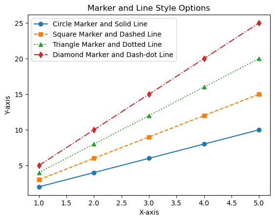
In this example, the code showcases different marker styles and line styles applied to a plot. This enables you to visualize how markers and lines combine to create various representations of data points and their connections.
7.4.2. Colors#
Matplotlib provides a wide range of colors that you can use to customize your plots. These colors are available as named colors or can be specified using hexadecimal color codes. Here’s an overview of the different ways you can use colors in Matplotlib [Pajankar, 2021, Matplotlib Developers, 2023]:
Named Colors: Matplotlib provides a variety of named colors that you can use directly by their names. For example:
'red','blue','green','purple','yellow','orange','cyan','magenta','black','white', and more.Hexadecimal Color Codes: You can specify colors using hexadecimal color codes. These are strings representing RGB values in hexadecimal notation. For example:
'#FF5733'for a shade of orange.RGB and RGBA Colors: Colors can also be specified using tuples of RGB values or RGBA values (including an alpha channel for transparency). For example:
(0.2, 0.4, 0.6)for a shade of blue.CSS4 Colors: Matplotlib supports CSS4 color names, which include a wide range of color names like
'aliceblue','chartreuse','darkslategray', and many more.XKCD Colors: Matplotlib includes a set of XKCD colors, which are whimsical color names inspired by the XKCD webcomic. These colors can be accessed using their unique XKCD names, like
'cloudy blue','cement','ugly pink', etc.
Here’s an example illustrating the use of various color options in Matplotlib:
import matplotlib.pyplot as plt

# Sample data
x = [1, 2, 3, 4, 5]
y = [2, 4, 6, 8, 10]

# Create a Figure and Axes object
fig, ax = plt.subplots()

# Plot using different colors
ax.plot(x, y, marker='o', color='blue', label='Blue Color')
ax.plot(x, [i * 1.5 for i in y], marker='s', color='#FF5733', label='Orange Color')
ax.plot(x, [i * 2 for i in y], marker='^', color=(0.2, 0.4, 0.6), label='RGB Color')
ax.plot(x, [i * 2.5 for i in y], marker='d', color='xkcd:ugly pink', label='XKCD Color')

# Set labels and legend
ax.set_xlabel('X-axis')
ax.set_ylabel('Y-axis')
ax.set_title('Various Color Options')
ax.legend()

# Display the plot
plt.show()
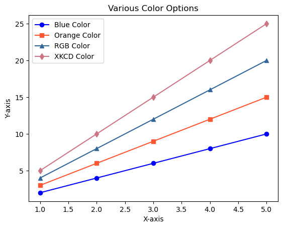
In this example, the code demonstrates how to use named colors, hexadecimal codes, RGB values, and XKCD color names to create a plot with multiple colored lines.
7.4.2.1. Base colors#
In Matplotlib, the mcolors.BASE_COLORS dictionary contains a set of predefined base colors that serve as the default colors for plots. These colors are available as named constants, making it easy to reference them when creating visualizations. The BASE_COLORS dictionary provides a consistent set of colors that are designed to be visually distinguishable from each other [Pajankar, 2021, Matplotlib Developers, 2023].
The BASE_COLORS dictionary is part of the matplotlib.colors module, and it is commonly used to set colors for various plot elements such as lines, markers, bars, and more. The base colors are typically used as the foundation for customizing plot styles, but you can also use them directly if you prefer the default color palette.
# Create a DataFrame
import pandas as pd
import matplotlib.colors as mcolors
df = pd.DataFrame(mcolors.BASE_COLORS.items(), columns=['Color Code', 'RGB Tuple'])

# Display the DataFrame
display(df.style.hide(axis="index"))

# you can get this function from https://matplotlib.org/stable/gallery/color/named_colors.html
from Matplotlib_tools import plot_colortable
_ = plot_colortable(mcolors.BASE_COLORS, sort_colors=True)
| Color Code | RGB Tuple |
|---|---|
| b | (0, 0, 1) |
| g | (0, 0.5, 0) |
| r | (1, 0, 0) |
| c | (0, 0.75, 0.75) |
| m | (0.75, 0, 0.75) |
| y | (0.75, 0.75, 0) |
| k | (0, 0, 0) |
| w | (1, 1, 1) |

These colors are used in sequential order for different data series in your plot. If you have more than nine data series, Matplotlib will cycle back to the beginning of the list.
Here’s an example that demonstrates the use of the base colors in a plot:
import matplotlib.pyplot as plt
import numpy as np

np.arange(1, 4, 0.5)

# Sample data
x = [1, 2, 3, 4, 5]
y = [2, 4, 6, 8, 10]

# Create a Figure and Axes object
fig, ax = plt.subplots()
for c, color in zip(np.arange(1, 4, 0.5), mcolors.BASE_COLORS.keys()):
    ax.plot(x, [i * c for i in y], marker='o', color=color, linestyle='-', label= 'Color: %s' % color)

# Set labels and legend
ax.set_xlabel('X-axis')
ax.set_ylabel('Y-axis')
ax.set_title('Base Color Options')
ax.legend()

# Display the plot
plt.show()
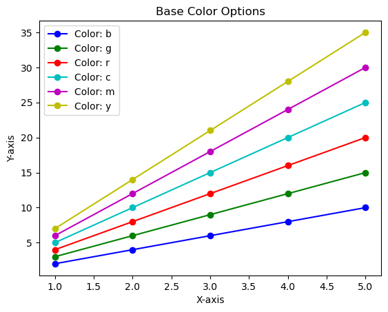
In this example, the code uses the base colors (‘C0’, ‘C1’, ‘C2’, ‘C3’) to create a plot with different colored lines. These base colors are particularly useful when you have multiple data series and want to ensure consistent and visually appealing color choices for each series.
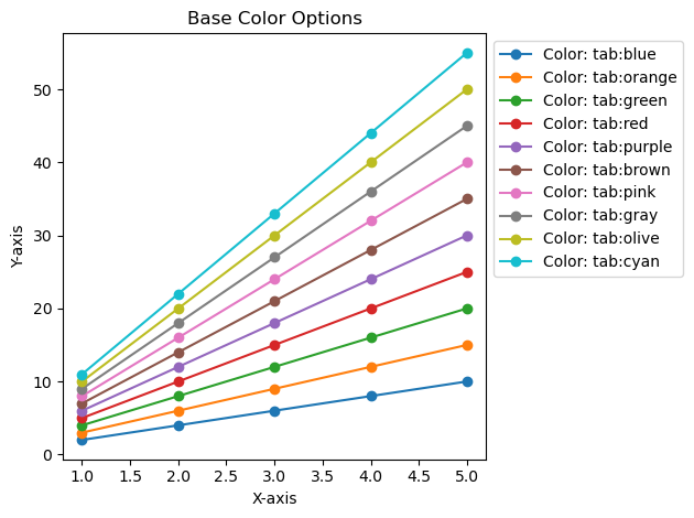
7.4.2.2. Tableau Palette#
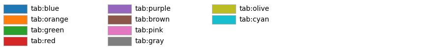
In Matplotlib, mcolors.TABLEAU_COLORS is a dictionary that provides a set of color names representing the default Tableau color palette. The Tableau color palette is designed to be visually distinguishable and suitable for creating attractive and informative data visualizations. This palette is especially popular for creating plots with multiple data series, as the colors are chosen to be easily distinguishable in print and on screens [Pajankar, 2021, Matplotlib Developers, 2023].
The mcolors.TABLEAU_COLORS dictionary maps color names (strings) to their corresponding RGB values. These color names can be used to set the color of various plot elements, such as lines, markers, bars, and more, using the color parameter in Matplotlib.
# Create a DataFrame
import pandas as pd
df = pd.DataFrame(mcolors.TABLEAU_COLORS.items(), columns=['Color Name', 'Hexadecimal Color Code'])

# Display the DataFrame
display(df.style.hide(axis="index"))

_ = plot_colortable(mcolors.TABLEAU_COLORS, ncols=3, sort_colors=False)
| Color Name | Hexadecimal Color Code |
|---|---|
| tab:blue | #1f77b4 |
| tab:orange | #ff7f0e |
| tab:green | #2ca02c |
| tab:red | #d62728 |
| tab:purple | #9467bd |
| tab:brown | #8c564b |
| tab:pink | #e377c2 |
| tab:gray | #7f7f7f |
| tab:olive | #bcbd22 |
| tab:cyan | #17becf |
Here’s an example that demonstrates the use of the Tableau palette colors in a plot:
import matplotlib.pyplot as plt
import numpy as np

np.arange(1, 4, 0.5)

# Sample data
x = [1, 2, 3, 4, 5]
y = [2, 4, 6, 8, 10]


# Create a Figure and Axes object
fig, ax = plt.subplots()
_number = 1 + len(mcolors.TABLEAU_COLORS)* 0.5
for c, color in zip(np.arange(1, _number, 0.5), mcolors.TABLEAU_COLORS.keys()):
    ax.plot(x, [i * c for i in y], marker='o', color=color, linestyle='-', label= 'Color: %s' % color)

# Set labels and legend
ax.set_xlabel('X-axis')
ax.set_ylabel('Y-axis')
ax.set_title('Base Color Options')
legend = ax.legend(loc='upper left', bbox_to_anchor=(1, 1))
# Adjust layout to accommodate the legend
plt.tight_layout()
# Display the plot
plt.show()
7.4.2.3. CSS Colors#
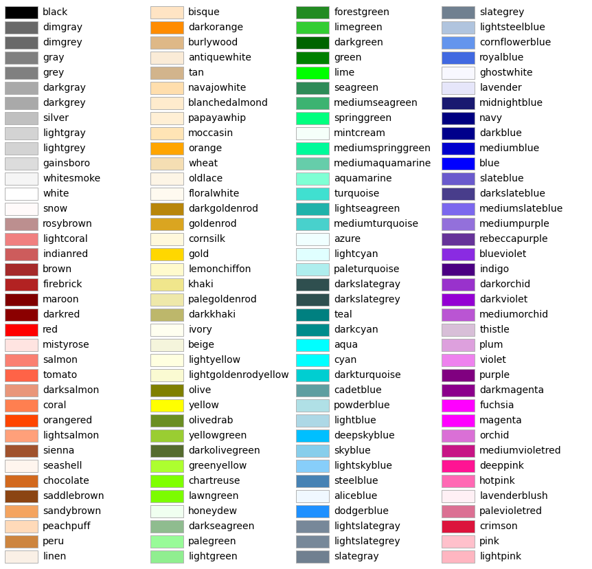
mcolors.CSS4_COLORS refers to a color dictionary provided by the Matplotlib library, a popular data visualization tool in Python. This dictionary contains a comprehensive set of named colors following the CSS4 standard, making it easy to use consistent and aesthetically pleasing colors in your data visualizations.
Each color in the mcolors.CSS4_COLORS dictionary is represented by its name (key) and its corresponding hexadecimal RGB value (value), allowing you to reference and use these colors by name in your Matplotlib plots and charts. This feature simplifies the process of choosing and using colors in your data visualizations.
_ = plot_colortable(mcolors.CSS4_COLORS, ncols=4, sort_colors=True)
# The function I've crafted is called "_CSS4_COLORS_df," designed to transform the provided dictionary into a dataframe.
from Matplotlib_tools import _CSS4_COLORS_df
display(_CSS4_COLORS_df().style.hide(axis="index"))
| Color 1 | Hex Code 1 | Color 2 | Hex Code 2 | Color 3 | Hex Code 3 | Color 4 | Hex Code 4 |
|---|---|---|---|---|---|---|---|
| black | #000000 | bisque | #FFE4C4 | forestgreen | #228B22 | slategrey | #708090 |
| dimgray | #696969 | darkorange | #FF8C00 | limegreen | #32CD32 | lightsteelblue | #B0C4DE |
| dimgrey | #696969 | burlywood | #DEB887 | darkgreen | #006400 | cornflowerblue | #6495ED |
| gray | #808080 | antiquewhite | #FAEBD7 | green | #008000 | royalblue | #4169E1 |
| grey | #808080 | tan | #D2B48C | lime | #00FF00 | ghostwhite | #F8F8FF |
| darkgray | #A9A9A9 | navajowhite | #FFDEAD | seagreen | #2E8B57 | lavender | #E6E6FA |
| darkgrey | #A9A9A9 | blanchedalmond | #FFEBCD | mediumseagreen | #3CB371 | midnightblue | #191970 |
| silver | #C0C0C0 | papayawhip | #FFEFD5 | springgreen | #00FF7F | navy | #000080 |
| lightgray | #D3D3D3 | moccasin | #FFE4B5 | mintcream | #F5FFFA | darkblue | #00008B |
| lightgrey | #D3D3D3 | orange | #FFA500 | mediumspringgreen | #00FA9A | mediumblue | #0000CD |
| gainsboro | #DCDCDC | wheat | #F5DEB3 | mediumaquamarine | #66CDAA | blue | #0000FF |
| whitesmoke | #F5F5F5 | oldlace | #FDF5E6 | aquamarine | #7FFFD4 | slateblue | #6A5ACD |
| white | #FFFFFF | floralwhite | #FFFAF0 | turquoise | #40E0D0 | darkslateblue | #483D8B |
| snow | #FFFAFA | darkgoldenrod | #B8860B | lightseagreen | #20B2AA | mediumslateblue | #7B68EE |
| rosybrown | #BC8F8F | goldenrod | #DAA520 | mediumturquoise | #48D1CC | mediumpurple | #9370DB |
| lightcoral | #F08080 | cornsilk | #FFF8DC | azure | #F0FFFF | rebeccapurple | #663399 |
| indianred | #CD5C5C | gold | #FFD700 | lightcyan | #E0FFFF | blueviolet | #8A2BE2 |
| brown | #A52A2A | lemonchiffon | #FFFACD | paleturquoise | #AFEEEE | indigo | #4B0082 |
| firebrick | #B22222 | khaki | #F0E68C | darkslategray | #2F4F4F | darkorchid | #9932CC |
| maroon | #800000 | palegoldenrod | #EEE8AA | darkslategrey | #2F4F4F | darkviolet | #9400D3 |
| darkred | #8B0000 | darkkhaki | #BDB76B | teal | #008080 | mediumorchid | #BA55D3 |
| red | #FF0000 | ivory | #FFFFF0 | darkcyan | #008B8B | thistle | #D8BFD8 |
| mistyrose | #FFE4E1 | beige | #F5F5DC | aqua | #00FFFF | plum | #DDA0DD |
| salmon | #FA8072 | lightyellow | #FFFFE0 | cyan | #00FFFF | violet | #EE82EE |
| tomato | #FF6347 | lightgoldenrodyellow | #FAFAD2 | darkturquoise | #00CED1 | purple | #800080 |
| darksalmon | #E9967A | olive | #808000 | cadetblue | #5F9EA0 | darkmagenta | #8B008B |
| coral | #FF7F50 | yellow | #FFFF00 | powderblue | #B0E0E6 | fuchsia | #FF00FF |
| orangered | #FF4500 | olivedrab | #6B8E23 | lightblue | #ADD8E6 | magenta | #FF00FF |
| lightsalmon | #FFA07A | yellowgreen | #9ACD32 | deepskyblue | #00BFFF | orchid | #DA70D6 |
| sienna | #A0522D | darkolivegreen | #556B2F | skyblue | #87CEEB | mediumvioletred | #C71585 |
| seashell | #FFF5EE | greenyellow | #ADFF2F | lightskyblue | #87CEFA | deeppink | #FF1493 |
| chocolate | #D2691E | chartreuse | #7FFF00 | steelblue | #4682B4 | hotpink | #FF69B4 |
| saddlebrown | #8B4513 | lawngreen | #7CFC00 | aliceblue | #F0F8FF | lavenderblush | #FFF0F5 |
| sandybrown | #F4A460 | honeydew | #F0FFF0 | dodgerblue | #1E90FF | palevioletred | #DB7093 |
| peachpuff | #FFDAB9 | darkseagreen | #8FBC8F | lightslategray | #778899 | crimson | #DC143C |
| peru | #CD853F | palegreen | #98FB98 | lightslategrey | #778899 | pink | #FFC0CB |
| linen | #FAF0E6 | lightgreen | #90EE90 | slategray | #708090 | lightpink | #FFB6C1 |
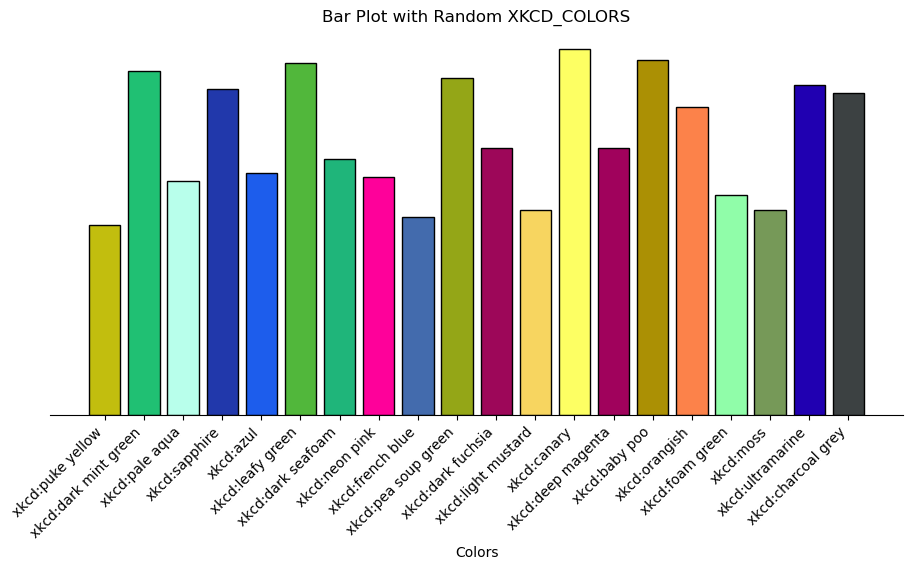
7.4.2.4. XKCD Colors#
mcolors.XKCD_COLORS is another color dictionary provided by the Matplotlib library in Python, specifically named after the XKCD Color Survey. This dictionary contains a set of named colors, each of which corresponds to a specific color that was popular in the XKCD webcomic’s color survey [Pajankar, 2021, Matplotlib Developers, 2023].
The XKCD color survey collected a wide range of color names from contributors, resulting in a unique and playful set of color labels that can add a fun and creative touch to your data visualizations.
Like mcolors.CSS4_COLORS, the mcolors.XKCD_COLORS dictionary allows you to easily use these named colors in your Matplotlib plots and charts. Each color in the dictionary is represented by its name (key) and its corresponding hexadecimal RGB value (value).
# # Create a figure displaying XKCD colors. This will provide a visual representation
# # of the XKCD color palette.
# xkcd_fig = plot_colortable(mcolors.XKCD_COLORS)

# # If you want to save this XKCD color figure for later use, you can do so using
# # the following command. It will be saved as "XKCD_Colors.png" in your working directory.
# xkcd_fig.savefig("XKCD_Colors.png")
Here’s an example of how you can use colors from mcolors.XKCD_COLORS in Matplotlib:
Show code cell source
import matplotlib.pyplot as plt
import matplotlib.colors as mcolors
import random

# Access the XKCD_COLORS dictionary
xkcd_colors = mcolors.XKCD_COLORS

# Select a random set of color names and generate data
num_bars = 20
values = [random.randint(50, 100) for _ in range(num_bars)]
random_colors = random.sample(list(xkcd_colors.keys()), num_bars)

# Create the figure and axes with specified figure size
fig, ax = plt.subplots(figsize=(11, 5))

# Plotting the bar plot with randomly colored bars
bars = ax.bar(random_colors, values, color=random_colors, ec = 'black')

# Set labels and title, remove unnecessary elements
_ = ax.set(xlabel='Colors', ylabel='', yticks=[], title='Bar Plot with Random XKCD_COLORS')
_ = ax.spines[['top', 'left', 'right']].set_visible(False)

# Rotate x labels for better readability
plt.xticks(rotation=45, ha='right')

# Show the plot
plt.show()