7.5. Seaborn plots#
Seaborn is a popular Python data visualization library based on Matplotlib. It provides a high-level interface for creating attractive and informative statistical graphics. Seaborn is built on top of Matplotlib and integrates well with Pandas data structures, making it an excellent choice for data visualization and exploration tasks [Waskom, 2021]. Key features of Seaborn:
High-level interface: Seaborn allows you to create complex visualizations with just a few lines of code, making it easy to explore and communicate insights from your data.
Attractive default styles: Seaborn comes with visually appealing default styles, which makes your plots look great right out of the box.
Support for statistical plots: Seaborn includes a variety of statistical plots, such as scatter plots, line plots, bar plots, box plots, violin plots, heatmaps, and more. These plots often include informative summaries of data distribution and relationships.
Integration with Pandas: Seaborn works seamlessly with Pandas DataFrames, allowing you to easily visualize and analyze your data.
Color palettes: Seaborn provides a range of color palettes, including categorical, sequential, and diverging, making it easy to customize the appearance of your visualizations.
Facet grids: Seaborn supports the creation of facet grids, allowing you to create multiple plots, each showing a different subset of the data, based on one or more categorical variables.
To use Seaborn, you need to have it installed in your Python environment. You can install Seaborn using pip:
>>> pip install seaborn
Once installed, you can import Seaborn in your Python script or Jupyter Notebook and start creating beautiful visualizations. Here’s an example of how to create a scatter plot using Seaborn:
Note
Seaborn is pre-installed in Google Colab as of September 2023.
Seaborn is a Python data visualization library based on Matplotlib that provides a higher-level interface for creating attractive and informative statistical graphics. It simplifies the process of creating various types of plots while offering enhanced aesthetics and better support for working with structured data. Here’s a table that lists the common types of plots in Seaborn along with a brief description of each:
Plot Type |
Description |
|---|---|
Bar Plot |
Display categorical data as rectangular bars. |
Box Plot |
Display the distribution of data based on quartiles. |
Count Plot |
Show the count of observations in each category. |
Facet Grid |
Create a grid of plots based on combinations of categorical variables. |
Heatmap |
Display a matrix where each cell is represented by color based on the data values. |
Histogram |
Represent the distribution of a continuous variable. |
Joint Plot |
Show the joint distribution of two variables with their respective univariate distributions. |
Line Plot |
Show the trend of a continuous variable over a continuous x-axis. |
Pair Plot |
Create pairwise scatter plots for multiple numerical variables. |
Regression Plot |
Display linear regression models. |
Scatter Plot |
Visualize the relationship between two continuous variables. |
Violin Plot |
Combines a box plot with a KDE (Kernel Density Estimate) plot. |
Here are some examples from these commonly used Seaborn plots:
7.5.1. Line Plot#
A line plot is a common type of data visualization that displays data points connected by straight lines [Waskom, 2021]. It is particularly useful for visualizing trends, changes over time, and the relationship between two numerical variables. Seaborn’s sns.lineplot() function allows you to create line plots with ease, and it provides various options for customization. Here’s an explanation of how to use sns.lineplot():
Usage: Line plots are used to show the trend or progression of a variable over a continuous axis, such as time, while connecting the data points to visualize the overall pattern or trajectory.
Seaborn Library: Seaborn is a Python data visualization library built on Matplotlib.
sns.lineplot()is part of Seaborn’s collection of plot functions.Syntax: The basic syntax for creating a line plot with Seaborn is:
sns.lineplot(x, y, data, hue, style, markers). Here,xandyare the variables to be plotted on the x-axis and y-axis, respectively.datais the DataFrame containing the data, andhue,style, andmarkers(all optional) allow you to differentiate lines based on categorical variables and customize the appearance of the lines and data points. You can see the full function descrition here.Line Plot Features:
Line Connection: The main feature of a line plot is that it connects the data points with straight lines, emphasizing the trend or pattern in the data.
Coloring (Hue): The
hueparameter allows you to color the lines based on a categorical variable, making it easier to distinguish different groups or categories in the data.Styling (Style): The
styleparameter lets you customize the line styles (e.g., solid, dashed, dotted) based on a categorical variable, providing additional information.Markers: You can add markers (e.g., circles, triangles) at the data points using the
markersparameter, making it easier to identify individual data points on the line.
Customization: Seaborn provides various customization options, such as setting plot aesthetics (line colors, styles, marker types), adding labels and titles, adjusting axis limits, and more.
Interpretation: When interpreting a line plot, focus on the overall trend of the line, any significant changes or inflection points, the relative behavior of different lines (if using
hue), and the variability or dispersion of the data points around the line.Data Preparation: Ensure that the data is properly organized and relevant for the line plot. Handle missing values and ensure that the variables being plotted on the x-axis and y-axis are suitable for a line plot (typically numerical variables).
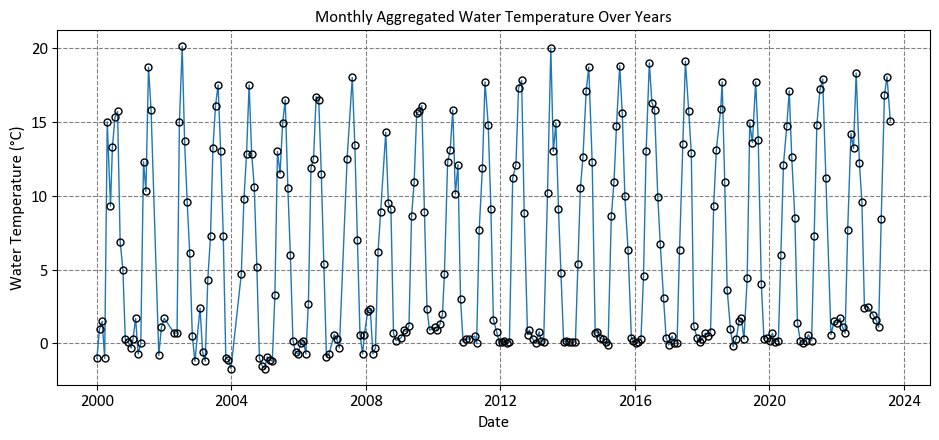
Example: The dataset was obtained from https://data.calgary.ca/stories/s/9phu-xb4j and pertains to Water Temperature (in degrees Celsius) at the Fish Creek 37th St Calgary Station (SUR_FC-37).
Description of the Dataset Columns:
Date: The date and time corresponding to each temperature measurement.
Water Temperature: The recorded water temperature in degrees Celsius (°C).
# Import the Pandas library as 'pd' for data manipulation
import pandas as pd

# Read a CSV file ('Fish_Creek_Water_Temp.csv') and select specific columns
# - 'usecols' specifies the columns to be included in the DataFrame.
#   In this case, we select 'Date' and 'Water Temperature.'
df_Water_Temp = pd.read_csv('Fish_Creek_Water_Temp.csv',
                            usecols=['Date', 'Water Temperature'])

# Convert the 'Date' column to a datetime format
# This step is important for handling date-related operations.
df_Water_Temp['Date'] = pd.to_datetime(df_Water_Temp['Date'])

# Display the first few rows of the DataFrame to inspect the data
# This helps us verify the data and check if the datetime conversion was successful.
display(df_Water_Temp.head())
| Date | Water Temperature | |
|---|---|---|
| 0 | 2021-11-01 09:35:00 | 0.6 |
| 1 | 2021-12-06 09:13:00 | 1.5 |
| 2 | 2022-02-07 09:22:00 | 1.7 |
| 3 | 2022-01-03 10:33:00 | 1.4 |
| 4 | 2022-05-02 09:31:00 | 7.7 |
Here’s a breakdown of the key steps:
Reading a CSV File:
pd.read_csv('Fish_Creek_Water_Temp.csv', usecols=['Date', 'Water Temperature'])reads a CSV file named ‘Fish_Creek_Water_Temp.csv.’The ‘usecols’ parameter is used to specify which columns from the CSV file should be included in the resulting DataFrame. In this case, it selects only the ‘Date’ and ‘Water Temperature’ columns.
Converting ‘Date’ Column to Datetime:
df_Water_Temp.Date = pd.to_datetime(df_Water_Temp.Date)converts the ‘Date’ column in the DataFrame ‘df_Water_Temp’ to a datetime format.This step is important because it ensures that the ‘Date’ column is recognized as a date, allowing for time-based operations and visualizations.
# Set the 'Date' column as the index of the DataFrame
# This allows for time-based indexing and analysis.
df_Water_Temp.set_index('Date', inplace=True)

# Calculate the monthly average water temperature
# - 'resample('MS')' groups the data by month and calculates the mean.
# - 'mean()' computes the average water temperature for each month.
# - 'reset_index(drop=False)' resets the index while keeping the 'Date' column.
monthly_avg_temperature = df_Water_Temp['Water Temperature'].resample('MS').mean().reset_index(drop=False)

# Display the first few rows of the resulting DataFrame
# This shows the calculated monthly average water temperatures.
display(monthly_avg_temperature.head())
| Date | Water Temperature | |
|---|---|---|
| 0 | 2000-01-01 | 0.0 |
| 1 | 2000-02-01 | 1.5 |
| 2 | 2000-03-01 | -1.0 |
| 3 | 2000-04-01 | 15.0 |
| 4 | 2000-05-01 | 9.3 |
Here’s a breakdown of the key steps:
Setting the ‘Date’ Column as the Index:
The code begins by setting the ‘Date’ column as the index of the DataFrame using the ‘set_index()’ method.
The parameter ‘inplace=True’ is set to modify the DataFrame in place, meaning the ‘df_Water_Temp’ DataFrame will be updated with the ‘Date’ column as its index.
Calculating Monthly Average Water Temperature:
After setting the ‘Date’ column as the index, the code calculates the monthly average water temperature.
The line ‘df_Water_Temp[‘Water Temperature’].resample(‘MS’).mean()’ performs the following steps:
‘df_Water_Temp[‘Water Temperature’]’ selects the ‘Water Temperature’ column from the DataFrame.
‘resample(‘MS’)’ is used to resample the data. In this case, ‘MS’ stands for “Month Start,” indicating that the data will be grouped into monthly intervals starting from the beginning of each month.
‘mean()’ calculates the mean (average) temperature for each monthly interval.
The result of this operation is a new DataFrame that contains the calculated monthly average water temperatures.
Resetting the Index:
The ‘reset_index(drop=False)’ method is applied to the newly created DataFrame. This step resets the index back to a default integer index, and ‘drop=False’ ensures that the ‘Date’ column is not dropped and remains in the DataFrame.
# Import necessary data visualization libraries
import seaborn as sns
import matplotlib.pyplot as plt
import warnings
warnings.filterwarnings("ignore")

# Use a custom style for the plot (adjust the path to your style file)
plt.style.use('../mystyle.mplstyle')

# Create a figure and axes with a specified size
fig, ax = plt.subplots(figsize=(9.5, 4.5))

# Create a line plot with markers
# - 'x' is set to 'Date,' and 'y' is set to 'Water Temperature' to define the data.
# - 'data' specifies the DataFrame to use for plotting.
# - 'marker' defines the marker style for data points.
# - 'markerfacecolor' sets the color of the marker face to None (no fill).
# - 'ax' specifies the axes where the plot should be drawn.
# - 'markersize' sets the size of the markers.
# - 'markeredgecolor' defines the color of the marker edges.
# - 'markeredgewidth' sets the width of the marker edges.
sns.lineplot(x='Date', y='Water Temperature',
             data=df_Water_Temp,
             marker='o',
             markerfacecolor='None',
             ax=ax,
             markersize=5,
             markeredgecolor='k',
             markeredgewidth=1)

# Set labels and title for the plot
ax.set(xlabel='Date', ylabel='Water Temperature (°C)',
       title='Monthly Aggregated Water Temperature Over Years')

# Display grid lines for better visualization
ax.grid(True)

# Adjust the plot layout for better presentation
plt.tight_layout()
Here’s a breakdown of the key steps:
Creating a Figure and Axes:
It creates a figure and axes using ‘plt.subplots(figsize=(9.5, 4.5)).’ The ‘figsize’ parameter sets the size of the figure in inches.
Creating a Line Plot with Markers:
A line plot is generated using ‘sns.lineplot().’ The following parameters are used:
‘x’ and ‘y’ specify the data for the x and y-axes, respectively, with ‘Date’ on the x-axis and ‘Water Temperature’ on the y-axis.
‘data’ specifies the DataFrame containing the data.
‘marker’ is set to ‘o,’ indicating that markers (points) should be displayed along the line.
‘markerfacecolor’ is set to ‘None,’ meaning that the marker faces are transparent.
‘ax’ specifies the axes where the plot should be drawn.
‘markersize’ determines the size of the markers.
‘markeredgecolor’ sets the color of the marker edges.
‘markeredgewidth’ determines the width of the marker edges.
Setting Labels and Title:
The ‘ax.set()’ method is used to set labels for the x and y-axes and provide a title for the plot. This step adds context to the visualization.
Displaying the Plot with a Grid:
‘ax.grid(True)’ adds grid lines to the plot, which can help in better understanding the data.
Adjusting Plot Layout:
‘plt.tight_layout()’ is called to ensure a tight layout, which improves the plot’s appearance by avoiding overlapping elements.
The primary limitation of the previous plot, while aesthetically pleasing, is its lack of substantive information. It fails to depict the trendline or the relationship between the variable on the x-axis (Date) and the one on the y-axis (Water Temperature). For a more informative visualization, I suggest the following plot.
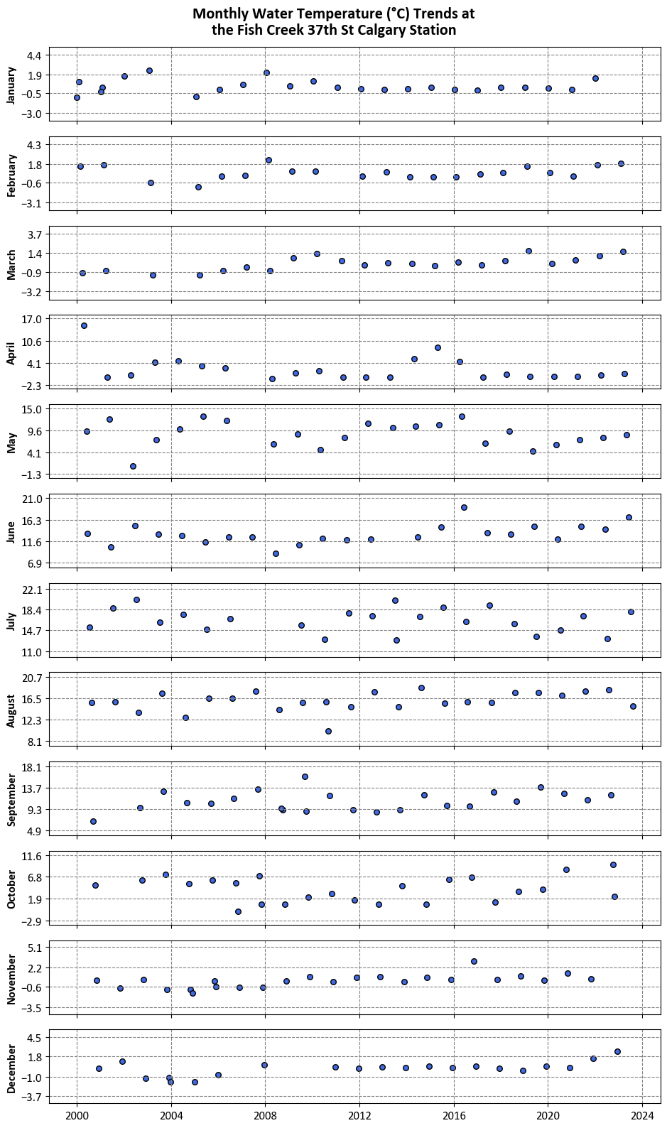
# Import the 'calendar' module
import calendar
import numpy as np

# Create a copy of the DataFrame 'df_Water_Temp'
df = df_Water_Temp.copy()

# Extract the 'Year' and 'Month' from the datetime index
df['Year'] = df.index.year
df['Month'] = df.index.month

# Reset the index, converting the datetime index into regular columns
df.reset_index(drop=False, inplace=True)

# Create a subplot with 12 subplots, one for each month
fig, axes = plt.subplots(12, 1, figsize=(9.5, 16), sharex=True)

# Iterate over each month and corresponding subplot
for m, ax in enumerate(axes, start=1):
    # Subset the data for a specific month
    df_sub = df.loc[df.Month == m].reset_index(drop=True).dropna()

    # Create a scatter plot for Mean Max Temperature
    ax.scatter(df_sub.Date, df_sub['Water Temperature'],
               fc='RoyalBlue', ec='k', s=30)

    # Set the y-axis limits
    ax.set_ylim([df_sub['Water Temperature'].min() - 3, df_sub['Water Temperature'].max() + 3])

    # Set four y-ticks
    yticks = np.linspace(df_sub['Water Temperature'].min()-2, df_sub['Water Temperature'].max()+2, 4)
    yticks = np.round(yticks, 1)
    ax.set_yticks(yticks)

    # Set the y-axis label as the month name
    ax.set_ylabel(calendar.month_name[m], weight='bold')

    # Enable grid lines on the subplot
    ax.grid(True)

# Set the main title for the figure
fig.suptitle("Monthly Water Temperature (°C) Trends at\nthe Fish Creek 37th St Calgary Station",
             y=0.99, weight='bold', fontsize=16)

# Adjust the layout for better spacing
plt.tight_layout()

# Clean up - delete unnecessary variables to free memory
del df, fig, axes, yticks
7.5.2. Scatter Plot#
A scatter plot is a fundamental visualization in data analysis that displays individual data points as dots in a two-dimensional space, with one variable plotted on the x-axis and another on the y-axis [Waskom, 2021]. Seaborn’s sns.scatterplot() is a function used to create scatter plots, and it offers several useful features for customizing the appearance of the plot. Here’s an explanation of how to use sns.scatterplot():
Usage: Scatter plots are used to visualize the relationship between two numerical variables, allowing you to identify patterns, trends, clusters, correlations, and outliers.
Seaborn Library: Seaborn is a Python data visualization library that provides a high-level interface for creating informative and aesthetically pleasing plots.
sns.scatterplot()is part of Seaborn’s toolkit.Syntax: The basic syntax for creating a scatter plot with Seaborn is:
sns.scatterplot(x, y, data, hue, size, style). Here,xandyare the variables to be plotted on the x-axis and y-axis, respectively.datais the DataFrame containing the data, andhue,size, andstyle(all optional) allow you to add additional dimensions by coloring, sizing, and styling the data points based on categorical variables. You can see the full function descrition here.Scatter Plot Features:
Data Points: Each data point is represented as a dot on the plot, with its position determined by the values of the two variables being compared.
Transparency: When data points overlap, scatter plots can benefit from transparency, allowing you to see the density of points in congested regions.
Coloring (Hue): You can use the
hueparameter to color the data points based on a categorical variable, making it easier to distinguish different groups or categories.Sizing (Size): The
sizeparameter allows you to adjust the size of the data points based on a numerical variable, which can help emphasize the significance or quantity associated with each data point.Styling (Style): The
styleparameter lets you apply different marker styles to the data points based on a categorical variable, adding an extra dimension of information.
Customization: Seaborn provides various customization options, such as setting plot aesthetics (colors, markers, line styles), adding labels and titles, adjusting axis limits, and more.
Interpretation: When interpreting a scatter plot, observe the overall trend of the data points (linear, nonlinear, no trend), the spread or concentration of points, the relationship between the variables, any clustering or grouping, and the presence of outliers.
Data Preparation: Ensure that the data is cleaned and relevant for the scatter plot. Handle missing values and ensure that the variables being compared are suitable for a scatter plot (typically numerical variables).
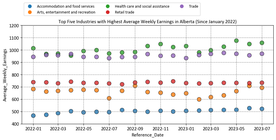
Example: In this example, we use Average Weekly Earnings (including overtime), Alberta. Average weekly earnings result from dividing total weekly income by the employee count, encompassing overtime pay and excluding unclassified businesses. Data is based on gross taxable payroll before deductions and available annually on the OSI website.
# Import the Pandas library for data manipulation
import pandas as pd

# Define the URL of the CSV data source
link = 'https://open.alberta.ca/dataset/948bc949-7c3d-428f-981d-6d8cca837de4/resource/9dadafb7-bd66-4dc2-afc4-c44f8edd1b71/download/stc_table-14-10-0223-01_average_weekly_earnings_monthly_csv_23-08-31.csv'

# Read the CSV data from the provided link
# - 'usecols' specifies the columns to include in the DataFrame.
df_weekly_earnings = pd.read_csv(link,
                                 usecols=['Reference_Date', 'Geography', 'Industry', 'Average_Weekly_Earnings'])
display(df_weekly_earnings)
| Reference_Date | Geography | Industry | Average_Weekly_Earnings | |
|---|---|---|---|---|
| 0 | 2001/01 | Alberta | Accommodation and food services [72] | $274.66 |
| 1 | 2001/02 | Alberta | Accommodation and food services [72] | $264.74 |
| 2 | 2001/03 | Alberta | Accommodation and food services [72] | $261.44 |
| 3 | 2001/04 | Alberta | Accommodation and food services [72] | $261.13 |
| 4 | 2001/05 | Alberta | Accommodation and food services [72] | $255.66 |
| ... | ... | ... | ... | ... |
| 80482 | 2023/03 | Saskatchewan | Wholesale trade [41] | $1449.16 |
| 80483 | 2023/04 | Saskatchewan | Wholesale trade [41] | $1469.97 |
| 80484 | 2023/05 | Saskatchewan | Wholesale trade [41] | $1404.25 |
| 80485 | 2023/06 | Saskatchewan | Wholesale trade [41] | $1403.60 |
| 80486 | 2023/07 | Saskatchewan | Wholesale trade [41] | $1402.92 |
80487 rows × 4 columns
# Convert the 'Reference_Date' column to datetime format with the specified format
# This step is crucial for working with date-based data.
df_weekly_earnings['Reference_Date'] = pd.to_datetime(df_weekly_earnings['Reference_Date'], format='%Y/%m')

# Remove the dollar signs ('$') from the 'Average_Weekly_Earnings' column and convert it to float
# This prepares the column for numerical analysis.
df_weekly_earnings['Average_Weekly_Earnings'] = df_weekly_earnings['Average_Weekly_Earnings']\
                                              .str.replace('$', '', regex=False).astype(float)

# Remove text within square brackets in the 'Industry' column
# This step cleans the 'Industry' column by removing text within square brackets.
df_weekly_earnings['Industry'] = df_weekly_earnings['Industry'].str.replace(r'\s*\[[^\]]+\]', '', regex=True)

# Display the resulting DataFrame after pre-processing
# This provides a glimpse of the data with applied transformations.
display(df_weekly_earnings)
| Reference_Date | Geography | Industry | Average_Weekly_Earnings | |
|---|---|---|---|---|
| 0 | 2001-01-01 | Alberta | Accommodation and food services | 274.66 |
| 1 | 2001-02-01 | Alberta | Accommodation and food services | 264.74 |
| 2 | 2001-03-01 | Alberta | Accommodation and food services | 261.44 |
| 3 | 2001-04-01 | Alberta | Accommodation and food services | 261.13 |
| 4 | 2001-05-01 | Alberta | Accommodation and food services | 255.66 |
| ... | ... | ... | ... | ... |
| 80482 | 2023-03-01 | Saskatchewan | Wholesale trade | 1449.16 |
| 80483 | 2023-04-01 | Saskatchewan | Wholesale trade | 1469.97 |
| 80484 | 2023-05-01 | Saskatchewan | Wholesale trade | 1404.25 |
| 80485 | 2023-06-01 | Saskatchewan | Wholesale trade | 1403.60 |
| 80486 | 2023-07-01 | Saskatchewan | Wholesale trade | 1402.92 |
80487 rows × 4 columns
Here’s a breakdown of the key steps:
Convert the ‘Reference_Date’ column to datetime format:
df_weekly_earnings['Reference_Date']refers to the ‘Reference_Date’ column in the DataFrame.pd.to_datetime()is a Pandas function used to convert date-like strings to datetime objects.format='%Y/%m'specifies the expected date format, where%Yrepresents the year and%mrepresents the month in a YYYY/MM format.This step is crucial for working with date-based data as it ensures that the ‘Reference_Date’ column is in a format that can be used for date-based analysis.
Remove the dollar signs (‘$’) from the ‘Average_Weekly_Earnings’ column and convert it to float:
df_weekly_earnings['Average_Weekly_Earnings']refers to the ‘Average_Weekly_Earnings’ column..str.replace('$', '', regex=False)is used to remove the dollar signs (‘$’) from the values in this column. Theregex=Falseargument ensures that it treats ‘$’ as a literal character, not a regular expression pattern..astype(float)converts the cleaned values to floating-point numbers.This step prepares the column for numerical analysis, ensuring that it contains numeric data rather than string representations.
Remove text within square brackets in the ‘Industry’ column:
The
.str.replace(r'\s*\[[^\]]+\]', '', regex=True)method is employed. It utilizes a regular expression pattern (\s*\[[^\]]+\]) to identify and replace any text within square brackets with an empty string.
The regular expression, ‘\s*[[^]]+]’, can be explained as follows:
‘\s*’ - This part matches zero or more whitespace characters. ‘\s’ represents whitespace (spaces, tabs, etc.), and ‘*’ indicates zero or more occurrences of the preceding element.
‘[’ - This matches an opening square bracket ‘[’ character. Since square brackets are special characters in regular expressions, they need to be escaped with a backslash ‘[’ to match the literal character.
‘[^]]+’ - This portion matches one or more characters that are not the closing square bracket ‘]’. ‘[^]]’ is a character class that matches any character except ‘]’. The ‘+’ indicates one or more occurrences of such characters.
‘]’ - This matches the closing square bracket ‘]’ character. Again, it needs to be escaped with a backslash ‘]’ to match the literal character.
# Import the Pandas library for data manipulation
import pandas as pd

# Filter the DataFrame to include data only for the 'Alberta' region
df_weekly_earnings_AB5 = df_weekly_earnings.loc[df_weekly_earnings['Geography'] == 'Alberta']

# Filter the DataFrame to include data only from January 2022 onwards
# This step focuses on a specific time period for analysis.
df_weekly_earnings_AB5 = df_weekly_earnings_AB5.loc[df_weekly_earnings_AB5['Reference_Date'] >= '2022-01-01']

# Find the top five industries with the highest average weekly earnings
# - 'groupby' groups the data by 'Industry.'
# - 'mean()' calculates the mean of 'Average_Weekly_Earnings' within each group.
# - 'sort_values()' sorts the groups by mean values in ascending order.
# - '[:5]' selects the top five industries.
top_five = df_weekly_earnings_AB5.groupby(['Industry'])['Average_Weekly_Earnings'].mean().sort_values()[:5].index.tolist()

# Filter the DataFrame to include data only for the top five industries
# This narrows down the dataset to focus on the most relevant industries.
df_weekly_earnings_AB5 = df_weekly_earnings_AB5.loc[df_weekly_earnings_AB5['Industry'].isin(top_five)].reset_index(drop=True)

# Display the resulting DataFrame
# This shows the filtered data with the top five industries.
display(df_weekly_earnings_AB5)
| Reference_Date | Geography | Industry | Average_Weekly_Earnings | |
|---|---|---|---|---|
| 0 | 2022-01-01 | Alberta | Accommodation and food services | 465.82 |
| 1 | 2022-02-01 | Alberta | Accommodation and food services | 472.64 |
| 2 | 2022-03-01 | Alberta | Accommodation and food services | 485.84 |
| 3 | 2022-04-01 | Alberta | Accommodation and food services | 501.45 |
| 4 | 2022-05-01 | Alberta | Accommodation and food services | 492.56 |
| ... | ... | ... | ... | ... |
| 90 | 2023-03-01 | Alberta | Trade | 967.78 |
| 91 | 2023-04-01 | Alberta | Trade | 975.87 |
| 92 | 2023-05-01 | Alberta | Trade | 968.53 |
| 93 | 2023-06-01 | Alberta | Trade | 955.96 |
| 94 | 2023-07-01 | Alberta | Trade | 969.01 |
95 rows × 4 columns
Here’s a breakdown of the key steps:
Filtering for Alberta Data:
It creates a new DataFrame ‘df_weekly_earnings_AB5’ by filtering the original DataFrame ‘df_weekly_earnings’ to include data only for the ‘Geography’ column with the value ‘Alberta.’ This step isolates data specific to Alberta.
Filtering for Data from January 2022 Onwards:
The script further narrows down the ‘df_weekly_earnings_AB5’ DataFrame by filtering for data where the ‘Reference_Date’ is greater than or equal to ‘2022-01-01.’ This step selects data from January 2022 onwards.
Finding the Top Five Industries:
Using the ‘groupby’ function, it calculates the mean of ‘Average_Weekly_Earnings’ for each unique value in the ‘Industry’ column within the ‘df_weekly_earnings_AB5’ DataFrame.
It then sorts these mean values in ascending order using ‘sort_values()’ and selects the top five using slicing ‘[:5].’ The result is a list of the top five industries with the highest average weekly earnings.
Filtering for Data in the Top Five Industries:
The script updates ‘df_weekly_earnings_AB5’ by filtering it to include data only for the industries found in the ‘top_five’ list. This step effectively isolates data for the top five industries.
Resetting the Index:
After filtering, the ‘reset_index()’ function is used with ‘drop=True’ to reset the index of ‘df_weekly_earnings_AB5’ and remove the previous index, resulting in a clean index.
# Import the necessary libraries
import matplotlib.pyplot as plt
import seaborn as sns

# Create a figure and axes
fig, ax = plt.subplots(figsize=(9.5, 5))  # Create a figure and its associated axes for the plot

# Create a scatter plot with color-coded points
sns.scatterplot(x='Reference_Date', y='Average_Weekly_Earnings', hue='Industry',
                data=df_weekly_earnings_AB5,   # Dataframe containing the data
                palette='tab10',               # Color palette for data points
                ax=ax,                         # Associate this plot with the defined axes
                s=100,                         # Size of data points
                edgecolor='k',                 # Edge color of data points
                alpha=0.8)                     # Transparency of data points

# Set plot title and adjust the y-axis limit
ax.set(title='Top Five Industries with Highest Average Weekly Earnings in Alberta (Since January 2022)',
       ylim=[400, 1200])                       # Setting the y-axis limits for better visualization

# Set the legend outside the plot, on top
legend = ax.legend(loc='upper left', bbox_to_anchor=(0, 1.25), ncols=3)  # Adjusting the legend's position

# Add grid lines below the scatter plot
ax.grid(True)   # Adding grid lines to the plot for reference

# Ensure a tight layout for better visualization
plt.tight_layout()  # Adjusting the layout to prevent clipping of plot elements
Here’s a breakdown of the key steps:
Custom Plot Style:
It sets a custom style for the plot using the ‘plt.style.use()’ function. The style file ‘mystyle.mplstyle’ is referenced here, but you should adjust the path to your specific style file.
Creating a Figure and Axes:
A figure and axes are created using ‘plt.subplots()’ with a specified figsize (figure size).
Creating a Scatter Plot:
A scatter plot is generated using ‘sns.scatterplot().’ The ‘x’ and ‘y’ parameters specify the data for the x and y-axis, respectively.
The ‘hue’ parameter colors the points based on the ‘Industry’ column.
‘data’ specifies the DataFrame containing the data.
‘palette’ sets the color palette for the points.
‘s’ determines the size of the points.
‘edgecolor’ sets the edge color of the points.
‘legend’ specifies to display the legend with full labels.
‘alpha’ controls the transparency of the points.
Setting Plot Title and Y-Axis Limit:
The ‘ax.set()’ method is used to set the plot title and adjust the y-axis limit, limiting it to the range [400, 1200].
Positioning the Legend:
The legend is positioned outside the plot, above it. ‘ax.legend()’ is used with ‘loc’ to set the upper left corner as the location, and ‘bbox_to_anchor’ adjusts its position.
Adding Grid Lines:
Grid lines are added below the scatter plot using ‘ax.grid(True).’
Ensuring a Tight Layout:
‘plt.tight_layout()’ is called to ensure a tight layout, which helps in improving the visualization’s appearance.
7.5.3. Bar Plot#
A bar plot is a common type of data visualization used to display the distribution of categorical data or the relationship between categorical and numerical variables [Waskom, 2021]. Seaborn’s sns.barplot() function allows you to create bar plots with ease, and it provides options for aggregating data and customizing the appearance of the bars. Here’s an explanation of how to use sns.barplot():
Usage: Bar plots are used to compare the values of different categories, display frequencies or counts of categorical variables, and visualize the relationship between categorical and numerical variables.
Seaborn Library: Seaborn is a Python data visualization library built on top of Matplotlib.
sns.barplot()is part of Seaborn’s collection of plot functions.Syntax: The basic syntax for creating a bar plot with Seaborn is:
sns.barplot(x, y, data, hue, estimator, ci). Here,xandyare the variables to be plotted on the x-axis and y-axis, respectively.datais the DataFrame containing the data, andhue,estimator, andci(all optional) allow you to differentiate bars based on categorical variables, aggregate data, and show confidence intervals around the bars. You can see the full function descrition here.Bar Plot Features:
Bars: The main feature of a bar plot is the vertical (or horizontal) bars that represent the values of different categories or groups. The height (or width) of the bars corresponds to the aggregated values, such as the mean, count, or sum of a numerical variable within each category.
Coloring (Hue): The
hueparameter allows you to differentiate bars based on a categorical variable, creating grouped bar plots where each group represents a different category.Aggregation (Estimator): The
estimatorparameter specifies the aggregation function to be applied to the data within each category. Common options include “mean,” “count,” “sum,” etc.Confidence Intervals (ci): The
ciparameter controls whether to display confidence intervals around the bars, providing a visual representation of the uncertainty in the aggregated values.
Customization: Seaborn provides various customization options, such as setting bar colors, adding labels and titles, adjusting axis limits, and more.
Interpretation: When interpreting a bar plot, focus on the heights (or widths) of the bars, which represent the values of the data within each category or group. Observe the relative differences between the bars, any patterns or trends, and the variation in the data.
Data Preparation: Ensure that the data is properly formatted for the bar plot. Handle missing values, encode categorical variables appropriately, and ensure that the variables being plotted on the x-axis and y-axis are suitable for a bar plot.
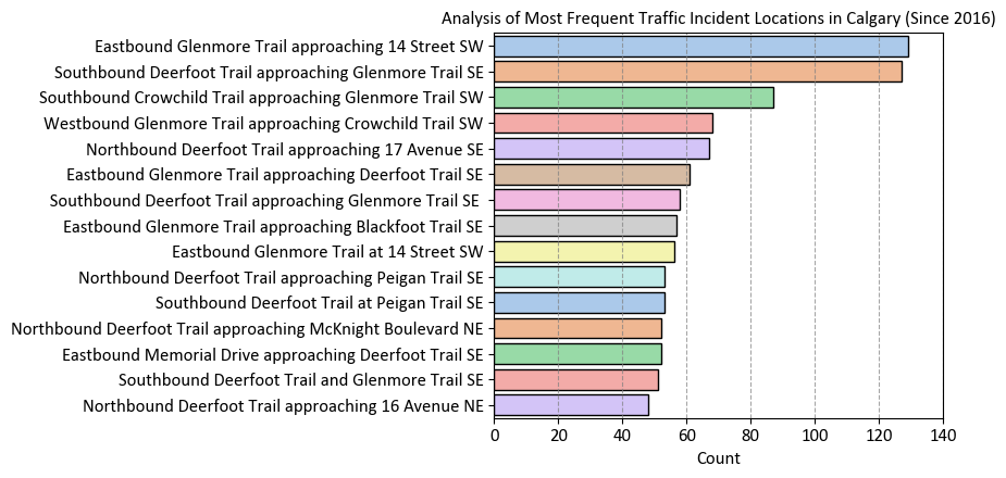
Example: Calgary Traffic Incidents dataset, acquired from here, provides information about various traffic incidents, including their locations, timestamps, the city quadrant in which they occurred, and a count of incidents at each location.
Description of the Dataset Columns:
INCIDENT INFO: This column provides a brief description of the location of the traffic incident. It typically includes the names of streets or intersections where the incident occurred.
START_DT: This column indicates the date and time when the traffic incident was reported or occurred. For example, “9/15/2023 8:44” means the incident took place on September 15, 2023, at 8:44 AM.
QUADRANT: This column specifies the quadrant of the city where the incident occurred. In this context, “NW” stands for Northwest, “SE” for Southeast, and “SW” for Southwest. It helps geographically categorize the incident location within the city.
df_traffic = pd.read_csv('Traffic_Incidents.csv')
df_traffic.head()
| INCIDENT INFO | START_DT | QUADRANT | |
|---|---|---|---|
| 0 | Berkshire Boulevard and Beddington Boulevard NW | 9/15/2023 8:44 | NW |
| 1 | Heritage Drive and Fairview Drive SE | 9/15/2023 8:27 | SE |
| 2 | Eastbound Glenmore Trail at Deerfoot Trail SE | 9/15/2023 7:39 | SE |
| 3 | 4 Avenue and 2 Street SW | 9/15/2023 6:52 | SW |
| 4 | Northbound Barlow Trail at 90 Avenue SE | 9/15/2023 6:44 | SE |
# Group the DataFrame by 'INCIDENT INFO' and calculate the count of each incident
df_Incident_Count = df_traffic.groupby('INCIDENT INFO').size().reset_index(name='Count')

# Sort the incident count DataFrame in descending order by 'Count' column
df_Incident_Count = df_Incident_Count.sort_values(by='Count', ascending=False).head(15)

# Display the top 15 incidents with their respective counts
display(df_Incident_Count)
| INCIDENT INFO | Count | |
|---|---|---|
| 10477 | Eastbound Glenmore Trail approaching 14 Street SW | 129 |
| 15650 | Southbound Deerfoot Trail approaching Glenmore... | 127 |
| 15445 | Southbound Crowchild Trail approaching Glenmor... | 87 |
| 17562 | Westbound Glenmore Trail approaching Crowchild... | 68 |
| 13202 | Northbound Deerfoot Trail approaching 17 Avenu... | 67 |
| 10491 | Eastbound Glenmore Trail approaching Deerfoot ... | 61 |
| 4134 | Southbound Deerfoot Trail approaching Glenmor... | 58 |
| 10486 | Eastbound Glenmore Trail approaching Blackfoot... | 57 |
| 10498 | Eastbound Glenmore Trail at 14 Street SW | 56 |
| 13243 | Northbound Deerfoot Trail approaching Peigan T... | 53 |
| 15715 | Southbound Deerfoot Trail at Peigan Trail SE | 53 |
| 13235 | Northbound Deerfoot Trail approaching McKnight... | 52 |
| 10827 | Eastbound Memorial Drive approaching Deerfoot ... | 52 |
| 15605 | Southbound Deerfoot Trail and Glenmore Trail SE | 51 |
| 13201 | Northbound Deerfoot Trail approaching 16 Avenu... | 48 |
Here’s a breakdown of the key steps:
Counting Incident Types:
The code begins by using the Pandas ‘value_counts()’ method on the ‘INCIDENT INFO’ column of the ‘df_traffic’ DataFrame. This method counts the number of occurrences of each unique incident type in the ‘INCIDENT INFO’ column.
The result of ‘value_counts()’ is a Series with incident types as the index and their respective counts as values.
Converting to a DataFrame:
The ‘to_frame(‘Count’)’ method is called on the Series returned by ‘value_counts().’ This step converts the Series into a DataFrame with two columns: ‘index’ and ‘Count.’ The ‘index’ column contains the incident types, and the ‘Count’ column contains their respective counts.
Resetting the Index:
The ‘reset_index(drop=False)’ method is used to reset the index of the newly created DataFrame. By default, the old index is preserved as a new column, and the ‘drop=False’ parameter ensures that the old index becomes a regular column in the DataFrame.
Sorting by Count:
The resulting DataFrame, ‘df_Incident_Count,’ is sorted by the ‘Count’ column in descending order. This sorts the incident types from the most frequent to the least frequent using ‘sort_values(by=‘Count’, ascending=False).’
Selecting the Top 15 Incidents:
‘head(15)’ is used to select the top 15 incident types with the highest counts after sorting. This step focuses on the 15 most common incident types.
import seaborn as sns
import matplotlib.pyplot as plt

# Create a figure and axes for the bar plot
fig, ax = plt.subplots(figsize=(9, 4.5))

# Create a bar plot using seaborn with a pastel color palette
sns.barplot(y='INCIDENT INFO',
            x='Count',
            data=df_Incident_Count,
            palette='pastel',
            ax=ax,
            edgecolor='k')

# Set labels and title for the plot
ax.set(ylabel = '',title='Analysis of Most Frequent Traffic Incident Locations in Calgary (Since 2016)',
      xlim = [0, 140])

# Add grid lines to the x-axis for better visualization
ax.xaxis.grid(True, linestyle='--', alpha=0.7)

# Adjust the plot layout for better presentation
plt.tight_layout()
Here’s a breakdown of the key steps:
Creating a Figure and Axes for the Bar Plot:
A figure and axes are created using ‘plt.subplots(figsize=(9, 4.5)).’ The ‘figsize’ parameter sets the size of the figure in inches.
Creating a Bar Plot with Seaborn:
A bar plot is generated using ‘sns.barplot().’
‘y’ is set to ‘INCIDENT INFO,’ specifying that the ‘INCIDENT INFO’ column from the ‘df_Incident_Count’ DataFrame should be represented on the y-axis.
‘x’ is set to ‘Count,’ indicating that the ‘Count’ column should be represented on the x-axis.
‘data’ specifies the DataFrame containing the data.
‘palette’ sets the color palette for the bars to ‘pastel.’
‘ax’ specifies the axes where the plot should be drawn.
‘edgecolor’ sets the color of the bar edges.
Setting Labels and Title:
The ‘ax.set()’ method is used to set the labels for the y-axis and provide a title for the plot.
‘ylabel’ is set to an empty string (‘’) to remove the y-axis label.
‘title’ sets the title of the plot.
‘xlim’ sets the limits for the x-axis to [0, 140].
Adding Grid Lines to the X-Axis:
Grid lines are added to the x-axis using ‘ax.xaxis.grid(True, linestyle=’–‘, alpha=0.7).’ This helps in better visualizing the data.
Adjusting Plot Layout:
‘plt.tight_layout()’ is called to ensure a tight layout, which improves the plot’s appearance by avoiding overlapping elements.
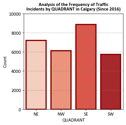
# Grouping the DataFrame by 'QUADRANT' and calculating the count of each quadrant
df_Incident_Count = df_traffic.groupby('QUADRANT').size().reset_index(name='Count')

# Sorting the quadrant count DataFrame by the 'QUADRANT' column
df_Incident_Count = df_Incident_Count.sort_values(by='QUADRANT')

# Displaying the quadrant counts
display(df_Incident_Count)
| QUADRANT | Count | |
|---|---|---|
| 0 | NE | 7209 |
| 1 | NW | 6114 |
| 2 | SE | 8871 |
| 3 | SW | 5726 |
Here’s a breakdown of the key steps:
Counting Incident Locations:
The code starts by using the Pandas ‘value_counts()’ method on the ‘QUADRANT’ column of the ‘df_traffic’ DataFrame. This method counts the occurrences of each unique incident location in the ‘QUADRANT’ column.
The result of ‘value_counts()’ is a Series with incident locations as the index and their respective counts as values.
Converting to a DataFrame:
The ‘to_frame(‘Count’)’ method is called on the Series returned by ‘value_counts().’ This step converts the Series into a DataFrame with two columns: ‘index’ and ‘Count.’ The ‘index’ column contains the incident locations, and the ‘Count’ column contains their respective counts.
Resetting the Index:
The ‘reset_index(drop=False)’ method is used to reset the index of the newly created DataFrame. By default, the old index is preserved as a new column, and the ‘drop=False’ parameter ensures that the old index becomes a regular column in the DataFrame.
Sorting by ‘QUADRANT’:
The code then sorts the resulting DataFrame, ‘df_Incident_Count,’ by the ‘QUADRANT’ column in ascending order. This means that the incident locations will be displayed in alphabetical order.
# Import the necessary libraries for data visualization
import seaborn as sns
import matplotlib.pyplot as plt

# Create a figure and axes for the bar plot
fig, ax = plt.subplots(figsize=(4.5, 4.5))

# Generate a bar plot using seaborn with a pastel color palette
sns.barplot(x='QUADRANT',
            y='Count',
            palette='Reds',
            data=df_Incident_Count,
            ax=ax,
            edgecolor='DarkRed',
            lw=3)

# Set labels and title for the plot
ax.set_title('Analysis of the Frequency of Traffic\nIncidents by QUADRANT in Calgary (Since 2016)',
             weight='bold', y = 1.01)

# Set the y-axis limits to enhance data visibility
ax.set_ylim([0, 10000])

# Add grid lines to the y-axis for improved visualization
ax.yaxis.grid(True, linestyle='--', alpha=0.7)

# Adjust the plot layout for better presentation
plt.tight_layout()
Here’s a breakdown of the key steps:
Creating a Figure and Axes for the Bar Plot:
A figure and axes are created using ‘plt.subplots(figsize=(4.5, 4.5)).’ The ‘figsize’ parameter sets the size of the figure in inches.
Creating a Bar Plot with Seaborn:
A bar plot is generated using ‘sns.barplot().’
‘x’ is set to ‘QUADRANT,’ specifying that the ‘QUADRANT’ column from the ‘df_Incident_Count’ DataFrame should be represented on the x-axis.
‘y’ is set to ‘Count,’ indicating that the ‘Count’ column should be represented on the y-axis.
‘data’ specifies the DataFrame containing the data.
‘palette’ sets the color palette for the bars to ‘pastel.’
‘ax’ specifies the axes where the plot should be drawn.
‘edgecolor’ sets the color of the bar edges.
Setting Labels and Title:
The ‘ax.set()’ method is used to set the title of the plot.
‘title’ sets the title of the plot, providing context for the visualization.
Adding Grid Lines to the Y-Axis:
Grid lines are added to the y-axis using ‘ax.yaxis.grid(True, linestyle=’–‘, alpha=0.7).’ This helps in better visualizing the data by providing reference lines.
Adjusting Plot Layout:
‘plt.tight_layout()’ is called to ensure a tight layout, which improves the plot’s appearance by avoiding overlapping elements.
7.5.4. Count Plot#
A count plot is a specific type of bar plot in Seaborn that displays the count of categorical data points in a dataset. It’s particularly useful for visualizing the distribution of categorical variables and comparing the frequency of different categories [Waskom, 2021]. Seaborn’s sns.countplot() function allows you to create count plots easily and provides options for customizing the appearance of the bars. Here’s an explanation of how to use sns.countplot():
Usage: Count plots are used to visualize the frequency or count of categorical data points, helping you understand the distribution and prevalence of different categories.
Seaborn Library: Seaborn is a Python data visualization library built on top of Matplotlib.
sns.countplot()is a specific function within Seaborn for creating count plots.Syntax: The basic syntax for creating a count plot with Seaborn is:
sns.countplot(x, data, hue). Here,xis the categorical variable to be plotted on the x-axis, anddatais the DataFrame containing the data. Thehueparameter (optional) allows you to differentiate the count bars based on another categorical variable, creating grouped count plots. You can see the full function descrition here.Count Plot Features:
Count Bars: The primary feature of a count plot is the vertical (or horizontal) bars that represent the count of data points in each category. The height (or width) of the bars corresponds to the frequency of occurrences of each category.
Coloring (Hue): The
hueparameter allows you to differentiate the count bars based on another categorical variable, creating a grouped count plot where each group represents a different category within the original categories.
Customization: Seaborn provides various customization options, such as setting bar colors, adding labels and titles, adjusting axis limits, and more.
Interpretation: When interpreting a count plot, focus on the heights (or widths) of the bars, which represent the count or frequency of data points within each category. Observe the relative differences in counts, any patterns or trends in the distribution, and the prevalence of each category.
Data Preparation: Ensure that the data is properly formatted for the count plot. Handle missing values, encode categorical variables appropriately, and ensure that the variable being plotted on the x-axis is categorical and suitable for a count plot.
Example: Consider the traffic incident example again.
# Import the necessary libraries for data visualization
import seaborn as sns
import matplotlib.pyplot as plt
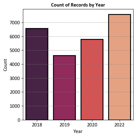
# Convert the 'START_DT' column to a datetime object and extract the year as a string
df_traffic['Year'] = pd.to_datetime(df_traffic.START_DT).dt.year.astype('str')
# Filter the DataFrame for the years 2018, 2019, 2020, and 2022 and sort by 'Year'
df_traffic_2018_2022 = df_traffic.loc[df_traffic.Year.isin(['2018', '2019', '2020', '2022'])].sort_values(by='Year')
# Create a figure and axes for the count plot
fig, ax = plt.subplots(figsize=(4.5, 4.5))
# Create a count plot using seaborn with a specified color palette
_ = sns.countplot(x='Year',
data=df_traffic_2018_2022,
palette='rocket',
ax=ax, edgecolor='k',
lw=2)
# Set labels and title for the plot
ax.set(xlabel='Year', ylabel='Count')
ax.set_title('Count of Records by Year', weight='bold')
# Add grid lines to the y-axis for improved visualization
ax.yaxis.grid(True, linestyle='--', alpha=0.7)
# Adjust the plot layout for better presentation
plt.tight_layout()
Here’s a breakdown of the key steps:
Extracting the Year from ‘START_DT’:
It creates a new column named ‘Year’ in the ‘df_traffic’ DataFrame by performing the following operations:
The ‘pd.to_datetime(df_traffic.START_DT)’ converts the ‘START_DT’ column to a datetime object.
‘dt.year’ extracts the year from the datetime object.
‘astype(‘str’)’ converts the extracted year to a string. This step is necessary because Seaborn expects categorical data for the x-axis.
Filtering the DataFrame:
The code filters the ‘df_traffic’ DataFrame to include only records from the years 2018, 2019, 2020, and 2022. This is achieved by using ‘df_traffic.Year.isin([‘2018’, ‘2019’, ‘2020’, ‘2022’])’ to create a boolean mask and then using ‘loc’ to filter the DataFrame accordingly. The filtered data is sorted by the ‘Year’ column.
Creating a Figure and Axes:
A figure and axes are created using ‘plt.subplots(figsize=(4.5, 4.5)).’ The ‘figsize’ parameter sets the size of the figure in inches.
Creating a Count Plot with Seaborn:
A count plot is generated using ‘sns.countplot().’
‘x’ is set to ‘Year,’ specifying that the ‘Year’ column from the filtered DataFrame ‘df_traffic_2018_2022’ should be represented on the x-axis.
‘data’ specifies the DataFrame containing the data.
‘palette’ sets the color palette for the bars to ‘muted.’
‘ax’ specifies the axes where the plot should be drawn.
‘edgecolor’ sets the color of the bar edges.
Setting Labels and Title:
The ‘ax.set()’ method is used to set labels for the x and y-axes and provide a title for the plot.
‘xlabel’ sets the label for the x-axis to ‘Year.’
‘ylabel’ sets the label for the y-axis to ‘Count.’
‘title’ sets the title of the plot.
Adding Grid Lines to the Y-Axis:
Grid lines are added to the y-axis using ‘ax.yaxis.grid(True, linestyle=’–‘, alpha=0.7).’ This helps in better visualizing the data by providing reference lines.
7.5.5. Histogram#
A histogram is a fundamental data visualization used to represent the distribution of a continuous numerical variable [Waskom, 2021]. Seaborn’s sns.histplot() function is designed to create histograms with ease and provides various options for customization. Here’s an explanation of how to use sns.histplot():
Usage: Histograms are used to understand the underlying frequency distribution of a continuous variable, allowing you to observe the pattern of values and identify central tendencies, dispersion, and potential outliers.
Seaborn Library: Seaborn is a Python data visualization library that enhances the aesthetics and ease of creating statistical graphics.
sns.histplot()is part of Seaborn’s suite of plot functions.Syntax: The basic syntax for creating a histogram with Seaborn is:
sns.histplot(data, x, bins, kde, rug). Here,datais the DataFrame containing the data,xis the numerical variable to be plotted on the x-axis,binsspecifies the number of bins (intervals) for the histogram,kde(optional) controls whether to overlay a kernel density estimate, andrug(optional) adds small vertical lines for each data point along the x-axis. You can find the full function description here.Histogram Features:
Bins: The histogram divides the range of the numerical variable into a set of contiguous intervals called “bins.” The height of each bar represents the frequency (or count) of data points falling within each bin.
Kernel Density Estimate (KDE): The
kdeparameter can be set toTrueto overlay a smooth density curve (kernel density estimate) on top of the histogram. The KDE provides a smoothed representation of the data’s distribution.Rug Plot: The
rugparameter adds small vertical lines (rugs) along the x-axis, indicating the location of individual data points. This can help in visualizing the distribution of data points more precisely.
Customization: Seaborn provides various customization options for histograms, such as setting the number of bins, adjusting the appearance of the bars, KDE customization, adding labels and titles, and more.
Interpretation: When interpreting a histogram, focus on the shape of the distribution, the location of the central tendency (mean, median), the spread (variance or standard deviation), the presence of multiple modes (bimodal, multimodal), and any potential outliers.
Data Preparation: Ensure that the data is properly cleaned and suitable for the histogram. Consider the choice of bin size, and be aware that the appearance of the histogram can change based on the chosen binning strategy.
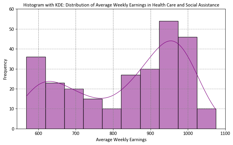
Example:
# Import the necessary library for data manipulation
import pandas as pd

# Filter the DataFrame to include data only for the top five industries
# Specifically, we are selecting data related to the 'Health care and social assistance' industry in the province of Alberta.
df_weekly_earnings_health = df_weekly_earnings.loc[
    (df_weekly_earnings['Industry'] == 'Health care and social assistance')  # Filtering by industry code
    & (df_weekly_earnings['Geography'] == 'Alberta')  # Restricting to the province of Alberta
].reset_index(drop=True)  # Resetting the index for the resulting DataFrame

# Display the resulting DataFrame, focusing on health care and social assistance earnings in Alberta
display(df_weekly_earnings_health)
| Reference_Date | Geography | Industry | Average_Weekly_Earnings | |
|---|---|---|---|---|
| 0 | 2001-01-01 | Alberta | Health care and social assistance | 568.30 |
| 1 | 2001-02-01 | Alberta | Health care and social assistance | 570.22 |
| 2 | 2001-03-01 | Alberta | Health care and social assistance | 572.50 |
| 3 | 2001-04-01 | Alberta | Health care and social assistance | 572.32 |
| 4 | 2001-05-01 | Alberta | Health care and social assistance | 574.65 |
| ... | ... | ... | ... | ... |
| 266 | 2023-03-01 | Alberta | Health care and social assistance | 996.92 |
| 267 | 2023-04-01 | Alberta | Health care and social assistance | 1026.17 |
| 268 | 2023-05-01 | Alberta | Health care and social assistance | 1075.06 |
| 269 | 2023-06-01 | Alberta | Health care and social assistance | 1048.08 |
| 270 | 2023-07-01 | Alberta | Health care and social assistance | 1057.81 |
271 rows × 4 columns
Here’s a breakdown of the key steps:
Filtering the DataFrame:
The code filters the ‘df_weekly_earnings’ DataFrame to include data only for the ‘Health care and social assistance’ industry in the ‘Alberta’ geographical location.
The filtering is done using the ‘loc’ method with multiple conditions within square brackets. The conditions are as follows:
(df_weekly_earnings['Industry'] == 'Health care and social assistance')checks if the ‘Industry’ column matches the specified industry, which is ‘Health care and social assistance’.(df_weekly_earnings['Geography'] == 'Alberta')checks if the ‘Geography’ column matches ‘Alberta.’
The filtered data is then assigned to a new DataFrame called ‘df_weekly_earnings_health.’
Resetting the Index:
After filtering, the code uses the ‘reset_index(drop=True)’ method to reset the index of the ‘df_weekly_earnings_health’ DataFrame. The ‘drop=True’ parameter ensures that the old index is discarded, and a new default integer index is set.
Displaying the Result:
Finally, ‘display(df_weekly_earnings_health)’ is called to display the resulting DataFrame. This DataFrame now contains data only for the ‘Health care and social assistance’ industry in ‘Alberta.’ It provides a focused view of earnings data specifically for this industry and location.
# Import the necessary libraries for data visualization
import seaborn as sns
import matplotlib.pyplot as plt

# Create a figure and axes for the plot
fig, ax = plt.subplots(figsize=(8, 5))

# Generate a histogram with a Kernel Density Estimation (KDE) plot
sns.histplot(data=df_weekly_earnings_health,
             x='Average_Weekly_Earnings',
             stat='count',
             bins=10,
             kde=True,  # Include KDE for visualizing the probability density
             color='purple',
             ax=ax,
             edgecolor='k')

# Set labels and title for the plot
ax.set(xlabel='Average Weekly Earnings',  # Label for the x-axis
       ylabel='Frequency',  # Label for the y-axis
       title='Histogram with KDE: Distribution of Average Weekly Earnings in Health Care and Social Assistance',
       ylim = [0, 60])

# Add grid lines to enhance visibility along the y-axis
ax.yaxis.grid(True, linestyle='--', alpha=0.7)

# Adjust the plot layout for better presentation
plt.tight_layout()
Here’s a breakdown of the key steps:
Creating a Figure and Axes:
A figure and axes are created using ‘plt.subplots(figsize=(8, 5)).’ The ‘figsize’ parameter sets the size of the figure in inches.
Creating a Histogram with KDE Plot:
A histogram with a KDE plot is generated using ‘sns.histplot().’
‘data’ is set to ‘df_weekly_earnings_health,’ specifying the DataFrame containing the data.
‘x’ is set to ‘Average_Weekly_Earnings,’ indicating that the ‘Average_Weekly_Earnings’ column should be represented on the x-axis.
‘bins’ specifies the number of bins for the histogram, which is set to 10.
‘kde=True’ adds a Kernel Density Estimation (KDE) plot on top of the histogram to estimate the probability density function.
‘color’ sets the color of the histogram and KDE plot to ‘purple.’
‘ax’ specifies the axes where the plot should be drawn.
‘edgecolor’ sets the color of the histogram bin edges.
Setting Labels and Title:
The ‘ax.set()’ method is used to set labels for the x and y-axes and provide a title for the plot.
‘xlabel’ sets the label for the x-axis to ‘Average Weekly Earnings.’
‘ylabel’ sets the label for the y-axis to ‘Frequency.’
‘title’ sets the title of the plot.
Adding Grid Lines to the Y-Axis:
Grid lines are added to the y-axis using ‘ax.yaxis.grid(True, linestyle=’–‘, alpha=0.7).’ This helps in better visualizing the data by providing reference lines.
Adjusting Plot Layout:
‘plt.tight_layout()’ is called to ensure a tight layout, improving the plot’s appearance by avoiding overlapping elements.
However, the plot above represents the distribution of Average Weekly Earnings in the Health Care and Social Assistance sector. These values span a period of over 20 years. It’s important to note that weekly earnings have evolved significantly over this time frame. For instance, in January 2001, the average weekly earnings in Alberta stood at C$568.30, and by January 2023, this figure had risen to C$1031.19.
df_weekly_earnings_health['Month'] = df_weekly_earnings_health.Reference_Date.dt.month
df_weekly_earnings_health['Year'] = df_weekly_earnings_health.Reference_Date.dt.year
display(df_weekly_earnings_health.loc[df_weekly_earnings_health['Month'] == 1,
                                      ['Year','Average_Weekly_Earnings']]\
        .style.background_gradient(cmap='PuBu', subset=['Average_Weekly_Earnings'])\
        .format({'Average_Weekly_Earnings': '{:.2f}'}).hide(axis="index"))
| Year | Average_Weekly_Earnings |
|---|---|
| 2001 | 568.30 |
| 2002 | 582.73 |
| 2003 | 598.07 |
| 2004 | 609.75 |
| 2005 | 657.29 |
| 2006 | 680.08 |
| 2007 | 705.03 |
| 2008 | 737.78 |
| 2009 | 773.48 |
| 2010 | 826.96 |
| 2011 | 868.78 |
| 2012 | 876.58 |
| 2013 | 917.02 |
| 2014 | 921.37 |
| 2015 | 946.27 |
| 2016 | 917.53 |
| 2017 | 951.10 |
| 2018 | 989.25 |
| 2019 | 960.27 |
| 2020 | 977.49 |
| 2021 | 1015.27 |
| 2022 | 1013.34 |
| 2023 | 1031.19 |
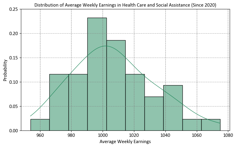
Instead, we should focus our investigation on more recent years, specifically starting from 2020 and moving forward.
# Import the necessary libraries for data visualization
import seaborn as sns
import matplotlib.pyplot as plt

# Create a figure and axes for the plot
fig, ax = plt.subplots(figsize=(8, 5))

# Generate a histogram with a Kernel Density Estimation (KDE) plot
sns.histplot(data=df_weekly_earnings_health.loc[df_weekly_earnings_health.Year >= 2020],
             x='Average_Weekly_Earnings',
             stat='probability',
             bins=10,
             kde=True,  # Include KDE for visualizing the probability density
             color='#22885c',
             ax=ax,
             edgecolor='k')

# Set labels and title for the plot
ax.set(xlabel='Average Weekly Earnings',  # Label for the x-axis
       ylabel='Probability',  # Label for the y-axis
       title='Distribution of Average Weekly Earnings in Health Care and Social Assistance (Since 2020)',
       ylim = [0, .25])

# Add grid lines to enhance visibility along the y-axis
ax.yaxis.grid(True, linestyle='--', alpha=0.7)

# Adjust the plot layout for better presentation
plt.tight_layout()
7.5.6. Box Plot#
A box plot [Waskom, 2021] (also known as a whisker plot) is a common data visualization used to depict the distribution and spread of numerical data. It provides insights into the central tendency, variability, and presence of outliers in a dataset. Seaborn’s sns.boxplot() function is designed to create box plots easily and allows for customization to enhance the visualization. Here’s an explanation of how to use sns.boxplot():
Usage: Box plots are particularly useful for comparing the distribution and spread of numerical data across different categories or groups, identifying potential outliers, and understanding the central tendencies (median, quartiles) of the data.
Seaborn Library: Seaborn is a Python data visualization library built on top of Matplotlib.
sns.boxplot()is part of Seaborn’s suite of plot functions.Syntax: The basic syntax for creating a box plot with Seaborn is:
sns.boxplot(x, y, data, hue). Here,x(ory) is the categorical variable to be plotted on the x-axis (or y-axis),datais the DataFrame containing the data, andhue(optional) allows you to differentiate box plots based on another categorical variable. You can find the full function description here.Box Plot Features:
Box: The main feature of a box plot is the “box” that represents the interquartile range (IQR), which encompasses the middle 50% of the data. The vertical line inside the box represents the median (50th percentile) of the data.
Whiskers: Whiskers extend from the box to the minimum and maximum non-outlier data points within a certain range (default is 1.5 times the IQR). Data points outside the whiskers are often considered potential outliers.
Outliers: Individual data points outside the whiskers are plotted as “outliers” using dots or other marker styles. These are data points that are significantly different from the bulk of the data.
Coloring (Hue): The
hueparameter allows you to differentiate box plots based on another categorical variable, creating grouped box plots for each category within the original categories.
Customization: Seaborn provides various customization options for box plots, such as setting colors, adding labels and titles, adjusting the appearance of the boxes and whiskers, and more.
Interpretation: When interpreting a box plot, focus on the median (center of the box), the spread (size of the box), the range covered by the whiskers, the presence of outliers (dots outside the whiskers), and the differences between box plots for different categories (if using
hue).Data Preparation: Ensure that the data is properly formatted for the box plot. Handle missing values, encode categorical variables appropriately, and ensure that the variables being plotted on the x-axis and y-axis are suitable for a box plot.
# Import the necessary library for data manipulation
import pandas as pd

# Filter the DataFrame to include data only for the 'Health care and social assistance' industry
# This filter is applied based on the 'Industry' column, specifically targeting the specified industry name.
df_weekly_earnings_health = df_weekly_earnings.loc[
    (df_weekly_earnings['Industry'] == 'Health care and social assistance')  # Filtering by industry name
].reset_index(drop=True)  # Resetting the index for the resulting DataFrame

# Display the resulting DataFrame, focusing on data related to the 'Health care and social assistance' industry
display(df_weekly_earnings_health)
| Reference_Date | Geography | Industry | Average_Weekly_Earnings | |
|---|---|---|---|---|
| 0 | 2001-01-01 | Alberta | Health care and social assistance | 568.30 |
| 1 | 2001-02-01 | Alberta | Health care and social assistance | 570.22 |
| 2 | 2001-03-01 | Alberta | Health care and social assistance | 572.50 |
| 3 | 2001-04-01 | Alberta | Health care and social assistance | 572.32 |
| 4 | 2001-05-01 | Alberta | Health care and social assistance | 574.65 |
| ... | ... | ... | ... | ... |
| 2976 | 2023-03-01 | Saskatchewan | Health care and social assistance | 1055.82 |
| 2977 | 2023-04-01 | Saskatchewan | Health care and social assistance | 1015.09 |
| 2978 | 2023-05-01 | Saskatchewan | Health care and social assistance | 1025.47 |
| 2979 | 2023-06-01 | Saskatchewan | Health care and social assistance | 978.37 |
| 2980 | 2023-07-01 | Saskatchewan | Health care and social assistance | 1060.61 |
2981 rows × 4 columns
Here’s a breakdown of the key steps:
Filtering the DataFrame:
The code filters the ‘df_weekly_earnings’ DataFrame to include data only for the ‘Health care and social assistance [62]’ industry.
The filtering is done using the ‘loc’ method with a condition within square brackets:
(df_weekly_earnings['Industry'] == 'Health care and social assistance')checks if the ‘Industry’ column matches the specified industry, which is ‘Health care and social assistance’.
The filtered data is then assigned to a new DataFrame called ‘df_weekly_earnings_health.’
Resetting the Index:
After filtering, the code uses the ‘reset_index(drop=True)’ method to reset the index of the ‘df_weekly_earnings_health’ DataFrame. The ‘drop=True’ parameter ensures that the old index is discarded, and a new default integer index is set.
# Import the necessary libraries for data visualization
import seaborn as sns
import matplotlib.pyplot as plt

# Create a figure and axes with a specified size for the box plot
fig, ax = plt.subplots(figsize=(9.5, 5))

# Generate a box plot to visualize the distribution of average weekly earnings by geography
sns.boxplot(y='Geography', x='Average_Weekly_Earnings', data=df_weekly_earnings_health, palette='Set3', ax=ax)

# Set labels and title for the plot
ax.set(ylabel='',  # No label for the y-axis
       title='Box Plot: Distribution of Average Weekly Earnings by Geography (Health Care and Social Assistance)',
       xlim=[400, 1200])  # Setting the x-axis limit for better visualization

# Add grid lines only for the x-axis to improve readability
ax.xaxis.grid(True, linestyle='--', alpha=0.7)

# Display the plot with a tight layout for better presentation
plt.tight_layout()
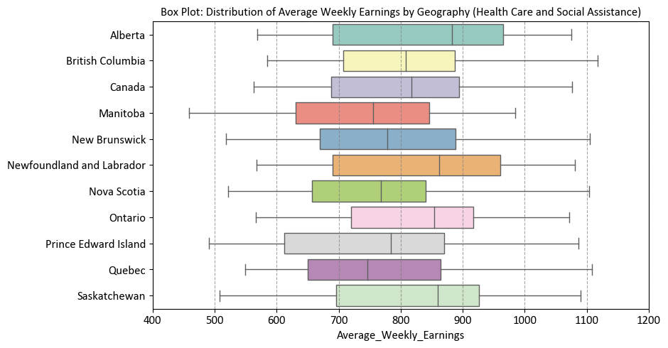
Here’s a breakdown of the key steps:
Creating a Figure and Axes with Specified Size:
A figure and axes are created using ‘plt.subplots(figsize=(9.5, 5)).’ The ‘figsize’ parameter sets the size of the figure in inches.
Creating a Box Plot with Seaborn:
A box plot is generated using ‘sns.boxplot().’
‘y’ is set to ‘Geography,’ specifying that the ‘Geography’ column from the ‘df_weekly_earnings_health’ DataFrame should be represented on the y-axis.
‘x’ is set to ‘Average_Weekly_Earnings,’ indicating that the ‘Average_Weekly_Earnings’ column should be represented on the x-axis.
‘data’ specifies the DataFrame containing the data.
‘palette’ sets the color palette for the box plots to ‘Set3.’
‘ax’ specifies the axes where the plot should be drawn.
Setting Labels and Title:
The ‘ax.set()’ method is used to set labels for the y-axis and provide a title for the plot.
‘ylabel’ is set to an empty string (‘’) to remove the y-axis label.
‘title’ sets the title of the plot.
‘xlim’ sets the limits for the x-axis to [400, 1200].
Adding Grid Lines to the X-Axis:
Grid lines are added to the x-axis using ‘ax.xaxis.grid(True, linestyle=’–‘, alpha=0.7).’ This helps in better visualizing the data by providing reference lines.
Showing the Plot with Tight Layout:
‘plt.tight_layout()’ is called to ensure a tight layout, improving the plot’s appearance by avoiding overlapping elements.
Box Plots
Box plots, also known as box-and-whisker plots, are a graphical representation of the distribution of a dataset. They provide a concise summary of the data’s central tendency, dispersion, and the presence of outliers. Box plots are particularly useful for comparing multiple datasets or visualizing the spread of data across different categories. A box plot consists of several elements:
Box: The box represents the interquartile range (IQR), which contains the middle 50% of the data. The bottom (lower) edge of the box marks the first quartile (Q1), and the top (upper) edge marks the third quartile (Q3). The length of the box indicates the spread or variability of the data in this range.
Whiskers: The whiskers extend from the edges of the box to the minimum and maximum values within a certain distance from the quartiles. The length of the whiskers is typically 1.5 times the IQR. Data points beyond the whiskers are considered outliers and are shown individually as points.
Median: The line inside the box represents the median (Q2) of the data, which is the middle value when the data is sorted in ascending order. It divides the data into two equal halves.
Outliers: Individual data points that lie beyond the whiskers are shown as separate points on the plot and are considered outliers.
Box plots are particularly useful for detecting the presence of outliers, identifying skewness in the data, and comparing the distribution of data across different categories or groups. They provide a clear visual representation of the spread and central tendency of the data and are valuable tools for exploratory data analysis.
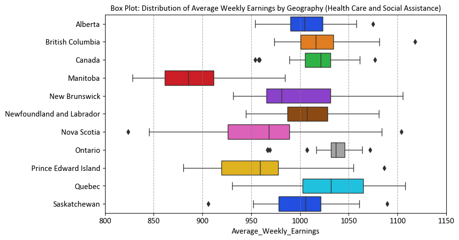
For the same reasons mentioned earlier, we can only generate a plot for data from 2020 onwards.
# Import the necessary libraries for data visualization
import seaborn as sns
import matplotlib.pyplot as plt

# Extract the 'Year' from the 'Reference_Date' column
df_weekly_earnings_health['Year'] = df_weekly_earnings_health.Reference_Date.dt.year

# Create a figure and axes with a specified size for the box plot
fig, ax = plt.subplots(figsize=(9.5, 5))

# Generate a box plot to visualize the distribution of average weekly earnings by geography
sns.boxplot(y='Geography', x='Average_Weekly_Earnings',
            data=df_weekly_earnings_health.loc[df_weekly_earnings_health.Year >= 2020],
            palette='bright', ax=ax)

# Set labels and title for the plot
ax.set(ylabel='',  # No label for the y-axis
       title='Box Plot: Distribution of Average Weekly Earnings by Geography (Health Care and Social Assistance)',
       xlim=[800, 1150])  # Setting the x-axis limit for better visualization

# Add grid lines only for the x-axis to improve readability
ax.xaxis.grid(True, linestyle='--', alpha=0.7)

# Display the plot with a tight layout for better presentation
plt.tight_layout()
7.5.7. Violin Plot#
A violin plot [Waskom, 2021] is a data visualization that combines elements of a box plot and a kernel density estimate (KDE) to show the distribution of a continuous numerical variable within different categories. It provides insights into the central tendency, variability, and the shape of the distribution, making it useful for comparing data distributions across different groups. Seaborn’s sns.violinplot() function is specifically designed to create violin plots and allows for customization to enhance the visualization. Here’s an explanation of how to use sns.violinplot():
Usage: Violin plots are used to compare the distribution of a continuous numerical variable across different categories or groups. They provide a comprehensive view of the data’s distribution, including central tendency, spread, multimodality, and potential outliers.
Seaborn Library: Seaborn is a Python data visualization library built on top of Matplotlib.
sns.violinplot()is part of Seaborn’s suite of plot functions.Syntax: The basic syntax for creating a violin plot with Seaborn is:
sns.violinplot(x, y, data, hue). Here,x(ory) is the categorical variable to be plotted on the x-axis (or y-axis),datais the DataFrame containing the data, andhue(optional) allows you to differentiate violin plots based on another categorical variable. You can find the full function description here.Violin Plot Features:
Violin: The main feature of a violin plot is the “violin” shape that displays the kernel density estimate (KDE) of the data’s distribution within each category. The width of the violin represents the density of data points, and the wider regions indicate a higher density of data.
Central Line: Inside the violin, there is often a central line that represents the median of the data within each category, similar to a box plot.
Interquartile Range (IQR): The width of the violin around the central line indicates the interquartile range (IQR), providing information about the spread of the data.
Coloring (Hue): The
hueparameter allows you to differentiate violin plots based on another categorical variable, creating grouped violin plots for each category within the original categories.
Customization: Seaborn provides various customization options for violin plots, such as setting colors, adding labels and titles, adjusting the appearance of the violins, and more.
Interpretation: When interpreting a violin plot, focus on the width of the violin (density of data points), the central line (median), the spread (width of the violin), the presence of multiple modes (if applicable), and the differences between violin plots for different categories (if using
hue).Data Preparation: Ensure that the data is properly formatted for the violin plot. Handle missing values, encode categorical variables appropriately, and ensure that the variables being plotted on the x-axis and y-axis are suitable for a violin plot.
import seaborn as sns
import matplotlib.pyplot as plt

# Create a figure and axes with a specified size
fig, ax = plt.subplots(figsize=(9.5, 8))

# Create a violin plot with a specified color palette
sns.violinplot(y='Geography', x='Average_Weekly_Earnings', data=df_weekly_earnings_health, palette='Set2', ax=ax)

# Set labels and title
ax.set(ylabel='', title='Violin Plot: Average Weekly Earnings by Geography (Health Care and Social Assistance)',
       xlim=[200, 1400])

# Add grid lines only for the x-axis
ax.xaxis.grid(True, linestyle='--', alpha=0.7)

# Show the plot with tight layout
plt.tight_layout()
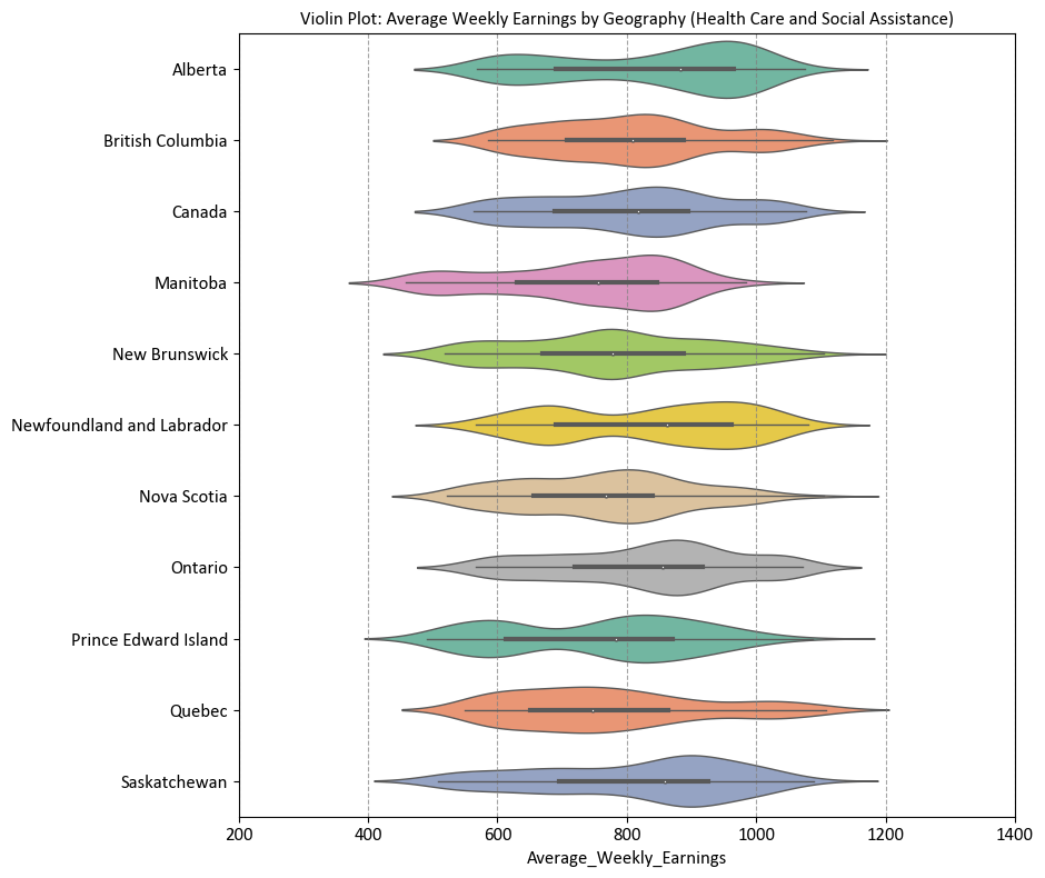
Here’s a breakdown of the key steps:
Creating a Figure and Axes with a Specified Size:
A figure and axes are created using ‘plt.subplots(figsize=(9.5, 8)).’ The ‘figsize’ parameter sets the size of the figure in inches.
Creating a Violin Plot with Seaborn:
A violin plot is generated using ‘sns.violinplot().’
‘y’ is set to ‘Geography,’ specifying that the ‘Geography’ column from the ‘df_weekly_earnings_health’ DataFrame should be represented on the y-axis.
‘x’ is set to ‘Average_Weekly_Earnings,’ indicating that the ‘Average_Weekly_Earnings’ column should be represented on the x-axis.
‘data’ specifies the DataFrame containing the data.
‘palette’ sets the color palette for the violin plots to ‘Set2.’
‘ax’ specifies the axes where the plot should be drawn.
Setting Labels and Title:
The ‘ax.set()’ method is used to set labels for the y-axis and provide a title for the plot.
‘ylabel’ is set to an empty string (‘’) to remove the y-axis label.
‘title’ sets the title of the plot.
‘xlim’ sets the limits for the x-axis to [200, 1400].
Adding Grid Lines to the X-Axis:
Grid lines are added to the x-axis using ‘ax.xaxis.grid(True, linestyle=’–‘, alpha=0.7).’ This helps in better visualizing the data by providing reference lines.
Showing the Plot with Tight Layout:
‘plt.tight_layout()’ is called to ensure a tight layout, improving the plot’s appearance by avoiding overlapping elements.
Violin Plots
A violin plot is a type of data visualization that combines aspects of a box plot and a kernel density plot. It is used to display the distribution of data for different categories or groups. The plot consists of one or more “violins,” each representing a group of data points. Each violin represents the density of the data within a specific range.
Here’s a breakdown of the key components of a violin plot:
Violin Body: The central part of the violin plot is called the “violin body.” It resembles a mirrored kernel density plot, showing the data density along the y-axis. Wider sections of the violin indicate higher data density, while narrower sections indicate lower density.
Interquartile Range (IQR): Inside the violin, a thick horizontal line represents the interquartile range (IQR) of the data. The IQR spans from the first quartile (Q1) to the third quartile (Q3) and contains the middle 50% of the data.
Median Line: A vertical line inside the violin represents the median value of the data.
Extremes and Outliers: The “whiskers” of the violin plot extend from the ends of the IQR to the minimum and maximum values within a certain range. Data points beyond these whiskers are considered “outliers” and are plotted individually as points outside the violin.
Violin plots are particularly useful when comparing the distribution of multiple datasets or groups. They provide insights into the shape of the data distribution, skewness, multimodality, and the presence of outliers.
For the same reasons mentioned earlier, we can only generate a plot for data from 2020 onwards.
# Import the necessary libraries for data visualization
import seaborn as sns
import matplotlib.pyplot as plt

# Create a figure and axes with a specified size for the violin plot
fig, ax = plt.subplots(figsize=(9.5, 8))

# Generate a violin plot to visualize the distribution of average weekly earnings by geography
sns.violinplot(y='Geography', x='Average_Weekly_Earnings',
               data=df_weekly_earnings_health.loc[df_weekly_earnings_health.Year >= 2020],
               palette='bright', ax=ax)

# Set labels and title for the plot
ax.set(ylabel='',  # No label for the y-axis
       title='Violin Plot: Average Weekly Earnings by Geography (Health Care and Social Assistance)',
       xlim=[700, 1200])  # Setting the x-axis limit for better visualization

# Add grid lines only for the x-axis to enhance readability
ax.xaxis.grid(True, linestyle='--', alpha=0.7)

# Display the plot with tight layout for improved presentation
plt.tight_layout()
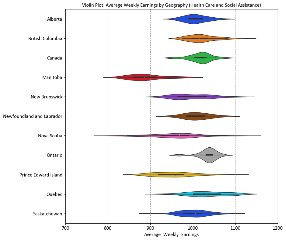
7.5.8. Pair Plot (Optional Content)#
A pair plot [Waskom, 2021], often implemented using Seaborn’s sns.pairplot() function, is a versatile and effective tool for visualizing pairwise relationships in a dataset containing multiple numerical variables. It creates a grid of scatter plots or other types of plots, showing the relationships between pairs of variables, as well as distribution plots for each variable along the diagonal. Here’s a detailed explanation of how to use sns.pairplot():
Usage: Pair plots are used to explore correlations, patterns, and distributions between pairs of numerical variables in a dataset. They’re particularly valuable when you have several numerical variables and want to quickly visualize their relationships.
Seaborn Library: Seaborn is a Python data visualization library built on Matplotlib.
sns.pairplot()is a function within Seaborn that facilitates creating pair plots.Syntax: The basic syntax for creating a pair plot with Seaborn is:
sns.pairplot(data, hue, kind). Here,datais the DataFrame containing the data,hue(optional) is used to add a categorical variable for color differentiation, andkind(optional) specifies the type of plots to display on the off-diagonal subplots (e.g., “scatter,” “kde,” “reg”). You can find the full function description here.Pair Plot Features:
Scatter Plots: The off-diagonal subplots (above the diagonal) are typically scatter plots, which show the relationship between pairs of variables. Each point represents an observation, and you can quickly identify trends or clusters.
Distribution Plots: The diagonal subplots show the distribution of each variable using histograms or kernel density estimates (KDEs). This allows you to understand the data’s distribution for individual variables.
Coloring (Hue): The
hueparameter allows you to add a categorical variable, and the pair plot will color the data points based on this variable, making it easier to distinguish between categories.Customization: Seaborn’s
sns.pairplot()offers customization options such as adjusting colors, marker styles, plot aesthetics, and more.
Interpretation: When interpreting a pair plot, focus on the scatter plots for pairwise relationships. Observe the trends, patterns, and strength of the correlation. Pay attention to the diagonal plots to understand the distribution of each variable and detect potential outliers.
Data Preparation: Ensure that the data is well-prepared and relevant for the pair plot. Handle missing values and ensure that the variables being compared are suitable for scatter plots and distribution plots.
Example - Iris Flower Pair Plot: The Iris Flower dataset, introduced by the British biologist and statistician Ronald A. Fisher in 1936, serves as a benchmark dataset in the field of pattern recognition and machine learning. This dataset comprises 150 instances of iris flowers, each belonging to one of three species: setosa, versicolor, or virginica. For each instance, four features are measured: sepal length, sepal width, petal length, and petal width, all in centimeters [Breiman, 2017, Pedregosa et al., 2011, scikit-learn Developers, 2023].
The primary objective of the Iris Flower dataset is to facilitate the development and evaluation of classification algorithms. Researchers and practitioners commonly employ this dataset for tasks such as species classification, where the goal is to accurately classify an iris flower into one of the three species based on its measured features [Breiman, 2017, Pedregosa et al., 2011, scikit-learn Developers, 2023].
Due to its simplicity and well-defined structure, the Iris Flower dataset is frequently utilized to demonstrate various machine learning techniques, including clustering, classification, and dimensionality reduction. Its accessibility and widespread use contribute to its status as a fundamental resource for beginners and experts alike in the realms of data analysis and machine learning [Breiman, 2017, Pedregosa et al., 2011, scikit-learn Developers, 2023].
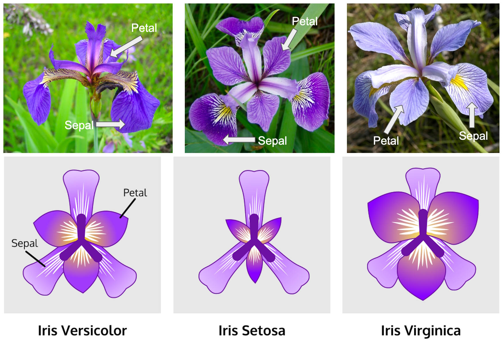
Fig. 7.1 The Iris Flower dataset. Image sourced from Kaggle.com.#
In this example, we utilize the Iris Flower dataset with Seaborn’s Pair Plot. We load the dataset, create a PairGrid for pairwise visualizations with color-coded species differentiation, and apply scatter and KDE plots to relevant sections. This enhances data understanding and pattern recognition.
# Import necessary libraries
import seaborn as sns
import matplotlib.pyplot as plt

# Load a sample dataset (Iris dataset)
iris = sns.load_dataset('iris')

# Create a PairGrid for visualizing pairwise relationships:
# - 'hue' colors the data points by the 'species' column.
# - 'palette' sets the color palette to 'Dark2.'
# - 'diag_sharey=False' ensures that the diagonal subplots have independent y-axes.
g = sns.PairGrid(iris, hue='species', palette='Dark2', diag_sharey=False)

# Map scatter plots to the upper triangle of the PairGrid
_ = g.map_upper(sns.scatterplot)

# Map Kernel Density Estimate (KDE) plots to the lower triangle of the PairGrid
_ = g.map_lower(sns.kdeplot)

# Map KDE plots to the diagonal subplots
_ = g.map_diag(sns.kdeplot)

# Add a legend to distinguish species colors
_ = g.add_legend()
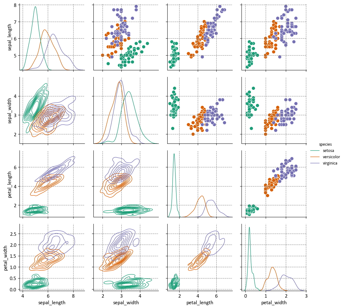
Here’s a breakdown of the key steps:
Loading a Sample Dataset:
The Iris dataset is loaded using ‘sns.load_dataset(‘iris’).’
This dataset contains measurements of sepal and petal length and width for three species of iris flowers.
Creating a PairGrid for Visualization:
A PairGrid is created to visualize pairwise relationships between variables in the Iris dataset.
‘hue’ is set to ‘species,’ which means that data points will be colored according to the ‘species’ column.
‘palette’ is set to ‘Dark2,’ which defines the color palette used for distinguishing different species.
‘diag_sharey=False’ ensures that the diagonal subplots have independent y-axes, allowing for better visualization.
Mapping Scatter Plots to the Upper Triangle:
The ‘g.map_upper(sns.scatterplot)’ command maps scatter plots to the upper triangle of the PairGrid. This shows the relationships between variables in a pairwise manner.
Mapping Kernel Density Estimate (KDE) Plots to the Lower Triangle:
The ‘g.map_lower(sns.kdeplot)’ command maps Kernel Density Estimate (KDE) plots to the lower triangle of the PairGrid. This represents the distribution of variables.
Mapping KDE Plots to the Diagonal Subplots:
The ‘g.map_diag(sns.kdeplot)’ command maps KDE plots to the diagonal subplots. These diagonal plots show the distribution of each variable individually.
Adding a Legend:
‘g.add_legend()’ adds a legend to distinguish different species colors in the pair plot.
Pair Plots
Seaborn’s pairplot is a versatile and informative visualization tool for exploring the relationships between multiple numeric variables in a dataset. It provides a grid of scatter plots and histograms (or kernel density estimates) to visualize pairwise relationships and individual variable distributions. This visualization can reveal correlations, trends, and patterns, making it useful for initial data exploration. Here’s a breakdown of the main elements and concepts related to Seaborn’s pairplot:
Pairwise Scatter Plots: The primary component of the
pairplotis the grid of scatter plots. Each cell in the grid represents the relationship between two numeric variables from the dataset. Points on these scatter plots indicate the values of the two variables for each data point. This helps in visualizing how the variables interact with each other.Diagonal Axes: The diagonal of the grid typically contains histograms (or kernel density estimates) for each individual variable. This allows you to understand the distribution and spread of each variable in the dataset. The diagonal elements provide insights into the univariate distribution of the data.
Hue Parameter: The
hueparameter allows you to specify a categorical variable, andpairplotuses this variable to color the data points or use different marker styles in the scatter plots. This is useful when you want to visually distinguish between different categories or groups in the data.Diagonal Plot Type: You can control the type of plot used on the diagonal axes using the
diag_kindparameter. Common options include “hist” for histograms and “kde” for kernel density estimates. This choice depends on the nature of the variable and your preference for visualization.Pairwise Relationships: By examining the scatter plots, you can identify correlations between variables. Positive correlations are indicated by points forming an upward trend, while negative correlations show a downward trend. If there’s no clear trend, the variables might be weakly correlated or not correlated at all.
Data Patterns: Pair plots can help uncover patterns or clusters within the data. If specific clusters of data points appear in the scatter plots, it may indicate the presence of subgroups or distinct patterns in the dataset.
Outliers: Outliers in the data can be identified in the scatter plots as data points that significantly deviate from the overall trend or pattern. These outliers may warrant further investigation.
Customization: Seaborn provides a range of customization options to modify the appearance of the pair plot, such as changing colors, marker styles, and more. Customization helps make the plot more visually appealing and tailored to your specific needs.
Data Preparation: Ensure that the data is cleaned and relevant for the analysis. Remove missing values or handle them appropriately before creating the pair plot.
Interpretation: Careful interpretation of the pair plot is essential. Look for interesting relationships, correlations, and patterns. The pair plot serves as a starting point for more in-depth analysis.
7.5.9. Regression Plot (Optional Content)#
A regression plot, often referred to as a scatter plot with a regression line, is a common visualization tool used to explore and understand the relationship between two numerical variables in a dataset. It helps you visualize the trend and strength of the linear relationship between the variables and can provide insights into how changes in one variable are associated with changes in the other. Here’s a comprehensive explanation of regression plots [Waskom, 2021]:
Usage: Regression plots are primarily used to examine the relationship between two continuous numerical variables. They are often employed to identify trends, patterns, and correlations, as well as to make predictions based on the observed relationship.
Seaborn Library: Seaborn is a Python data visualization library built on top of Matplotlib. It offers a simple and aesthetically pleasing way to create regression plots.
Syntax: The basic syntax for creating a regression plot in Seaborn is:
sns.regplot(x, y, data, scatter_kws, line_kws). Here,xandyare the variables you want to compare,datais the DataFrame containing the data,scatter_kwsallows customization of scatter plot parameters, andline_kwsallows customization of the regression line. You can find the full function description here.Scatter Plot: A regression plot starts with a scatter plot, where each data point is plotted with one variable on the x-axis and the other on the y-axis. This shows the distribution of data points and the general relationship between the variables.
Regression Line: The core component of the regression plot is the fitted regression line. This line represents the best-fit linear relationship between the variables. It shows the trend, direction, and strength of the relationship.
Intercept and Slope: The regression line has an intercept (the value where the line crosses the y-axis) and a slope (indicating the rate of change). These parameters provide valuable information about the relationship between the variables.
Confidence Intervals: Many regression plots also display confidence intervals around the regression line. These intervals help assess the uncertainty of the regression estimates, showing the range within which the true regression line is likely to fall.
Residuals: Some regression plots include residuals, which are the vertical distances between each data point and the regression line. Residuals can be useful for assessing the goodness of fit and identifying outliers.
Customization: Seaborn regression plots can be customized using various parameters to adjust colors, marker styles, line styles, and other visual aspects, allowing you to tailor the plot to your needs and enhance its readability.
Interpretation: When interpreting a regression plot, focus on the direction and slope of the regression line. Consider the strength and significance of the relationship. If confidence intervals are displayed, pay attention to their width and whether they encompass zero (indicating non-significance).
# Import necessary libraries
import seaborn as sns
import matplotlib.pyplot as plt

# Sample data
x = [1, 2, 3, 4, 5, 6, 7, 8, 9, 10]
y = [2, 4, 5, 7, 8, 9, 11, 12, 13, 15]

# Create a figure and axes with a specified size
fig, ax = plt.subplots(figsize=(8, 5))

# Create the regression plot using sns.regplot
# - 'x' and 'y' are the data to be plotted on the x-axis and y-axis.
# - 'scatter_kws' sets parameters for the scatter plot, including marker size.
# - 'color' sets the color of the scatter points.
# - 'line_kws' sets parameters for the regression line, including its color.
# - 'ax' specifies the axes where the plot should be drawn.
sns.regplot(x=x, y=y, ci=None, scatter_kws={'s': 60},
            color='blue', line_kws={'color': 'red'}, ax=ax)

# Set labels for the x-axis and y-axis, and a title for the plot
ax.set(xlabel='X-axis', ylabel='Y-axis',
       title='Scatter Plot with Regression Line')

# Display grid lines for both x and y axes
ax.grid(True)

plt.tight_layout()
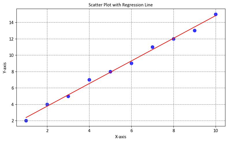
Here’s a breakdown of the key steps:
Defining Sample Data:
Two lists, ‘x’ and ‘y,’ are defined as sample data. These lists represent values for the x-axis and y-axis, respectively.
Creating a Figure and Axes with a Specified Size:
A figure and axes are created using ‘plt.subplots(figsize=(8, 5)).’ The ‘figsize’ parameter sets the size of the figure in inches.
Creating the Regression Plot Using
sns.regplot:sns.regplot()is used to create the regression plot.‘x’ and ‘y’ are specified as the data to be plotted on the x-axis and y-axis.
‘scatter_kws’ is a dictionary that sets parameters for the scatter plot, such as the marker size (‘s’: 60).
‘color’ sets the color of the scatter points to blue.
‘line_kws’ is a dictionary that sets parameters for the regression line, including its color (‘color’: ‘red’).
‘ax’ specifies the axes where the plot should be drawn.
Setting Labels for the Axes and a Title for the Plot:
ax.set()is used to set labels for the x-axis and y-axis and to provide a title for the plot.‘xlabel’ is set to ‘X-axis’ to label the x-axis.
‘ylabel’ is set to ‘Y-axis’ to label the y-axis.
‘title’ is set to ‘Scatter Plot with Regression Line’ to provide a title for the plot.
7.5.10. Heatmap#
A heatmap [Waskom, 2021] is a popular data visualization technique that uses colors to represent numerical values in a matrix-like format. It’s particularly useful for visualizing relationships, patterns, and distributions within a dataset, especially when dealing with two-dimensional data. Seaborn’s sns.heatmap() function is designed to create heatmaps easily, and it offers customization options for enhanced visualization. Here’s an explanation of how to use sns.heatmap():
Usage: Heatmaps are used to display a matrix of numerical values where each value is represented by a color. They are commonly used to show correlations, patterns, or distributions in datasets with two dimensions (e.g., a matrix of data points).
Seaborn Library: Seaborn is a Python data visualization library built on top of Matplotlib.
sns.heatmap()is part of Seaborn’s collection of plot functions.Syntax: The basic syntax for creating a heatmap with Seaborn is:
sns.heatmap(data, annot, cmap). Here,datais the two-dimensional array or DataFrame containing the numerical values,annot(optional) controls whether to annotate the heatmap cells with the actual values, andcmap(optional) specifies the color map to be used for the heatmap. You can find the full function description here.Heatmap Features:
Color Mapping: Each cell in the heatmap represents a numerical value, and the color of the cell is determined by a color map (
cmap) that maps the values to colors. You can choose a color map that best suits your data and visualization needs.Annotation: The
annotparameter allows you to display the actual numerical values within the cells of the heatmap, providing additional information and making it easier to interpret the visualization.
Customization: Seaborn’s
sns.heatmap()offers customization options, such as adjusting the color map, adding labels and titles, setting axis ticks, adjusting plot aesthetics, and more.Interpretation: When interpreting a heatmap, focus on the color variations, which indicate the relative magnitude of the numerical values. Look for patterns, correlations, or clusters within the heatmap. If annotations are enabled, the actual values within each cell can provide additional context.
Data Preparation: Ensure that the data is well-structured for the heatmap. It should be in a matrix-like format, with rows and columns representing categories or variables and the cell values being the numerical data points to be visualized.
# Import necessary libraries
import seaborn as sns
import matplotlib.pyplot as plt

# Create a correlation matrix
data = [[1, 0.8, 0.2],
        [0.8, 1, 0.6],
        [0.2, 0.6, 1]]

# Create a figure and axes with a specified size
fig, ax = plt.subplots(figsize=(6, 4))

# Create a heatmap using Seaborn
sns.heatmap(data, ax=ax,
            annot=True,  # Display correlation values within the heatmap cells.
            fmt='.2f',   # Format the annotations to two decimal places.
            cmap='coolwarm',  # Set the color map for the heatmap.
            linewidths=0.5,  # Define the width of the grid lines between cells.
            cbar=True,  # Show the color bar to indicate the scale.
            vmin=0, vmax=1,  # Set the color scale limits (0 to 1).
            annot_kws={"fontsize": 14}  # Customize the font size of the annotations.
           )

# Set multiple properties using the Axes object
ax.set(title='Correlation Heatmap',  # Set the plot title to 'Correlation Heatmap.'
       aspect='equal'  # Ensure equal scaling for both axes, making cells square.
      )

# Turn off grid lines
ax.grid(False)

# Ensure a tight layout for better presentation
plt.tight_layout()
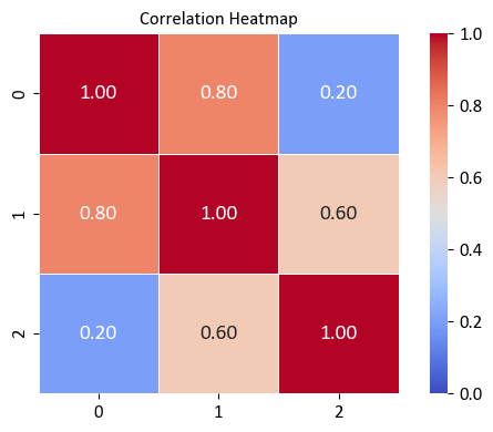
Here’s a breakdown of the key steps:
Creating a Correlation Matrix:
A correlation matrix is defined as ‘data.’ This matrix represents the correlations between variables and is typically square with ones on the diagonal since each variable correlates perfectly with itself.
Creating a Figure and Axes with a Specified Size:
A figure and axes are created using ‘plt.subplots(figsize=(6, 4)).’ The ‘figsize’ parameter sets the size of the figure in inches.
Creating the Heatmap Using Seaborn:
sns.heatmap()is used to create the heatmap.‘data’ is specified as the correlation matrix to be visualized.
‘annot=True’ displays the correlation values within the heatmap cells.
‘cmap=‘coolwarm’’ sets the color map for the heatmap, which uses cool and warm colors to represent positive and negative correlations, respectively.
‘ax’ specifies the axes where the heatmap should be drawn.
‘annot_kws’ allows you to customize the font size of the annotations in the heatmap. In this case, the font size is set to 12.
Setting Multiple Properties Using the Axes Object:
The ‘ax.set()’ method is used to set multiple properties for the plot.
‘title’ is set to ‘Correlation Heatmap’ to provide a title for the plot.
‘aspect’ is set to ‘equal’ to ensure that the cells of the heatmap are square, providing a more accurate representation of the correlation matrix.
Turning off Grid Lines:
ax.grid(False)is called to turn off grid lines in the plot, enhancing its clarity.
Ensuring a Tight Layout:
plt.tight_layout()is used to ensure a tight layout, which optimizes the spacing and arrangement of plot elements for better presentation.
Heatmap Plots
A Seaborn heatmap is a graphical representation of a 2D dataset in which individual values are represented as colors. It’s a powerful tool for visualizing the relationships and patterns within the data, especially when dealing with numerical data and correlation matrices. Here’s a detailed explanation of Seaborn’s heatmap:
Usage: Heatmaps are commonly used to visualize matrices, including correlation matrices, confusion matrices, and any 2D data where the values have meaningful relationships.
Color Mapping: Heatmaps use a color scale to represent values in the dataset. By mapping colors to numerical values, it becomes easier to identify patterns, clusters, and variations in the data.
Seaborn Library: Seaborn is a Python data visualization library based on Matplotlib. It provides a high-level interface for creating informative and visually appealing statistical graphics, including heatmaps.
Syntax: The basic syntax for creating a heatmap in Seaborn is:
sns.heatmap(data, annot, cmap, center, linewidths). Here,datais the 2D dataset you want to visualize,annot(optional) controls whether to annotate each cell with its value,cmapspecifies the color palette,center(optional) defines the center value of the color map, andlinewidths(optional) adds space between cells.Color Palette: The choice of color palette (
cmap) is crucial. It affects the visual representation of the data. Seaborn provides various built-in color palettes, such as “coolwarm,” “viridis,” “cividis,” “plasma,” “hot,” and more. Choose a palette that suits the data and emphasizes the patterns you’re interested in.Annotating Cells: The
annotparameter allows you to display the actual values of each cell within the heatmap. This can be useful for understanding the dataset at a glance, especially when dealing with correlation matrices or other matrices where the exact values matter.Center Value: The
centerparameter lets you set a specific value around which the colors are centered. This is particularly helpful when you want to emphasize positive and negative deviations from a particular value.Interpretation: When interpreting a heatmap, look for clusters of similar colors, which indicate groups or patterns within the data. Pay attention to the color scale’s legend to understand the correspondence between colors and values. Also, consider any annotations present within the cells, especially when exploring correlation or similarity matrices.
Customization: Seaborn allows you to customize the appearance of the heatmap, such as adjusting the color scale, annotating cells with different formatting, and modifying the plot’s aesthetics.
Data Preparation: Ensure that the data is appropriately organized and cleaned before creating a heatmap. Heatmaps work best with structured 2D data.
7.5.11. Joint Plot (Optional Content)#
A Seaborn Joint Plot [Waskom, 2021] is a versatile visualization that combines several different types of plots to visualize the relationship between two numerical variables in a dataset. It provides a compact and informative representation of the data, including scatter plots, histograms, kernel density estimates (KDEs), and optional regression fits. Here’s an explanation of Seaborn’s Joint Plot:
Usage: Joint plots are used to explore the relationship between two numerical variables. They are particularly useful for understanding the correlation, distribution, and potential trends between these variables.
Seaborn Library: Seaborn is a Python data visualization library built on top of Matplotlib. It aims to simplify the creation of informative and attractive statistical graphics, and the Joint Plot is one of its offerings.
Syntax: The basic syntax for creating a joint plot in Seaborn is:
sns.jointplot(x, y, data, kind, hue). Here,xandyare the variables from the dataset that you want to compare,datais the DataFrame containing the data,kindspecifies the type of plot (e.g., “scatter,” “reg,” “resid,” “kde,” etc.), andhue(optional) is used to add a categorical variable to color the data points. You can find the full function description here.Scatter Plot: The default plot type for a joint plot is a scatter plot, which shows the individual data points and their distribution across the two variables.
Histograms: By setting
kind="hist", joint plots can display histograms for each variable on the corresponding axes. This helps understand the distribution of each variable independently.Kernel Density Estimates (KDEs): When
kind="kde"is used, joint plots display the estimated density of the data points, providing insights into the joint distribution of the variables.Regression Fits: You can include a linear regression fit to the scatter plot using
kind="reg". This helps visualize the overall trend between the variables and provides information about the strength and direction of the relationship.Residual Plots: When
kind="resid", joint plots show the residuals of the linear regression fit. This can be useful for understanding the goodness of fit and identifying any systematic deviations.Customization: Seaborn joint plots offer various customization options, such as changing colors, marker styles, adjusting the appearance of regression lines, and more. Customization allows you to tailor the plot to your specific needs.
Interpretation: When interpreting a joint plot, pay attention to the scatter plot to observe the relationship between the variables. Look for patterns, clusters, or trends. If a regression line is included, consider its slope and the strength of the correlation. If using the
hueparameter, observe how different categories are distributed.
import seaborn as sns
import matplotlib.pyplot as plt

# Sample data
x = [1, 2, 3, 4, 5]
y = [2, 4, 6, 8, 10]

# Create a joint plot with a scatter plot
g = sns.jointplot(x=x, y=y, kind='scatter', color='purple')

# Set labels and title using the axes of the joint plot
g.ax_joint.set(xlabel='X-axis', ylabel='Y-axis')

# Add grid lines only for the y-axis
g.ax_joint.grid(True, linestyle='--', alpha=0.7)
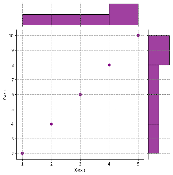
Here’s a breakdown of the key steps:
Defining Sample Data:
Two lists, ‘x’ and ‘y,’ are defined as sample data. These lists represent values for the x-axis and y-axis, respectively.
Creating a Joint Plot with a Scatter Plot:
The ‘sns.jointplot()’ function is used to create a joint plot.
‘x’ and ‘y’ are specified as the variables to be plotted.
‘kind’ is set to ‘scatter’ to create a scatter plot to visualize the relationship between ‘x’ and ‘y.’
‘color’ is set to ‘purple’ to define the color of the plot.
Setting Labels and Title Using the Axes of the Joint Plot:
‘g.ax_joint.set()’ is used to set labels for the x-axis and y-axis using the axes of the joint plot (‘g.ax_joint’).
‘xlabel’ is set to ‘X-axis’ to label the x-axis.
‘ylabel’ is set to ‘Y-axis’ to label the y-axis.
Adding Grid Lines to the Y-Axis:
Grid lines are added to the y-axis of the joint plot using ‘g.ax_joint.grid(True, linestyle=’–‘, alpha=0.7).’ This provides reference lines for better visualization.
7.5.12. Facet Grid plot (Optional Content)#
A Seaborn Facet Grid plot is a powerful way to visualize relationships between multiple variables in a dataset by creating a grid of subplots based on unique values or combinations of categorical variables. It allows you to compare and contrast subsets of your data within the same visualization. Here’s an explanation of Seaborn’s Facet Grid [Waskom, 2021]:
Usage: Facet Grid plots are particularly useful when you want to explore how a relationship varies across different levels of one or more categorical variables. It’s a great tool for understanding interactions and patterns in the data.
Seaborn Library: Seaborn is a Python data visualization library based on Matplotlib. The Facet Grid is a higher-level feature within Seaborn that makes it easy to create grid-like arrangements of plots.
Syntax: The basic syntax for creating a Facet Grid plot in Seaborn is:
sns.FacetGrid(data, col, row, hue). Here,datais the DataFrame containing the data,colspecifies the categorical variable for creating columns of subplots,rowspecifies the categorical variable for creating rows of subplots, andhue(optional) is used to color the subplots based on a categorical variable. You can find the full function description here.Multiple Subplots: The Facet Grid creates a grid of subplots, where each subplot displays a subset of the data based on the unique values of the specified categorical variables. You can have separate plots for each combination of categorical levels.
Visualization: The type of plot you use within the Facet Grid depends on the specific relationship you want to visualize. Common plot types include scatter plots, bar plots, histograms, line plots, and more. The choice of plot type helps in understanding the relationship between variables.
colandrowParameters: Thecolandrowparameters allow you to create facets along the columns and rows, respectively. This is useful when you want to explore how the relationship between variables changes based on different categories.hueParameter: Thehueparameter can be used to add a categorical variable that colors the data points or lines in the subplots, providing additional information and making it easier to distinguish between categories.Customization: Seaborn’s Facet Grid allows for customization, including changing plot aesthetics, colors, adding titles, and applying different plot types to the subplots.
Interpretation: When interpreting a Facet Grid plot, focus on the patterns and differences in the relationships between the variables within each subplot. Observe how the relationship changes across different categories or levels.
Data Preparation: Ensure that your data is well-prepared and suitable for the Facet Grid arrangement. Categorical variables should be properly encoded, and the dataset should be structured in a way that makes sense for the visual comparison.
import seaborn as sns
import matplotlib.pyplot as plt

# Load the "tips" dataset
tips = sns.load_dataset("tips")

# Create a Facet Grid plot
g = sns.FacetGrid(tips, col="day",
                  col_wrap=2, height=3)  # col_wrap specifies the number of columns
g.map(plt.scatter, "total_bill", "tip", alpha=0.7)

# Add titles
_ = g.set_axis_labels("Total Bill ($)", "Tip ($)")
_ = g.set_titles(col_template="{col_name} day")
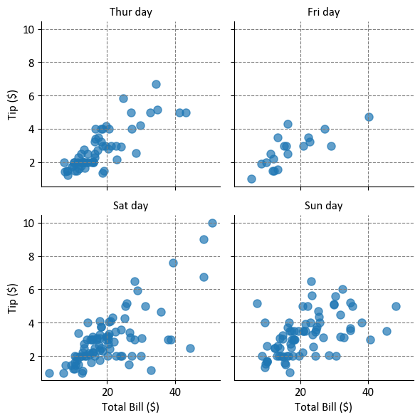
Here’s a breakdown of the key steps:
Loading the “tips” Dataset:
The “tips” dataset is loaded using ‘sns.load_dataset(“tips”).’
This dataset contains information about restaurant bills and tips, including columns like “total_bill,” “tip,” “day,” and more.
Creating a Facet Grid Plot:
A Facet Grid plot is created using ‘sns.FacetGrid().’
‘tips’ is specified as the dataset to be used.
‘col’ is set to “day,” which means that subplots will be created for each unique value in the “day” column.
‘col_wrap’ is set to 2, which specifies that the subplots should be arranged in 2 columns before wrapping to the next row.
‘height’ sets the height of each subplot to 3 inches.
Mapping a Scatter Plot to the Facet Grid:
The ‘g.map(plt.scatter, “total_bill”, “tip”, alpha=0.7)’ command maps a scatter plot to the Facet Grid.
It specifies that “total_bill” should be plotted on the x-axis, “tip” on the y-axis, and ‘alpha=0.7’ sets the transparency of the points.
Adding Titles:
‘_ = g.set_axis_labels(“Total Bill ($)”, “Tip ($)”)’ sets the labels for the x-axis and y-axis of each subplot.
‘_ = g.set_titles(col_template=“{col_name} day”)’ sets titles for each subplot, where “{col_name}” is replaced by the actual value from the “day” column.